
TL;DR: A branding kit is your complete visual identity package that includes logos, color palettes, typography, and usage guidelines. It’s what keeps your brand looking consistent everywhere, from your website to your social media posts.
A branding kit contains all the visual elements that define your brand identity. This includes logo variations, color schemes with specific codes, font choices, spacing rules, and clear instructions on how to use each element. Think of it as your brand’s instruction manual that anyone on your team can follow to maintain a professional, cohesive look across all platforms.
Your brand needs to look the same whether someone sees it on Instagram, your website, or a business card. That’s where a branding kit comes in. A branding kit gives you (and your team) everything needed to present your brand consistently, no matter where it appears.
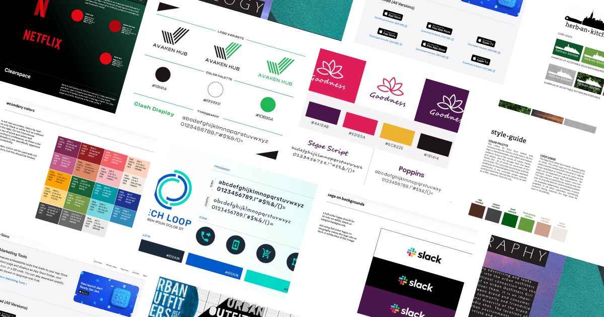
Companies like Netflix, Apple, and Starbucks didn’t become instantly recognizable by accident. They use detailed branding kits that specify exactly how their logos should appear, which colors to use, and even how much white space to leave around certain elements.
What’s Included in a Branding Kit
Before looking at examples, understand what makes a complete brand kit. Strong brand design services include these core elements:
Logo variations in different formats and colors, typography specifications with primary and secondary fonts, color palettes with exact HEX and RGB codes, usage guidelines showing correct and incorrect applications, supporting graphics like patterns or icons. These elements work together to create a cohesive visual identity across every customer touchpoint.
Here are branding kit examples from famous brands, plus tools and tips to help you create the perfect kit for your business.
Penji Branding Kit
Starting with an example from Penji, this kit offers logo variations including a green version, black version, and combination of the two. The kit specifies the brand’s typeface along with hex codes of the color scheme. This straightforward approach gives designers everything needed to create on-brand materials quickly.
Netflix Branding Kit
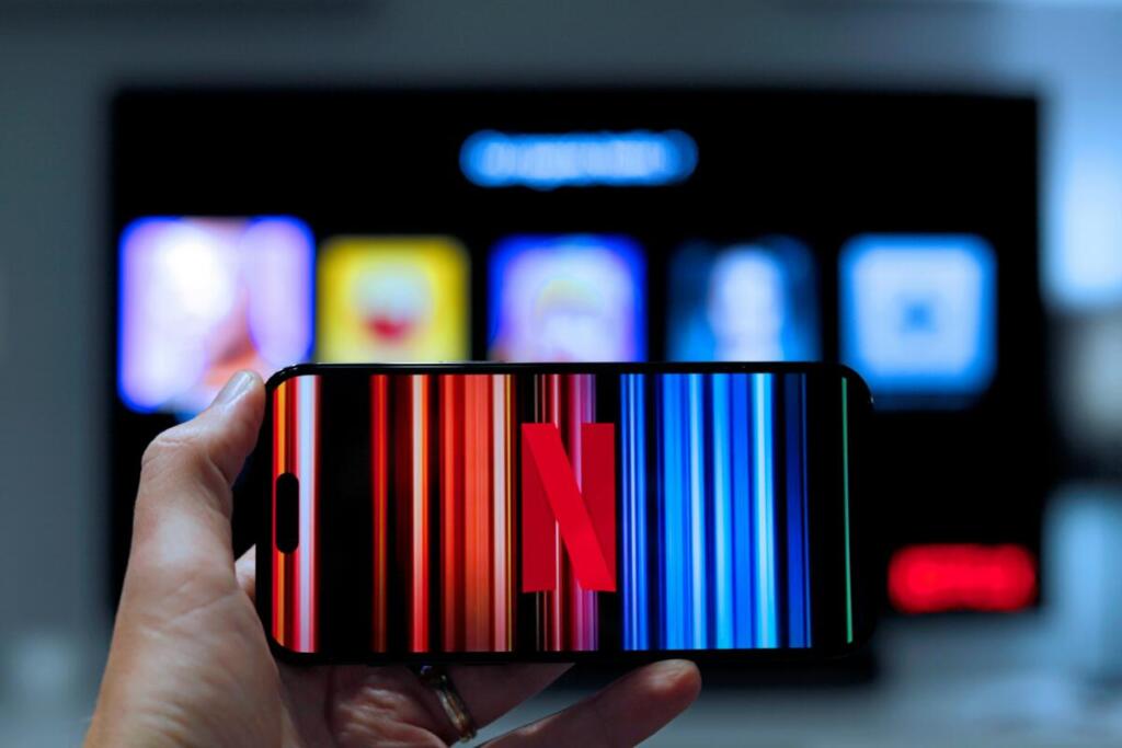
Netflix has taken the world by storm over recent years. The streaming platform’s branding is so strong that users are familiar with its “Tudum” sonic logo accompanying the visual logo. Their branding kit explains both the symbol and wordmark, showing how audio and visual elements combine to create memorable brand experiences.
Spotify Branding Kit

If you’re a loyal Spotify user, the company’s green logo is probably etched in your mind. But the audio streaming provider also has other logo color combinations. Their branding kit shows these variations, demonstrating how brands can maintain flexibility while staying recognizable.
Starbucks Branding Kit

Starbucks, the global coffeehouse chain, is instantly recognizable by its iconic green mermaid logo. The Starbucks branding kit includes logo variations and typeface combining custom and standard fonts. The primary color is Starbucks Green, but the palette includes complementary colors like deep brown representing coffee and cream representing milk. Each color comes with specific HEX, CMYK, and RGB codes.
Apple App Store Brand Style Guide

Apple’s brand style guide provides clear guidelines on incorporating visuals for various uses. This helps ensure the brand stays intact across all platforms and partner brands. The precision in their guidelines shows why Apple maintains such consistent brand recognition globally.
Slack Branding Kit
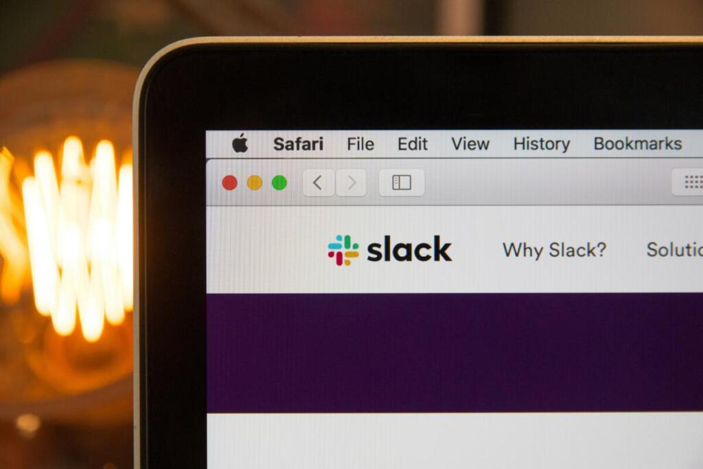
This branding kit for Slack offers detailed guidelines about logos, typeface, and other branding assets. The kit specifies not only primary colors but also secondary colors. This level of detail helps partners and team members create materials that feel authentically Slack.
Tools for Creating Your Branding Kit
Creating professional branding kits requires the right tools and expertise. Design as a service platforms like Penji offer unlimited graphic design services that include complete brand kit development. Working with professional designers ensures your brand kit includes everything needed while maintaining visual excellence.
Other useful tools include branding tools for organizing assets and creating documentation. Whether you’re building a kit from scratch or refining existing materials, having proper tools makes the process smoother and results stronger.
Tips for Brand Kit Success
Start with clear brand identity defining your mission, values, and personality. Document every visual decision with specific measurements and codes. Create usage examples showing both correct and incorrect applications. Keep your kit accessible to everyone who creates brand materials. Update regularly as your brand evolves while maintaining core consistency.
Consider working with branding agency professionals or using full service branding to develop comprehensive kits. Professional guidance ensures nothing gets overlooked and your brand presents consistently from day one.
Get Your Professional Branding Kit
Ready to build a brand kit that drives recognition and consistency? Penji’s professional designers create comprehensive branding and design packages including logo variations, color palettes, typography guides, and usage documentation. With unlimited revisions and graphic design monthly plans, you get everything needed to build strong brand identity.
Work with designers who understand brand consistency. Get started with Penji and create a branding kit that makes your business instantly recognizable. Looking to hire experts? Learn about hiring brand designer professionals who bring your vision to life.
Frequently Asked Questions
What should be included in a branding kit?
A complete branding kit includes logo variations in multiple formats, color palette with HEX/RGB codes, primary and secondary typography, usage guidelines, and supporting graphics. Optional elements include photo style guides, iconography, and voice/tone guidelines for written content.
How is a branding kit different from a style guide?
Branding kits focus on visual assets and their usage, while style guides often include broader elements like brand voice, messaging, and editorial guidelines. Many businesses combine both into comprehensive brand guidelines documents.
Can I create a branding kit myself?
You can create basic kits using design tools, but professional designers ensure visual excellence and completeness. Custom graphic design service platforms provide expert help at affordable rates, delivering polished results faster than DIY approaches.
How often should I update my branding kit?
Review annually and update when launching new products, entering new markets, or refreshing visual identity. Minor updates might happen more frequently, but major overhauls should be infrequent to maintain brand recognition.
What file formats should a branding kit include?
Provide logos in vector formats like AI, EPS, and SVG for scalability, plus PNG files with transparent backgrounds. Include both RGB for digital use and CMYK for print applications to ensure colors reproduce correctly across all media.
About the author

Carla Deña
Carla is a journalist and content writer who produces stories for both digital and legacy media. She is passionate about creativity, innovation, and helping small businesses explore solutions that drive growth and social impact.


