


Not all billboard designs are created equal. Some are just okay, some are witty, and a special few touch our emotions and become unforgettable.
Need a billboard design of your own? Use code BB25 for 25% off your first month of Penji!
Here are the top billboard designs that can teach you a thing or two, especially if you are working on a marketing campaign.
[in_content_ads gallery="Marketing" logo="off" title="Create smart, effective campaigns efficiently" subtitle="Meet your conversion goals using visuals that stand out" btntext="I need this!" btnlink="https://penji.co/pricing/?affiliate=J2O5AB8RAR3386837"]1. Calgary International Film Festival
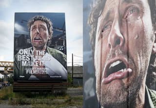
Why it’s effective: It’s an example of a perfect union between design and ingenuity. Ad agency WAX created this billboard in anticipation of the Calgary International Film Festival. The billboard is a masterpiece in terms of design and engineering as it’s showing the actor crying with real tears flowing from his eyes.
2. Colorado State Patrol: Tailgating Isn’t Worth It
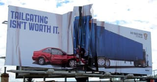
Why it’s effective: What you see isn’t an illusion. The billboard does actually have a crumbled texture. The heart-wrenching visual combined with the message “TAILGATING ISN’T WORTH IT.” sends a clear message to all motorists in Colorado.
1.3 million people die from auto accidents each year according to a study by ASIRT. Tired of the piling death tolls, the Colorado State Patrol took matters into their own hands and commissioned this billboard to go up on major highways.
3. Edina Realty
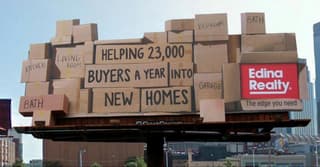
Why it’s effective: I feel physically and emotionally exhausted just looking at the stacked cardboard boxes. And that’s exactly what Edina Realty wanted to represent by completely overloading the billboard. You physically feel the claustrophobia even if you’re glancing at it from a busy highway.
4. Women’s Aid: Look at Me
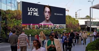
Why it’s effective: This is one of the most straightforward billboard designs on this list. You cannot help but feel sympathy when looking at a billboard like this. It gets one message across clearly — domestic violence should be stopped. The text “LOOK AT ME.” is a bold and polarizing statement. With only 7 words, the billboard design did its job.
5. Martor Solingen Germany
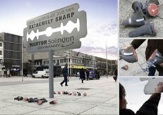
Why it’s effective: It is made abundantly clear exactly how sharp Martor’s products are with pigeons cut cleanly in half littering the ground below it. This billboard, which stands in the middle of the road, is in the shape of a giant blade. Because of the installation’s size, it sparks curiosity and interaction.
6. Road Safety Billboard Design
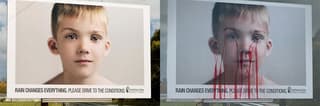
Why it’s effective: During a normal sunny day, you see a happy school photo of a boy. But come back again on a rainy day, and this billboard transforms into something out of your nightmares.
The bloody image is a gruesome road safety reminder during rainy conditions. I bet this billboard design was effective at keeping that area safe. No way I’m driving by this billboard twice.
7. Avera Health
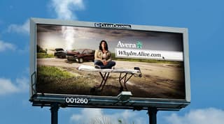
Why it’s effective: Powerful messages don’t always need to be clever, genius, or break the 4th wall. This billboard ad design lets us interpret the message ourselves. No witty taglines or clever messaging to persuade us other than the “WhyImAlive.com” link.
The compelling backdrop carries a strong message that stands on its own without the need for explanation. This is a great example of a non-technical billboard design that’s emotional and effective.
8. SnoreStop #betogether

Why it’s effective: SnoreStop is a company that sells anti-snore products. As you can see, they don’t try to explain their product on this billboard. They go for an emotional storytelling approach instead.
The messaging in this ad is simple. If the company can keep an interesting couple like this together, then they’re claiming they can keep anyone together.
9. BBC World – Both Sides Of The Story
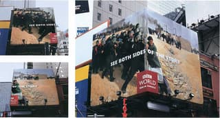
Why it’s effective: We often hear “There are two sides to every story”. Thanks to BBC, we can visualize that statement. One side of the billboard shows a group of armed militants fighting a battle. Meanwhile, the other side shows a woman pushing back against them. And only at an angle can you see the full picture.
10. Pimples?
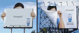
Why it’s effective: For those of us who had a hard time with acne, you know this feeling. No matter how good you feel on the inside, one glance at any reflective surface can melt your confidence.
This ad is particularly powerful because the model is well dressed, groomed, and could be attractive based on her outline…but she’s hiding her face. And it’s not to say that those with acne aren’t beautiful, but it uncovers real insecurity that plagues a large number of individuals.

11. The Economist – Lightbulb
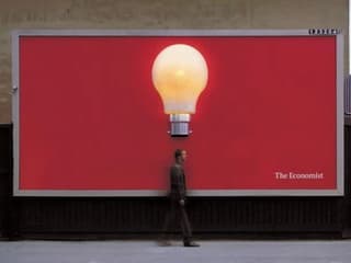
Why it’s effective: Another way to make billboard designs memorable is by making them interactive. Such can be found in The Economist’s Lightbulb design.
You see, billboards can generally captivate one’s attention because of their dominating size. By adding features like a giant lightbulb turning on as you walk underneath, it could be an effective visual asset. And with people constantly uploading interesting photos like this on their social accounts, your billboard design has the potential to go viral.
12. Oldtimer – Tunnel
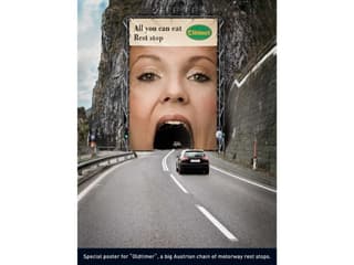
Why it’s effective: Adding a disruptive billboard in the least expected places is an effective way to get reactions quickly. You stay memorable and maybe even get a chuckle or two.
Take a look at what Oldtimer did with their large and in charge billboard. Instead of using mouthwatering food to advertise their ‘all you can eat’ offering, they took a bold approach. Billboard designs like this are opportunistic and take the surroundings into account, creating an unforgettable experience.
13. McDonald’s – Chalkboard
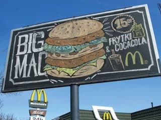
Why it’s effective: In a world where most designs are sleek and modern, McDonald’s did a complete 180, using classic typography and going back to traditional styles. Chalkboard art with a seemingly organic design makes it stand out amongst the dozens of billboards you see on your drive to and from work.
Sometimes, reviving classic styles enable you to win the market through the feeling of nostalgia. While other advertising campaigns are riding trends, this billboard design is in a league of its own.
14. IKEA – Assembly Fail, Shelf
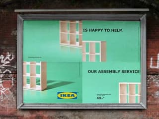
Why it’s effective: IKEA shows a great example of how to be brand-centric with this billboard design. They understand the struggle of their customers assembling furniture themselves, hitting that pain point with this ad.
The call to action is simple and easy to read, even with the image split up the way it is. IKEA knows this and created a billboard that will make you want to solve their simple problem.
15. Mr. Kipling – Life is Better With Cake
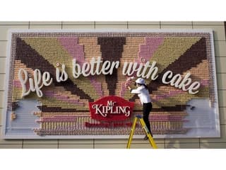
Why it’s effective: When they say you have to go the extra mile, Mr. Kipling did so deliciously. For their billboard design, they hung more than 13,000 cupcakes, which is already impressive. But that doesn’t stop there. They also hired a professional artist to place the icing directly onto the billboard.
That’s quite tedious, yes! But that’s one of the best ways you can fuse outdoor advertising and product sampling. We bet people would go loco for this.
16. The Detroiter Travel Center – You Made It
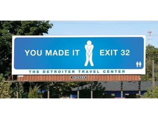
Why it’s effective: We appreciate the humor in this billboard design because they know exactly what you’re looking for: a restroom. The tweaking of a classic icon design is creative and instantly recognizable. This billboard reminds us that being original doesn’t mean you have to start from scratch.
Restroom break, anyone?
17. Tylenol – Get Back to Normal
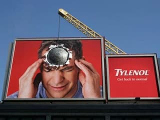
Why it’s effective: If you’ve experienced a severe type of headache, you would know that this billboard isn’t exaggerating. The feeling of getting a headache is just too intense, like a wrecking ball right through your head.
This billboard design is both fun and has a sprinkle of truth in it, which makes it effective. The simplicity in the concept catches your attention, even from a busy highway.
Need billboard designs of your own?
When it comes to outdoor advertising, Penji is at the forefront of the top graphic design companies with quality output.
Having an ad displayed publicly for everyone to see, all 36 x 10.5 ft of it – sounds intimidating, huh? Well, it doesn’t have to be.
You tell us what you need, and we’ll use our creative chops to turn those ideas into eye-catching visuals. Best of all, requesting a design from us is a walk in the park! Here’s how it works.
1. Create Project
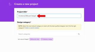
PRO TIP: Make sure that you get the actual dimensions of the billboard. That way, our designer can create a high-resolution design for the billboard.
2. Review
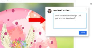
Within 24 to 48 hours, a designer will get back to you with a draft. If you want anything to be changed, click on any part of the image and type your comments. The draft will be sent back to the designer for revision.
3. Download
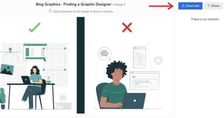
Once you’re happy with the design, click the “Download” button and it will automatically be saved to your computer.
Sign up today and see how we can help you reach out to your customers. Use code BB25 for 25% off your first month!
[convertkit form=3285107]


