
More than anything, a beauty product should have a beautiful logo, otherwise, no one will dare touch it. To prove our point, here are 8 of Penji’s best beauty logo designs that you can use as inspiration. We’ll also throw in a few pointers to help you create a powerful logo. We’ll also show you how you can have a professionally-made logo in no time.
1. Lancôme
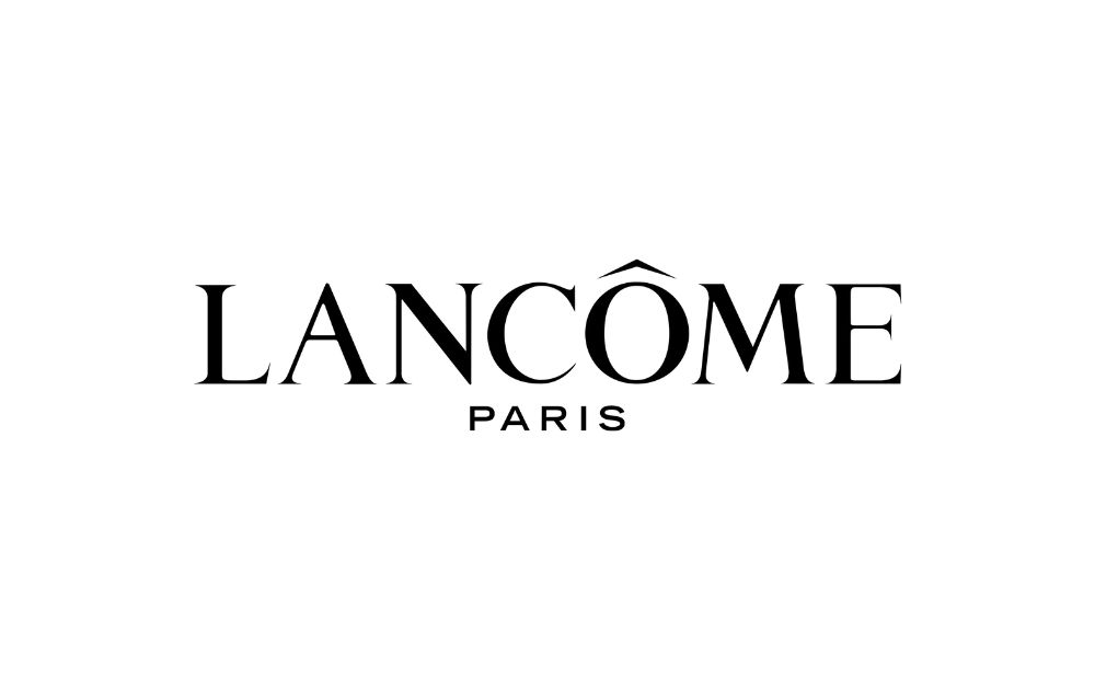
Chic elegance and French sophistication – that’s the feeling you’ll get when you lay eyes on Lancôme’s logo.
Lancôme is a brand known for its unwavering commitment to a particular style. The logo, created in the brand’s early days, has remained largely unchanged and continues to reflect the brand’s philosophy of simple, sophisticated elegance. Its owners chose the name “Lancôme,” the d’Ornano family, as a nod to the mysterious and intriguing “Lancosme” forest renowned for its roses.
What makes it appeal to customers:
- A classic but timeless logo
- Good combination of serif and sans-serif fonts
Beauty logos packed with appeal and charm
Design beauty logos in 1-2 days
2. Anastasia
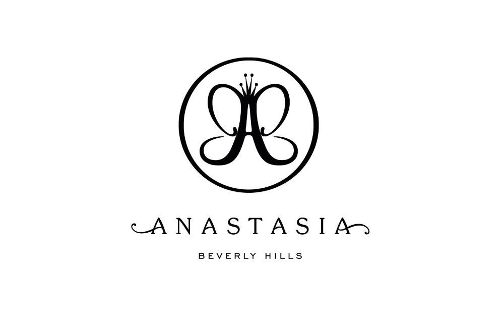
Anastasia Beverly Hills logo is three-fold – an elaborate “A” symbol, brand name, and location.
The highlight of the logo is the letter “A,” which also resembles a butterfly. The brand name is written in sleek and modern black letters, with the first letter stylized in a unique and recognizable script font. The logo is simple and elegant, conveying the brand’s focus on high-quality beauty products and services.
What makes it appeal to customers:
- Subtle symbolism of a butterfly as having completed metamorphosis
- Soft and feminine curved lines
3. NARS
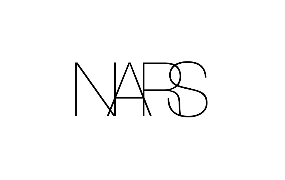
The NARS logo features the brand name in sleek, modern sans-serif letters.
That said, the simplicity of the design conveys a sense of sophistication and luxury, reflecting the brand’s focus on producing high-quality beauty products. What makes this beauty logo unique is the negative spacing between the letters. If you don’t have the time to learn about tracking, kerning, and font-related concepts, you can get unlimited graphic design services for the top 2 percent of designers.
What makes it appeal to customers:
- Simple yet interesting look
- Negative spacing between letters
4. Guerlain
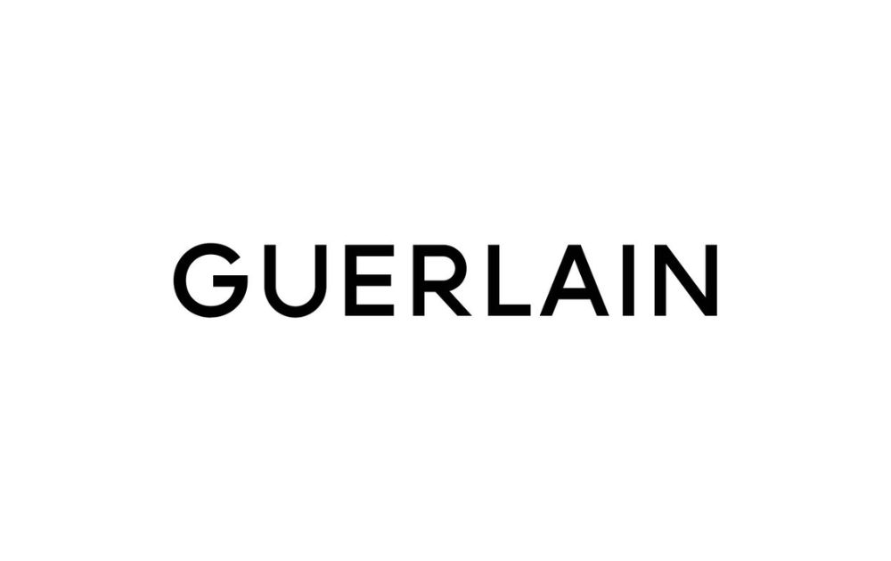
Here’s another example of a beauty logo that doesn’t need fancy text styles to make an impression.
In 2022, the Guerlain emblem underwent a redesign, featuring a refined typeface with all the characters having the same size. The new design boasts bolder lines and increased spacing between the characters, giving it a more solid and stable appearance that reflects the brand’s confidence and expertise.
What makes it appeal to customers:
- Bold lines expressing confidence
- Balanced look due
5. MAC
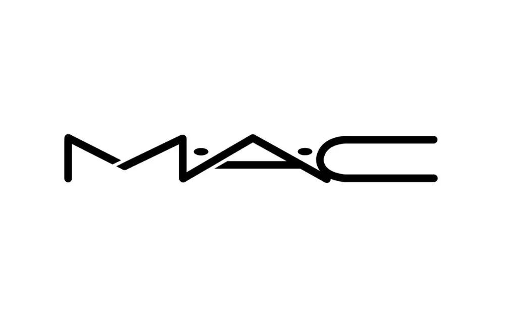
Moving to professional-grade makeup brands, MAC’s logo is bold and straightforward.
The MAC brand name is derived from “Make-up Art Cosmetics,” so as an acronym, it is always written in capital letters. The MAC logo features stretched lettering in a modern and futuristic sans-serif font. The lines are clean and rounded, with the “M” and “A” letters open at one point, giving the wordmark a lightweight and stylish appearance.
What makes it appeal to customers:
- Bold and straightforward design
- Clean and rounded letters create a lightweight look
6. Saint Laurent
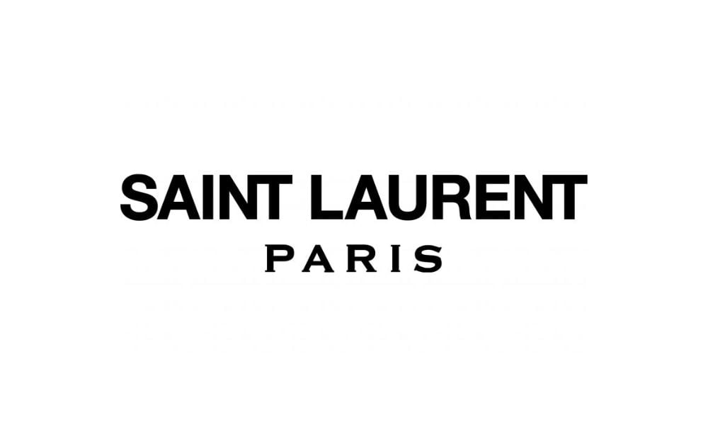
From Yves Saint Laurent, the brand name was shortened to Saint Laurent in 2012, along with a logo redesign.
The new design centered around the bold sans-serif lettering of the brand name, along with a more refined “Paris” in a different font. The upper line of the logo, written in Neue Helvetica, was made larger and cleaner. In contrast, the “Paris” tagline in all capital letters was written in a modern serif font resembling Copperplate Gothic Std Bold.
What makes it appeal to customers:
- Enlarged and clean main text
- Spaced-out letters in the tagline give an airier feel
7. Clinique
If you want a timeless beauty logo that will serve you for decades, take inspiration from Clinique.
The Clinique logo has been recognizable and unchanged over the years, with only minor updates. The current version features an elegant, old-fashioned typeface. The design of the logo can be described as progressive, soft, and individualized, encapsulating the brand’s rich history.
What makes it appeal to customers:
- Text style with irregular stroke widths and curly serifs
- Serifs’ sharp angles give the impression of the word being reflected on water
8. Sephora
The Sephora logo consists of the brand’s name in white against a black background and a symbol – a white flame shaped like the letter “S.”
The flame’s shape is a reference to the brand’s name, but it also resembles wavy hair. The mark symbolizes freedom of choice and creativity, as the company states. However, the image can be interpreted in different ways. For instance, some even see it as a representation of a slender female body, conveying the message of beauty. Regardless of its meaning, the logo is distinctive and memorable. The brand’s name is positioned below the flame, adding to the logo’s elegance.
What makes it appeal to customers:
- A signature letter that refers to the brand name
- A black and white color scheme that contributes to the sophisticated and professional look of the logo
How can I make my own beauty logo?
With a wide variety of online resources like free vector designs and apps, you can create your own beauty logo. Just make sure that you understand the basic principles of design before you embark on a project. This resource about logo design the Louisiana Tech University can be a good start.
How can I make a beautiful logo for free?
If the budget is tight, you can turn to AI-generated logos, which are dime-a-dozen these days. Remember, though, that the logos generated via AI tend to look generic and may not look as stunning as the examples above. For logos that are tailor-fit for your brand, you need professional services like ours here in Penji. We offer a money-back guarantee, so you’ll get the best value for your money.
What is the best color for a beauty logo?
The best color for a beauty logo depends on the brand’s identity, target audience, and the emotions you want to evoke with your products. Whatever colors you choose, make sure that they translate well when you create a black-and-white version of the logo – just like our examples.
About the author

Carla Deña
Carla is a journalist and content writer who produces stories for both digital and legacy media. She is passionate about creativity, innovation, and helping small businesses explore solutions that drive growth and social impact.


