
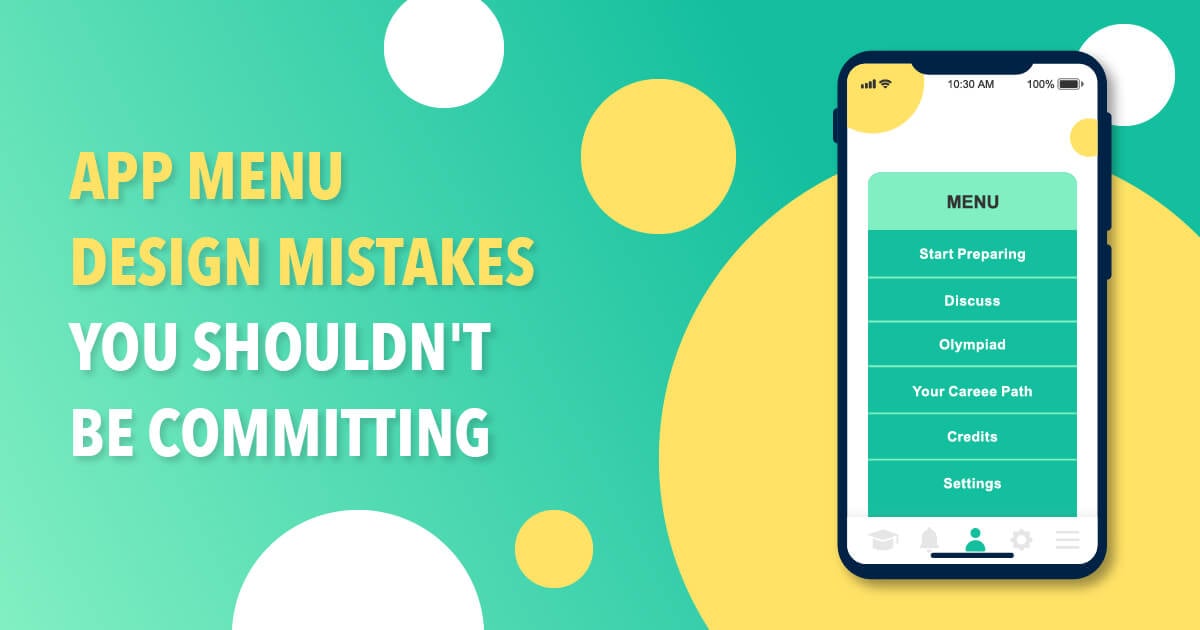
User experience draws the line between a good app and a bad one. The only reason why users abandon your app is when they can’t find what they’re looking for in a few clicks. And this is why an app menu design is vital to keep them on your app longer.
This app design concept is called Interaction Design. And any app design worth their salt would build their design around this concept. Simply put, Interaction Design pertains to the way users interact with machines or digital products. Aside from the app design itself, other elements can impact Interaction Design. Motion, sound, space, copy, to name a few.
As app designers, having a keen eye to create a well-thought-out app menu design that makes all elements work is vital. Why?
Here are the benefits of a stellar app menu design:
- Easy navigation for users
- Free of distractions, so users don’t get lost when browsing
- More app downloads
- Longer app engagement
- Higher app retention and lower app churn
- Increase app store ranking
App menu design is a tricky and strategic undertaking. And it should only take professional app designers to handle this colossal task to avoid app menu design mistakes.
In this article, we’ll tell you where to get quality and affordable app menu designs and app menu design mistakes you must avoid.
Penji Offers Unlimited App Menu Designs
Sounds too good to be true? Well, it’s true, indeed. Although hiring a freelance app designer might sound tempting, costs can pile up. Plus, it can be challenging to find the right app designer, especially from freelance marketplaces. Why? Because…
- Anyone can join freelance marketplaces
- There is no quality assurance from these online sites
- Freelancers may only choose to show their best portfolio
- The hiring process is time-consuming
For agencies and design teams, these factors can be a hurdle to their projects. If you’re looking for an app design partner that is reliable and efficient, subscribe to Penji.
Penji is an on-demand graphic design service that offers unlimited designs for a flat monthly rate. Here are Penji’s affordable plans:
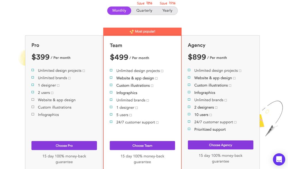
For as low as $499 a month, you get unlimited graphic designs, web and app designs, and custom illustrations. This business model is perfect for startups, small businesses, agencies, and design teams. Penji’s plans let you leverage your graphics to level the playing field with the big guns in the industry.
Aside from affordability, here are other benefits when subscribing to Penji:
- Quality results. Penji’s stringent hiring process ensures that they only hire the top two percent of designers in the industry.
- Prioritized projects. Penji assigns a dedicated account manager for every project to ensure that it’s always monitored. So working with Penji means you have an entire team behind you. Unlike freelance app designers who sometimes go MIA, Penji’s designers will never leave you hanging.
- Fast turnaround. Penji’s quick turnaround is one of the primary reasons why many clients choose to work with them. You can get your first draft in 24 hours. For more complex designs, expect the first draft within 48 hours.
- Customized platform. Once you’re subscribed to Penji, you will have access to a personalized design platform, which will change your life. There is no need to use other applications and software to collaborate with Penji’s designers. Everything is done on the platform. Read on until the end, and we’ll show you a step-by-step guide with screenshots.
- Add team members. Subscribing to Penji doesn’t mean leaving out your design team members. The platform lets you add up to 10 team members who can also communicate with Penji’s designers. This means you’ll have a seamless collaboration throughout.
- Scalability. Penji’s unique business structure is built for scalability. It might not be a good idea for startups and small businesses to commit to contracts when choosing designers. But Penji lets you subscribe and unsubscribe anytime you want, especially when projects are slow.
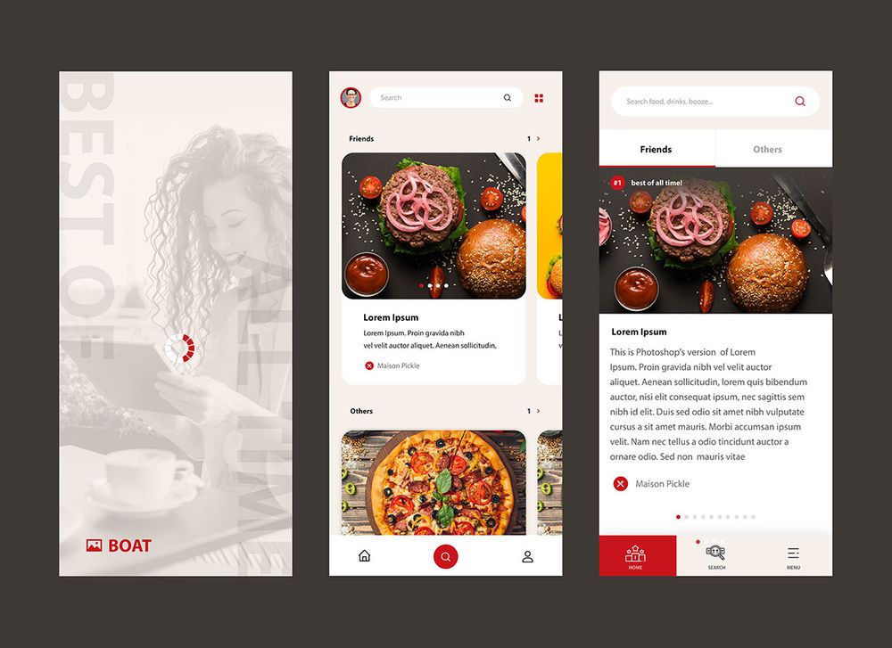
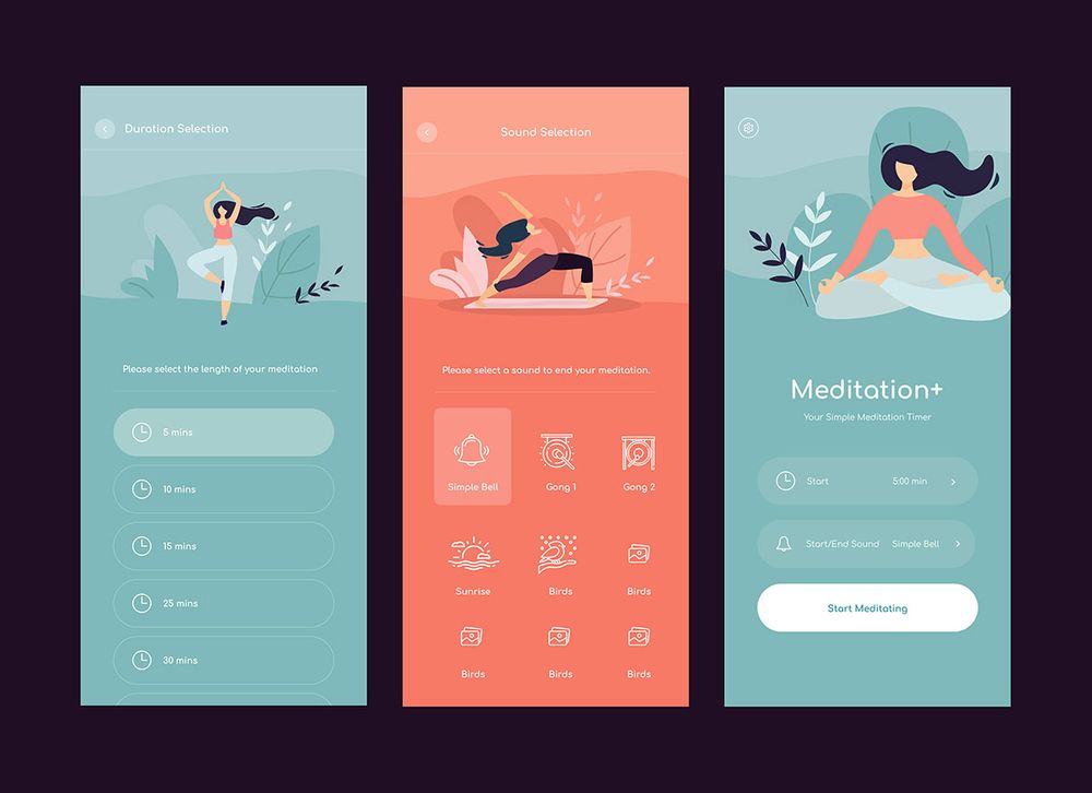
Penji’s App Design Work Samples
Penji’s diverse projects mean the designers have varied design specialties. Here’s Penji’s extensive portfolio list. Meanwhile, here are some snippet of their work samples:
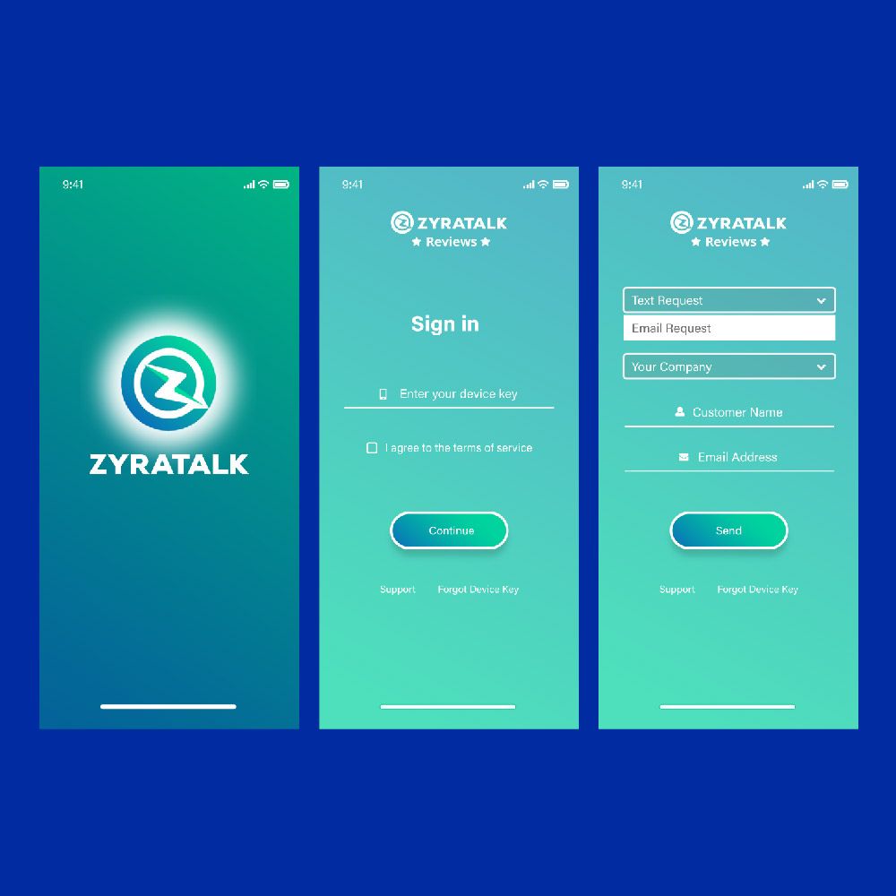
- App design sample
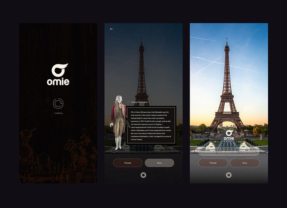
2. App design sample
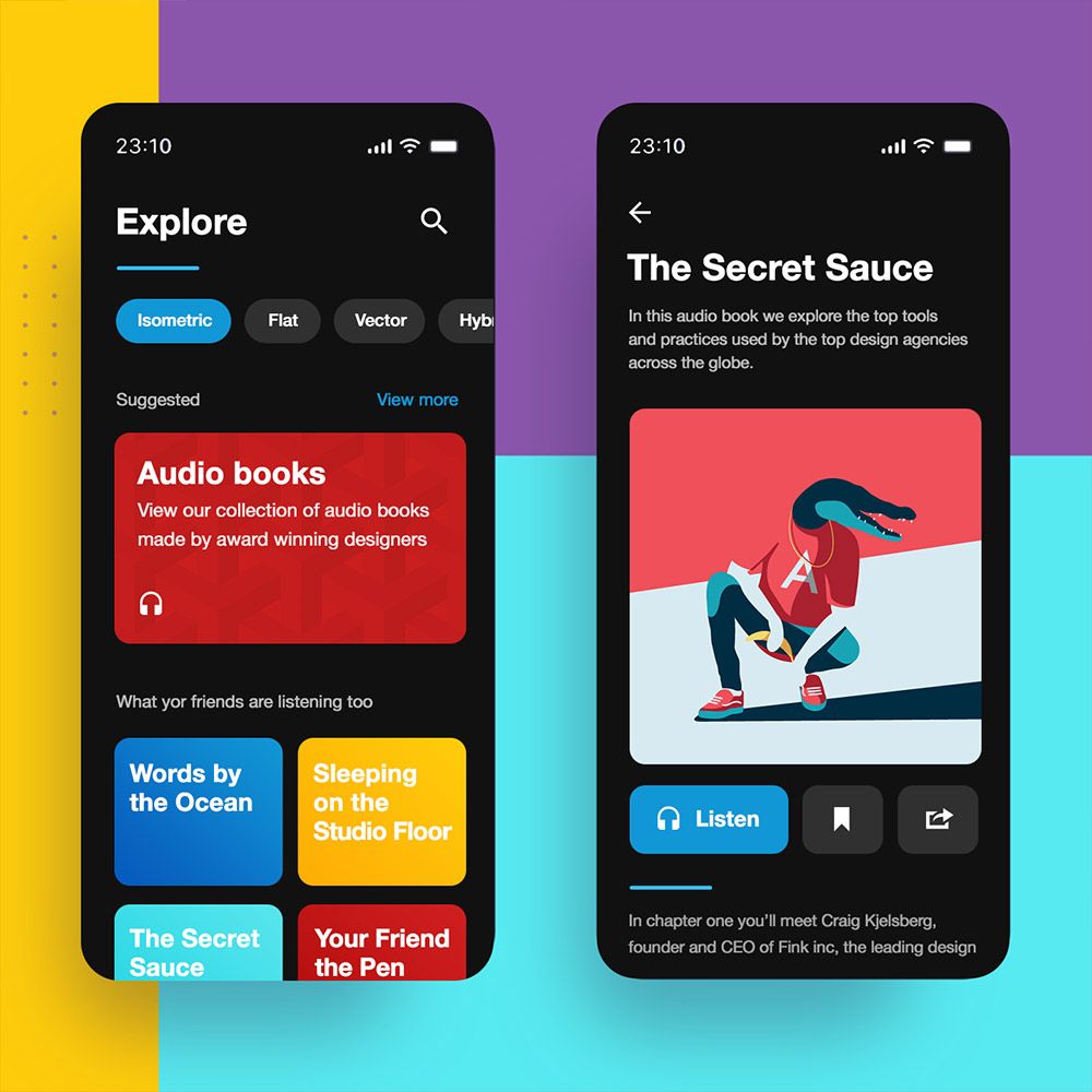
3. App design sample
4. App design sample
5. App design sample
7 App Menu Design Mistakes You MUST NOT Commit
If you’ve created some app menu designs in the past and have always wondered why the apps never scale, maybe you’re doing something wrong. Here’s a checklist of some common app menu design mistakes that designers sometimes commit:
1. Not selecting the right navigation menu type
Navigation is the most crucial factor in app design. In web design, an unofficial rule is called the “three-click rule.” This means users must be able to perform the desired task in three seconds. Try to apply this rule when designing your app menu design. So if app designers don’t align their navigation menu type with their app’s concept and purpose, they will fail in user navigation. Here are a couple of ideas:
Hamburger Menu
Designers love the hamburger menu because it saves a lot of space on a small screen. Unfortunately, users won’t even explore this menu because they can’t see the options hidden in it. A good rule when using a hamburger menu is to only place secondary menu options under it. The primary content and navigation options should be on the main page, displayed front and center.
Floating Action Button
This type of navigation menu is popular in Android apps. It’s the little small circle on the lower right of the screen. It’s usually bright-colored and prominent, making it stand out when users jump from one screen to the other. However, since it’s too prominent, you might want to use one only per screen.
Use a floating action button if you want to center your user’s attention to one command. For instance, you can use a floating action button for playing or pausing in a music app.
Tab Bar
Popular in Apple app design, the Tab bar is typically displayed on the bottom of the screen. It has limited menu icons (up to five) that users can navigate. All of these icons are related and are usually displayed on every app page. Use this type if your app only has a handful of top-level navigation options.
Priority + Pattern
Similar to the concept of a hamburger menu, this type also hides the less critical menu options. But the only difference is a command that says “More” or “All.” Once users click on the navigation, the screen expands, showing the less important list of options. This type of navigation menu is well-suited for content-centric apps that contain a lot of pages and sections.
Full-Screen Navigation
As the name suggests, the full-screen navigation takes up the entire page of the app. Users can either swipe left of scroll up to reveal more options. Use this type of navigation menu if your app is focused on tasks or directions. Showing broad options that lead to more specific pages could lead users down the funnel.
What to do:
Sit down and deliberate with your team what the app’s purpose is. List down all the primary and secondary menu options. Next, determine how you want to present these options by choosing the right type of navigation menu.
2. Not making the app design consistent
Your app design should have consistency. Consistency goes beyond the logo, brand colors, and typeface. It must be centered on user experience like all the other app design principles. For example, if your buttons and labels are always changing, users might get confused the further they explore your app.
Not putting the user in control means you’re not banking on predictability. And predictability is an extremely vital element in app navigation.
What to do:
Focus on three consistencies in your app design:
- Visual (typeface, buttons, labels, colors, icons, etc.)
- Functional (Commands, feedback, interactive components)
- External (Similar design across multiple channels: Website, social media, etc.)
3. Not minimizing cognitive load
Cognitive load is a user’s capacity to process information to understand and use the app. And in terms of app menu design, letting users use very minimal brainpower should be of the essence. But some app designers fail to do this. Some apps contain too much information that hinders users’ processing powers.
What to do:
Never overwhelm your users with too much information or texts. Here are a few tips on what to do:
- Declutter and keep content minimal
- Break content into bite-sized pieces
- Reuse data to offload some repetitive tasks (entering user information)
- Don’t reinvent the wheel, use familiar app screens and icons
- Minimize user input (use autocomplete features, keep forms short, reuse data)
- Apply visual balance
- Don’t use technical terms
4. Not avoiding sign-in walls

Asking for a “set-up” form upfront will undeniably turn your users off. This is called the sign-in wall. This is a mandatory registration form that users must fill in before using the app. For well-known apps, this might work. Unfortunately, newer apps in the market might want to deviate from this system. It’s best to showcase your app menu design right off the bat instead of the sign-in wall.
What to do:
Let your users explore the primary menu the first time they use your app. This will give a great first impression and will discourage app abandonment and uninstalls. However, ask for set-up info only when it’s really necessary.
5. Not minimizing the options on your app menu (and not having enough options)
There could be two worst things a user can experience browsing your app menu design: Having too many options and not having enough choices. Having too many options will overwhelm users and add to cognitive load. Meanwhile, lacking options will frustrate users for not serving their intent of using your app.
What to do:
As app designers, always strike the right balance when integrating options on your menu. Selecting the essential navigation menu should be your priority.
6. Not prioritizing feedback
Some app designers take this app design principle for granted. Feedback is how a machine communicates with the human. It tells the user which part of the app they are, the current state, or an update of a recent action.
What to do:
Provide snippets, pop-ups, or snack bar messages of the user’s current interaction state.
7. Not considering tap targets
Tap target refers to how the icons, buttons, texts are packed together in an app menu design. Design them too close, and users will mistakenly tap the wrong button. Design them too far from each other, and you won’t maximize the small mobile screen. App designers sometimes neglect tap targets. But this is one crucial app design element that adds to user experience.
What to do:
Always design for touch. Remember that users won’t be using a mouse and cursor. The sizes of fingers vary, make sure your tap target can cater to every type of finger.
Pro Tip: Consider the thumb zone. The “green zone” should be where the main navigation menu is. And the “red zone” should be where the danger options like “Delete” or “Undo” are.
Request Your App Menu Design from Penji
If you want a hassle-free app design process, try Penji’s user-friendly platform for 15 days. It only takes three simple steps:
Create a project
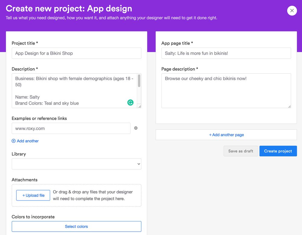
Click on “Create New Project” on the dashboard. You will then fill out a form to provide as many app design details for the designer. Be brief and concise to make for clear communication. If you can’t express it in words, you can also upload images and links for references.
Review
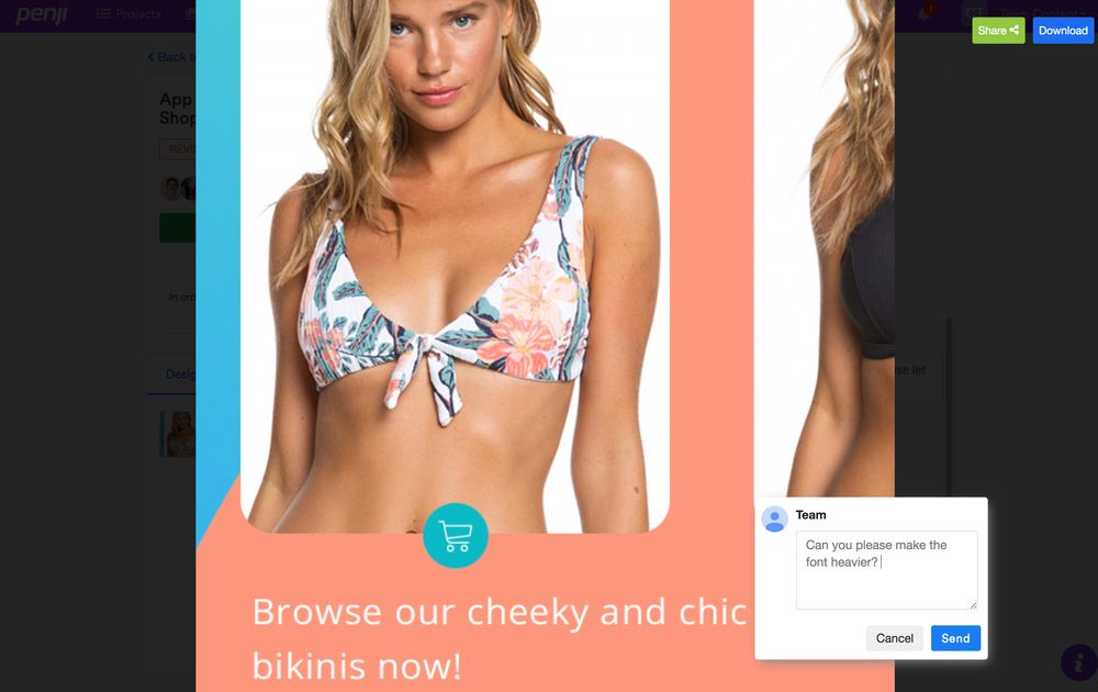
Wait for 24 to 48 hours for the first app menu design draft. If you’re not fully satisfied, request for revisions. Click and type in your comments in the revision box. Submit and wait another 12 to 24 hours.
Download
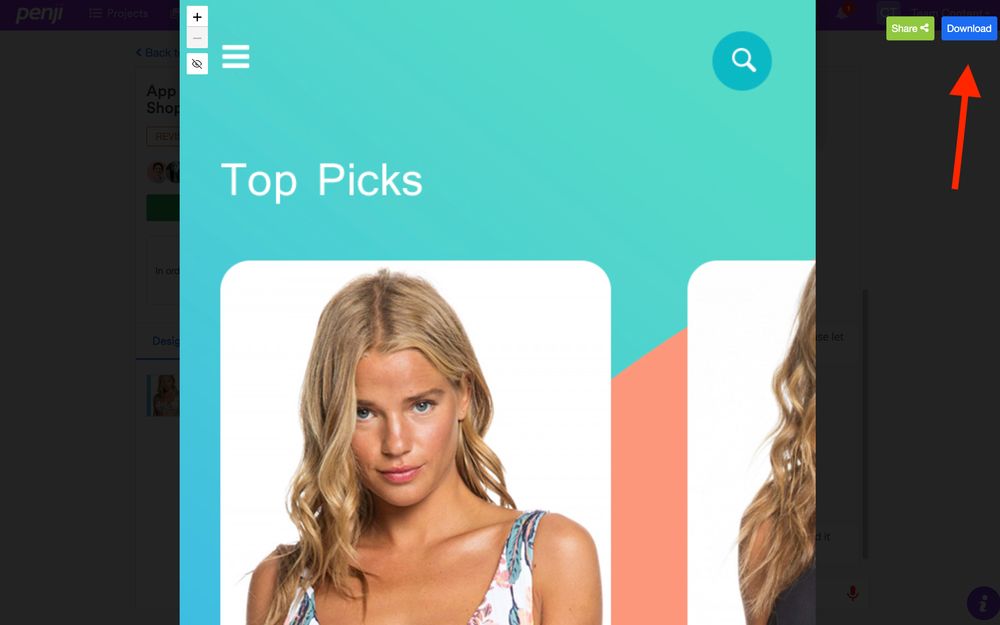
If you’re 100 percent happy with the design, click the “Download” button. The design will be automatically saved to your computer. You will also have all rights and licenses for all designs created.
Using Penji’s customized design platform will make requesting app menu designs a breeze. There is no need to toggle between a myriad of applications and websites. You only need one platform to request designs, ask revisions, download, and provide feedback. If you’re ready to submit your first app menu design, sign up here, and you’d be surprised how easy it is.


