![What is Advertising Design? [+Examples of The Good and the Bad]](https://penji.co/wp-content/uploads/2020/03/cover-image-ad-design.jpg)
Lunio estimates that the average person sees 6,000 to 10,000 ads daily. That staggering number is attributed to the digital ads and commercials we are exposed to daily. Plus, those who leave home regularly will likely see more out-of-home ads. That said, it can be challenging to break through the noise, considering big brands will get the best placements or publish more ads. And one way to make an impact is through captivating advertising design.
Here’s our guide to ad design. Plus, we’ve added good and bad ad examples!
What is Advertising Design?

Advertising design refers to the visuals created solely to promote a business’s product, service, or event. Ad design marries marketing and graphic design to create an appealing visual and entice their target audience.
What Are The Types of Advertising Design?

Modern ad designs come in two primary forms: traditional and digital. Here’s a complete list of all ad designs:
- Newspaper ads
- Magazine ads
- Direct mail
- Billboard
- Poster ads
- Social media ads
- Email marketing
- Display ads
Good Examples of Ad Designs
Many brands create stand-out ads. But not every brand will be privileged to be recognized for “good ad design.” Here’s a list that caught our eye.
Ikea – Out-of-Home Advertising
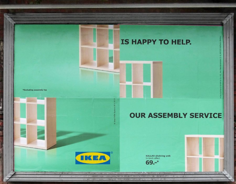
We get a sense of pride when we assemble Ikea products. But sometimes, it doesn’t work out for us. Ikea created a campaign promoting their assembly service. Instead of their usual minimalist format, they disassembled the ad to invite the audience to try their assembly service.
It even makes you want to put the pieces in the correct order. You can sprinkle a bit of fun like this in your ad to make it engaging to the viewer.
Bloomberg – Social Media Ad
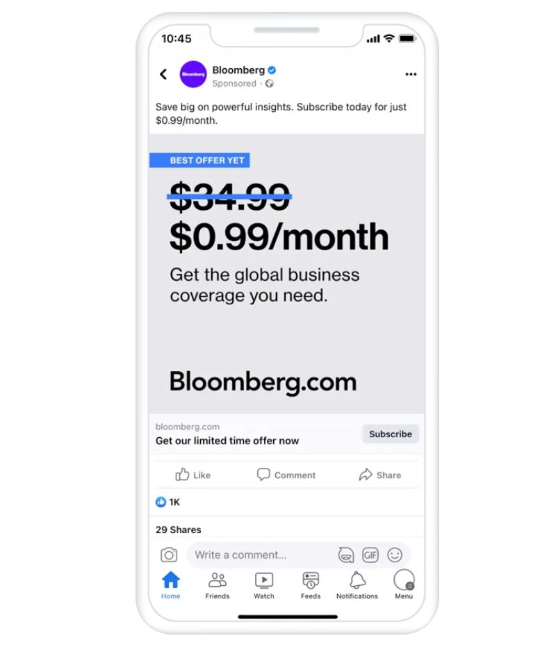
Sometimes ads don’t need images. You can take a page from Bloomberg on how they created a successful Facebook ad campaign using photo ads. This text-only ad represents the brand, considering they have an online publication.
When presenting a sale or discount, you’ll never go wrong with a slashed price. Similar to their ad, make sure that the slash color differs from the others in your ad. This way, it’s conspicuous.
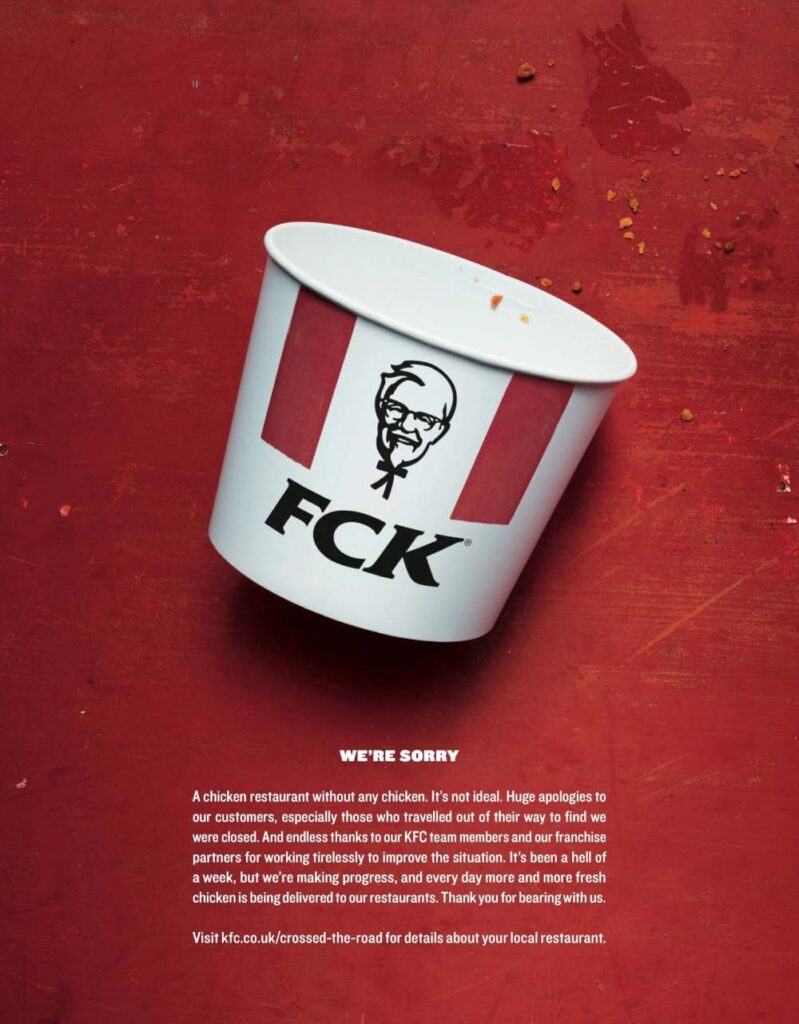
KFC – Print Ad
Source: Ads of The World
One ad that made KFC go viral for its ad design was its full-page ad apologizing for the chicken shortage. The print ad had a simple design: an empty bucket and an apology at the bottom. You’ll also see crumbs to show that they ran out of chicken. Plus, their ad is reminiscent of old print ads where the image is the focal point, and the text comes second, creating a visual hierarchy.
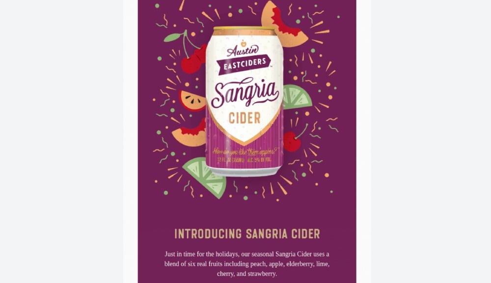
Austin Eastciders – Email Marketing
Source: Really Good Emails
One way to entice your target audience to take an interest in your product is through the senses. It can be difficult to convey smell, taste, feeling, and hearing in a static visual ad. But Austin Eastciders tried to stimulate a sense of taste through illustrations. Adding these fruity graphics to their email gave their subscribers an idea of what flavors to expect. Plus, the ad design also creates contrast through the headline and call-to-action button.
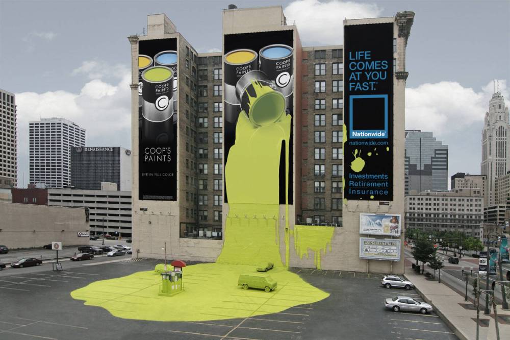
Nationwide Insurance – Billboard/Wallscape Ad
Source: Ads of The World
Our final good ad on our list comes from Nationwide Insurance. At first glance, you would think the ad is for a company called “Coop’s Paints.” But it turns out that it’s for Nationwide Insurance for their “Life Comes At You Fast” campaign. The spilled paint literally adds a splash of color to the ad, showing that disasters happen and insurance will help you get through it.
Bad Examples of Ad Designs
Not all ad designs are pleasing to the eyes. That said, looking at bad ad design examples is essential too. This way, you know what design blunders to avoid.
Burger King – Print Ad
Source: Reddit
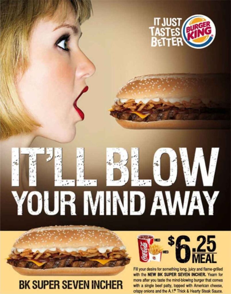
This oldie but a baddie will forever be memorialized as a bad ad. Although Burger King didn’t intend to make it appear sexual, image placements matter. Plus, it doesn’t help that a woman had to be the person who had to eat the seven-inch sandwich.
To avoid this blunder, you can feature the product by itself. And make it mouthwatering with photography and bold colors.
Starbucks – Print Ad
Source: Sites at Penn State
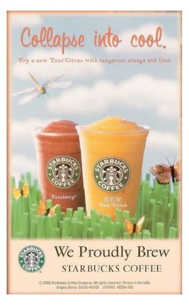
Although Starbucks isn’t known for posting ads, they missed the mark in one of their old ads, leaving a bad taste in everyone’s mouths. The print ad generated controversy because it was posted a few months after the tragic events of 9/11. Aside from that, the ad design was also questionable because of the text and imagery.
PETA – Billboard Ad
Source: Huffpost
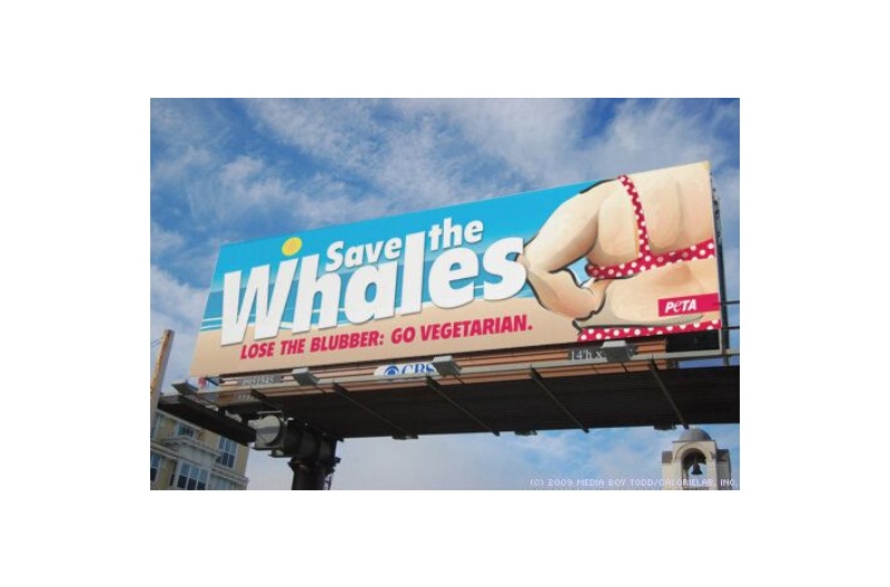
PETA’s ads are hit-and-miss. But one particular ad drew ire because of the imagery and copy. Their “Save the Whales” campaign appears as a dig at overweight or obese people. Instead of educating people on how to save the whales or switching to vegetarianism, they targeted fat people. It’s an insensitive and bad ad that shouldn’t have been given the green light in the first place.
Trademark Productions – Social Media Ad
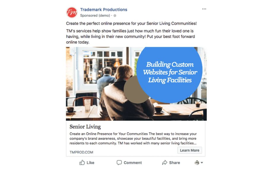
Source: Media Heroes
Here’s one Facebook ad design that will scratch your head. This one from Trademark Productions doesn’t work because the imagery doesn’t match the copy. Plus, the text placement in the design doesn’t look great either and takes up too much space.
Norwegian Airlines – Digital Ad

Norwegian Airlines has created memorable ad designs, such as the Norwegian flag ad and the “Brad is Single” campaign. But there was one ad that raised eyebrows. Their “Don’t just like it. Live it.” ads show people with two facial expressions. However, the models appear to be having a stroke rather than enjoying their trip.
Quick Tips: Making Compelling Ad Designs

- Keep your audience in mind and connect with them through emotions
- Incorporate brand colors or use a different color palette
- Stick to one clear message
- Add a call-to-action
- Be creative through imagery
- Tell a story
- Apply graphic design principles
Why Choose Penji for Your Ad Designs?
Whether you need digital or printed ad designs for your campaign, Penji will be with you every step of the way. You can entrust your ad designs with our amazing team of Penji designers who have created captivating designs for our clients. Plus, our Penji designers will strive to create compelling ads that viewers wouldn’t want to miss. And if you want to give Penji a try, choose a plan that fits your budget here and be part of the 25,000+ brands and agencies that love Penji.
About the author

Katrina Pascual
Katrina is a content writer specializing in graphic design, marketing, social media, and technology. In her spare time, she writes monthly personal blogs to practice her craft.
Table of Contents
- What is Advertising Design?
- What Are The Types of Advertising Design?
- Good Examples of Ad Designs
- Ikea – Out-of-Home Advertising
- Bloomberg – Social Media Ad
- KFC – Print Ad
- Austin Eastciders – Email Marketing
- Nationwide Insurance – Billboard/Wallscape Ad
- Bad Examples of Ad Designs
- Burger King – Print Ad
- Starbucks – Print Ad
- PETA – Billboard Ad
- Trademark Productions – Social Media Ad
- Norwegian Airlines – Digital Ad
- Quick Tips: Making Compelling Ad Designs
- Why Choose Penji for Your Ad Designs?


