When readers scroll through Goodreads or Amazon, they always look at the thumbnails to decide which book to check. That’s why a fabulous eBook cover design is an effective marketing tool that fuels the growth of your book publishing business. As an author, you might wonder whether to have a different print and eBook covers. Continue reading to learn the difference between the physical book and eBook covers. In addition, we’ll share some design tips to help you create a smashing eBook cover.
What is the difference between ebook and print book covers?

Unlike a physical book, an ebook cover doesn’t have a back or spine. But, it has to be meticulously designed. Besides, a printed book and eBook covers’ purpose are the same. They serve the same goal, which is to give an introduction to exciting and genre-friendly content. In short, if you have an excellent print cover, it should work equally great for an eBook version.
Given the limitation of eBooks in comparison with printed books, you have to consider these two essential points:
1. An eBook cover should have a good thumbnail.
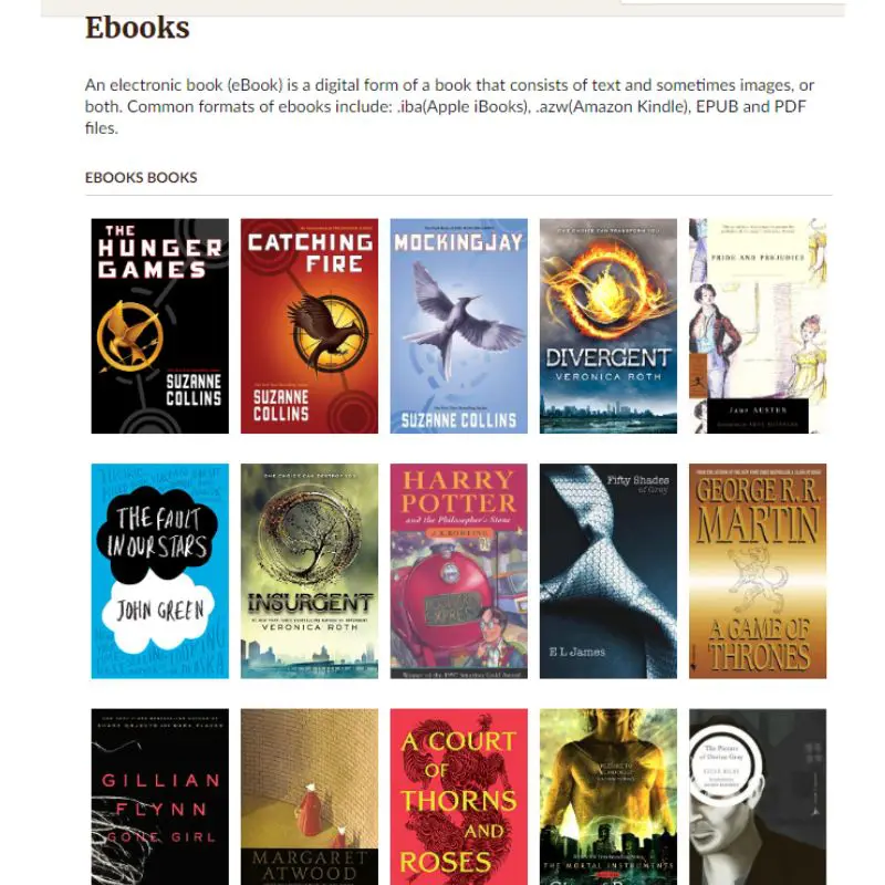
It has to be a visually appealing and readable small image user sees when looking through the book list. For example, a typical catalog thumbnail size on Goodreads looks like this.

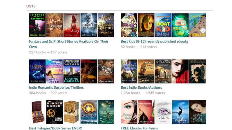
Recommendations are even smaller thumbnails with dimensions 98 x 148 pixels.

2. An eBook cover should look good even in monochrome.
Most eBook readers have black-and-white displays on their gadgets. Your cover should be recognizable even in monochrome. It’s not an essential nuance but an excellent appeal to your digitized book cover.
Difference between printed book and ebook cover
It is best to remember that an eBook should look pretty on your reader’s screen, while a printed book’s cover may look awesome on a bookshelf. So, aim for a striking and Internet-friendly design.
Should the Design for the Printed Book Cover and eBook Cover be the Same?
If you already designed a print book cover that will work as a thumbnail well, then there’s no doubt that you can use it as an eBook cover. But sometimes, it could be the other way around – an excellent ebook cover that will look good on a shelf can be used for print books. Besides, you can always make some adjustments if necessary.
However, it is better to create a separate design for both versions with a high-resolution image and adjust it for the required formats.
Tips on eBook Cover Design
An eBook cover design must properly balance the images, font style, and layout. An adequate cover reflects its genre, caters to the target audience, and, more importantly, rocks a smashing look. It means that coming up with ideas for a cover is not rocket science. More importantly, it requires a thorough understanding of imagery, color, and typography.
Tip No. 1: Typography
Typography is crucial for an eBook cover design. It could make or break the message of the cover. Below are the benefits of typography.
- Informs a reader about the book and author
- It helps to specify the genre
- It helps to create a focal point
- Ties the imagery together
Check out the most common fonts publishers and authors use in eBook cover design.
- Trajan font’s classical feel is perfect for nonfiction and fiction ebook covers.

Trajan Pro Font Free Download from Font Sonic
- Aphrodite is a beautiful script font fitting for a romance eBook.

Source: Typesenses
- Century Gothic is a geometric-like typeface for mystery and thriller eBook covers.

Source: Fonts in Use
- Arboria is an airy and elegant font. It is best for fantasy eBook cover design.

Source: Free Fonts
Tip No. 2: Imagery
Imagery is the second important element that gives readers the promise of an exciting read. Here are some tips for excellent eBook cover design imagery:
- Images should be well-recognizable in thumbnails.
- Choose a photo with a single focus and a simple background instead of a combination of different scenes or visuals.
- Don’t be afraid to use references and borrow ideas from the genre’s best.
- Either aim for strong symbolism or hints at the plot.
Tip No. 3: Color Palette

Generally, choosing a proper color palette that evokes the emotion of your eBook cover is good. You can talk to your designer or research what color scheme matches your genre or theme. Likewise, look at your competitors and observe what color choices work and which fail.
As for the colors, refer to these helpful tips:
- Dark hues are a perfect choice for crime, fantasy, and thrillers. They imply mystery and provoke anticipation.
- Black and red communicate danger well, so they’re a good choice for horror and thrillers.
- Tender pastel hues fit romance.
- Yellow and orange are about happiness and joy, so comedy is a safe bet with them.
- Stark contrasts dark and bright colors to create a sense of wonder in the mystery-book-cover.
- For nonfiction eBooks, yellow and orange can work wonders if you’re talking about productivity.
- If your book is about business development, you can use blue, which many people associate with trust.
- White fits spiritual literature well.
Popular eBook Publishing Companies
Before we summarize this guide, here are the most prominent online book retailers where you can easily self-publish your book.
- Amazon Kindle Direct Publishing (KDP)
- Apple Books
- Kobo Writing Life
- Barnes and Noble Press
- Lulu
- Draft2Digital
- Smashwords
Work with Designers at Penji for your eBook Covers
Building up the importance of an eye-catching eBook cover in this modern and saturated self-publishing market can take time and effort. A solid understanding of its requirements and overall design principles will place you on top of the competition. Then, the designer’s experience and artistic abilities will help bring your ideas to life.
We at Penji wish you luck on your journey. Our talented design team can help you design a winning eBook cover quickly. Ready to try our services? Fill out this form to subscribe to Penji’s unlimited graphic design service. Sign up today and avail yourself of our 30-day money-back guarantee.
About the author

Rowena Zaballa
With a background as a former government employee specializing in urban planning, Rowena transitioned into the world of blogging and SEO content writing. As a passionate storyteller, she uses her expertise to craft engaging and informative content for various audiences.
Table of Contents
- What is the difference between ebook and print book covers?
- 1. An eBook cover should have a good thumbnail.
- 2. An eBook cover should look good even in monochrome.
- Should the Design for the Printed Book Cover and eBook Cover be the Same?
- Tips on eBook Cover Design
- Tip No. 1: Typography
- Tip No. 2: Imagery
- Tip No. 3: Color Palette
- Popular eBook Publishing Companies
- Work with Designers at Penji for your eBook Covers


