Fishing services and companies face stiff competition in the industry. One way to become the leading provider of fresh seafood in your market is through your logo. And if you need one, you’re in the right place! We’re showcasing the best fishing logo examples from our fantastic Penji designers. Plus, here’s how else Penji can help your business!
1. Pacific Fresh Fish and Co.

The beautiful lines equally displayed in this logo will instantly capture your attention. The fish stands out as the most evident element, which sits nicely on bright yellow and orange background colors. The font style is also unique, creating enthusiasm within the brand’s target audience.
2. Ocean Bounty Rod and Reels
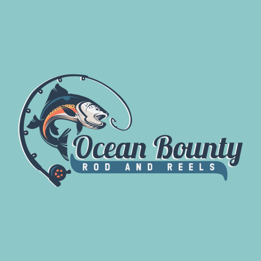
The stunning typography in this company logo creates depth and visual interest. The combination of the elegant script font and the sans serif font establishes a more modern appeal, apt for this fishing company. Plus, the drawing of a fish seemingly being caught by a fishing rod is symbolic of what the brand offers.
3. The Marine Reels and Bait
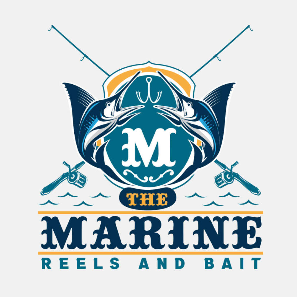
A vintage logo design is timeless and never goes out of style. Going vintage for your fishing logo is a way to go beyond the various trends and styles because of its classic look. This logo from The Marine Reels and Bait fishing company is one such example. The overall design looks like an emblem with the fish in the middle and two fishing rods in the background. The letter “M” is also displayed in the middle, so this icon can act as a standalone logo even without the brand name.
4. Brave Sailor Fishing Services
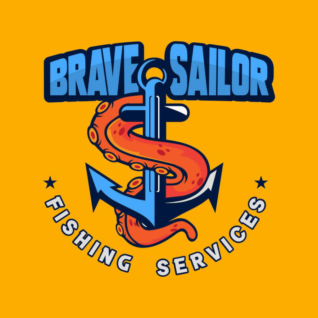
This is one of the simplest fishing logos on this list. What draws you in is the well-thought-out hierarchy that keeps the design neat and uncomplicated. The brand name sits proudly at the top, which lures the eyes first. Then the anchor hooks the brand name until the bottom text. The octopus’s arm wraps around the anchor, giving it an interesting flair. Additionally, the orange color is an attractive contrast against the blue text and anchor.
5. St. Agnes Boats and Bait
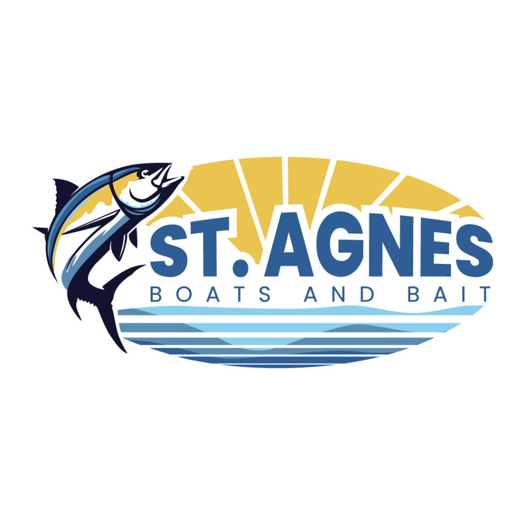
You can clearly see the design cohesion in this St. Agnes Boats and Bait fishing logo. The overall logo is compact with complementing design elements that are soothing to the eyes. First, the fish on the left ties everything together, followed by the bold typeface sprawled in the middle of the oval background. Finally, the vertical and horizontal lines in varying colors give this look a playful vibe.
6. Poseidon Marine Shop

Nothing beats a good fishing logo than making the god of sea and waters, Poseidon, your mascot and brand name. The Poseidon Marine Shop logo is a fun take on this omnipotent god that holds a fish proudly and his trident in his left hand. The overall logo design is also memorable as it combines excellent drawing and eye-catching typography.
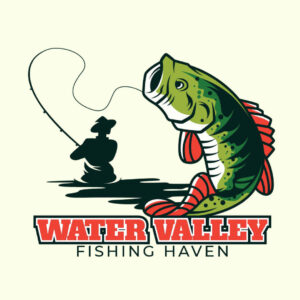
7. Water Valley Fishing Haven
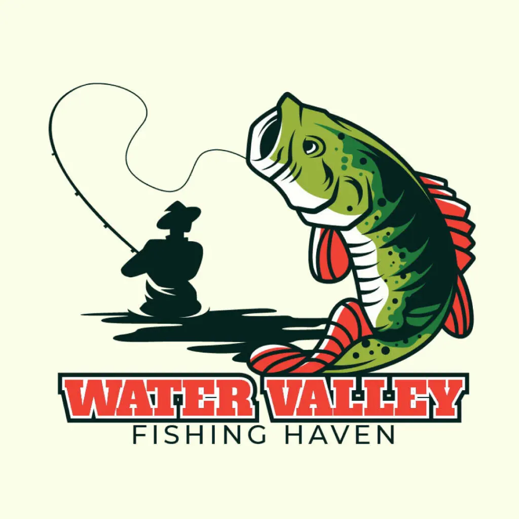
The Water Valley Fishing Haven is an interesting play on fishing because it shows boldness and character. The silhouette of a man with a hat complements the colorful and oversized fish hooked by his fishing rod. Moreover, the combination of a bold serif font and a slim sans serif font is a smart idea to create contrast and visual attraction.
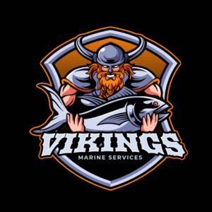
8. Vikings Marine Services

The fishing company Vikings Marine Services features an apt mascot for their logo design. What better way to represent your brand name and company than by putting a seafaring warrior front and center? The Viking on this logo design holds a fish, which is symbolic of what the brand has to offer. Plus, the color grey dominates the logo in a harmonious way. Overall, this emblem-style logo is captivating because it’s compact with interesting design components.
9. Aquafest Fishing Spot
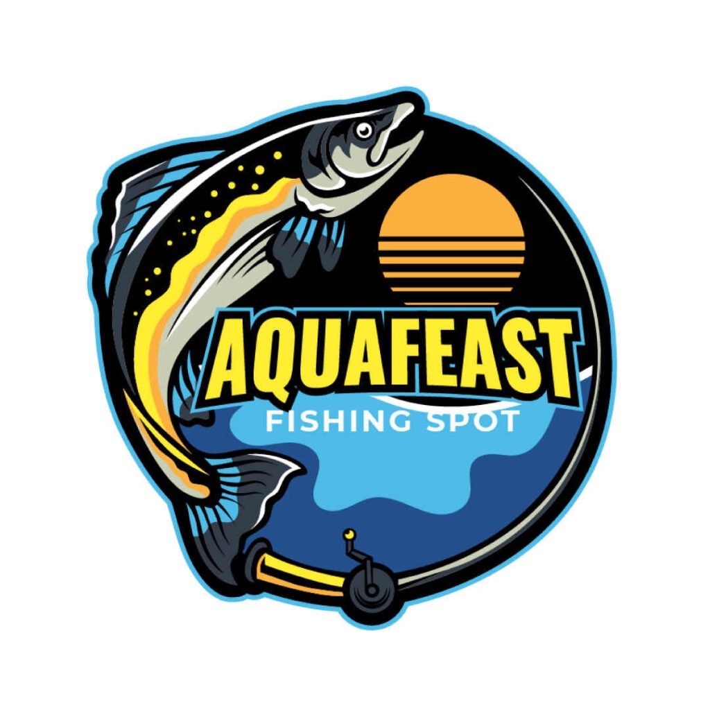
Every design element on the Aquafest Fishing Spot logo screams attention — in a good and appealing way. The circle encompasses all the components, and the fish secures the loop. The brand name is also displayed in a bright yellow color against a black, orange, and blue background. The sun shines at the top right, and the ocean beams with pride at the bottom. However, the most remarkable component of this logo is the fishing rod that also doubles as the circle.
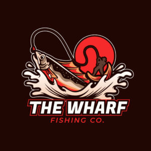
10. The Wharf Fishing Co.
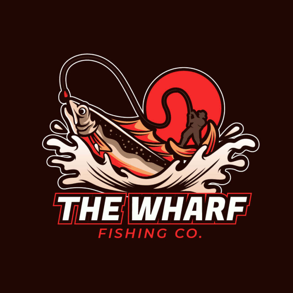
This fishing logo is a fun and playful take on a man fishing as it features an oversized fish with the man standing on its back. It’s a hyperbolic representation of the power of the fish at the mercy of the fishing enthusiasts. The color red screams power and energy, which dominates the entire design.
Where to Get Your Fishing Logo
As you can see from these fishing logo examples, research, experience, and creativity are involved. And these factors will only be perfected by professional logo designers, meaning DIYing your fishing logo won’t make the cut.
If you want your fishing logo to stand out, work with only the best and get your logo and other branding and marketing designs from Penji.
Penji offers unlimited designs and revisions for an affordable flat monthly rate. You may request any of these designs:
- Logos
- Business cards
- Billboard ads
- Online ads
- Car wraps
- Flyers
- Brochures
- Tradeshow banners
- Merchandise designs
- Web design
- App design
- Custom illustrations and more!
Subscribing to Penji means you’ll also get access to a bespoke platform, which makes the design process quick and easy. You’ll be assigned an account manager who monitors every project. This way, nothing gets overlooked.
Sign up now for a 15% discount on your first month. But we have another special offer in mind. Our Marketplace is now open for one-off designs! If you need a logo, then head on over there to get one for your fishing business! Catch this limited-time offer before it goes away.
About the author
Table of Contents
- 1. Pacific Fresh Fish and Co.
- 2. Ocean Bounty Rod and Reels
- 3. The Marine Reels and Bait
- 4. Brave Sailor Fishing Services
- 5. St. Agnes Boats and Bait
- 6. Poseidon Marine Shop
- 7. Water Valley Fishing Haven
- 8. Vikings Marine Services
- 9. Aquafest Fishing Spot
- 10. The Wharf Fishing Co.
- Where to Get Your Fishing Logo

