Fast food giants like McDonald’s and KFC are household names and continue to dominate the industry. But it doesn’t mean your new fast food joint should be overlooked. Your food may be delicious, and your service is stellar. But another way to get recognized is through branding, and to start, you need a fast food logo to go with it. If you need ideas, here are ten amazing fast food logos. Plus, our Penji designers created five excellent examples when you scroll down!
Additionally, here’s how you can get a logo from us!
1. Cupbop

Food logos are known to show what they offer as a pictorial mark in their logo. Cupbop follows that trend. You’ll see an image of a rice bowl in the O of their wordmark, representing their best-selling rice bowls. Other than that, there’s also the Korean writing, which is the Hangul version of their name. This helps establish their Korean background and that non-Korean customers will know they’re buying from a Korean establishment.
2. Noodles and Company
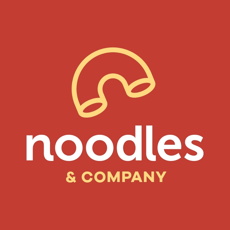
The Noodles and Company logo is simple yet effective in delivering a message and establishing its identity. They use the macaroni as the image to show that they are a noodle company. But it’s more than that. If you see the shape of the macaroni, it could be shaped as a small letter n or c, symbolizing Noodles and Company, the business name. Plus, if you look closely, the “noodles” wordmark appears to have curves and twists at the end of n and l to show the different noodle textures.
Do you want a no-frills logo like this one from Noodles and Company? Check out the logos our fantastic designers have created for our clients here.
3. Pollo Tropical
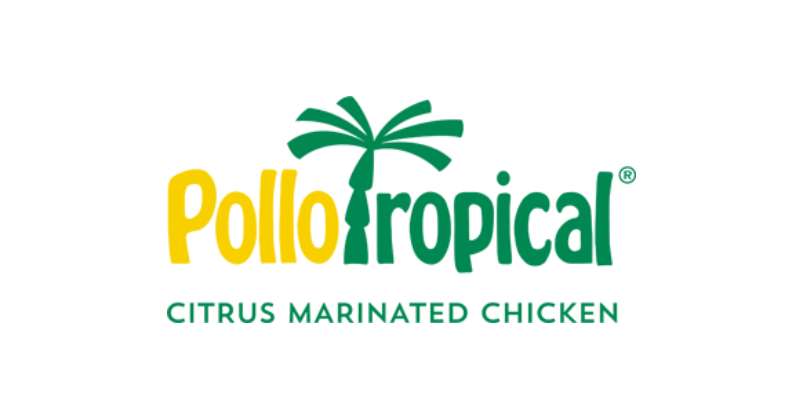
Establish branding from the get-go with this logo from Pollo Tropical. But how did they do it? Their logo is a wordmark with an added illustration of a palm tree. The added yellow to their brand color further enhances the citrusy taste they offer in their chickens. Going back to the palm tree, it symbolizes the tropical-ness of their brand. Overall, their logo is relevant and simple and truly captures the essence of their brand.
4. Burgerville
Get reminded of the good old days with this logo for Burgerville. Its old-school charm can still bring in customers because Burgerville has been a mainstay in the Pacific Northwest. Going back to their logo, it’s a modernized version of their original logo. It shows us that even if they’ve been in the fast food industry for so long, they want to attract old and new customers to their restaurants. Plus, it helps that they used a red logo, which has been effective in increasing appetites.
5. Glory Days
Relive the glory days like this logo from the Glory Days. It has a retro style to it, thanks to the font and shadow. Cursive or script fonts give logos a nostalgic look while also giving the brand a warm personality. And that’s what Glory Days is trying to achieve in its logo. It helps Glory Days position itself as a family-friendly restaurant or one that can transform your dining experience reminiscent of the past.
6. Salsarita’s

Here’s another example of a logo that takes inspiration from its cuisine. The Salsarita’s logo reminds us of salsa sauce, a mainstay in most Mexican cuisine. The same goes for the lime slice, which you see in most alcoholic drinks. And the green hue of their logo indicates the freshness of their tagline. Alternatively, the red and green brand colors can also represent the “heat” or spiciness that comes from eating Mexican cuisine. And the logo can deliver that message to their customers.
7. Which Wich

Don’t get too tongue-tied when you look at this logo from Which Wich. Their logo is unlike any other because it integrates some elements that deliver their branding message. First, you’ll see the bread underneath the W, acting as the lower ends of the letter. You’ll also see a question mark. It’s rare to see question marks in a logo, but theirs work because it’s asking the target audience what sandwich they can order for the day.
8. Erbert and Gerbert’s
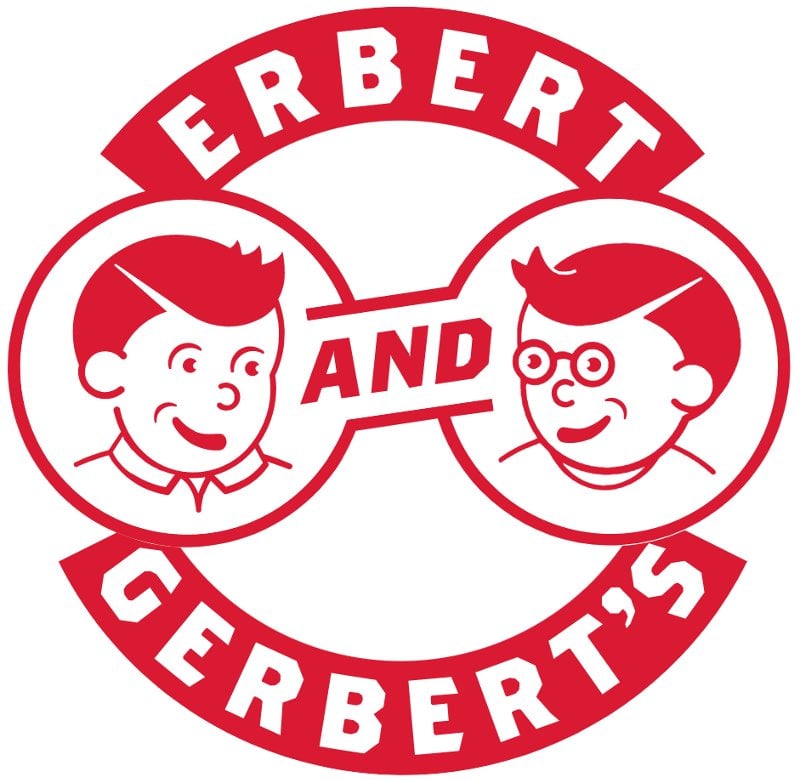
If you’re aiming for an abstract combination logo, here’s Erbert and Gerbert’s logo. The name was inspired by the stories that the founder was told as bedtime stories. And the founder brought the characters to life with the logo. What makes this logo unique is the overall look of the logo too. Aside from having two characters, it also resembles a sandwich, which is what Erbert and Gerbert’s sell.
And maybe if you look a little closer, you can also create the shape of a small letter e and a big letter G from their logo.
Also, if you want a logo like Erbert and Gerbert’s, why not tap Penji to design your logo? If you’re unsure how to get one from us, sign up for a demo to see Penji in action!
9. Uncle Maddio’s
When it comes to pizza logos, we think of mascots like Papa John’s or Little Caesars or pictorial marks like Domino’s Pizza and Sbarro. Although some big pizza chains have pizzas or slices in their logo, why not use the most important ingredient to represent your fast food logo, like this one from Uncle Maddio’s?
Instead of opting for pizza or slices, Uncle Maddio’s logo looks like the pizza dough before baking it. They pair the logo with a wordmark with Maddio’s standing out because it looks like pizza sauce.
10. Taziki’s

Blue isn’t exactly the most appetizing color for food logos. But if it pays homage to its country’s roots, it would work on your branding. Plus, you can stand out from the rest, like this fast food logo from Taziki’s. Aside from the Greek blue, the meander (a well-known Greek pattern) is also seen in their logo. With these elements in mind, Taziki’s positions itself as an authentic Mediterranean fast-casual restaurant that many can enjoy.
Fast Food Logos by Penji
Need some convincing before you can fully commit to a Penji subscription? Here are some of the best fast food logo designs created by Penji!
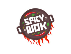
11. Spicy Wok

Turn up the heat in your logo like this one for Spicy Wok. The logo teases its target audience about what the restaurant offers and the senses too. The added fiery streak on the sides of the pan helps you imagine food sizzling, and it will even make you hungrier and want to dine in their store. Plus, you might even imagine the smell of the food being cooked on the wok.
Like this logo? Well, check out what Penji customers have loved about Penji. Read here why many businesses trust Penji for their graphic design work.
12. Grill House
Here’s another restaurant that uses fire in its logo. It uses elements you’ll see in most grill house logos, like the grilling forks and fire. But what differentiates their logo from the others is the metallic finish and the house shape, symbolizing “Grill House.” In terms of logo principles, the Grill House logo is simple and relevant.
13. Slice Club Pizza
Don’t miss out on a good slice of pizza from the Slice Club Pizza. Their logo resembles Domino’s Pizza because of the red and blue motif. However, to differentiate itself from the well-known restaurant, Slice Club uses a semicircle to show half a pizza. And true to their name, a slice is taken out from the pizza to give its customers a slice of their tasty pizza.
14. Cucina Burrito
Here’s another Mexican restaurant that uses the green and red motif. Cucina Burrito uses a cursive font to give them an approachable look. This way, more customers will be inclined to go to their restaurant. The added burrito can make customers crave one. And Cucina Burrito will be there to satisfy that craving. Overall, their logo is relevant and simple.
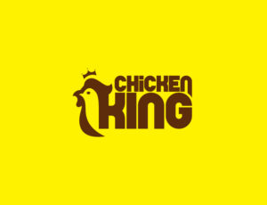
15. Chicken King
Make people feel like they’re in the presence of a king like this Chicken King logo. Although it may seem like a majestic image, having yellow in their brand can definitely attract people to see what they’re offering. Another great trait of this logo is the seamless transition of the pictorial mark to the wordmark, giving it one cohesive look.
Get A Brand New Logo Here at Penji
KFC, Burger King, and McDonald’s partnered with professional graphic designers to create their logos. That said, their logos are recognizable and memorable anywhere. And you should follow in their footsteps by hiring professional graphic designers to produce your logo. Fortunately, Penji is here to help you with that.
You can subscribe to Penji and start your first-ever request! However, our Marketplace is now open if you want to get one-off designs for your brand, such as logos, business cards, packaging designs, and more!
About the author

Katrina Pascual
Katrina is a content writer specializing in graphic design, marketing, social media, and technology. In her spare time, she writes monthly personal blogs to practice her craft.
Table of Contents
- 1. Cupbop
- 2. Noodles and Company
- 3. Pollo Tropical
- 4. Burgerville
- 5. Glory Days
- 6. Salsarita’s
- 7. Which Wich
- 8. Erbert and Gerbert’s
- 9. Uncle Maddio’s
- 10. Taziki’s
- Fast Food Logos by Penji
- 11. Spicy Wok
- 12. Grill House
- 13. Slice Club Pizza
- 14. Cucina Burrito
- 15. Chicken King
- Get A Brand New Logo Here at Penji

