Now that the world is slowly recovering from the effects of the pandemic, many businesses are seeing tremendous and steady growth. The fitness industry is one of these, as proven by its 400 billion projected revenue growth by 2028. And as always, the challenge for every business is how to cut through all the noise. One of the best ways to leave a huge impact is through an amazing logo design. Here are 20 fitness logo ideas to help you.
How to Create a Fitness Logo

1. Find Inspiration for Your Fitness Logo Idea
When creating a fitness logo, you might have to look at the giants in the fitness industry. You can look at logos from Anytime Fitness, Orangetheory, and Planet Fitness as examples. This is to get an idea of what’s already out there and not to copy. Of course, don’t limit your search there. You can also go to portfolio websites like Behance and Dribbble.
2. Conceptualize or Write Your Logo Design Brief in Detail
If your search for a fitness logo has been deemed fruitful and you now have a concept of a logo in mind, it’s time to conceptualize. Some would use sketches or draft versions of their logos to show to a designer. However, those without any eye for design could write a detailed logo design brief, with the logo design references attached. This will help your designer in creating the logo you envisioned.
As a tip, you can use this logo design checklist to help you write your design brief.
3. Make or Find a Designer to Create Your Logo
It’s easy to create a logo these days, thanks to online logo makers. In a few minutes, you’ll have a new logo ready to use for your website, social media accounts, products, merch, and more. Plus, some of them are free to use and let you download the new logo immediately.
Although they seem enticing to use because some are free or more affordable than most freelancers, agencies, or design services, your logo won’t be unique. In addition, you might run into copyright issues when using these online logo makers. There is a huge probability that someone else may have the same logo as yours.
That’s why hiring an actual designer or using a graphic design service like Penji are a few of the best ways to get a logo. After all, you want a recognizable, memorable, and unique logo, something that logo makers can’t give you. With Penji, you can get your envisioned logo and help with all your branding needs.
20 Fitness Logo Ideas
1. Co-Lab Fitness
Most fitness centers and gyms would use gym equipment images as part of their logo. Here’s a company that uses dumbbells as part of its logo. It’s a group of what seems like the letter C as the name of the brand is Co-Lab Fitness. It’s a unique take on a fitness logo, which you can try for your gym or fitness center.
2. Jungle Gym
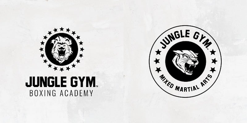
Image credit: Sek Design
Jungle Gym has two logos. One is for the boxing academy, while the other is for their MMA program. Both logos use animals from the jungle; the boxing academy uses the lion, while the MMA program uses the panther. The stars featured in both logos denote excellence and power.
3. Merritt Clubs
To stand out from the competition, take a leaf out of Merritt Clubs’ book. Not only does its logo have a sense of vibrancy, but it also has a good representation of the community. While we usually see gyms use bright colors for their logos to signify energy, fun, and movement, Merritt Clubs has made it project a sense of trustworthiness as well. An abstract letter “M” can be used as a stand-alone logo icon, even without the company name.
4. Wittsfit
If you want your logo to make an impact, here’s a fitness logo idea that will turn heads. Wittsfit is a private fitness studio that has a notably striking logo. With a bright blue and yellow motif, it can attract people to come in and get motivated to sign up and work out in the studio. The overall contrast also creates visual interest that makes the overall ensemble pop.
5. Hit Fit SF

Like most fitness logos, you will see equipment and an illustration of a muscular person. This one by Hit Fit SF gives us a different side to this. Their logo shows two people working out. The wordmark appears slanted to signify movement. Plus, two people doing various exercises paint a picture in fitness junkies’ heads. It’s another common element in fitness logo ideas to show power, energy, and strength.
6. Utopia
Bold text and colors are usually associated with fitness logo ideas. However, Utopia moved away from that identity and created a luxurious logo. It oozes sophistication because of the gold coloring. Its minimalist style adds to its elegance and style. What looks like an infinity symbol also depicts a continuity that emanates grit and the willingness to stay fit and healthy.
7. Carina Chirila Fitness
Image credit: Red Kite Design
Like Utopia, the Carina Chirila Fitness logo doesn’t have the same branding style as most gyms. According to Red Kite Design, the logo incorporates Chirila’s philosophy and her initials. Aside from this, it also shows the importance of trainer-client relationship and her values such as trust, empathy, and reliability.
8. Unique Fitness

Image credit: Imprint Design
Here’s a fitness logo that uses striking colors and text to get the right attention. Unique Fitness uses a combo of lettermark and wordmark for its logo. The single letter U represents the members or clients. Alternatively, it also means “It’s all about U” to signify the goals of any individual that comes to the gym.
9. Kraft Fitness

If you’re looking for another version of a bold fitness logo, here’s the logo for Kraft Fitness. Luna Creative explains the direction for their logo, saying that they added a monogram in a square, to give the logo balance. With this logo, they can establish that they’re a trusted and reliable training center for anyone who wants to get fit.
10. Morristown Fitness
Image credit: Proof Branding
Fitness logo ideas like this one from Morristown Fitness can be easily spotted thanks to the very fitting font it uses. It’s very prominent and seems imposing. The bold and impactful typography perfectly shows that they are one of the top gyms anyone in the area should go to.
11. NS FIT Clubs
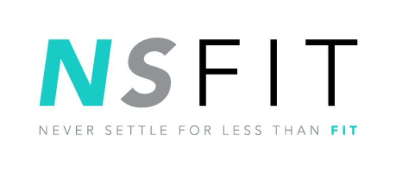
For modern fitness logo ideas, you can check out this example from NS Fit Clubs. The font choice is what gives it that trendy look. Aside from that, while the colors gave it a sense of calm, the green in its logo further enhances its branding as a company that aims to improve health in its communities.
12. Bodypulse Fitness Studio

Here’s a bold yet minimalist logo design to inspire you. According to Kimbo Design, the Bodypulse Fitness Studio logo represents power and authenticity. Even with the minimalist style, the logo can still catch your eye. The combination of bold and subtle font styles is an alluring strategy for marketing on various channels as well.
13. Champion Zone Fitness

Champion Zone Fitness has a surprisingly unique logo. Even if it’s static, you can imagine it moving because the logo appears slanted. The abstract image of a man running while both hands balled into a fist creates a sense of motion. Plus, the logo bearing the color yellow is noteworthy as it’s synonymous with optimism and energy.
14. Flawless Boxing & Fitness

You may not normally see flashy colors as part of a gym’s branding but Flawless Boxing & Fitness has done it so well. They have gone for that identity to lure more people to go to their gym. Their aim was to represent power and energy and has succeeded in creating a logo that’s appropriate for a boxing gym, which explains the bold monogram logo with the initials “FBF.”
15. Rileys Gym
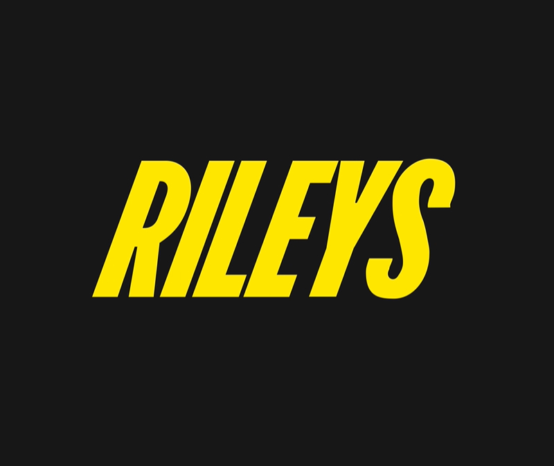
Image credit: Percept
Here’s another logo idea that indicates movement. The Rileys logo appears to slant to the right, suggesting that its gym members move forward to become fitter and healthier. Plus, according to Percept, it’s to show that they are a dynamic gym and want to empower individuals.
16. Athletica

Several gyms only allow women to sign up as their members. One of those gyms is Athletica. To attract more women to become members or work out in their gym, the logo incorporated a minimalist and sophisticated feel to it. They wanted to include the brand’s values, such as empowerment, affluence, and inclusivity which they capably did.
17. Barry’s

Barry’s is known for its tough workouts. When it comes to their logo, their color choice of orange to represent energy and motivation was an excellent decision. Plus, as we see on their logo, the A is replaced by two arrows and a star. This represents the powerful and high-intensity workouts they teach members.
18. Equinox
Image credit: BrandStruck
Luxury branding for gyms is rare, so here’s another logo design example if you want to give your brand a sophisticated look. The Equinox logo has a bold look while the font and colors give it a premium style.
19. Heartline Fitness

If you want an example of a logo that’s straight to the point, here’s the logo from Heartline Fitness. Based on their name, their logo reflects it by connecting different lines and forming a heart. Their logo evokes their passion for the changes they can make within their community. It also represents their values such as reliability and assurance.
20. Element Fitness
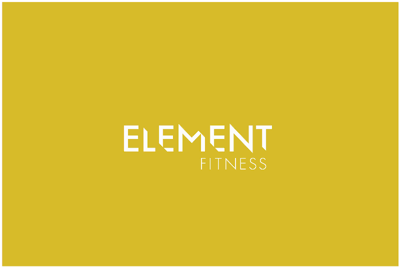
Image credit: Mindsy Design
The Element Fitness logo has a sleek and luxurious look, which is a style you’ll rarely see for gyms. According to Mindsy, Element Fitness has a science-based, premium approach that other gyms may not offer. The sharp edges give the logo a modern and sleek look.
How Penji Can Help With Your Fitness Branding
With over 30,000+ gyms open in the US, it’s more important than ever to establish your branding and increase your sign-up rates in the coming years. While you convince more people to come to your gym or health center, get the right help you need. Let Penji handle the design work for you. You name it, Penji designers can create them for you. For logo, website design, social media graphics, flyers, business cards, merchandise, and more, Penji will be there for you.
Take the next step by subscribing to Penji. Choose a Penji plan here and try it 100% risk-free for 15 days!
About the author

Katrina Pascual
Katrina is a content writer specializing in graphic design, marketing, social media, and technology. In her spare time, she writes monthly personal blogs to practice her craft.


