
The yearbook represents a vital milestone, and yearbook layouts must highlight the lessons and fond memories graduates will take with them in the next chapter.

Once students have earned their diplomas and said goodbye to the classroom for good, all that’s left to look back are wonderful memories. And it goes beyond collating graduation photos and quotations. At Harvard, for instance, there’s a whole non-profit student organization dedicated to preserving the memories of each class at the university.
A tangible object that will remind them of their learning years is a treasure – and that’s why yearbook layouts are so crucial.
In fact, some of our clients here at Penji ask us to create yearbook layouts that don’t only look good but also tell a story. After all, graduates will revisit these tomes during reunions ten, twenty, even fifty years down the road. And the design should hold up and create an impact even after all those years (the quotes might be a different story).
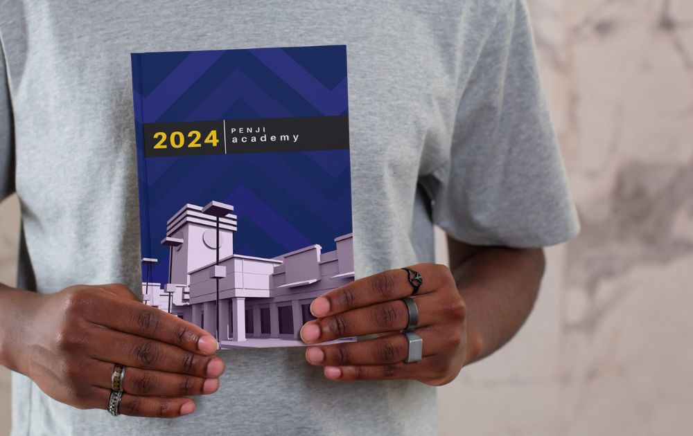
How do you Layout a Yearbook?
A yearbook’s main function is to record and commemorate the past academic year. In that sense, the layout should highlight the people and events without overwhelming the reader.
Though yearbook layouts, templates, and other instant solutions are a-dime-a-dozen online, going down that route might not be optimum. After all, you’d want to inject as much personality as you can into the yearbook.
What was the school year like? How did it feel to be learning and making friends then?
Here are a few elements to keep in mind when you’re brainstorming for custom yearbook templates:
- Grid
A layout grid is the rows and columns where you can organize content. The placement of photos and text, as well as their distance from one another, largely depends on the style you’re going for.
- Typography
You need a cohesive style for the whole yearbook. That said, you need to set the typeface you’ll use for titles, subtitles, in-paragraph text, and any other element. It’s best to use fonts that don’t clash with one another. Otherwise, reading the book would be an overwhelming experience.
- Image Style
You may want to add effects to photos, or you may not. In the same vein, you may opt to use background images or patterns on the pages. Whatever you choose, the image style can do a lot to set the mood of the yearbook.
- Visual Motif
If the image style is Batman, the visual motif is Robin. Visual motif pertains to repeated visual elements that give the yearbook a unique look and feel.
- Safety Line and Bleed Area
The safety line is the margin within the page where you can place all the important text and images. If you want a photo to extend to the edge of the page without surrounding margins, then you should place the image beyond the safety line and along the bleed area.
What are Some Themes for Yearbook?
Whether you’re looking for printed yearbook layouts or virtual yearbook ideas, we rounded up the most interesting ones online. Take a look at each and let them inspire your layout design!
1. A Day in a Life
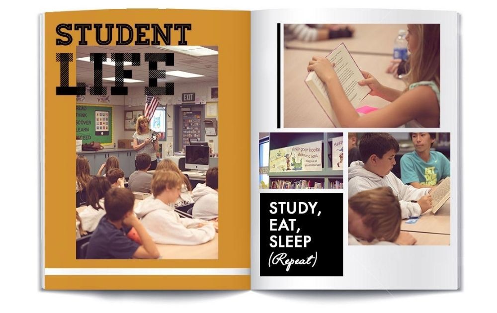
Image Credit: Shutterfly
Though big events are the usual highlights of a yearbook, it never hurts to add a page or two showing a normal day during the school year. For instance, this example from Shutterfly shows a regular day in the classroom. The pages like these will make students reminisce about their life back when they were in school.
2. Go for Some Action
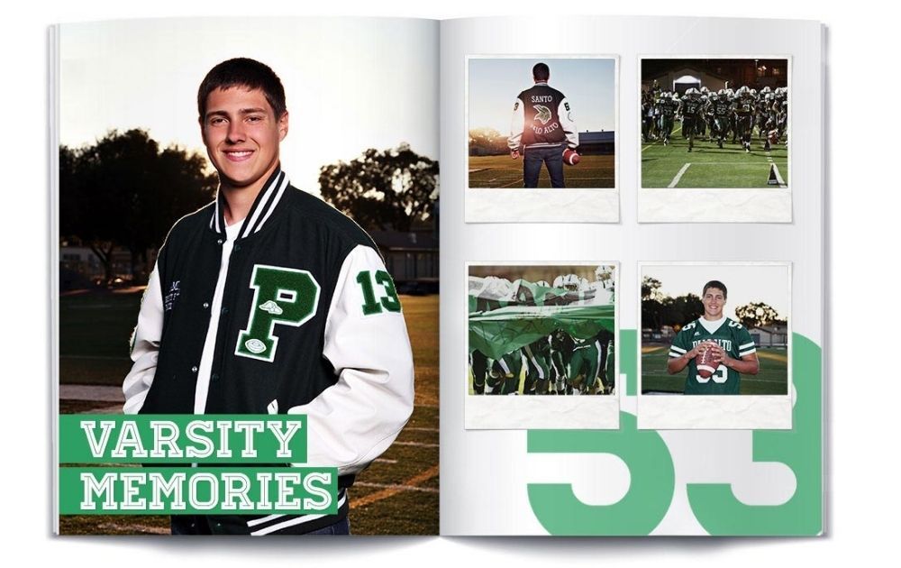
Image Credit: Shutterfly
There’s nothing like a big game to unify the students and make everyone cheer for the school on top of their lungs. Bring that action into the pages of the yearbook, just like this example from Shutterfly. The layout included action shots and emphasized stellar photojournalism. In addition to that, the simple background made way for the photos to stand out.
3. Add an Unexpected Element
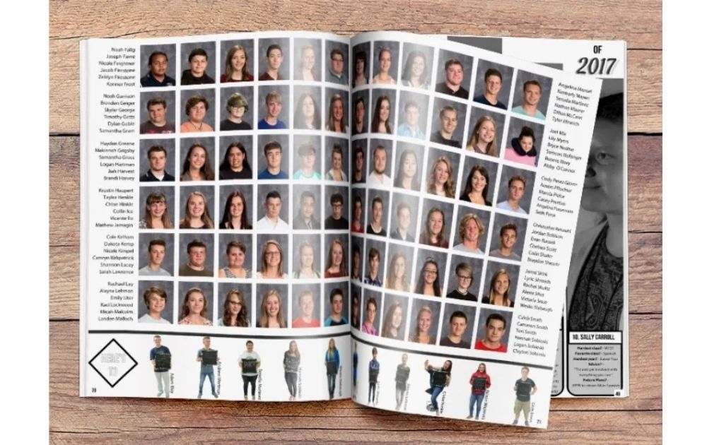
Image Credit: TreeRing
Here’s one of the high school yearbook layout ideas students would love. Add an unexpected element to the page, just like this example from TreeRing. Below the usual grid of photos is a strip of images showing students’ full body shots. That alone transformed the layout from drab to fab!
4. A Palette that Complements the Layout
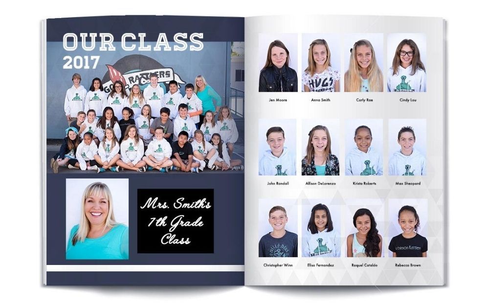
Image Credit: Shutterfly
This example from Shutterfly features a simple layout featuring a straight grid of photos. Despite the straightforward layout, the color palette added interest to the look. The contrast of indigo and cream, paired with pops of aquamarine, made the pages a beautiful thing to look at.
5. Make Graduates Feel Like Celebrities
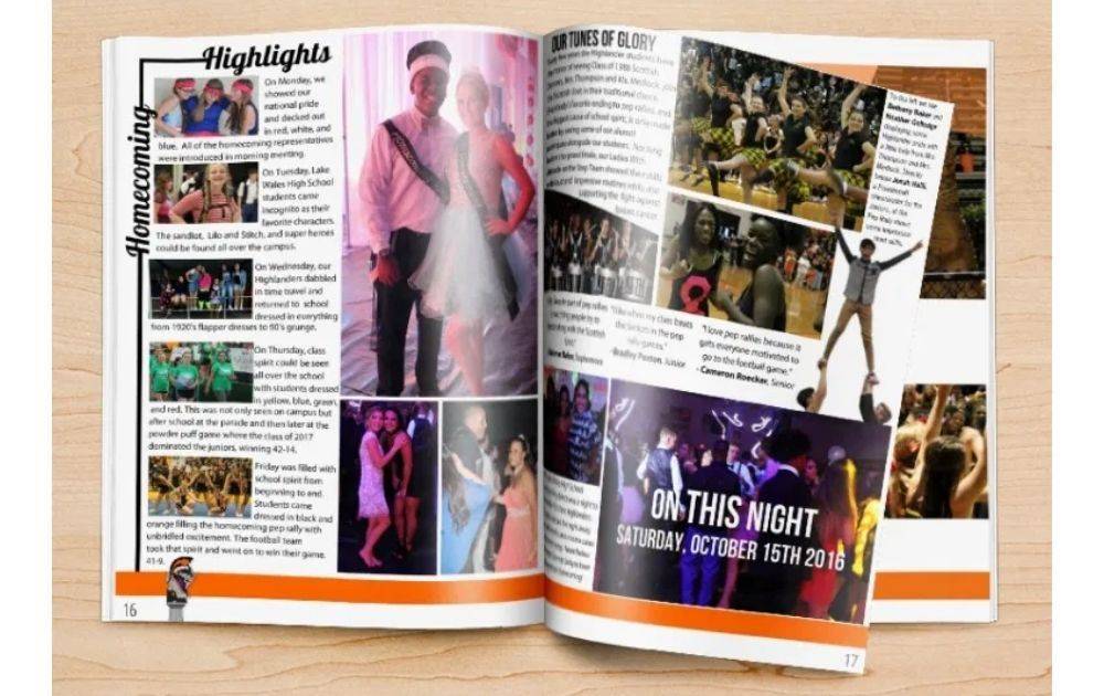
Image Credit: TreeRing
Give the students a celebrity treatment by including a few pages with a magazine layout, just like this example from TreeRing. This especially looks cute for events like the prom or the school fair. Also, it would be a great idea to throw in an interesting article from the campus journalists for extra value.
6. Choose the Right Motif
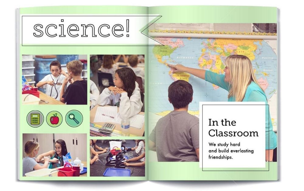
Image Credit: Shutterfly
We’ve talked about visual motifs earlier, and this example from Shutterfly shows how to use them best. The round stickers showing a calculator, an apple, and a magnifying glass add a dose of character to the whole layout. The great thing about this style is you don’t have to use the same images over and over again. You can use different images with the same clipart style inside the same round sticker, and they would still look cohesive.
What Makes a Good Yearbook Layout?
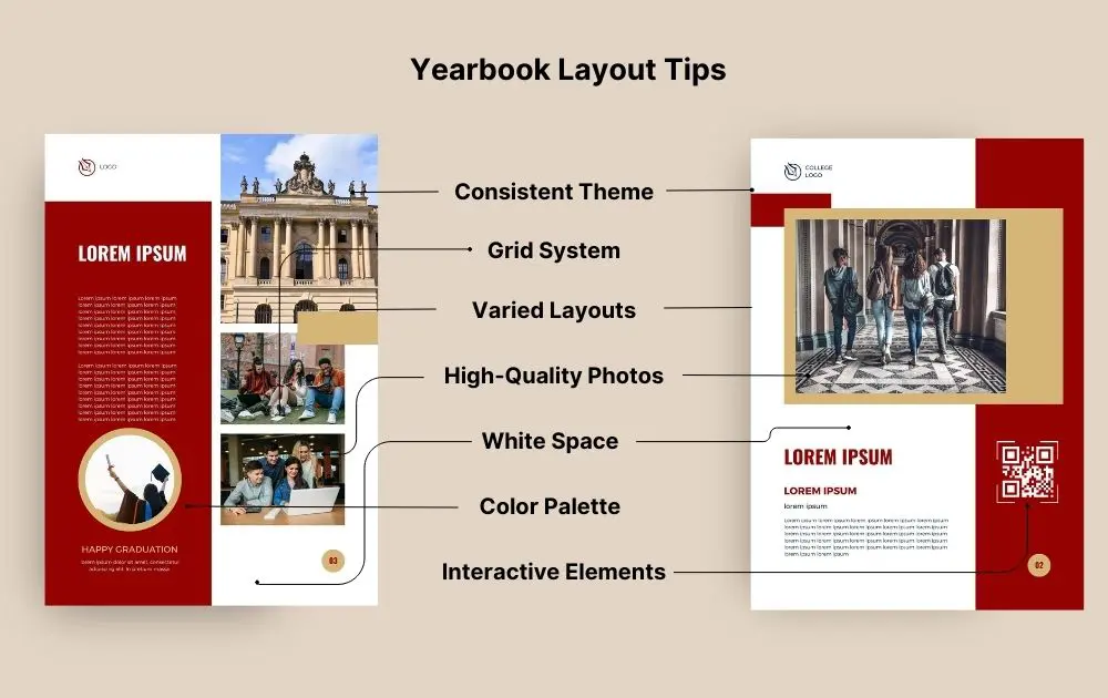
Here are yearbook layout tips to help you create a memorable and visually appealing yearbook:
- Consistent Theme. A consistent theme provides a unified and harmonious look to the yearbook, making it more visually appealing and memorable. Start by brainstorming ideas related to the school year, significant events, or popular culture. Once you’ve chosen a theme, ensure that every page reflects it, whether through graphics, colors, or typography.
- Grid System. A grid system provides a structured framework for your layout, ensuring that elements are evenly spaced and aligned. Divide your pages into columns and rows. This will help in placing photos, text, and other elements in a neat and organized manner.
- Varied Layouts. Varying layouts keep the reader engaged and prevent monotony. While some pages might focus on a single event with a large photo, others could be dedicated to showcasing multiple events with a collage. Remember to maintain a balance to avoid a cluttered look.
- High-Quality Photos. Clear, high-resolution photos enhance the visual appeal of the yearbook and capture memories more vividly. Always request or take photos in the highest resolution possible. Before including them, check for clarity and sharpness.
- White Space. White space, or negative space, provides visual relief and can highlight important content. Don’t feel the need to fill every inch of the page. Allow for margins and spaces between elements.
- Color Palette. Choose a limited color palette that complements your theme. Too many colors can make the yearbook look chaotic, so it’s best to stick to a few main colors and use them consistently.
- Interactive Elements. Interactive elements add a modern touch and can provide additional content or memories. Consider adding interactive elements like fold-out pages, pockets for mementos, or even QR codes that link to videos or additional content online.
Frequently Asked Questions (FAQs)
What is a layout in yearbook?
A layout in a yearbook refers to the arrangement and design of visual and textual elements on a page. It encompasses the placement of photos, captions, headlines, and body text in a structured and aesthetically pleasing manner. The layout ensures that the content is presented in an organized way, making it easy for readers to navigate and understand the yearbook’s stories and memories.
Do yearbooks have themes?
Yes, many yearbooks have themes to provide a cohesive and unified look throughout the book. The theme often reflects the school year’s events, milestones, or a particular concept or idea that resonates with the student body. It serves as a central idea around which the design, photos, and text revolve, making the yearbook more memorable and visually appealing.
What should a yearbook theme include?
A yearbook theme should encompass a central idea or concept that captures the essence of the school year. Key elements to include are the concept or the unifying idea that resonates with the student body; consistent motifs, patterns, or symbols that reinforce the theme; a color palette;
relevant imagery; and themed sections and features.
The Takeaway
Yearbooks are as good as time capsules. That said, the layout should work well to tell a story and make the tome an awesome piece of memorabilia any student would love to revisit now and then.
Need help with yearbook layouts? We, at Penji, can do it for you! We offer unlimited graphic design at a flat monthly rate. So, you can have all the designs you need without spending an arm and a leg. From digital yearbook and book illustrations to content marketing design ideas, we’ve got you covered!
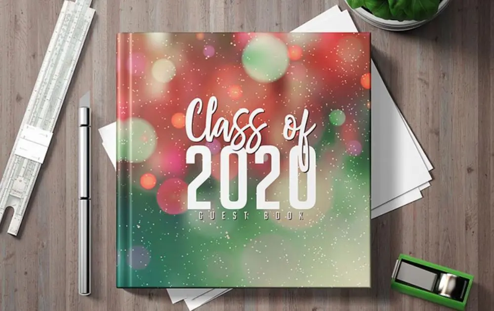
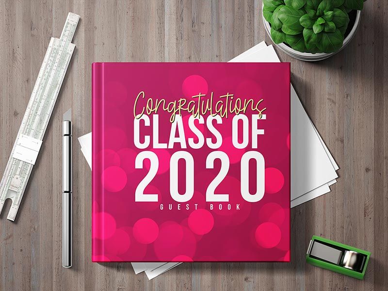
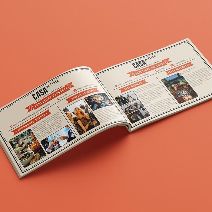
Here are some of the layout designs we’ve done in the past:
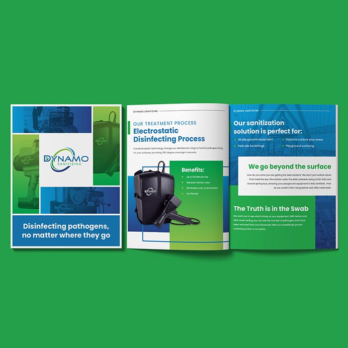
We have the top 2 percent of designers, so you can rest assured that we can help you develop a design that puts your brand in the best light. Sign up now by clicking this link to enjoy 15% off the first month of any plan. And the best part? You can try any of our packages risk-free for 15 days.
About the author

Carla Deña
Carla is a journalist and content writer who produces stories for both digital and legacy media. She is passionate about creativity, innovation, and helping small businesses explore solutions that drive growth and social impact.
Table of Contents
- How do you Layout a Yearbook?
- What are Some Themes for Yearbook?
- 1. A Day in a Life
- 2. Go for Some Action
- 3. Add an Unexpected Element
- 4. A Palette that Complements the Layout
- 5. Make Graduates Feel Like Celebrities
- 6. Choose the Right Motif
- What Makes a Good Yearbook Layout?
- Frequently Asked Questions (FAQs)
- What is a layout in yearbook?
- Do yearbooks have themes?
- What should a yearbook theme include?
- The Takeaway


