Craft beer is gaining popularity like never before. It’s a booming market, which means that emerging brands need to step up their game not only with their products but also with their craft beer logos. In this fiercely competitive industry, branding should be given top priority.
If you’re feeling a bit stuck and running out of ideas, grab yourself a craft beer, kick back, and let these logos inspire you. Trust me, a little relaxation and some visual inspiration can go a long way in creating a standout craft beer logo. Cheers to that!
Need an awesome logo for your brand? Check out Penji for unlimited graphic design services or one-off logo designs.
Southern Brewing & Winery
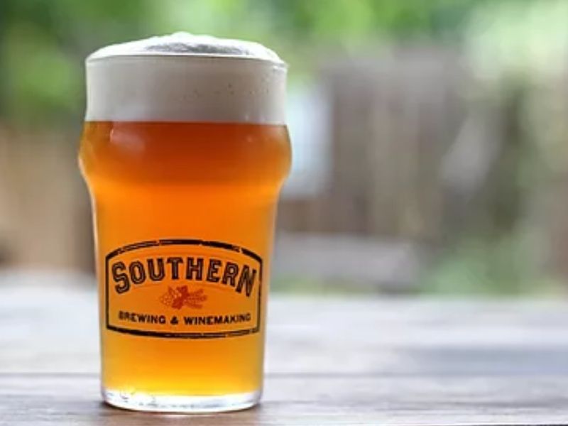
There’s no going south for this logo. It’s beautiful, classic, and appeals to all ages. It makes us feel at home looking at the font style. The logo reminds us of the old advertisements and store-front signages.
Magic Hat
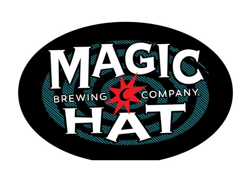
Craft beers are magical, and this brand is no exception. From the taste of their beer to their logo, everything seems to be whimsical. Quite frankly, it’s borderline hypnotic. It’s fun and playful but not kiddie-like.
Smog City
Smog City is owned by an award-winning brewer. It’s not surprising that the logo is outstanding too. The balance between nature and the bustling skyline is intriguing enough to try out their beers. It’s another sample of black and white logo that can still speak the brand’s message.
Scrappy Punk
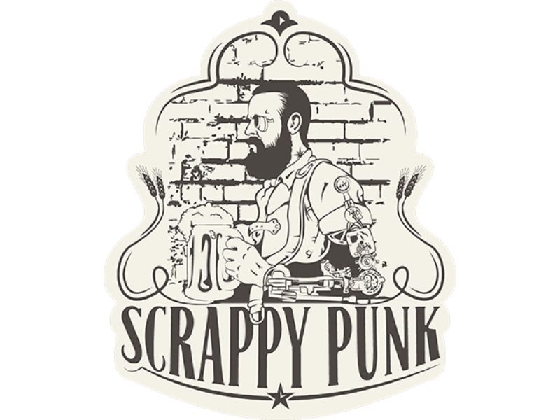
This logo is far from being a scrap. We love how it perfectly mixed classic design with a modern robotic twist. It doesn’t even need to have splashes of color. Its image and text are more than enough to win new customers.
Carver Brewing Co.
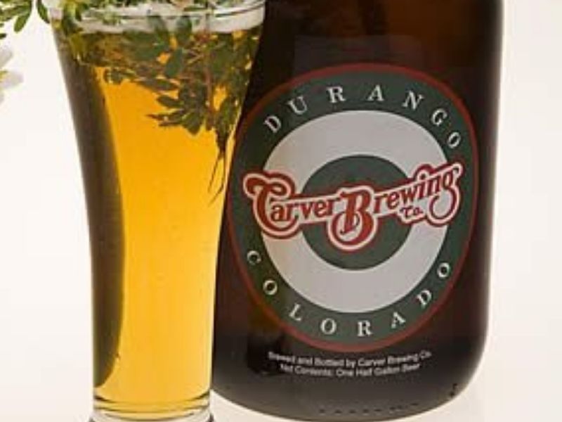
This eco-friendly brand has the heart to help the environment. But apart from that advocacy, we also get to love them because of their logo. The font style reminds us of the older times where things are simple and good. It has that strong appeal perfect for beers.
Red Hook
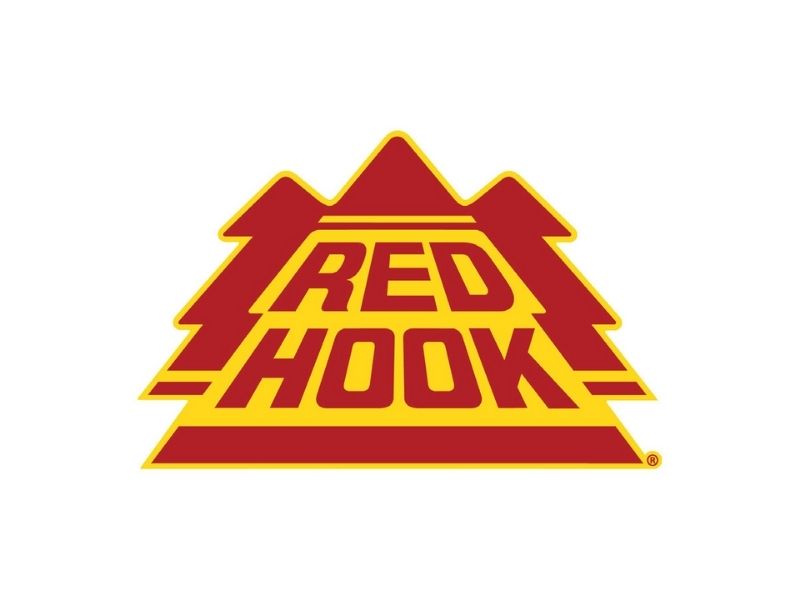
When we first saw Red Hook’s logo, we were reminded of the 80s video games. It has that look that works even in today’s age. It’s simple but has that tremendous impact. With this beer, you are definitely hooked.
The Bald Eagle Beer
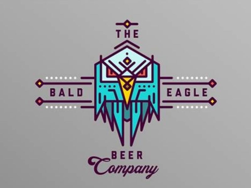
In most cases, we recommend designers to take it slowly when mixing and matching design elements. But on rare occasions, breaking the rules could work. Take for example, this logo from The Bald Eagle Beer. While you can see that a lot is going on, they perfectly fit together, and it surprisingly works.
Flying Dog
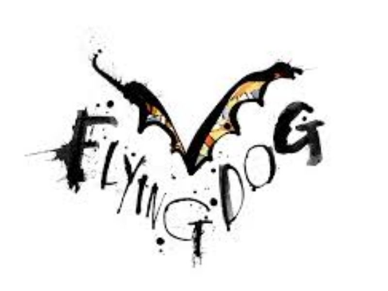
The name itself is already a show-stopper, and it only fits that it will be accompanied by an almost flamboyant logo. The graffiti style is too raw, ideal for what craft beers have to offer. It gives a whole new character to the beverage, and we wouldn’t mind carrying this bottle with an awesome logo to flaunt.
JDUB’s
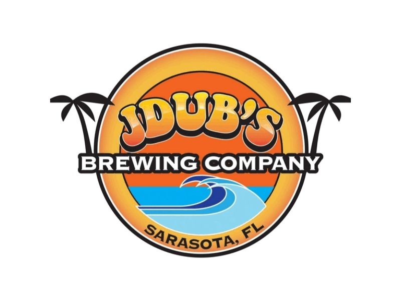
JDUB’s took a different approach when they designed their logo tropically-inspired. This is a good design, most especially if you target a younger audience enjoying a beer while they spend their time on the beach.
Alaskan Brewing Co.
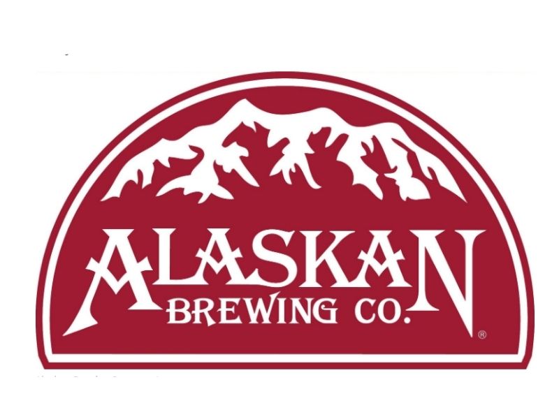
You can also use iconic destinations and landmarks when you do your craft beer logos. Such a technique was used by Alaskan Brewing Co. The color is not overpowering, and the font style perfectly matched. It’s rugged and organized at the same time.
Night Shift Brewing
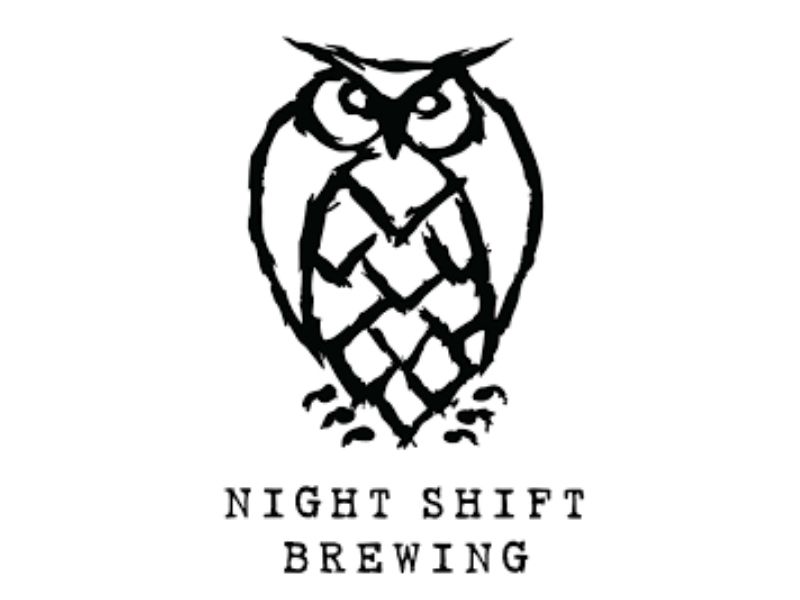
The owl is right for its name. But what amazes our team is that it is hand-drawn! That’s a good strategy if you want to stand out as well. There’s something charismatic with hand-drawn logos. From all the digital ones we see today, it’s a good break. Plus, it shows the hard work and dedication of not just the designer but the brand as well.
Stone Brewing Co.
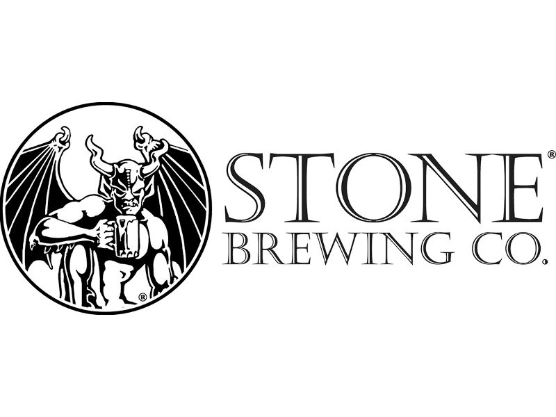
One thing is for sure. This logo is brave enough to add a demon. While most companies refuse to associate their product with anything evil, this one dared to do so. And yes, it worked to their advantage.
Boiler Brewing Company
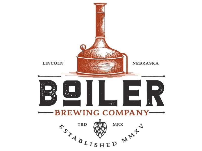
Using old icons is a good way to stand out. Many companies opt for a minimalist approach, which could also work. But if you use different design elements and do it right, you get to send a clearer message to the market. And it is more effective. Take a look at what Boiler Brewing Company did.
Lamplighter Brewing Co.
While most craft beer logos in this list are playful, the Lamplighter Brewing Co. is one of the few that looks classy and rigid. And it appeals to a different audience. Think about a relaxing lounge where jazz music plays all night long.
Cute Hoor
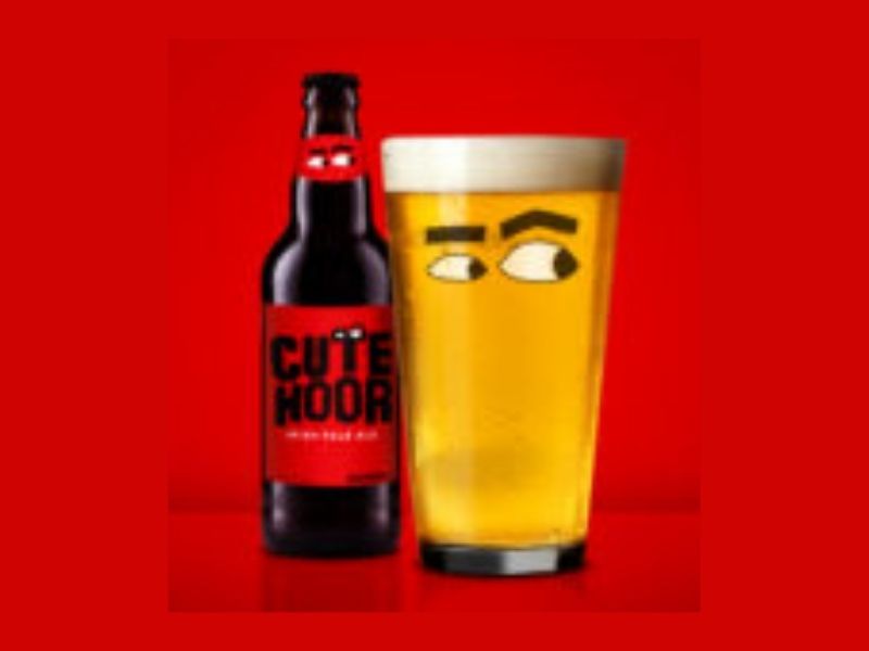
The brand is true to its name, and it is seen from their logo. Cute Hoor made their branding playful and bold. Holding their beer seems like you are in a cartoon series, making the entire experience nothing short of amazing.
Drink Me Brewing Company
We have to commend the name of this brand. It’s straight to the point and is an actual call to action. But even with a clever name, they made sure that their logo is as interesting too.
Guinness’s Porters
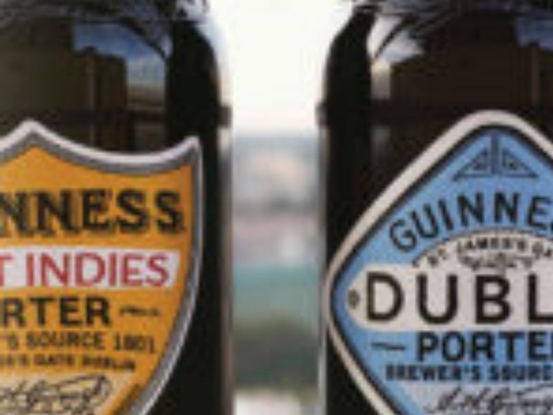
Using old-school and classic logos seems to be the trend for modern craft beers. This is what you can see from Guinness’s Porters. What’s interesting is that they have a variety of font types depending on their offering. Yet, you can still identify that the beer is under their brand.
Tips for Craft Beer Logos
When you are designing craft beer logos, it’s best to sprinkle it with personality and originality. Do not be afraid to go all out. But make sure it will still convey your message and story to the market.
Conclusion
Creating craft beer logos is no easy feat. And if you are not well-versed in terms of design, you might want to outsource this delicate task to professionals. If you think hiring experts is expensive, you are wrong.
You just need to know where to find them. For example, the Penji team has serviced hundreds of small and medium-sized companies without causing a dent in their budget. With their unlimited graphic design services, you get value for money. Sign up now, and get unlimited graphic design services or one-off logo designs.
About the author

Barbara Anne Isla
BA Isla is a Content Writer and also an Events Host. She left the corporate world to do what she loves and to spend more time with her amazing kids. She hopes to bring valuable change to society with her words.
Table of Contents
- Southern Brewing & Winery
- Magic Hat
- Smog City
- Scrappy Punk
- Carver Brewing Co.
- Red Hook
- The Bald Eagle Beer
- Flying Dog
- JDUB’s
- Alaskan Brewing Co.
- Night Shift Brewing
- Stone Brewing Co.
- Boiler Brewing Company
- Lamplighter Brewing Co.
- Cute Hoor
- Drink Me Brewing Company
- Guinness’s Porters
- Tips for Craft Beer Logos
- Conclusion


