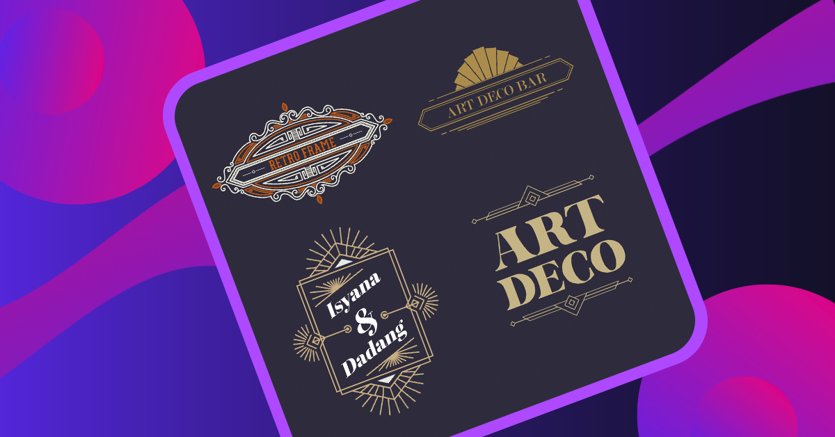
Design trends come and go, but there’s one style that has stood strong over the years: art deco. Unlike other trends that fade away quickly, art deco has proven its lasting impact on visual assets. Just take a look at the art deco logos used by numerous brands in the market—they still pack a punch today.
So, let’s delve into the world of art deco logos and uncover what it takes to create a remarkable one. But before we dive in, let’s get a grasp on what this style is all about. Need an awesome logo for your brand? Check out Penji for unlimited graphic design services or one-off logo designs.
Art Deco Overview
Art deco is also referred to as style moderne. It originated in the 1920s but became a huge hit in the US and Europe a decade after. The style screams anti-traditional elegance that still highlights sophistication and wealth.
This has made a comeback, not just with branding but also with architectural structures and interior design. All thanks to its nostalgic and unique charm.
It has become popular nowadays because of its clean lines and pattern that reflect the modern style that most millennials crave for. Yet, with its additional flair, it gives an otherwise blunt design its own flavor.
Characteristics of Art Deco Logos
One of the core reasons why art deco in itself is interesting is that it doesn’t follow a single style. You would see various patterns seamlessly put together to create a beautiful piece. While some of the art deco logos today infused minimalism, it originally had heavy geometric influences, straight and smooth lines, ziggurat patterns, exaggerated curves, and sometimes even loud colors.
For better appreciation, let’s take a look at the best samples.
Best Samples of Art Deco Logos
You might want to check out these art deco logos that could serve as your inspiration. Some of these are clean and simple, while others are loud and intriguing. All designs successfully won the hearts of their respective markets.
Clyde’s
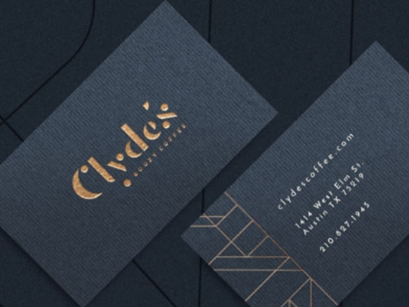
The logo represents a coffee bar inspired by the infamous criminal, Clyde Barrow. While known for his bank robberies, people identified him as someone who admired the luxurious lifestyle. As seen from Clyde’s branding, it also reflects grandeur. Its navy blue color reminds us of a designer suit that could last for generations.
Metropolis
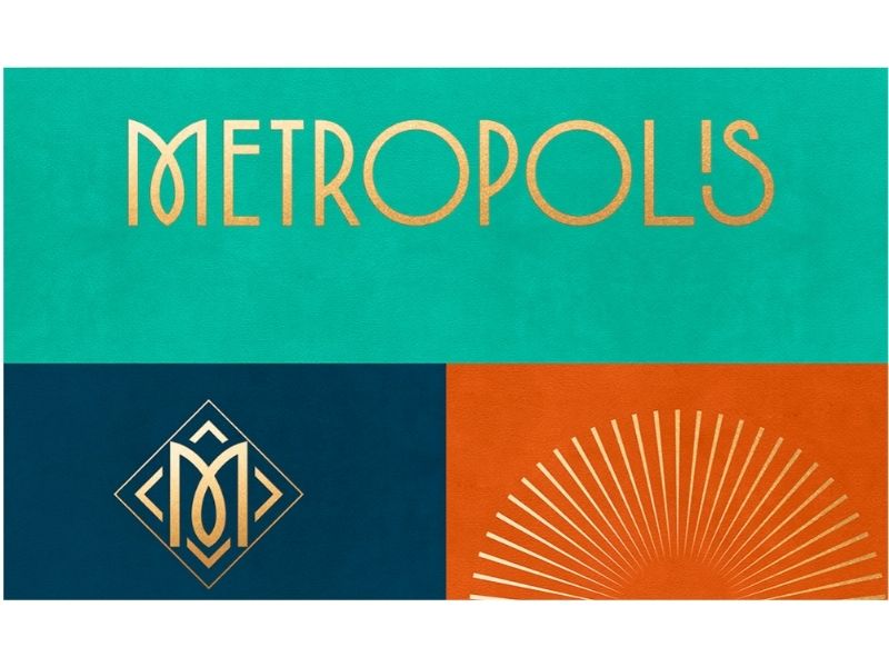
The logo and entire branding of Metropolis is one of the crowd favorites. The use of gradient added to its level of sophistication. And the lines and interesting patterns made it irresistible as well. Let’s not forget the pop of color, which helps it stand out. It’s not your usual gold and black combination, often found in Gatsby-inspired logos. However, it doesn’t make it any less sophisticated.
Centro Italia
The Centro Italia is known as the oldest Italian supermarket and bistro in Berlin. This art deco logo was inspired by classic wrought-iron Italian signage, giving us the vintage feel. It’s clean, fancy, yet playful at the same time, deserving a spot in our list.
Naturally Salvaje
The use of art deco-inspired images amplifies the branding for Naturally Salvaje. It’s a company offering fun handcrafted skincare and other natural products. Removing one critical design element from this logo diminishes its value. Proof that using multiple styles could be advantageous for your brand.
Cassandra Croucher
When an event emcee, Cassandra Croucher, requested a logo, she specifically wanted an Art Deco emphasizing a musical element. This one is definitely a show-stopper with its bold design elements perfectly sewn to each other. Regardless of the color scheme used, the impact remains the same.
Accrual Empire
In one glance, one word comes into mind seeing this logo – empire. And that’s fitting for the company’s name. Accrual Empire is a Business Consulting firm, helping others achieve growth and success. The play of geometric shapes to build a solid structure worked perfectly for their branding. It’s straightforward, and you can already identify as to which industry it belongs to.
CopperMuse Distillery
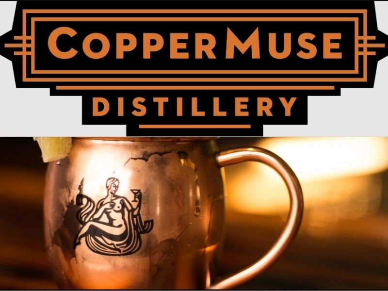
The CopperMuse Distillery’s logo reminds us of classic movie houses, suits, cigars, and a whole bunch of flappers. They also incorporate an interesting icon which they cleverly use in some of their marketing assets. If seen separately, it’s hard to imagine that these will fit together. But that’s the beauty of art deco. It sometimes uses contradicting elements, only to show that it could work.
The Ancestors
Many people love art deco logos because it clearly shows what your brand is all about. Yet, it is far from being plain. Just take a look at The Ancestors’ logo. The subtle additional design elements have made it more interesting. There’s no need for wild and crazy icons and images, but the pattern itself speaks a lot.
Michelle Mack
Lastly, we have a sample art deco logo for Michelle Mack. The positioning of the two Ms is smart. It creates a perfect symmetry, commonly found in art deco designs. And to finish off with a crown-like icon creates a feeling of being regal. It’s a good technique to show the market that you are on top of the game.
Should You Create Your Own Art Deco Logos?
To date, we’ve seen many apps and software suggesting that you can make your own art deco logos. Interestingly, they make it appear that creating one is as easy as 123. But the danger of choosing this path is the lack of options. The creativity is also limited as you are offered with templates. For an upcoming, or even an established brand, this isn’t a good idea. You would want your logo to be as unique as possible. But we understand that some people take this approach for economic purposes. Hiring a good and reliable graphic designer can be quite a challenge.
So here’s the best solution. Why don’t you hire the services of Penji, where you can get unlimited graphic design for a fraction of the cost. Apart from your art deco logos, you could ask their professional team to work on your art deco-inspired packaging, brochure, and even social media posts.
Conclusion
Art deco logos will remain to be a classic. And if you want your brand to look timeless with a pinch of luxury, we recommend using this style. It’s clean, smart, and anything but shabby. It’s one of the safest yet powerful styles you can use. Sign up with Penji now, and get unlimited graphic design services or one-off logo designs.
About the author

Barbara Anne Isla
BA Isla is a Content Writer and also an Events Host. She left the corporate world to do what she loves and to spend more time with her amazing kids. She hopes to bring valuable change to society with her words.

