How many apps have you used over the past 24 hours? Go ahead, check your smartphone, and count.
According to a consumer app usage report by App Annie Intelligence, users launch at least nine apps a day and an average of 30 apps per week. That’s quite a handful!
With these stats in mind, it’s no wonder many marketers are trying to learn the basics of launching an app, including Android app design.
Now, the prospect of learning the basics of app design may sound intimidating to any non-designer. And for some, it may seem unnecessary. Why learn it when you can hire an app designer, right?
Yes, it’s best to leave the heavy-lifting to the pros like our designers at Penji. After all, working with us means working with the top 2% of designers (stick until the end, and we’ll show you how easy it is to get an app design from us).
That said, however, it’s still ideal for entrepreneurs and marketers to learn the basics of app design. After all, it’s your app to develop and sell!
And as a client, knowing the ins and outs will allow you to be on the same page with the designer and be on top of the project.
This ultimate guide will help non-designers be familiar with concepts and principles related to app design. We’ll try to be as jargon-free as possible as we discuss the following:
- What do Users Expect From Apps?
- The Importance of UI and UX in App Design
- Android App Design vs. iOS
- Factors to Consider in App Design
- What it Means for Marketers
We’ll also throw in a quick guide to request an app design with us the easy way, so watch out for that.
What Do Users Expect from Apps?
Before we dive right into Android app design concepts, let’s tackle a more general but equally crucial topic.
For us to be able to develop and design a successful app, we need to be aware of consumer expectations.
Knowing what the audience wants to get out of an app can make all the difference in downloads and engagement.
Ease of Use
Whether you’re downloading an app for messaging, weather forecast, or transport, you’re most likely doing it for one thing: convenience.
So, it would be tough to market an app that promises to make life simpler if using it is complicated. Your app idea might be excellent. But if the method of delivery, aka the design is too intricate for the average user, then it defeats the purpose.
Essential in making an app easy to use is UI (user interface) and UX (user experience). Both of these are the critical components in app design, and we’ll discuss them in detail below.
Fast Loading Time
With apps, the user’s short attention span can work greatly against your favor.
An app that loads as slow as a snail will possibly end up with: a.) bad ratings and reviews, or b.) users abandoning it altogether.
But how slow is “slow” exactly? Here’s are clear benchmarks as per Google Developers:
- Cold startup (first app launch since the device booted) should take less than 5 seconds.
- Warm startup (the user relaunched the app) should take less than 2 seconds.
- Hot startup (the device only has to bring the app activity to the foreground) should take less than 1.5 seconds.
Offers a Solution to a Problem
Most people who develop an app come up with the idea because they want to solve a problem. Yes, even those that seem to be purely for entertainment – after all, they provide a solution for boredom.
The app should bridge the gap between the problem and the solution. Or if such a bridge already exists, the new app should create a better, more efficient answer.
During the planning phase, it’s best to brainstorm with your partners or co-collaborators about the pain points your app aims to address.
Talk to your family or friends who fall within the target market of the app. Visit forums frequented by your audience. Study your competitors. By getting a bigger perspective about the problem, you can think of better ways to address it.
Engaging
Check your phone and try to pick out apps that you’d be willing to uninstall right now and never use it again.
Most likely, those apps either don’t solve a problem for you. Or, you don’t stand to lose anything if you stop using it – you’re just not that invested.
As illustrated by this quick exercise, your app should be engaging enough that users will feel like they’ll miss out on something if they stop using it.
For instance, many users view Instagram as an online photo album of random life snapshots they can share with their followers. The longer they stay on the platform, the more photos (not to mention, likes and comments) they collect.
*Insert Graphics – What do Users Expect From Apps? (IN QUEUE)
The Importance of UX/UI in App Design
UX and UI are two components of app design. To grasp the concept of this duo, let’s discuss each one in detail:
- UX. As the name suggests, this involves optimizing users’ overall experience whenever they use the app. This component focuses on the UX wireframe or the apps’ basic skeleton and user flow.
- UI. User interface, on the other hand, pertains to the actual look of the app’s pages. If you look at an Android app UI design, for instance, every button, screen, and component has been designed with user experience in mind.
In short, UX is what goes into each screen and how the user gets from one point to the next (for example, from product page to check out), while UI is the look of each page – the design, color scheme, creative images, and other visual components.
As seen from most Android UI design patterns, UX and UI go hand-in-hand in enhancing user satisfaction. Without the other, neither could one-handedly make the app a pleasant tool for the user.
4 Factors to Consider in App Design
When planning for Android app design, it’s crucial to give UX and UI equal thought and attention.
Here are some factors a non-designer must keep in mind when launching an app:
1. Cognitive Load
Have you ever come across a website that bombarded you with too much data all at once, it gave a serious case of info overload? That’s one thing you must avoid at all costs.
In UX, cognitive load pertains to the amount of info you’re supplying the user at a given period. Psychological research says the brain can only accommodate seven info chunks at a time. Go higher than that and you risk giving the user cognitive overload.
Here are a few tips to prevent cognitive overload:
- Make sure that instructions are easy to understand.
- Don’t give the user too much to think about.
- Keep copy short and sweet.
2. Clean Interface
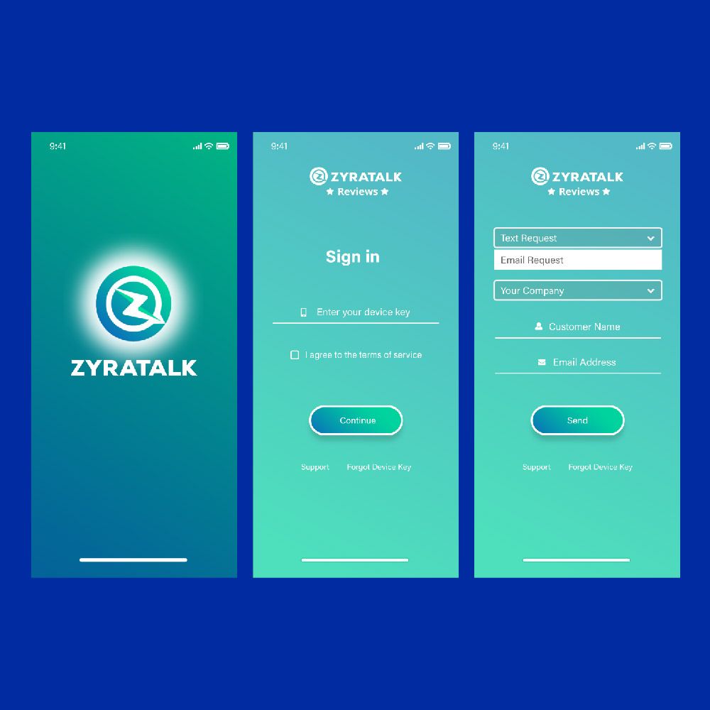
Related to maintaining a manageable cognitive load is having a clean UI. After all, visual info is still info. That said, a cluttered interface can make the app too “noisy” to look at; it’s not good for UX.
Just like with logo designs, in UI, less can be more. Here are a few tips to keep your interface as clutter-free as possible.
- Only present the visuals and info that the user needs at the moment.
- Minimize features and eliminate unnecessary ones.
- Simplify visuals as much as possible.
Here’s an example of a clean interface:
3. Familiar Features
You’ll want your app to be unique, but not too unique that learning how to use it will be tedious.
If you look at Android app design templates, most use the same familiar features. For instance, you’ll most likely see these familiar screens and buttons such as:
- Getting started
- Search Results
- Notifications
- Go Premium
- Newsfeed
By using these familiar features, you’re allowing the users to use the app without much preparation. It also helps avoid cognitive overload, which could result in high bounce rates and poor engagement.
4. Task Breakdown
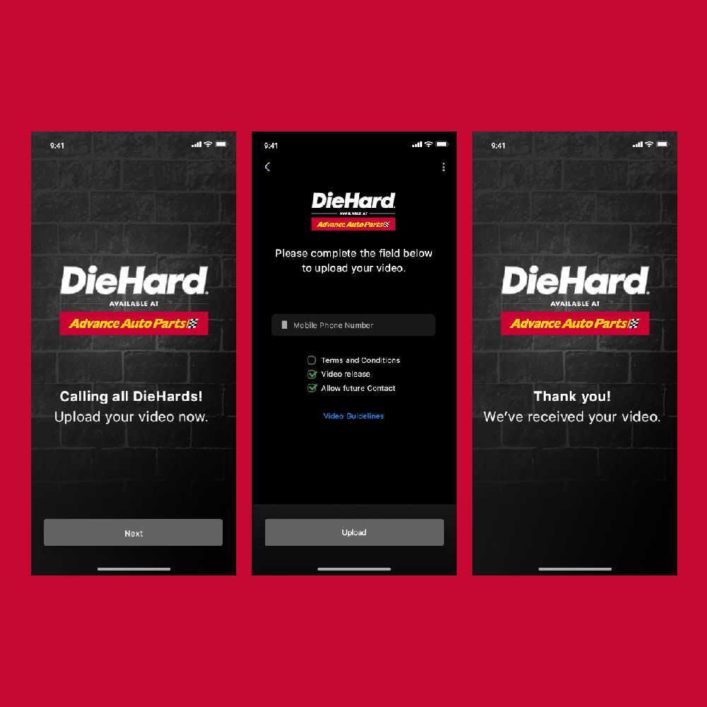
As any Android app design tutorial would advise, it’s best to break down tasks into smaller chores.
You need to be familiar with a concept called progressive disclosure – it’s a design pattern that involves dividing and actions into several screens.
The image above is an example of a UI design that breaks down the task of uploading a video into three screens.
For instance, instead of creating a long sign-up form, it’s better to sequence it into four bite-sized segments. Many apps divide the information into four parts:
- Personal information
- Billing Address
- Payment, and
- Review
As much as possible, however, it’s best to avoid a sign-in wall or the mandatory registration before a user can proceed to an app.
The sign-in wall can increase the number of users who abandon the app because of the additional task required from them. This is the reason why many apps offer the “Continue with Google” or “Continue with Facebook” option.
Android App Design vs. iOS App Design
The factors above apply to general mobile app design guidelines. But what about Android app design in particular? What makes it different from iOS apps?
Here are a few basic examples of how Android app design guidelines differ from that of iOS.
- Navigation. There are many differences between the top-of-the-screen, primary, secondary, and back navigations of the operating systems. For the primary navigation, for instance, Android has a floating button, search bar, and overflow menu spread across the screen. For iOS, however, these navigation features are arranged horizontally at the bottom.
- Buttons. The buttons for iOS are mostly flat, while those for Android use shadows.
- Icons. Android and iOS icon sizes differ depending on the home screen size. The Android icon size may vary from 48 x 48 pixels to 512 x 512 pixels, depending on the screen size.
- Typography. Android uses Roboto default system typeface while iOS uses San Francisco.
*Insert Graphics – Android App Design vs. iOS App Design? (IN QUEUE)
Requesting an Android App Design the Easy Way
Knowing the basics about Android app design doesn’t necessarily mean you’ll need to do it by yourself. After all, it takes loads of experience to come up with a UI that hits the mark.
The most time-efficient marketers turn to Penji for high-quality designs. That way, they can focus on branding and marketing tasks while a pro designer handles the app’s visuals. Best of all, requesting a design from us only takes three steps:
1. Create a Project
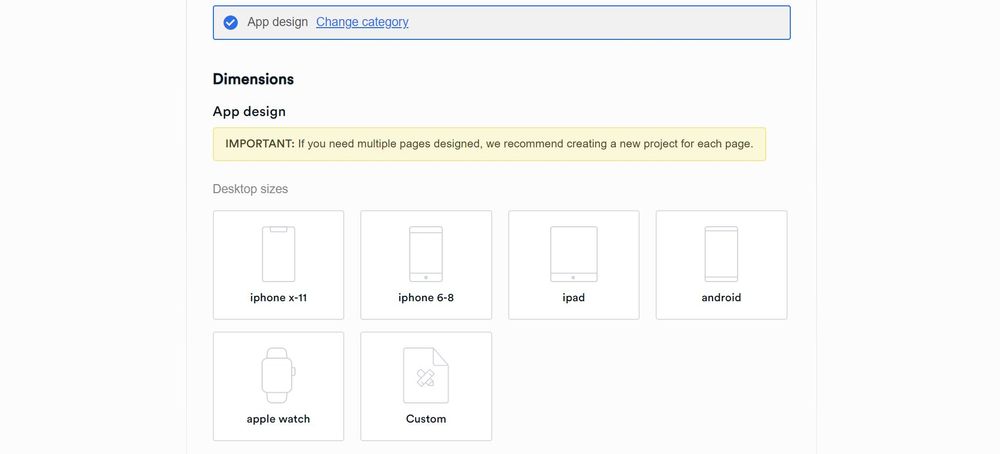
In the Penji dashboard, click New Project. Type the project title. In the design category, select app design, then select the screen size you need such as Android, iPad, iPhone, or Apple Watch. If you can’t find the screen size you need, click Custom. If the app is already existing, paste the link.
In the description page, type in the details of the project including what your app does, your target audience, and the color scheme. Click Create Project. The project will be assigned to a UX/UI designer well-versed in your industry.
2. Review and Revise
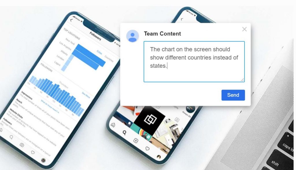
Within 24 to 48 hours, the assigned designer will send you a draft. To view the design, just click on the file within the thread. If you need anything revised, simply click on the part of the graphic and type in your comments. The design will be returned to the designer for revision.
PRO TIP: All our packages come with unlimited revisions, so feel free to ask for revisions until you have the UI you’re happy with.
3. Download
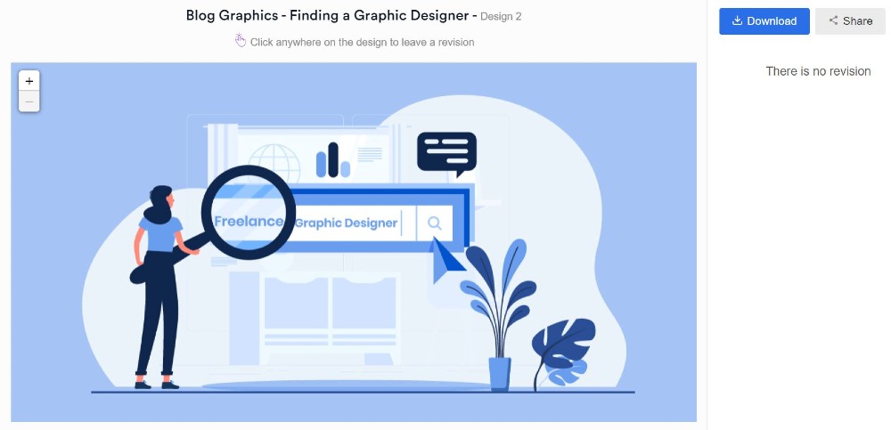
Once you’re 100% satisfied with the design, click the Download button at the upper right corner. The graphic will be saved right to your computer. You can check out samples of our work from our portfolio.
The Lowdown for Marketers
Before you worry about social media marketing strategy and optimizing your app store page, fully understanding your app design is the first step to knowing how to frame it in a way that will appeal to your audience.
And with Penji by your side, you can get an Android app design so stunning, it will market itself. Sign up today and try any of our packages risk-free for 15 days.
Like what you learned? Share this post on social media!
About the author

Carla Deña
Carla is a journalist and content writer who produces stories for both digital and legacy media. She is passionate about creativity, innovation, and helping small businesses explore solutions that drive growth and social impact.


