
According to eMarketer, banner ads are some of the most popular types of display ads. Designing banner ads that get the user’s attention, communicate your message clearly, and prompts them to take action is an art form.
At Penji, we’ve designed literally thousands of banner ads for our agency clients, so we know a thing or two about what works and what doesn’t. Here are the best tips used by agencies to create captivating banner ads that drive clicks. Let’s get started!
[in_content_ads gallery="digital-ads" logo="off" title="Generate leads the most obvious way" subtitle="Your next ad will do well...if the design is right." btntext="I need this!" btnlink="https://penji.co/pricing/?affiliate=J2O5AB8RAR3386837"]TEST 5-10 Headlines At A Time
The best way to get viewers’ attention is through the use of a killer headline. However, most aren’t testing their headlines. When conducting an A/B test for your headlines, put together anywhere from 5 – 10 different headlines and test them all at once. Don’t be afraid to try edgy or non-traditional headlines. After you have data on which headlines work, continue A/B testing your headlines. This should be a constantly evolving process.
A good headline also must deliver on the promise, otherwise, you’re wasting your ad spend. Avoid clickbait ad headlines, where the initial promise isn’t consistent with the actual offer. This could be the fastest way to lose your audience’s trust.
Avoid Generic Stock Photos
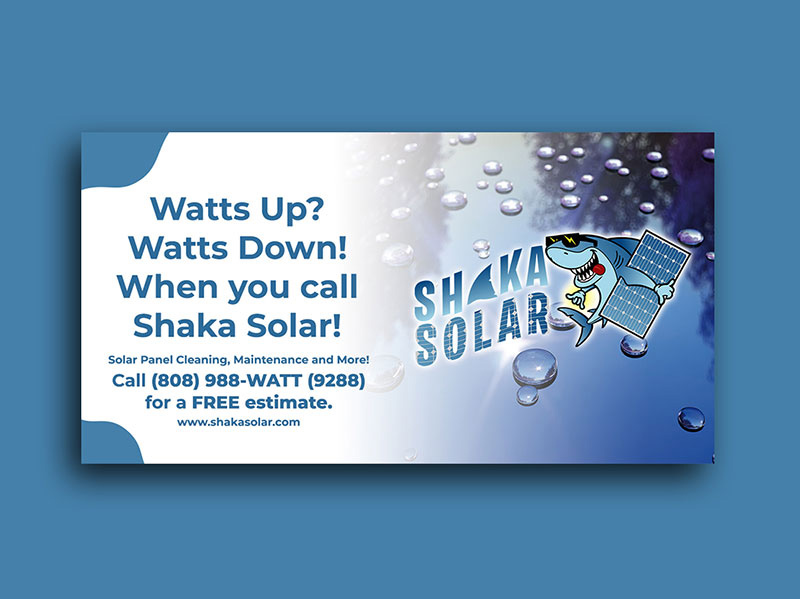
What makes the above banner ad design so compelling isn’t only the headline. Actually, the image and the text complement each other perfectly, making this one a fantastic banner ad. Given how important the graphics are, avoid using generic stock photos. They used to be “eye-catching” 20 years ago. Today, the same ones are still circulating, and you need to avoid them like the plague.
If you have the budget, hire a professional photographer to take custom photos for your campaign. A single photoshoot can run you anywhere from $500 – $1000, but you’ll have enough photos recycle for the entire year. It’s well worth the investment.
Make every word count
You don’t want to oversaturate your banner ad with rows after rows of texts. The purpose of the banner isn’t to tell them everything about your company, product, or offer. The purpose is to get their interest, and then link them to a web page that goes into depth.
Every single word on the banner must serve a purpose. Remove filler words such as “The”, “Just”, “That”.
Here’s an example:
Instead of… “We’re just the better solution for smarter teams”
Use…”Better solutions for smarter teams.”
See the difference? For your banner ad copy, read it out loud and make every word count.
A/B Test the CTA Button
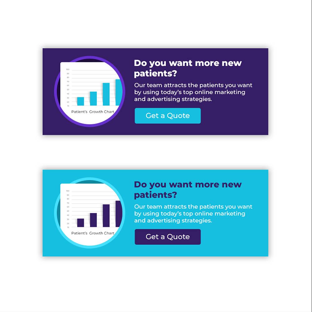
The Call to action buttons is often ignored when conducting the A/B test. They’re one of the most important elements of the design – literally the gateway from the banner ad to your landing page. So take special care of them. We’ve even advised some of our clients to run a separate A/B test just for the CTA.
Match Your CTA With The Banner’s Intent
The texts on the call to action should match the intent of the banner ad. For example, if you’re just providing information and you want them to learn more about your product/service, the CTA should be labeled “Learn more”. If you’re running a promotion and want them to grab an offer while supplies last, then “Claim Offer” is more appropriate.
Experiment with colors
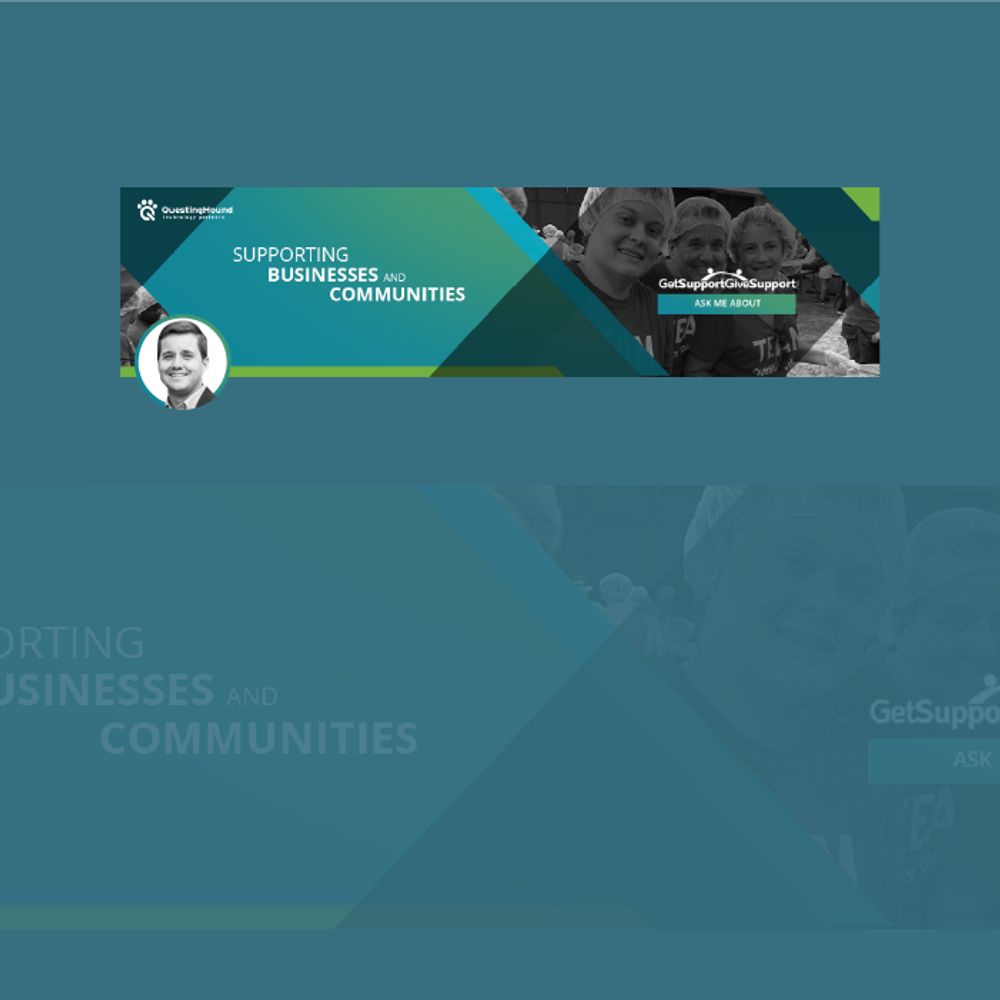
A well-designed advertisement fully takes into consideration the emotions that color elicits. Don’t over-saturate your design with your brand’s color. Make each palette count and use colors in accordance with the reaction you want to get. You don’t always need to use the colors of the brand’s logo.
Limit Ad Details
The objective is to lead consumers to your website and not to confuse them. Too many details on an ad can bore people away. Who wants to read too much text on an ad when all they wanted was to read the main article? In addition, avoid using too many images, icons, or illustrations.
Choose Fonts Carefully

The aforementioned banner ad issue brings us to fonts. The banner ad above shows how much typography can affect a design. A general rule of thumb is to use as few font types as possible. The same way you choose colors wisely, so should you with fonts. You need to keep your readers focused on what’s important in your ad. The trick is to keep your banner ad design simple.
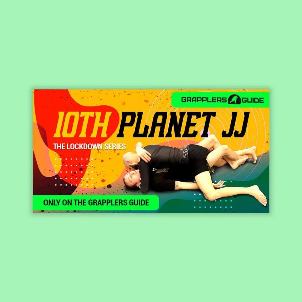
Here are a few examples of banner designs that we have designed for previous clients:
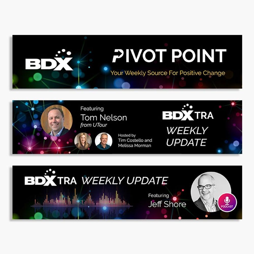
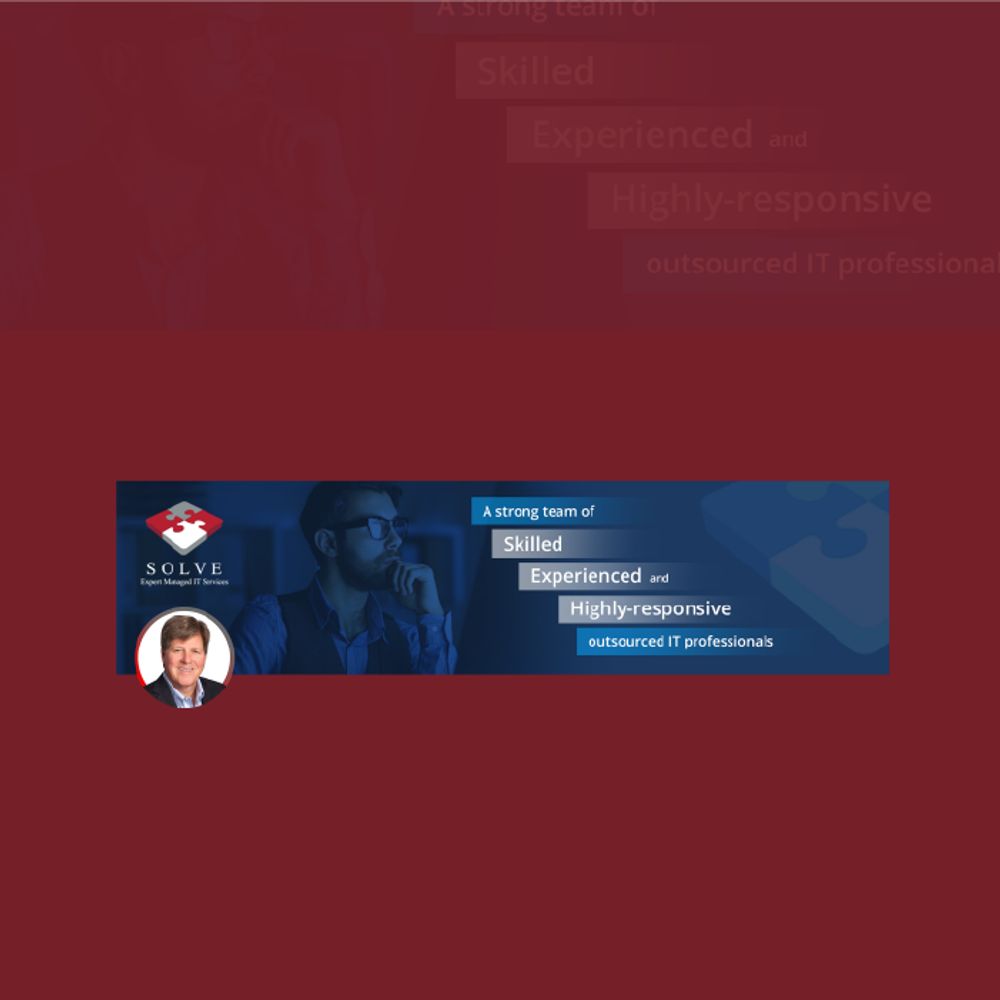
Requesting an Ad Banner Design from Penji
Clients turn to us whenever they need a high-quality banner design fast and easy. In fact, with a turnaround time of 24 to 48 hours, time efficiency is one of our strong points, along with professionally-crafted graphics, of course!
In addition to that, requesting a design from us is as easy as 1,2,3:
1. Create Project
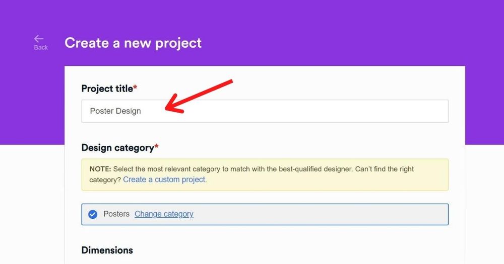
In the dashboard, click on New Project. Type in the title of the project and select a category. If you can’t find your project category from our list, click “Custom Project.” On the description box, describe what you want to achieve with your design.
You can be as detailed as you want to be in this section – our designers will read through each and every word to make sure that they fully understand what you need. Click Create Project.
2. Review and Revise
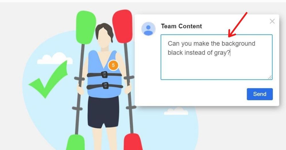
The project will be assigned to a designer. In 24 to 48 hours, a draft will be sent to you for review and possible revision requests. To view the design, just click on the file on the thread.
If you need anything revised, click on the part you want to change and type in your comments. The designer will take your recommendations and revise the design until you’re happy with it.
3. Download
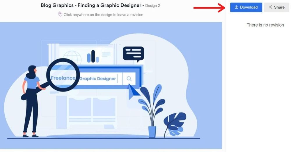
Once you’re satisfied with the design, click the “Download” button and it will automatically be saved to your computer.
Final Thoughts
All these practices can be overwhelming for a non-designer. But understanding how to create a good banner ad design is a must. You can always count on Penji to create head-turning banner ads for you. Sign up today and get to try any of our packages risk-free for 15 days!
About the author

Celeste Zosimo
Celeste is a former traditional animator and now an SEO content writer specializing in graphic design and marketing topics. When she's not writing or ranking her articles, she's being bossed around by her cat and two dogs.


