
Before you choose all the furniture, fixtures, paint color, and decor in your house, you’ll have to have a basic floor plan. And that’s exactly what a UX wireframe does for a website or a tech product. In this article, we’ll discuss why it’s crucial for marketers to learn the significance of UX wireframes. We’ll also take a look at some great examples to inspire you as you create your very own blueprint.
Don’t have any idea how to create wireframes? Penji is here to help. Serving startups, marketing teams, and agencies, we offer unlimited designs at a flat monthly rate. Whether you need logo designs or visuals for your ads and other marketing efforts, our expert artists can do it. Schedule a demo to learn more about our services.
Intro to Wireframing
Building a website or an app from scratch requires planning, and that’s what a wireframe is for. Creating one allows you to build a low-fidelity “map” of the product. While the elements don’t have to be exact, it puts you, the designer, the developer, and other members of the team on the same page.
But when exactly should you create a wireframe?
Usually, a low-fidelity UX design is built right from the brainstorming process. In this initial phase, you can easily use online UX wireframe tools or wireframe mockup options. If you don’t have the time to learn wireframe tutorial at this phase, don’t fret. Even simple sketches will do at this point. Doing so can help you picture how it will all look like as you plan the features and functions of the product.
Some of the things you have to weigh when wireframing include the following:
- Users’ motivations for using the product
- Goals they want to achieve
- Tasks they need to do
Further into the planning process, you will most likely hone and fine-tune your ideas for the product. Once ideas are finalized, many find it crucial to have a high-fidelity wireframe, ideally created by a graphic designer. The image will serve as a guide for visual designers, developers, and other members of the team during production.
The Benefits of Wireframing an App or Website
Why should you put effort into creating a clear blueprint before your team starts producing the app or website? A well-built wireframe offers these perks:
- It can act as a distinct source as programmers develop and explore product functions.
- You catch any possible usability issues from the get-go, long before you load branding assets into the product.
- Stakeholders will be able to review the creative and technical functions more clearly.
With all these benefits, a wireframe can indeed pave the way for smoother product development.
Wireframe vs. Mockup vs. Prototype
A wireframe is usually confused with mockup and prototype during product planning. Here’s a quick comparison of the three:
- A wireframe is a simple visual design of the interface. It can be low-fidelity or high-fidelity.
- On the other hand, a mockup is a high fidelity design with exact and pixel-perfect precision. It’s high-fidelity and more detailed but isn’t clickable.
- A prototype is a clickable and high-fidelity design that’s closest to the look of the final product.
10 UX Wireframe Examples
Here are some UX wireframe examples you might want to review as you plan your project.
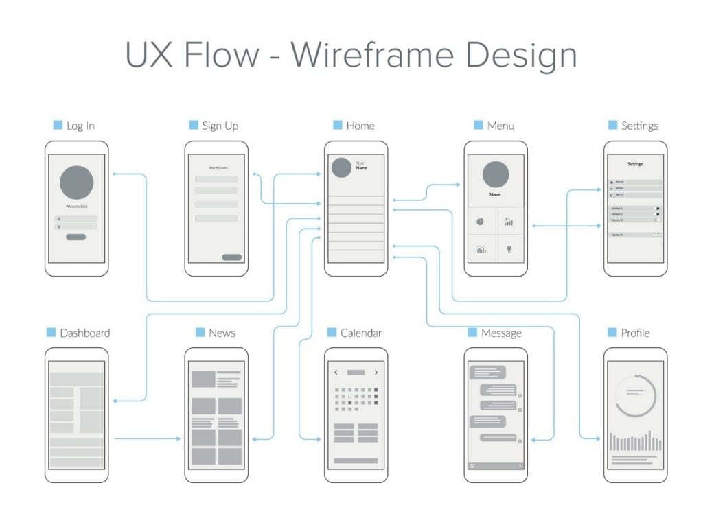
Image Credit: Shivraj Singh
This wireframe by Shivraj Singh shows how a simple image can make it a lot easier to grasp the design and functions of an app.
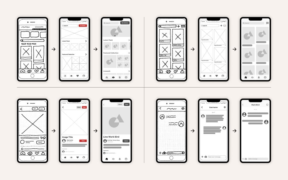
Image Credit: Aaron Akbari-Mort
Aaron Akbari-Mort created this design for an app for tattoo enthusiasts called Inktank. It shows the passage of a design from a sketched low-fidelity wireframe to a high-fidelity image and then to a mockup.
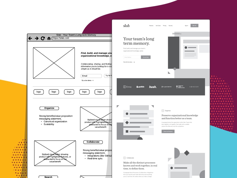
Image Credit: Shabnam Gideon
With this image, Shabnam Gideon gives us a great look at how a low-fidelity wireframe translates to a high-fidelity one. The first version shows a loose layout, while the second one offers a more detailed display, complete with logos and font.
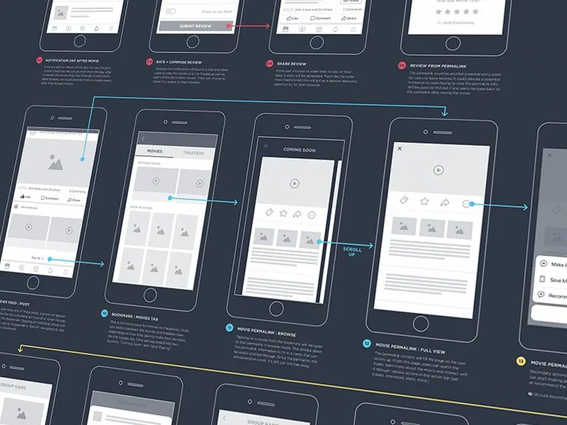
Image Credit: Autumn Mariano
Though grayscale wireframes are enough to show the layout, Autumn Mariano went the extra mile by using color-coding to map the UX flow. This technique will be useful in complex projects such as financial website design.
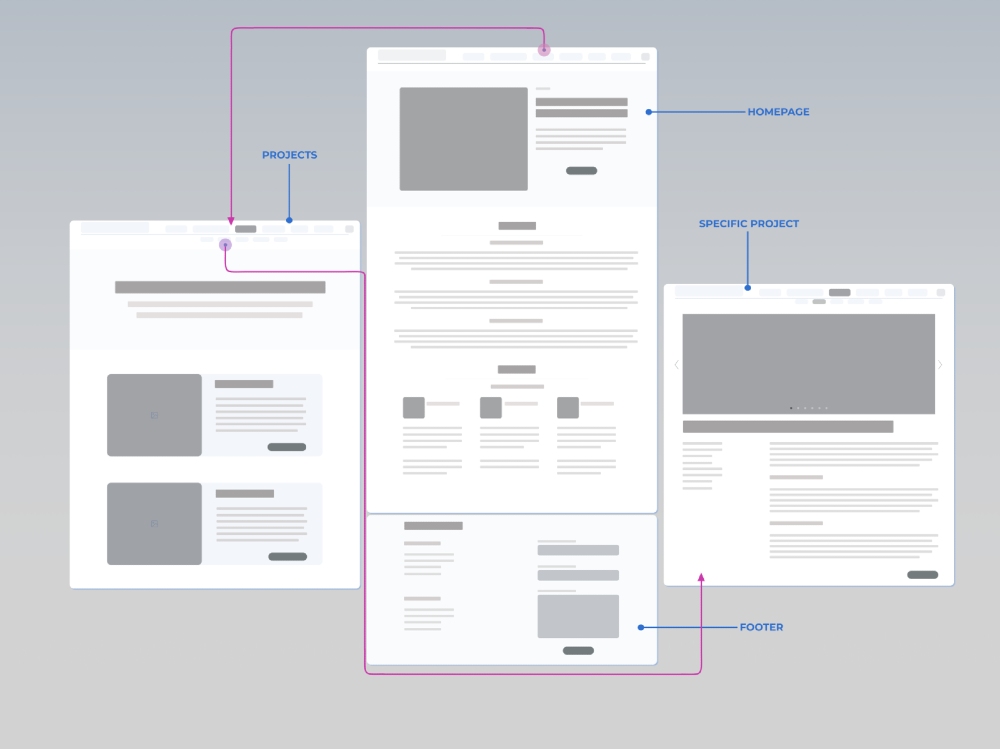
Image Credit: Edyta Jabłońska
Edyta Jabłońska made this UX wireframe for a website redesign of a client. Even though it’s low-fidelity, it gives a clear picture of the layout of the site elements.
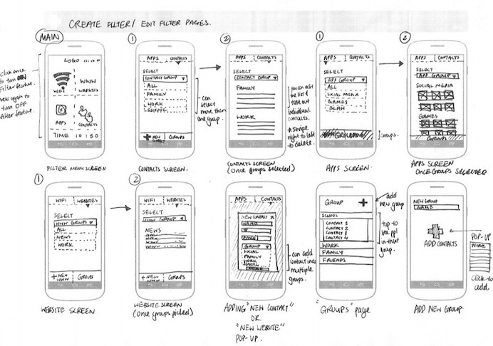
Image Credit: Jiani Lu
This example created by Jiani Lu shows how a sketched plan can be a useful visual design of a given product. The series shows how to use the interface of a smartphone app.
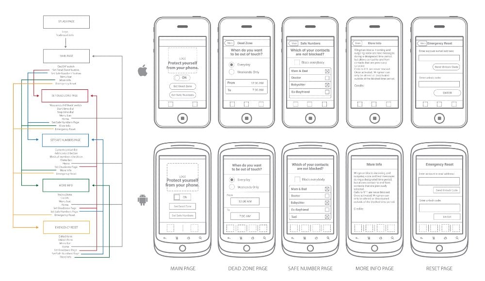
Image Credit: Andrew Brennan
This design by Andrew Brennan shows a mobile app wireframe coupled with a flowchart of its functions. It also offers a glimpse into how the product will look like in Apple and Android.
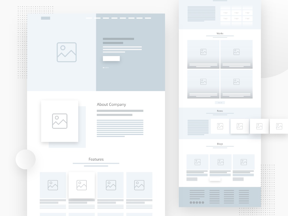
Image Credit: Pavan Penurkar
This illustration by Pavan Penurkar shows how a first layout is geared to show only the basic features and functions. As seen, the design doesn’t show the color, fonts, or graphics of the actual project.
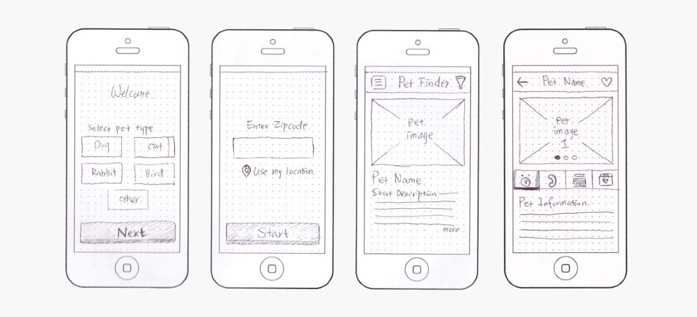
Image Credit: Wen Xiong Design
This design from Wen Xiong Design was made for a pet adoption mobile app. The design was well-suited for a product that aims to help users find available pets nearby.
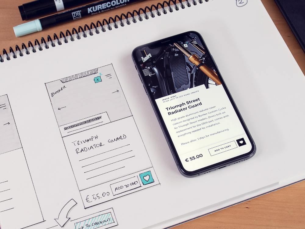
Image Credit: Ufuk Cetincan
If you’re wondering how the initial visuals would translate to the final product, this image is a great material. The design is by Ufuk Cetincan for a custom cycles business.
Use Penji for Your UX Wireframe
We cannot emphasize enough how important it is to come up with your UX Wireframe. This will be your backbone for your website and app. Thus, you need professionals to work on it. If you want a team that can perfectly handle your design requests, Penji is here to help. They have an easy-to-use platform, and you can get your designs the soonest possible time. All for a fixed fee every month. Here’s how you can enjoy their services.
Sign Up and Start Requesting for a Design
They have several plans to choose from and you can get the one ideal for your business requirements. Make sure to sign up and get access to their user-friendly app.
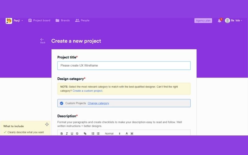
After signing in to the platform, you can already see the dashboard that is easy to understand. We bet you won’t need extra help to use it. But just in case you need it, our team will offer assistance.
Find the New Project button. This is located at the right corner of your screen. Just click that in order to go to the next page where you can request designs, specifically your UX wireframe.
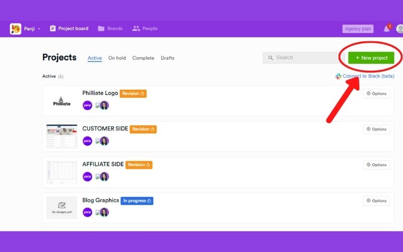
Just answer the guide questions and supply the necessary files if these are available. The Penji team made it easier for our clients to create project requests. Thus, we created these guide questions so you won’t miss out on any details. As a result, the designer can work on your project as soon as possible. When you are done, just submit it.
You will automatically receive a message that a designer will be assigned to you. From there, your designer will send you a message if there are points for clarification. Likewise, they will provide you updates about your request.
We encourage you to check your account often so you won’t miss any messages. But, you can also check from your email because you will be notified of any action that is happening in the app or your request in particular.
Review the First Draft and Send Feedback
As a rule of thumb, you will receive your first draft within 24 – 48 hours. But expect that UX wireframe requests will take longer considering its complexities.
Once you have the first draft at hand, it’s always encouraged to take a closer look. And how can you do that? You just simply need to click on the image. Now that you can see the design up close, you can already pinpoint the areas where you are not fully satisfied. From there, you can click it and a comment box will pop. Type your comments directly so that the designer will be notified.
In extreme cases that the designer is not able to satisfy your needs, you can always ask for a replacement.
Download the Source Files Whenever You are Convenient
Already happy with the output? Now, you can download the source files whenever you want to. You can skip emailing your designer to request these files. Thus, making the entire process fast and efficient.
Most of Penji’s clients are always more than happy to get our services over and over again. And that’s understandable considering the output we provide and their overall experience with our team. If you want to enjoy the benefits of hiring our unlimited graphic design services, sign up now.
Final Thoughts
A solid UX wireframe makes it possible to produce a website optimized for user experience. Let’s revert back to the house construction comparison. You can use the classiest paint colors and most stylish flooring tiles in your home, but if the bathroom is placed in the middle of the patio, there’s a slim chance anyone would want to visit, let alone live in it. A great design usually requires ample planning. And if you want to build a product your market will enjoy, using a UX wireframe is a good start.
About the author

Carla Deña
Carla is a journalist and content writer who produces stories for both digital and legacy media. She is passionate about creativity, innovation, and helping small businesses explore solutions that drive growth and social impact.


