
It’s a no-brainer – advertising is vital to your entire business. Without functioning ads, there’s no sales. Without sales, there’s no business. And while many would consider advertising to be a science, it can be practiced more like an ongoing creative project. It’s not just numbers and selling (if it were, things would get boring quickly). This is why advertising is art. In this article, we’ll look at some companies who totally get it, and their success says it all.
If you’re searching for ways to come up with art ads that will drive sales in 2023, check out Penji. With unlimited designs at a flat monthly rate, you’ll have ad visuals crafted by experts at an affordable rate. Penji designers can craft the most artful designs to help your brand thrive. Whether you need designs for social media marketing ads, print posters, apps, websites, vector drawings, or anything else, Penji is your best bet.
Why is Art Important in Advertising?
Before we dive into why is art important in advertising, let’s discuss the definition of both components first. Advertising at the most basic is paying for space in a medium to promote a product or service. Art, on the other hand, is an expression of ideas and themes through creative skills.
Melded together, advertising art is using creative skills and ingenuity to produce a material meant to promote. It’s using and editing the best photos, illustrations, videos, or digital materials to tell a brand’s story in the best way. When you review at the artful creation of the most clever ads, it’s easy to grasp why advertising is art.
Not all marketers, however, see this perspective. Many newbies, for example, think that an ad is simply posting a photo of the product along with a copy. But marketing a brand or product should go beyond posting a press release. Visual ads, both disruptive and traditional, should make the most out of design to convey meaning and urge viewers to support the brand. The copy, usually created by expert copywriters, should complement the visuals and tie the whole ad together.
So, just how exactly do ad design experts do this? The answer is visual rhetoric. Though it may sound a bit scholarly, it’s worthy to learn about visual rhetoric or the theory of how visual elements are used to express an idea.
Expert graphic designers would know how to rhetorically craft a material so that it talks to viewers’ conscious and subconscious minds.
10 Companies that Prove Advertising is Art
Here are 10 companies that show how advertising and art can go hand in hand. Take a look at how these art ads convey their messages creatively and spark intrigue among viewers.
McDonald’s

This promo McDonald’s ad from Canada in 2018 exudes classy visuals without looking passe. The ad was made to promote their Big Mac x Bacon Collab Limited Edition burger. The campaign anchored on the exclusivity of the fashion industry and infused themes like streetwear and sneaker culture. The black and white filter adds a dose of culture to the visuals.
IKEA

This Ikea ad for the furniture and appliance store in collaboration with Hay is every bit of stylish, modern, and graceful. The video starts with a text that says, “Curious about the future Scandinavian design.” It then treats the viewers to a relaxing, abstract short film that features a rolling glass ball, unraveling threads, and floating fabric.
Australia Post
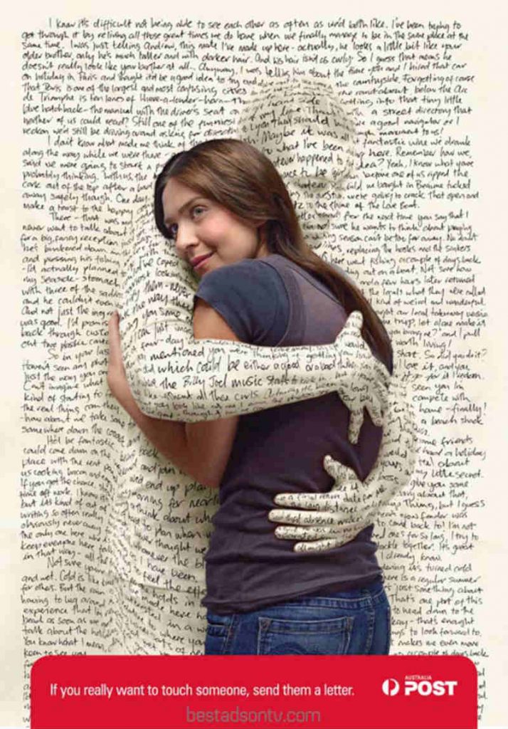
This state-owned corp provides postal services in the land down under. Their promo poster aptly expresses the heartfelt warmth of getting a handwritten letter akin to a hug. Amid the popularity of online options such as email and chat apps, the pretty image conveys a golden message.
Conservation International
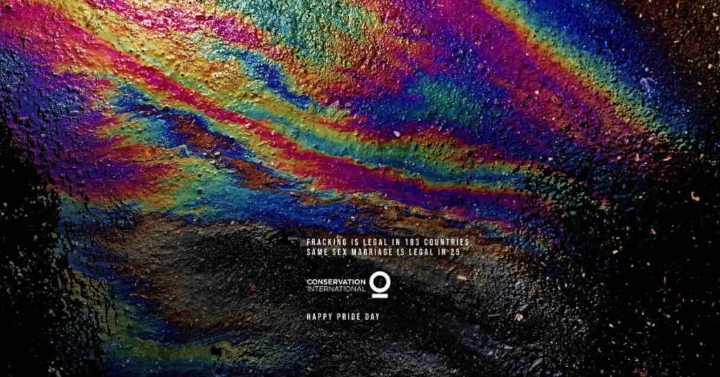
The org works to protect nature and conserve it as a viable source of fresh water, food, livelihoods, and a stable climate. Thus, this image that they released for Pride Day marries their main advocacy with another timely cause. The photo of rainbow-colored fuel drippings on a dark pavement paints the message creatively.
Ipanema
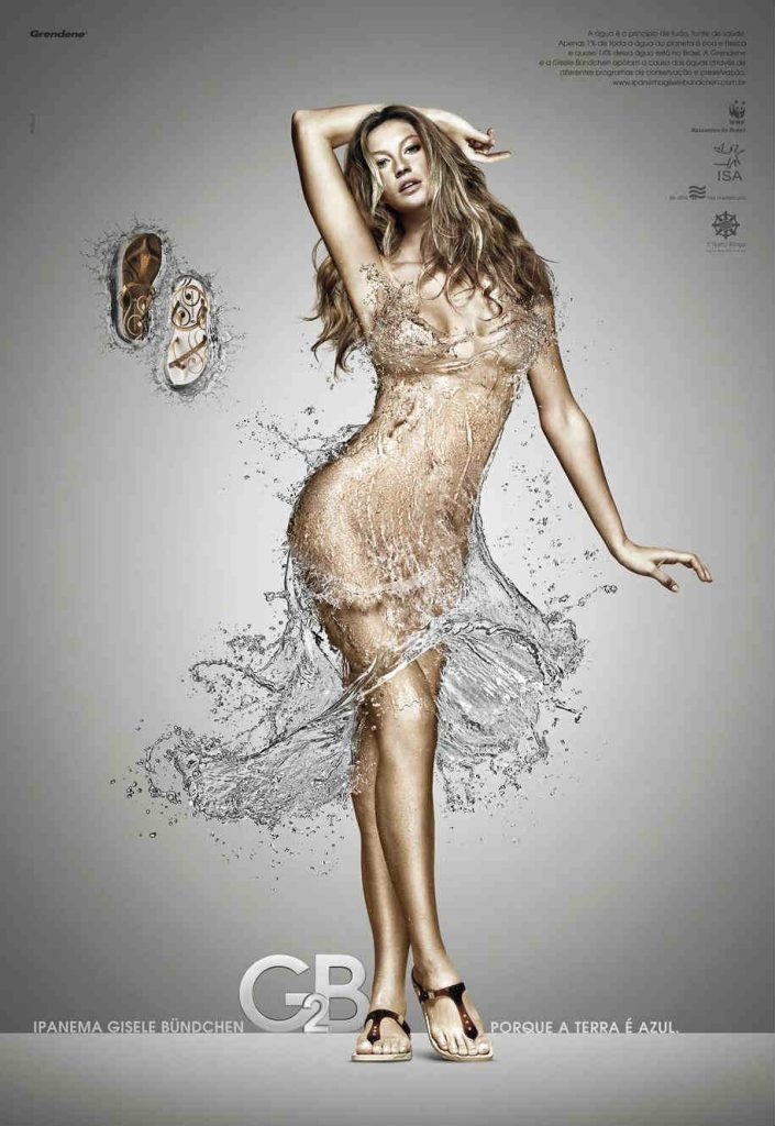
This poster from the Brazilian-based footwear venture is a cross between an editorial photo and an image of a sculpture. The muse, Gisele Bundchen, looks stunning wearing a pair of sandals and what looks to be a sassy dress made of water splashes. The collaboration aims to raise awareness about the conscious use of water, thus, the water element in the image.
Jeep
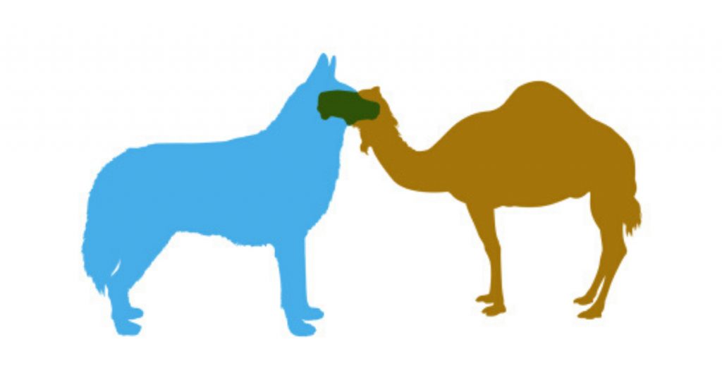
This award-winning Jeep ad paints the brand as a common ground between two wholly different worlds. The image features a cool blue wolf and a warm gold camel coming as one to form a Jeep in its signature green hue. This simple but artful ad won various awards such as the Gold Outdoor Lion feat at Cannes.
Hut Weber
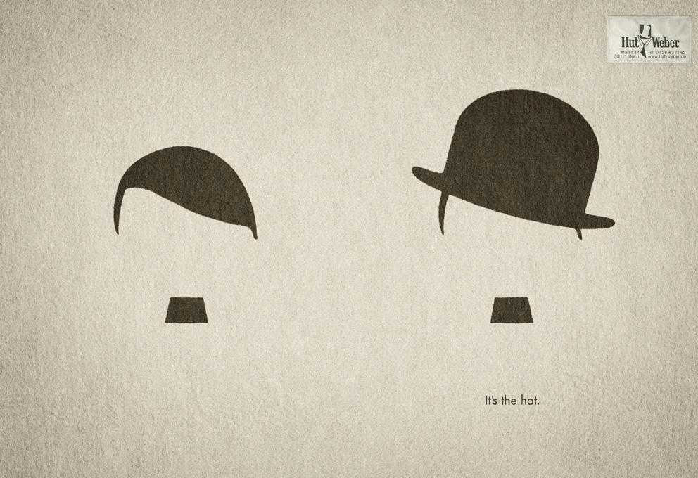
This German hat brand broke a taboo with this simple but creative poster. The image features black drawings resembling heads of hair and mustaches on what looks like a piece of old paper. The one on the left looks like Adolf Hitler and the one on the right looks like Charlie Chaplin. The clever copy says, “It’s the hat.”
Budweiser

The US-based pale lager brand previously released this ad that shows how they support a worthy cause. The campaign was meant to highlight their steps to brew their beer with 100% renewable energy. Accordingly, the image features a vacuum inside a glass of lager that also resembles a tornado. The copy says, Beer Against Climate Change.
KitchenAid

You can’t get artsier than taking the lead of famous artists. This KitchenAid ad for the home appliance brand under Whirlpool Corp features images inspired by the art of French fauvism icon, Henri Matisse. The campaign also features images inspired by other artists like Andy Warhol and Salvador Dali. Quite literally, this advertising is art!
Luxor Highlighter
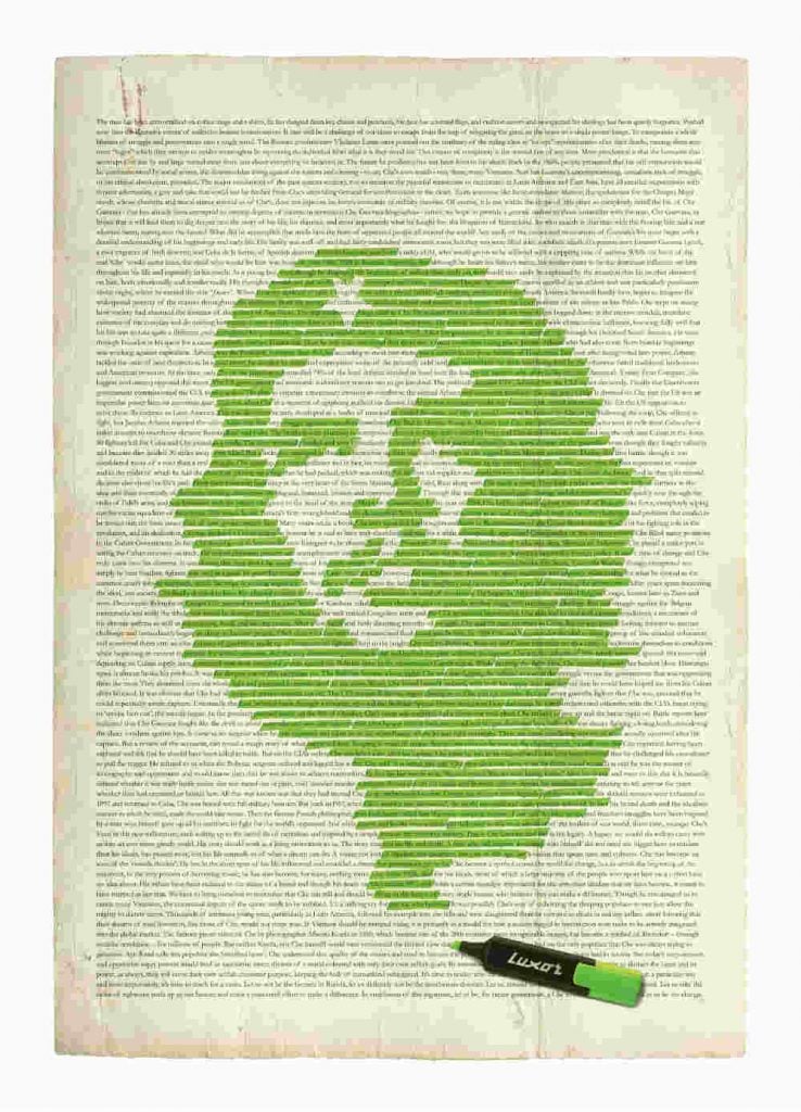
This ad from Luxor features a creative image of how their product is used in action. The photo shows a page from an old book, with highlights that form the image of Che Guevara. Interestingly though, if you zoom in to the ad, you’ll see that the content on the page is really about the guerilla leader. More impressing is how the whole piece makes sense and how the highlighted part summarizes the piece, thus combining beauty with meaning. Its another example of why advertising is art in many cases.
About the author

Carla Deña
Carla is a journalist and content writer who produces stories for both digital and legacy media. She is passionate about creativity, innovation, and helping small businesses explore solutions that drive growth and social impact.


