If you’re in charge of marketing in a company or work with creating marketing materials, then this article is for you. Graphic design for marketing materials and ads isn’t the same as other designs. Just because something looks great doesn’t mean it works great. Your design usually has a particular focus, whether it’s to attract clicks, entice a user to perform a specific action, or convey your brand/company’s message quickly and clearly.
As marketing becomes visual, follow the trends by using Penji. Don’t let your marketing efforts go down the drain. Penji, an unlimited graphic design service, can help enhance your marketing strategy. You need high-quality and professional marketing materials. It can widen your reach and increase engagement rates. Take a look at what our Penji designers have produced for our clients.
Here are 10 powerful ways you can create marketing graphic design to get better results for your efforts!
1. Do extensive research

This might come off as obvious, but a lot of times marketing teams just don’t do their proper research before creating their marketing materials. What are your competitors doing? What kind of content are they putting out? How are they crafting their content? And what kind of language are they using in how they are marketing graphic design? Before you even start designing your marketing materials, make sure it’s needed. And make sure it’s competitive relative to your competitors
2. Create a smarter “Ideas” folder
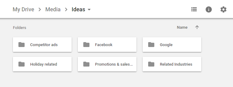
You probably have ONE idea folder clumped with everything under the sun. It’s probably become just a dump for anything you find remotely interesting. And going through it is likely more work than just doing your research all over again. Don’t let this happen and create an “Ideas Folder”. Within your Ideas Folder, have sub-folders labeled based on criteria relevant to you. It could be organized based on social media networks, ad-types, marketing material types, or different target audiences.
Every time you decide to save something to these folders, don’t just accept the default name. Rename the image to something more relevant so you can recall it later. Let’s take a look at “FB_CleverSlogan_1.PNG” vs “IMG7918762.PNG”. By using the platform and its purpose in the title, you can remember it in the future. Compare that to a generic title, and you save time.
3. Test Your Headlines/Taglines

If you’re designing an ad, promotional material, infographic, or social post, then you’ll likely need a solid headline/tagline to entice your viewers. Come up with at least 25 (yes, you read that right) tagline/headlines. Then whittle them down yourself to the best 10-15. This process is important because only through the elimination process will you know what you don’t want in your ultimate design. Then present your final list of 10 – 15 to your office mates. Grab them while they’re having lunch or getting coffee and run down the list asking them which one resonated with them. Keep a simple tally next to the ones that people are checking off, and there’s your list of winning headlines/taglines.
4. Design for your audience
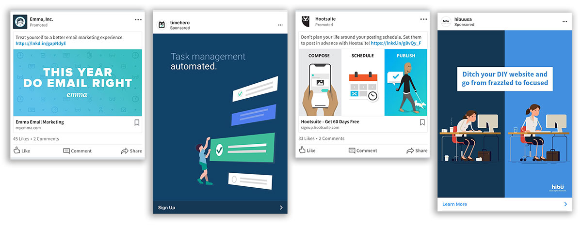
Here are some examples of good marketing designs that clearly had their audience in mind. Designing and creating content/marketing graphic design specifically for your audience may seem like common sense to marketers, but it’s one that’s easily forgotten. Your marketing materials are only effective if your target audience “gets” it. And they’ll only get it if you design it specifically for them. When designing your marketing graphics, keep your audience in mind and ask yourself, “Would they get this?” frequently. Putting yourself in their shoes and asking that question allows you to see from your customer’s perspectives. Often times you’ll catch yourself designing for your boss or for people in your industry instead of customers who don’t have your knowledge or understand your lingo.
Watch a Penji demo video to know how our designers can help you with this.
5. Have good photography on hand

Avoid using the same photos that all your competitors are using from free stock image websites. These websites are great resources, but after a while, everyone starts recycling the same photos again and again. If you want to market graphic design more effectively, invest in good photographs. Either hire a professional photographer or ask one of your office mates who happen to own a good camera to plan a few good shots around the office.
Don’t worry too much about how they will be utilized just yet. Just take a bunch of photos and save it to your collection for use later. When the time comes, you’ll have a large selection of professional photographs to use for your marketing materials, and it’ll always look 1000x better than stock images.
6. Have a clear style guide/brand guideline
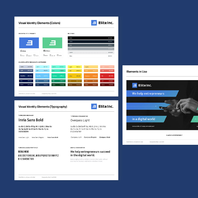
You definitely don’t want to just wing it and use whatever colors/fonts available to you. Make sure your company has a clear and intuitive style guide or brand guideline (they’re the same thing). And make sure you follow it. People don’t just recognize your message, they also identify you with your brand. And the more consistent your brand is, the more likely they’ll be able to quickly and easily identify your brand and your service in the future.
[in_content_ads gallery="Marketing" logo="off" title="Create smart, effective campaigns efficiently" subtitle="Meet your conversion goals using visuals that stand out" btntext="I need this!" btnlink="https://penji.co/pricing/?affiliate=J2O5AB8RAR3386837"]7. Space = Elegance
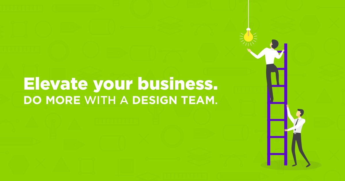
If you happen to not be a graphic designer – don’t sweat it. I’ll show you a quick trick that will turn you into at least a C-grade designer. Inexperienced marketers like to fill empty spaces. A general rule in graphic design is that space is elegance, and you’ll want to use this minimalistic graphic design style to your advantage. Having space around any particular element brings focus to that element.
If you want a message to be read loud and clear without distractions, put it in the center without anything else around it. Simplicity and space create elegant designs that truly speak to your customers. The graphic above was made for another article. We intentionally left a lot of space around the text in order for your eyes to zero in on our message.
8. Diversify your materials
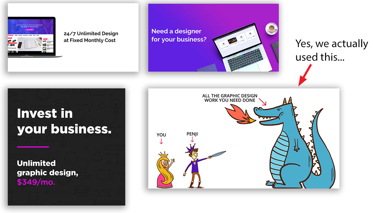
If how you go about marketing graphic design is primarily digital and will be shared through various networks, then consider diversifying your style a bit. Don’t always show the same types of design, in presented in the same fashion etc. If you’re always presenting text on left, and image on right, then consider text on top and the image below.
If you’re always using stock photos with text overlay on top, consider using a solid background + flat image + text. These are just some examples. The idea is you need to be diverse with your presentation, even if you’re presenting the same ideas/message to your audience.
9. Capitalize on holidays

More companies should do this. Take a look at your calendar and see what major AND minor holidays are coming up and plan how you will be marketing graphic design around those themes. But don’t just focus on the major holidays that everybody celebrates. Take advantage of the minor holidays – they’re often more fun/witty and provide a bit more value to your audience since they probably didn’t know that holiday existed until they saw your content.
Did you know April 12 was national Grilled Cheese day? What about April 14th International Moment of Laughter Day? Now imagine how much more fun and memorable your marketing materials would be if you capitalize on these fun holidays. You can find more of these fun and whacky holidays here.
10. Write for a specific audience

Without a doubt, your written content is a part of “design”. Don’t make the mistake of thinking your graphics and content are 2 separate pieces of the puzzle. They’re the same piece and needs to be thought out and coordinated together. Some of the most effective marketing materials and advertisements target one specific audience. The more hyper-focus your targeting is, the more appealing it will be when your target audience encounters it.
Don’t make the mistake of creating marketing designs for a wide target audience to save time and money, chances are it won’t work out. Instead, you’re blowing money on marketing materials and advertisements with low ROI. Stick with effective marketing campaign ideas with proven success.
Related article: 10 Marketing Ideas For Events That Actually Work
11. Add Icons and Illustrations
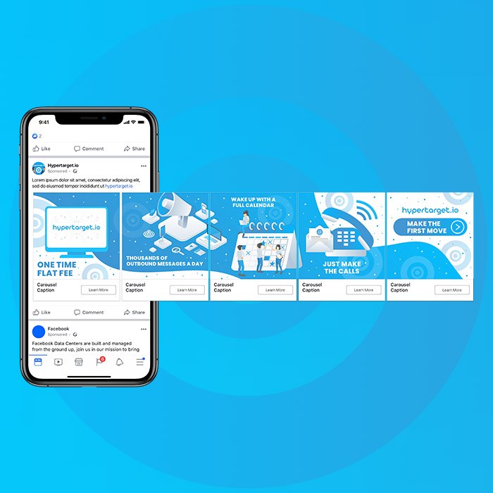
Aside from diversifying your materials, your designs should also include icons and illustrations. Both of these can become a visual representation of text or messaging. Plus, illustrations have become one of the fastest growing graphic design trends. In fact, many businesses use illustrations for their branding. In turn, they use it in most of their materials.
If you plan on using icons for your marketing graphic design, make sure that it’s in an appropriate context. Most icons can be used to replace text without losing its overall meaning. Or perhaps symbolize ideas or statistics and make it easier for us to process data. Most of the time, many designers use social media icons to replace the company name.
12. Make it Simple

Even with all these elements to keep in mind, you want to make sure that your marketing graphic design will stay simple. You don’t want your design “looking noisy” or complicated. It’s much better that you keep it simple. When it comes to colors, stick to a color palette or your branding. For fonts, use up to two at the maximum. But simple doesn’t have to be boring. You can have a minimalist design, and it can still become compelling and eye-catching.
13. Remember Design Specs and File Types

If you’re doing a multi-platform campaign, you should remember the different sizes for each platform or marketing material. For example, on Instagram, will you post it on your feed or as part of your Story? Will you post it on your website or use it as a banner advertisement? Make sure that you have the size and image type specifications. This way, your design won’t appear stretched out or pixelated when published online or printed.
Also, make sure you know file types when publishing or printing marketing materials. There are some designs that may require JPG only. Some may accept PNG too. But to be sure, save different file types for every platform or printable marketing material.
14. Make Sure Your Design Follows a Structure

Make sure that structure is present in your graphic design. You don’t want it to look cluttered or in disarray. Graphic designers would suggest that you add lines or use rulers when creating any design. This way, not only will you have a well-designed graphic design, but it will also look organized or clean.
If you’re using a DIY graphic design service or software, you can use the rulers or the grid. It will help organize and align elements in your graphic design. It may even help you with symmetry or lack thereof.
15. Know When to Follow Trends

Design trends change every year. In most instances, you will see different brands follow a similar aesthetic. That can become tiresome to your audience because you want to stand out. In this case, you can rely on your brand style guide and do your own thing when you post marketing graphic design.
However, trends can also help you in becoming modernized. Know which ones to use for your brand, and see how your audience responds to it. From there, observe if you still need to follow trends or rely on your branding or other design aesthetics.
Getting Marketing Designs from Penji
If you want to improve your marketing visuals, sign up for a Penji subscription. We don’t complicate the process of requesting a design. Learn more about how it works.
Step 1: Create a Project & Connect
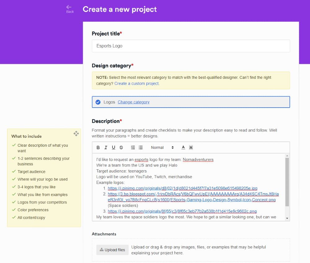
To start the requesting process, you should Create a Project.
From here, you click on “New Project” on the dashboard. After this, choose the type of design you need from “Search categories.” If you can’t find any of it, you can “Create a custom project.”
Make sure to be specific with your design request. Please follow the guidelines stated on “What to Include.” This way, the designer assigned to your project can work on it straight away. When you’re done, just click “Create project.”
We’ll assign you to one of our expert designers, and they can submit the first draft within 24 to 48 hours.
Step 2: Review & Provide Feedback
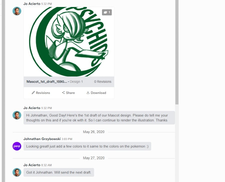
When you receive the first draft, you can review it.
On the Penji platform, you won’t have difficulty leaving revision notes. You don’t have to send an email or use another software to point out the revisions. We make it easy for you to use the all-in-one Penji platform.
Use either the point-and-click feature or leave messages to your designers. This way, you won’t experience any miscommunication.
Step 3: Download & Mark as Complete
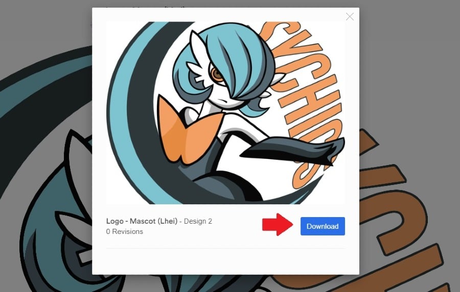
Love the design you received? You can immediately download it.
Click “View Design” and download it. From there, the files are all yours! Plus, you can access the files anytime because we store your files on a cloud.
Make sure to click on “Mark as Complete” as well. This way, you could request for other marketing materials.
Level Up Your Marketing Strategy with Graphic Design
Graphic design has played a role in the marketing strategies of different brands. Yours is no exception. That’s why Penji is dedicated to providing graphics for businesses and elevating branding or marketing campaigns.
Get started on a Penji plan today. For only $479/mo, request all the graphics you need. You no longer have to hire a graphic designer per graphic or campaign. Penji offers a budget-friendly plan for every business type. Sign up now and test out the Penji platform free for 15 days.
About the author

Alan Walker
Alan is a writer for Penji covering technology, designs, startups, businesses, and anything related to gaming. He is a huge PC gaming freak with a custom rig and loves to review gaming related products.
Table of Contents
- 1. Do extensive research
- 2. Create a smarter “Ideas” folder
- 3. Test Your Headlines/Taglines
- 4. Design for your audience
- 5. Have good photography on hand
- 6. Have a clear style guide/brand guideline
- 7. Space = Elegance
- 8. Diversify your materials
- 9. Capitalize on holidays
- 10. Write for a specific audience
- 11. Add Icons and Illustrations
- 12. Make it Simple
- 13. Remember Design Specs and File Types
- 14. Make Sure Your Design Follows a Structure
- 15. Know When to Follow Trends
- Getting Marketing Designs from Penji
- Level Up Your Marketing Strategy with Graphic Design


