
Did You Know?
According to a study by MIT, the human brain can process images in just 13 milliseconds. That’s faster than you can blink. This means that what you see often sticks with you more than what you read or hear. That’s why visual communication is such a powerful tool, especially in graphic design services.
Why Visuals Speak Louder Than Words

Let’s be honest—nobody likes reading a wall of text. You’ve probably skipped a few yourself. But if a page has images, color, space, and flow? You’re more likely to stop and look. That’s because your brain understands visuals faster than it does words.
That’s the heart of visual communication. It’s how you use images, layouts, colors, and symbols to share a message without saying much at all. If you’ve ever made a flyer, scrolled through Instagram, or clicked on an ad, then you’ve already seen visual communication at work.
In this guide, you’ll learn what visual communication really means, how it fits into graphic design, and why it should be at the core of any design strategy. Whether you’re new to this or just want to improve your work, this will help you create designs that actually resonate with people.
What Is Visual Communication?
Clear Messages Without Words
Visual communication involves sharing ideas through pictures, shapes, colors, or designs, rather than relying solely on words. You see it all the time in your daily life. Stop signs tell you when to stop. Emojis show how you feel. Picture books make it easy to follow a story. Posters and websites also use designs to help people understand something fast. This is why visual communication is such a helpful tool. It enables you to learn and react quicker than just reading words alone.
Everyday Examples
You use this all the time, even if you don’t notice. Here are some everyday places where visual communication plays a significant role:
- Social media graphics
- Website layouts
- Infographics
- Store signs
- App icons
- Logos and branding
All of these are designed to help you get the message fast—and remember it longer.
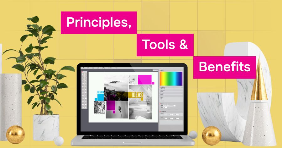
Principles of Visual Communication
These ten design principles help guide the organization and presentation of visual content. When you follow these, your designs become easier to understand and more effective at delivering your message.
1. Clarity
The first and most important rule of visual communication is clarity. Your design should be easy to understand. If someone looks at your poster, graphic, or website and becomes confused, they’ll likely leave quickly. Use simple layouts, clean fonts, and clear images. Avoid using too many effects or overloading the text. The more straightforward your design is, the clearer your message will come through.
2. Simplicity
You don’t need to fill every space with something. Sometimes, the best designs are the simplest. Using just a few colors, one or two fonts, and basic shapes can help your message stand out. A clean design helps the viewer focus on what matters most, without distractions.
3. Contrast
Contrast means using differences to highlight key parts of your design. This could be dark text on a light background, a large headline followed by smaller text, or a bold color paired with a neutral one. High contrast draws attention and makes your design easier to read and navigate. Without contrast, everything blends together and becomes hard to follow.
4. Balance
Balance is about making your design feel even and steady. You don’t want everything crowded on one side of the page. Instead, try to spread out your elements—images, text, buttons—so they feel evenly placed. A well-balanced design makes people feel comfortable and helps them move through the content more easily.
5. Proximity
This principle is all about grouping things that belong together. For example, a heading should be close to its related paragraph. A button should be near the action it refers to. If related items are too far apart, users might get confused. Proper proximity helps the viewer quickly understand what goes with what.
6. Hierarchy
Hierarchy shows what’s most important. You do this by changing the size, color, or position of elements. Big, bold headlines draw the eye first. Subheadings come next. Body text follows. Without hierarchy, everything looks the same, and people don’t know where to look first. Use it to guide the viewer step-by-step through your design.
7. Consistency
Consistency makes your work feel polished. Use the same colors, fonts, spacing, and design rules throughout your project. This not only enhances your design’s appearance, but it also helps your audience feel more at ease. When things remain consistent across all your materials, people trust your brand more.
8. Emphasis
If everything is bold, nothing stands out. That’s why emphasis is key. Use emphasis to highlight only the most essential part of your message. Maybe it’s a call to action, a key fact, or an image. You can emphasize with color, size, or placement. Just make sure it stands out from the rest without being overwhelming.
9. Movement
Movement is how your design leads the eye. You want people to move from one part to the next in a natural order. For example, a top-to-bottom layout or left-to-right reading path. Good movement makes the design feel smooth and easy to follow. Without it, people might miss your most important content.
10. Alignment
Everything in your design should line up with something else. That’s alignment. When things are aligned—whether to the left, center, or right—they appear cleaner and more professional. Misaligned items look messy and unorganized. Even small changes in alignment can make a big difference in how your design feels.
Key Elements of Visual Communication
These are the actual tools and parts that help you deliver your message visually. When used correctly, they enhance the strength and clarity of your design.
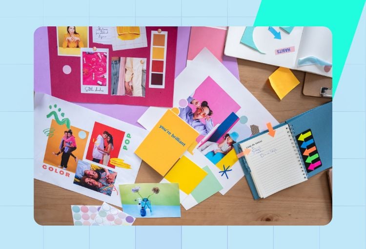
1. Images and Pictures
Photos and illustrations can convey a message much more effectively than words. A good image tells a story or sets a mood without needing any extra explanation. In graphic design services, professionals often select high-quality, meaningful photos to emotionally connect with the viewer.
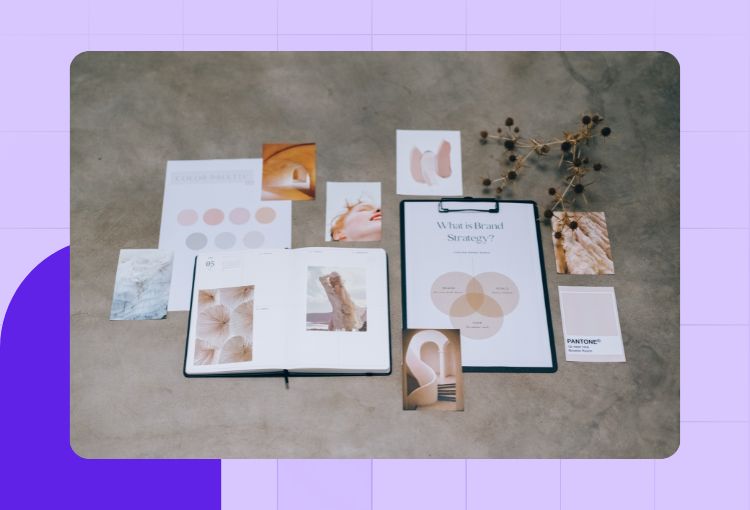
2. Color
Color isn’t just for decoration—it carries meaning. Red can convey urgency, while blue evokes a sense of calm and safety. Green often evokes associations with nature or growth. Select a color palette that aligns with your message and target audience. Consistent use of color helps build your brand identity and guides people through your content.
3. Typography
Typography refers to the style and layout of your text. The font you pick, its size, weight, and spacing all affect how people read your message. Headlines should be easy to spot. Body text should be simple and comfortable to read. Select two or three fonts that complement each other well and use them consistently throughout your design.
4. Icons and Symbols
Icons are small images that represent ideas quickly. A magnifying glass means search. A heart means like or favorite. These little symbols are part of our everyday visual language. They’re helpful in buttons, menus, or signs because they convey information quickly without requiring words. Ensure that your icons are familiar and clear.
5. Layout and Space
Layout refers to the arrangement of elements on the page. Space is just as important as the elements themselves. Giving your design enough breathing room makes it feel open and organized. A cluttered design can feel stressful and difficult to follow. Utilize grids, margins, and white space to create a more structured appearance.
Why Do We Need Visual Communication?
Here’s where we zoom out a bit and ask: Why does all this matter? Why should you care about layouts, colors, or fonts? The answer is simple: visual communication helps you connect with people more quickly and effectively. Let’s break it down.
1. Grabs Attention
People scroll fast. You need to grab attention in seconds. Strong visuals, bright colors, and bold headlines capture attention. Whether you’re posting on social media or designing a flyer, good visual communication helps you stand out.
2. Makes Information Easier to Understand
A picture really can be worth a thousand words—especially when you’re explaining something complex. Charts, diagrams, or simple illustrations can show how something works better than a paragraph ever could.
3. Improves Retention
People tend to remember visuals more than they do text. If someone sees a great graphic with your message, they’re more likely to recall it later. This helps your ideas stick and keeps your brand or message at the forefront of people’s minds.
4. Speeds Up Communication
Text takes time to read. But a visual? You get it right away. This is especially useful in places where people don’t have time to read lengthy explanations, such as on apps, signage, or websites with fast loading times.
5. Builds Emotional Connections
Colors, photos, and illustrations can evoke emotions, such as happiness, inspiration, curiosity, or calmness. That emotional connection is powerful. It turns a viewer into a fan, and sometimes even into a customer.
6. Crosses Language Barriers
Not everyone speaks the same language, but visuals can speak to almost anyone. That’s why global brands rely heavily on icons, colors, and imagery. It allows their message to travel further without getting lost in translation.
7. Enhances Brand Identity
Your brand isn’t just your logo. It’s your color scheme, your fonts, your layout style, your visual identity. Keeping all of these elements consistent builds recognition and trust. This is a major focus of graphic design services, and for good reason.
8. Makes Communication More Engaging
Let’s face it—visuals are more fun. Whether it’s a colorful chart, an eye-catching illustration, or a clean layout, visual content keeps people interested longer. That means they’re more likely to finish reading or interacting with your content.
Why Visual Communication Matters in Graphic Design

Your Audience Notices Design First
The truth is, people make snap decisions. They decide whether something looks trustworthy or not in a matter of seconds. In fact, 75% of users judge a business’s credibility based on its website design. That’s why good design isn’t just about being pretty, it’s about being clear and smart.
When you use visual communication well, you guide your audience. You help them focus, understand, and feel something. That connection helps your message stick.
Visuals Help You Control the Story
With the right visuals, you can lead someone through your content step by step.
For example:
- Want your message to feel friendly? Use round shapes and soft colors.
- Want to seem bold and modern? Try high contrast and sharp edges.
These choices all affect how someone experiences your design. And the best part? You don’t need a single word to make it work.
How Visual Communication Shapes Design Strategy
You Start with the Goal
Every design has a purpose. Maybe you want someone to click a button, read a blog, or remember your brand. Before you create anything, you ask: What do I want this design to do?
That’s where strategy comes in. You build a plan to ensure your design performs its intended function. Then, you use visual communication to bring that plan to life.
You Match the Message to the Medium
Designing for a mobile app is different from making a billboard. So you adjust your visuals. You keep things simple on small screens. You use big, bold elements for large signs.
The medium shapes the message, and visual communication makes sure it fits.
You Keep It Consistent
If your colors, fonts, and layout change frequently, people become confused. But when everything feels the same across your designs, your brand looks more trustworthy.
Visual communication helps create this consistency. You build a system of design elements—like a style guide, that makes every piece feel like it belongs together.
How Graphic Design Services Utilize Visual Communication
Professionals think visually
If you work with a design team, such as those that provide graphic design services, you will likely find that they ask numerous questions before getting started. They want to understand your objectives, target audience, and the message you’re conveying.
Why? Because design is more than simply making things seem pretty. It is about fixing an issue. The most effective way to tackle it is through effective visual communication.
They build with purpose
Excellent design services prioritize precise results. They may create:
- A logo that conveys your brand’s story
- A website layout that helps users find what they need
- Social media graphics that grab attention in seconds
Each design choice they make is based on how it will resonate with the viewer, without needing to be explicitly stated.
Get Unlimited Custom Designs
Try Penji risk-free for 30 days and get all your design projects done


Tips for Implementing Visual Communication in Your Own Projects
Keep it simple
Too many elements can cause confusion for the viewer. Use a few fonts, a simple color scheme, and a clear layout.
Focus on the viewer
Consider who will see your design. What are they concerned about? What should they know? Allow their needs to guide your decisions.
Test and improve
Sometimes things do not work the first time. That is okay! Present your design to a friend or teammate. Determine what they notice first. Use their comments to make improvements.
Conclusion: Make Each Design Count
When you use visual communication effectively, you ensure that your designs not only appear excellent but also function correctly. Whether you’re working on your project or employing graphic design services, remember that strong visual communication is more than just a skill. It is the key to developing designs that connect, communicate, and last.
About the author

Je Ann Bacalso
Je Ann is a creative content writer who crafts engaging, SEO-friendly articles and web copy. With a passion for storytelling and a sharp eye for detail, she delivers clear, compelling content that connects with readers.
Table of Contents
- Did You Know?
- Why Visuals Speak Louder Than Words
- What Is Visual Communication?
- Principles of Visual Communication
- Key Elements of Visual Communication
- Why Do We Need Visual Communication?
- Why Visual Communication Matters in Graphic Design
- How Visual Communication Shapes Design Strategy
- How Graphic Design Services Utilize Visual Communication
- Tips for Implementing Visual Communication in Your Own Projects
- Conclusion: Make Each Design Count


