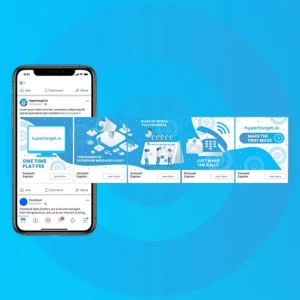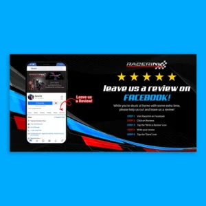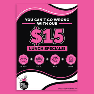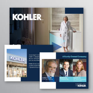
Getting your audience’s attention does not end with being seen; it’s about stopping them mid-scroll and turning that precious moment of attention into action. Your goal should be to create display ads that pique their interest and convert viewers into customers. Here are ten display ads that masterfully blend creativity with functionality, inspiring you to do the same.
Table of Contents
- What are Display Ads?
- Hotel Triton
- All District Reads
- Real Estate News Blog
- Envisioning Green
- Goth with Glitter
- Semarchy
- OcFredio
- Welch Equipment Company
- The Suit Lady
- Gibb Insurance
What are Display Ads?
Short for display advertisements, display ads are digital ads that appear on websites, apps, and social media channels across the internet. They come in various formats, from native advertisements to eye-catching banners, and blend seamlessly with a website’s content.
In addition, display ads work by raising brand awareness while people browse their favorite websites. This is in contrast to search ads, which appear when someone actively searches for specific products or services. This is why display ads are a powerful tool for entrepreneurs to add to their digital marketing arsenal. They offer precise targeting, measurable results, and the flexibility to adjust campaigns in real-time.
As promised, below are ten striking display ads created by Penji’s talented design team:
1. Hotel Triton
This display ad created for Hotel Triton is an excellent example of effective advertising. It beautifully combines strong visuals, targeted copy, and a compelling CTA (call-to-action) in a clean and organized layout. Its image of a classic San Francisco street with a cable car instantly captures attention.
Also, this display prominently shows the hotel’s name, ensuring brand recognition. It has little text but packs information while creating a sense of urgency. Even the CTA is simple and action-oriented, veering away from the usual Learn More or Book Now.
2. All District Reads
Display ads come in a variety of shapes and sizes. This one, designed for All District Reads, is in a tall format perfectly suitable for sidebar placements. The strong visuals of a teacher reading with smiling children evoke warmth, positivity, and the value of education.
The design is consistent, using complementary colors (light green, blue, and orange) to maintain a cohesive look and visual appeal. If you’re looking for inspiration for an ad with emotional appeal, clear branding, and actionable language, this is it.
3. Real Estate News Blog
An excellent example of a horizontal banner ad, this Real Estate News Blog ad effectively communicates its purpose. Aside from its intriguing headline and clear CTA, its balanced layout efficiently divides the space between the headline and the text. The addition of an AI figure makes the display ad clean and easy to follow.
Moreover, the blue and white color scheme is visually appealing while projecting a professional image. This display ad successfully combines clear messaging, an engaging topic, and an actionable CTA that attracts its target audience.
4. Envisioning Green
A great combination of visual appeal, concise messaging, strong CAT, and relevant targeting makes this a well-executed display ad for Envisioning Green. As a brand that specializes in crafting exceptional outdoor living spaces, the image of a stunning outdoor living area with a fireplace is spot on.
Likewise, the ad creates a strong emotional connection with the readers, evoking a sense of relaxation and enjoyment. Its use of a green and brown color scheme establishes the brand’s sustainability efforts and associations with nature. The compelling text completes this display ad’s persuasive and informative appeal.
5. Goth with Glitter
This display design made for Goth with Glitter has a strong visual impact. It is an excellent example of a memorable and attractive ad. Its shimmery and vibrant colors evoke a sense of excitement, fun, and nostalgia, along with the catchy phrase “bringing the people back.” The CTA and the website URL effectively encourage the viewer to take the next step.
Additionally, this display ad’s bold typography choice of large and white text makes the main message stand out. Its aesthetics appeal to a specific audience interested in goth, punk, or alternative culture.
6. Semarchy
With a clean and professional design, this display ad created for Semarchy clearly expresses its efficiency and credibility. Its straightforward layout and design, combined with text that provides social proof and compelling CTA, make it an informative piece of advertising. It focuses on the brand’s clear value proposition, effectively generating leads and driving conversions.
While this brand requires a design that conveys stability, dependability, and authority, the color scheme contrasts it nicely. It gives the design a light and friendly vibe, preventing the display ad from looking stiff and unfeeling.
7. OcFredio
This display ad for OcFredio is vibrant and attention-grabbing, perfect for the brand’s message. Its use of bold typography emphasizes the ad’s main component, the pizza. The red and yellow color scheme is modern and stylish, combining deliciousness and unique style.
The design has an easy-to-read format, cut in half to provide a good sense of hierarchy. The logo is prominently displayed, and all the information is included in the ad. This and the strong CTA encourage readers to take the brand’s desired action.
8. Welch Equipment Company
The auto mechanic niche requires straightforward yet visually attractive display ads. The Penji designers did precisely this for Welch Equipment Company. It has a thought-provoking headline and a subheadline that provides enough context and highlights the blog post’s value.
Furthermore, this display ad includes an image of a mechanic, complementing the overall design. It uses a blue color scheme that gives the design a hint of mystery, elegance, and intrigue. All these elements entice the readers to click and know more about the blog and the brand.
9. The Suit Lady
If you’re looking for a stylish and elegant inspiration for your display ads, this one created for The Suit Lady is a solid option. It has a robust visual hierarchy, eye-catching typography, and a clean layout. Its overall design and concise messaging convey its purpose while keeping the aesthetics modern and dapper, ideal for the brand personality.
Likewise, this display ad focuses on the product being promoted. It has the pricing added to show not only what needs to be shown but also to project significant savings. The color scheme adds to its classic elegance, and the appropriate image of a man wearing the suit makes for a well-crafted display ad.
10. Gibb Insurance
This display ad, created for Gibb Insurance, is simple, straightforward, and easy on the eyes. It has plenty of white space to prevent the design from looking cluttered. Its clean and modern layout grabs attention, complemented by concise text.
Additionally, this display ad features an image of a woman, which adds a sense of connection and professionalism. The inclusion of the Best in DFW People’s Choice logo adds social proof and makes the brand an authority worthy of consumer trust.
Final Thoughts
These striking display ads prove that creating them requires careful thought and planning. They aim to stop viewers in their tracks and encourage them to visit your website instead. If you want to create display ads like these, you only need to click this link to get our Penji designers working with you. Watch our demo video here to know more.
About the author

Celeste Zosimo
Celeste is a former traditional animator and now an SEO content writer specializing in graphic design and marketing topics. When she's not writing or ranking her articles, she's being bossed around by her cat and two dogs.

