
Have you ever seen a design and felt something was off, but you can’t quite put your finger on it?
Such is the power of the elements of design principles. When you’re well aware of the elements and you know how to apply the principles, your design simply “clicks” and you get your message across smoothly.
In this article, we’ll tackle the elements of design, the principles of design, and how they work together. We’ll also look at excellent design examples and explore the best practices in design. Let’s get started!
Table of Contents
- What are the Elements of Design?
- What are the Principles of Design?
- Applying the Elements and Principles of Design
What are the Elements of Design?
Before we tackle how to apply the elements of design principles, first things first: What are the elements of design?
The elements of design are the basic components or building blocks used to create any visual composition.
Knowing these elements is crucial for creating effective and visually appealing designs, whether you’re creating a brand illustration, learning how to design an infographic, or even planning a painting.
Here are the elements of design to master:
1. Line
Lines are the most basic element of design, used to define shapes, create textures, and guide the viewer’s eye. They can be straight, curved, thick, thin, or even implied.
2. Shape
Shapes are created by closing lines, forming areas in a composition that stand out due to their boundaries. Shapes can be geometric (like squares and circles), organic (irregular, natural forms), or abstract.
3. Form
Form refers to the three-dimensional quality of an object, which includes its height, width, and depth. In two-dimensional work, form can be implied through the use of shading and perspective.
We can observe line, shape, and form in these logo designs:

Both use shapes to depict beer glasses and bottles, and lines to draw emphasis to them. The logo on the left uses shading to imply 3D quality. As for perspective, the glass at the center is the biggest, implying that it’s the closest to the viewer.
4. Color
Color brings life and emotion to design. It can be used to convey mood, highlight important areas, or establish a sense of harmony and balance. Colors are often chosen based on color theory, which includes concepts like complementary and analogous colors.
5. Texture
Texture refers to the surface quality of a design, whether real or implied. It can create a tactile feel in two-dimensional designs or enhance the realism in three-dimensional designs.
6. Space
Space in design refers to the area around and between elements. Positive space is the area occupied by an object or element, while negative space (also known as white space) is the empty area around it. Effective use of space ensures clarity and focus in a composition.
7. Value
Value deals with the lightness or darkness of a color, which creates contrast and emphasis in a design. High contrast in value can make certain elements stand out, while low contrast can create a softer, more integrated feel.
This example offers a nice display of using vibrant colors, layered textures, the right contrast through values, and the use of sufficient space between elements:

What are Principles of Design?
While the elements of design are the tools, the principles of design are the rules and guidelines. They help the designer come up with cohesive and visually appealing designs that effectively express a message to execute the creative strategy.
Here are the primary principles of design:
1. Balance
Balance involves placing elements evenly within a design to create a sense of stability. This can be achieved through:
- Symmetrical balance (elements are mirrored)
- Asymmetrical balance (elements are balanced by weight rather than symmetry)
- Radial balance (elements radiate from a central point)
This design, for instance, uses symmetrical balance, with more or less the same elements on each side:

2. Contrast
Contrast is about creating differences between elements to draw attention and emphasize certain aspects of the design. This can be done through:
- Color
- Size
- Shape
- Texture
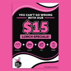
For example, this design shows a color contrast. If you’re familiar with how to use the color wheel, you’ll know that green and red are complementary colors. That said, using them on the same design makes them pop:

3. Emphasis
Emphasis involves making a particular element stand out in a design, ensuring it grabs the viewer’s attention first. This is often achieved through contrast, placement, or color.
The design below, for instance, has several elements, including leaves, a field, and a water splash. However, the juice bottles remain the emphasis of the design because of the color and detail.

4. Proportion
Proportion refers to the size relationship between different elements in a design. Proper proportion ensures that elements look cohesive and that the design as a whole is visually appealing.
This ad design, for instance, shows a tortilla wrap and a water bottle directly proportion to each other.

5. Movement
Movement guides the viewer’s eye through the design, creating a sense of action or a path for the eye to follow. This can be achieved through the use of lines, shapes, and the arrangement of elements.
These designs, for instance, use a mixture of shapes, lines, and human poses to suggest movement.

6. Rhythm
Rhythm in design is about creating a sense of organized movement through repetition of elements. It helps establish a visual tempo that can lead the viewer’s eye across the design.
This packaging is an example of a design with good rhythm. The waves are repeated in the noodles illustration, the green accent, the black twirls, and the text pattern.

7. Unity
Unity is the principle that ensures all elements within a design work together harmoniously. It’s about creating a cohesive look where nothing feels out of place.
Take this design, for instance. Despite containing different illustrations, the design looks united because the image style and color palette are consistent.

8. Variety
While unity brings harmony, variety adds interest and excitement. It involves using different elements and principles in a way that keeps the design dynamic without losing coherence.
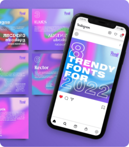
Here’s an example of a series of images that offer variety. The images use different elements but the color palette, text, and images are repeated, so it’s hard to miss that they’re all part of a single campaign.

Applying the Elements and Principles of Design
Being familiar with design elements will allow you to be more mindful of each component you add to your design. Knowing the principles, meanwhile, will enable you to create harmonious designs that bring your message forward instead of burying it into distracting elements.
If you need professional designs that make a mark, Penji can help. We have the top 2% of designers who are well-versed in design elements and principles – and they’re more than willing to handle your visual assets so you won’t have to.
View a demo and get amazing designs at a flat monthly rate.
About the author

Carla Deña
Carla is a journalist and content writer who produces stories for both digital and legacy media. She is passionate about creativity, innovation, and helping small businesses explore solutions that drive growth and social impact.


