Sending out email newsletters can be a hit or miss. But it doesn’t have to be. If you know the elements that go into writing an excellent email newsletter, then it’ll likely get opened and read. Graphics, copy, and structure are just a few of the components that make a good email newsletter. And if you want to know how the big brands do it, then check out these 15 email newsletter examples.
1. Bon Appetit
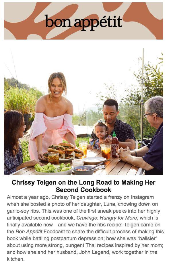
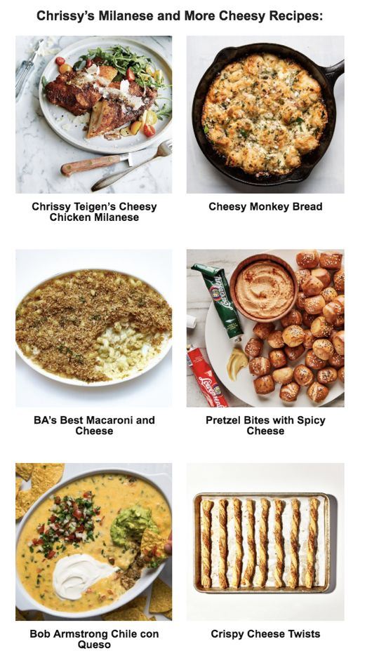
Bon Apetit is a digital magazine that provides cooks with delicious recipes. And this email newsletter example hits the nail on the head with mouthwatering images of the food. Entice hungry consumers through their eyes first, then accompany with a concise copy, so they end up craving for more. Bon Appetit displayed photos of the food that make you salivate. Plus, a succinct description to urge consumers to click and learn more.
2. BarkBox

BarkBox is a brand that sells dog treats and toys. Their branding is casual, fun, and playful, which shows in their email newsletter. Everything about this email is eye-candy. It uses vibrant colors that are suitable for the company’s branding and offers. Moreover, humor and storytelling are the elements that make this email stand out. They’ve integrated funny copywriting that presents the products in a lighthearted manner.
3. Ben & Jerry’s

Ben & Jerry’s is a brand that takes a stand regarding social issues. Their ChunkMail regular newsletter campaign not only includes how their ice cream is made. But it also touches on the hottest social issues like marriage equality. Showing what your brand advocates and aligning your brand values with your audience can gain brand loyalty.
4. TOMS

This is one of the most well-structured email newsletter examples from this list. From top to bottom, this email is very easy to scroll and digest. It starts with a captivating headline that offers 35 percent off. Underneath are subheadlines that feature images of the products, followed by a call to action.
5. Litmus

We love how Litmus used different pastel colors to segment each content in this email. All five topics are also coupled with call-to-action buttons in darker shades. The violet background also makes the grids pop out. Overall, this email has a clean and straightforward layout.
6. Foot Locker

The main heading is what captures the recipient’s attention here. It offers free shipping with no minimum amount required for members, and free shipping for non-members on orders of $550. Then Foot Locker put their product front and center over a rasta-colored background. The only way recipients read your email from top to bottom is if the heading interests them. And this example from Foot Locker leverages one of the hesitations of online shoppers — shipping fees.
7. Skift Table
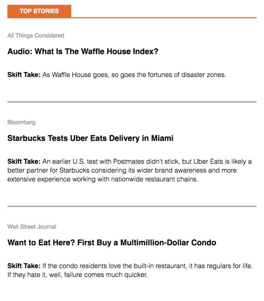
Emails that contain text only also work when structured in an easy-to-digest manner. Avoid blocks of text when sending out email newsletters. Skift Table’s email is one of the best text-based newsletter examples. The headings in bold allow readers to skim through the topics. Then they included a “Skift Take” that summarizes each article.
8. Community.is
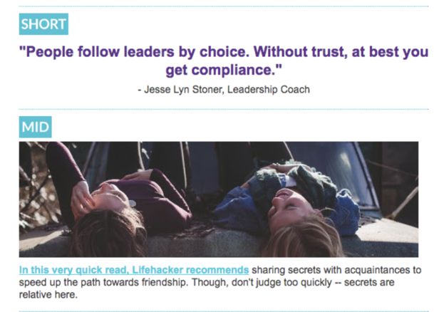
Community.is is an organization that writes about anything that inspires and educates communities. From technology to community issues, Community.is doesn’t stop at what they love to advocate the most. Typically, email newsletters that educate can be quite a long read. And that’s why Community.is categorizes their email content into short, middle, and long. This way, recipients can choose which topics they want to read, depending on their time availability.
9. H&M

Special events and holidays are always an excellent opportunity to send your offers through email newsletters. And H&M did so by leveraging the spirit of Holloween in inviting regular members to join their loyalty program. Even though the email is Halloween-themed, they didn’t stray off their branding by using soft colors and their logo.
10. CB Insights
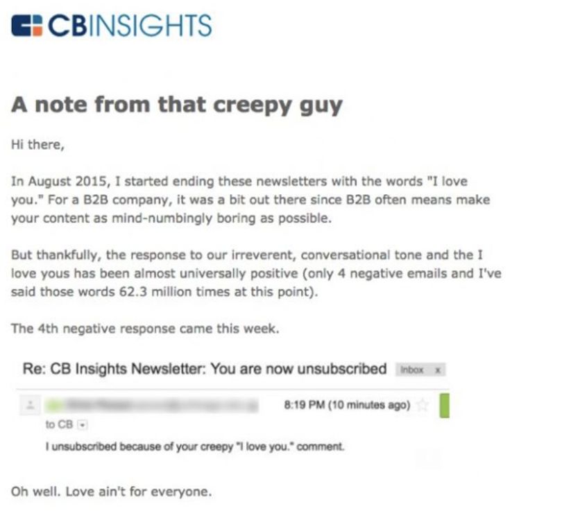
CB Insights provides consultations about business to corporations. You’d instantly think that newsletter examples from B2B companies are bland and boring. But CB Insights did theirs differently. This email has a dry humor and conversational tone, which is quite unusual for a B2B company. This works because of the overall funny content, which doesn’t make sense. CEOs and decision-makers would have the impression that CB Insights is a unique B2B company worth looking into.
11. Campbell’s Soup
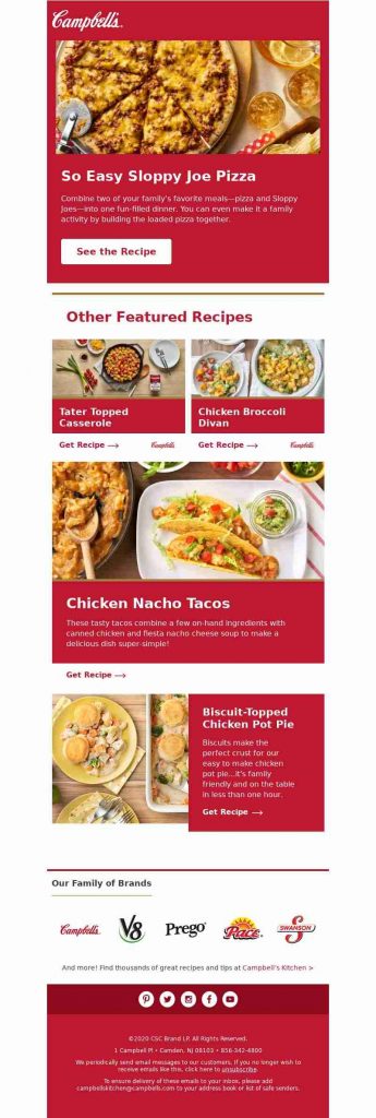
At first glance, this Campbell’s Soup email might seem like a lot is going on. But the red grids make it easy to scroll through the various recipes. Also, the red-and-white combination makes the calls to action stick out from each category. Campbell’s also made sure to put their logo on every category to stay on-brand.
12. Zales

How each offer is laid out in this email can make readers want to learn more. First, the headline is personalized and talks directly to the reader. Then Zales offers three various ways the recipient can choose jewelry. And the icing on the cake is the discount offer. Zales also made sure to place calls to action after every section.
13. PS4
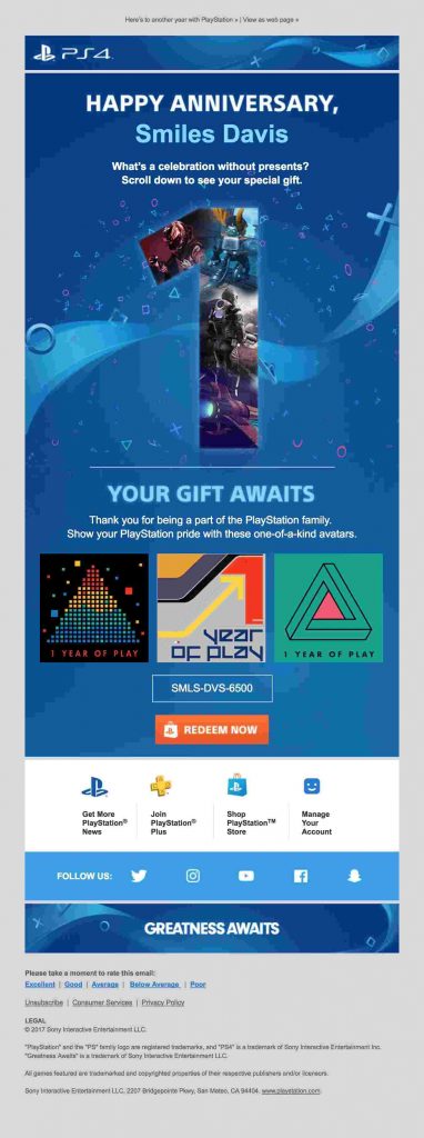
This PS4 email wins in the personalization department. The email greets the recipient by their full name and offers a special gift for their anniversary with PS4. The graphics are also eye-catching, with a contrasting call-to-action button at the bottom.
14. Birchbox
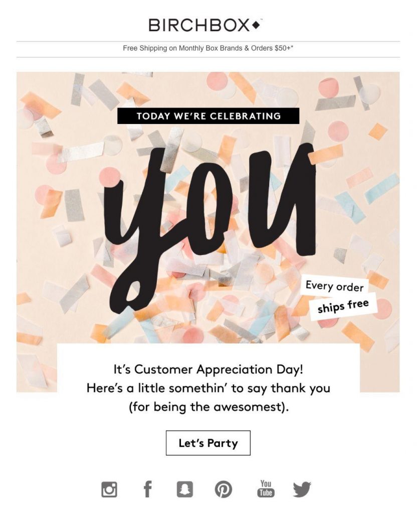
Birchbox’s email is another newsletter example that revolves around personalization. However, this has a simpler and shorter copy, yet it still captures the reader’s attention due to the bolded word “YOU.” Remember, adding a personal touch can gain affinity from your target audience.
15. Kiehl’s

This Kiehl’s email newsletter hits three birds with one stone. It offers a $10 off on the next purchase, promotes Kiehl’s products, and invites recipients to join their event. Even though there are various offers on this email, it doesn’t seem cluttered, making it easy to skim.
Wrap Up
After learning a thing or two from these newsletter examples, it’s time to craft one that your recipients will enjoy. Make sure your readers will open, click, and read every email you send. But if you don’t have all the time in the world to design your emails, entrust this colossal task to Penji.
Penji is your affordable and reliable graphic design partner that offers unlimited design monthly. It works on a subscription-based model, so you only pay a fixed rate per month. If you no longer need the service, you can quickly cancel your subscription without incurring penalties. Sign up and try Penji’s convenient design process for 15 days risk-free.


