
Branding is important. Aside from a name, a logo, color scheme, and language are the most identifiable assets that an institution has in order for people to know who this entity is, or what they represent. You see it all the time: businesses, people, products, the list goes on. And educational bodies aren’t exempt from this, either.
But sometimes, there may be an instance in which the current brand image may not communicate the message that the institution is trying to portray. Or perhaps, it needs to evolve to stay relevant in a rapidly changing world, with the advent of things like the Internet and social media. Universities, in particular, have been known to rebrand – some successfully, others – not so much. For this piece, I’m going to share with you some examples I think did a pretty good job with their university rebranding strategy.
And if after looking at these excellent rebranding graphics you’ll need a graphic design partner to work on yours, there’s Penji. Penji is a subscription-based graphic design service that offers VERY affordable plans in exchange for unlimited graphic designs. Watch the demo to know more about Penji’s hassle-free method.
1. University of Connecticut
This university, believe it or not, hasn’t been called the University of Connecticut for years – it’s almost as if people forgot that was their real name. Instead, it has been always referred to as UCONN. So, what does the institution do? Go with the majority, of course. In 2013, the school did a complete overhaul of its image, logo and even mascot to adopt the more popular moniker that it’s had in the public eye. Here’s their logo change: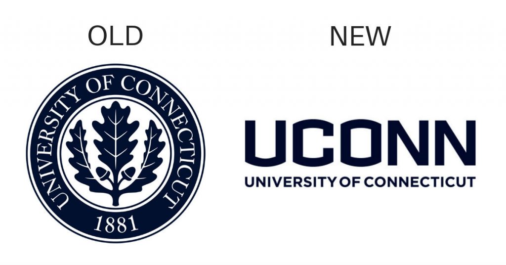
As for student feedback, it was a bit mixed at first, but the change was slowly warmed up to. Student-athletes, in particular, welcomed the change.
2. George Washington University
Now, what happens when you find that your current image doesn’t seem to represent what you stand for? You change it, correct? That should have simply been the case, but not with George Washington University. In fact, the institution had to change its image 3 times for it to finally stick. Take a look at their changes throughout the years: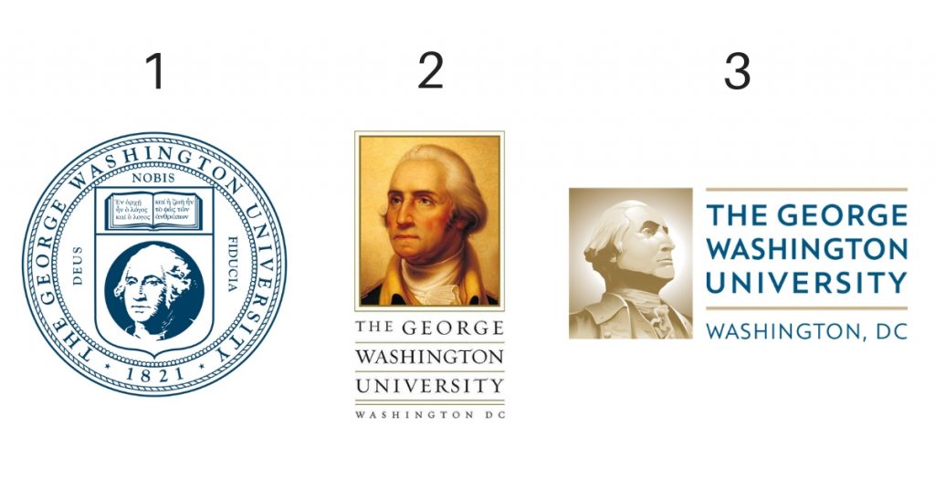
The redesign came with much positive reception, especially from students and staff alike, as they thought the older logo was anything but visually friendly. Not to mention that it was poorly represented in the current age of smartphones and mobile Internet browsing. With regards to the school itself, the current logo served as a means to unify the various departments that GWU shared, as all had their own logo and as a sense, felt disjointed and separate.
Personally, I agree with the change from the second to the third, but I think that the first logo would work just as well in 2019, as it did in 1821.
3. Ball State University
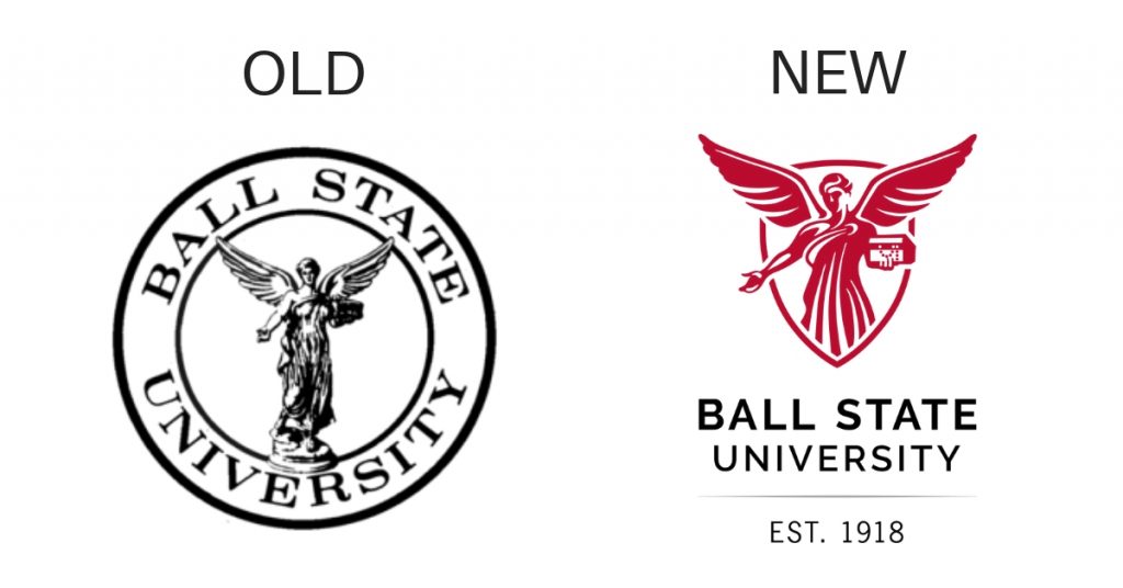
Sometimes, it takes more than simply changing a logo to change up your entire university branding – this is a sentiment that Ball State University knows very well. BSU had been using their slogan “Education Redefined” as part of their strategy for pretty much since the mid-2000s and felt that a change to better match the explosive growth that they had been receiving with more enrolments, better infrastructure, and very minimal tuition increases. So what’s the new slogan? “We Fly”.
Frankly, I think it works just well – and most of the student body thinks so too.
[in_content_ads gallery="Marketing" logo="off" title="Create smart, effective campaigns efficiently" subtitle="Meet your conversion goals using visuals that stand out" btntext="I need this!" btnlink="https://penji.co/pricing/?affiliate=J2O5AB8RAR3386837"]4. Towson University
You know, this may be a redesign that I personally think wasn’t necessary, from the aspect of the logo. The wavy lines give me a sense of fluidity and it’s somehow calming to look at. But it does get straight to the point of Towson and apparently, some students and staff have taken a liking to the change.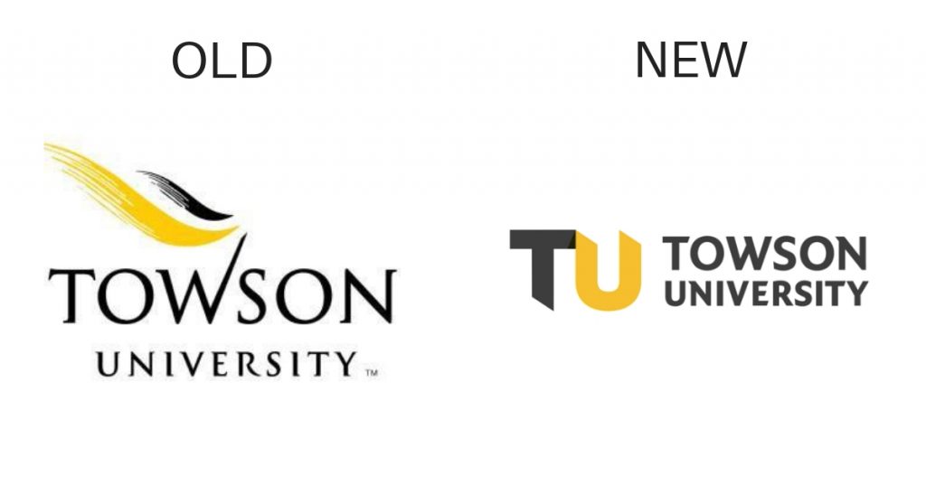
Something also interesting to note is the change of the typography – that wasn’t just a simple cosmetic change, either. It’s to make it more optimizable on smart devices, as well as showcase a ‘retelling’ of what Towson is, and what makes it so great.
So, what makes this change a big deal, anyway? Long story short: this university rebranding was to usher the school into a modern era, from an aesthetical point, in addition to the story retelling. And despite my personal preference over the logo itself, it does indeed work.
5. University of Suffolk
Another instance of university rebranding going beyond a change in logo, the University of Suffolk had a complete overhaul when it officially became known as such. The institution was previously known as the University Campus Suffolk, and decided that to reflect their new position, a new image was needed as well. To be honest, that was an excellent idea – it conveys a sense of evolution and maturity. It even showcases this with their logo upgrade: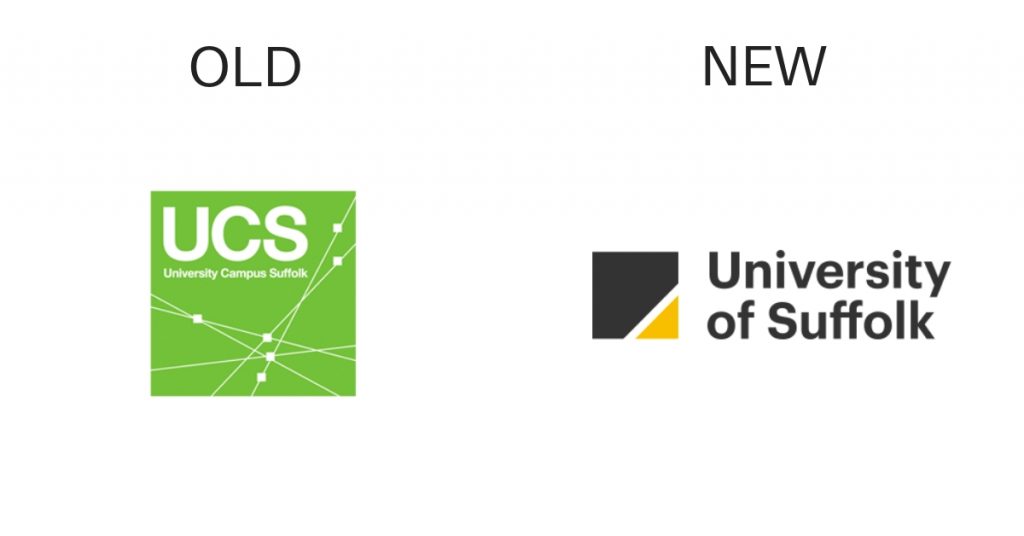
6. Ulster University
One of the premier institutions of learning in Ireland, Ulster University underwent a major facelift back in 2004. Why? They had a desire to re-establish themselves as a ‘forward-thinking’ university and show that it can be a modern place for tertiary education. And frankly, it shows in the logo. Notice how the U moves away from the serif font to a more modern, sans serif style: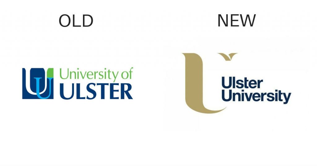
There’s also no more interlocking Us. Even the simple rearranging of the name can be powerful. Lastly, the decision to focus on one color shows a sense of focus, which I think is pretty important in an increasingly competitive climate.
7. LIU Post
For those of you in the New York space, you may have heard about the C.W. Post Campus of Long Island University, named in honor of Charles William Post. Well, it has since been renamed LIU Post and their logo has since changed. Recently, this branch of Long Island University underwent more university branding, to be more fleshed out.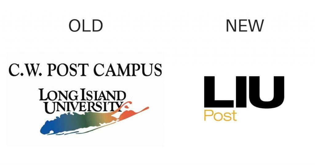
It’s actually not just the C.W. Post campus that’s gotten a facelift, either. Most, if not all of the other campuses have been rebranded accordingly to better fit the new LIU brand.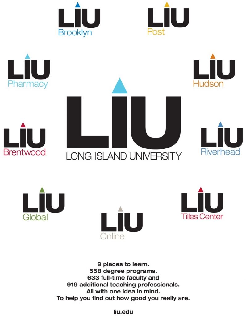
As for students and staff, they welcome the change, citing it as a fresh new take on the school, as well as fostering unity between campuses.
8. Douglas College
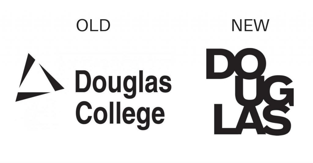
For Douglas College’s university rebranding, they decided to become a bit more ‘active’ in a manner of speaking. In fact, in addition to changing their logo, they also decided to emphasize a simple action: “Do.” This was in an attempt to inspire students to take action to explore careers and post-secondary education options. And judging from the fact that a large amount of input came from the students, it’s safe to say that the new brand clicked with them quite well.
How to Request Unlimited Graphic Designs at Penji
Penji is one of the leading on-demand graphic design services in the market today. Hiring only the top two percent of graphic designers, the brand takes pride in quality and affordable graphics. Here’s a three-step guide on how to request one from Penji:
Create a new project
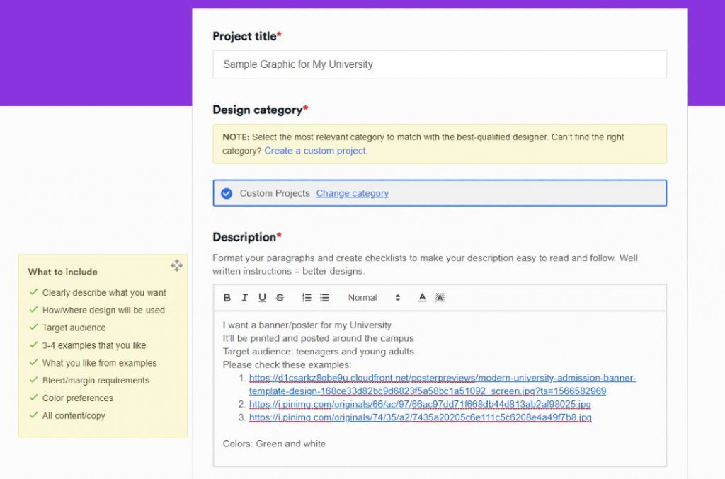
On your dashboard, create a new project to submit your first design request. Fill in the details on the form to give your designer a clear design brief. You will then be assigned the most suitable designer for the job.
Review and revise
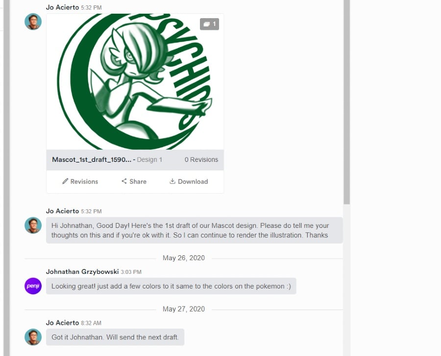
Ate Penji, the turnaround time is 24 to 48 hours. Once you receive the first draft, you can either download or do some more tweaking. But don’t fret, Penji doesn’t charge you with additional fees for revisions. The designer will revise your design until you’re 100 percent happy.
Download
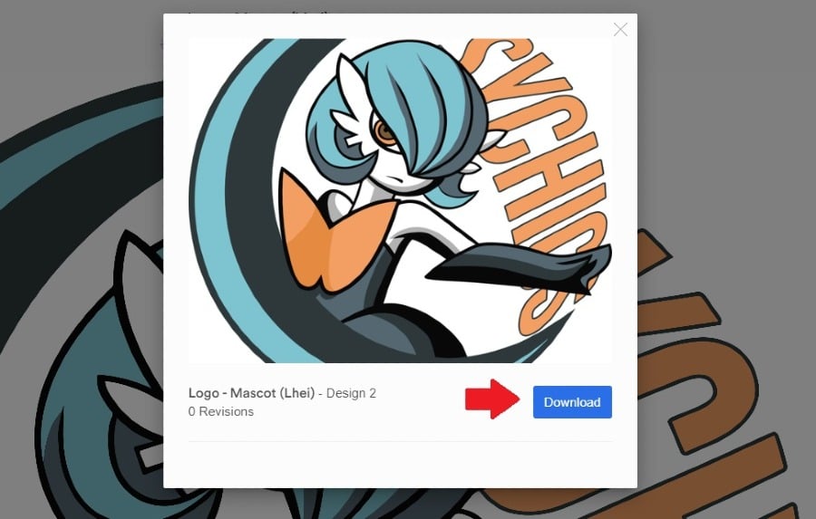
Once you have the final design you like, click on the “Download” button and it will automatically save on your computer. With Penji, you get all rights and licenses of all designs created for you. Plus, Penji also stores finished designs on your platform, making it easy for you to monitor your inventory.
Sign Up Now
If you want affordable, quality, and fast graphic designs for your educational institution’s marketing, try Penji’s services for 15 days. Request your first design and see how easy it is. Sign up here and say hello to your new reliable graphic design partner.


