Food is an essential part of life. Many of us look forward to a hearty, comforting dinner after a hard day’s work. We celebrate occasions with a nice meal, often shared with people important to us. And on those days when we’re feeling under the weather, a serving or two of our favorite dessert can miraculously lift up your spirits.
Needless to say, the restaurant industry will never run out of people looking for good food. With most restaurants serving up delicious offerings, the competition all boils down to marketing tactics. We’ll look at the top restaurant ad design examples and see what each one brings to the table.
If you want restaurant graphic designs that are good enough to eat, hire Penji. With unlimited designs for a flat monthly cost, you can have all your business materials crafted by an expert. From your menu to your website and social media posts, Penji can always cook up a great design that will entice diners in.
1. Chipotle
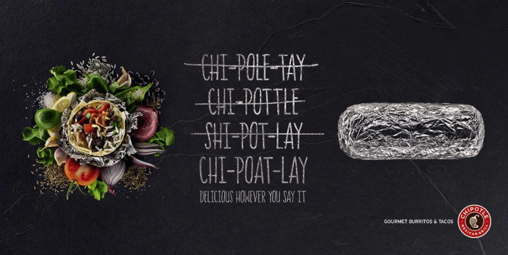
Okay, I love this. Why? Because I can relate to this ad. I can never figure out the correct way to pronounce the name, and the restaurant brand plays on that. However, it doesn’t fail to note that the food there is still delicious, no matter how you say it. Witty, to the point, and overall really fun ad.
2. Pizza Hut
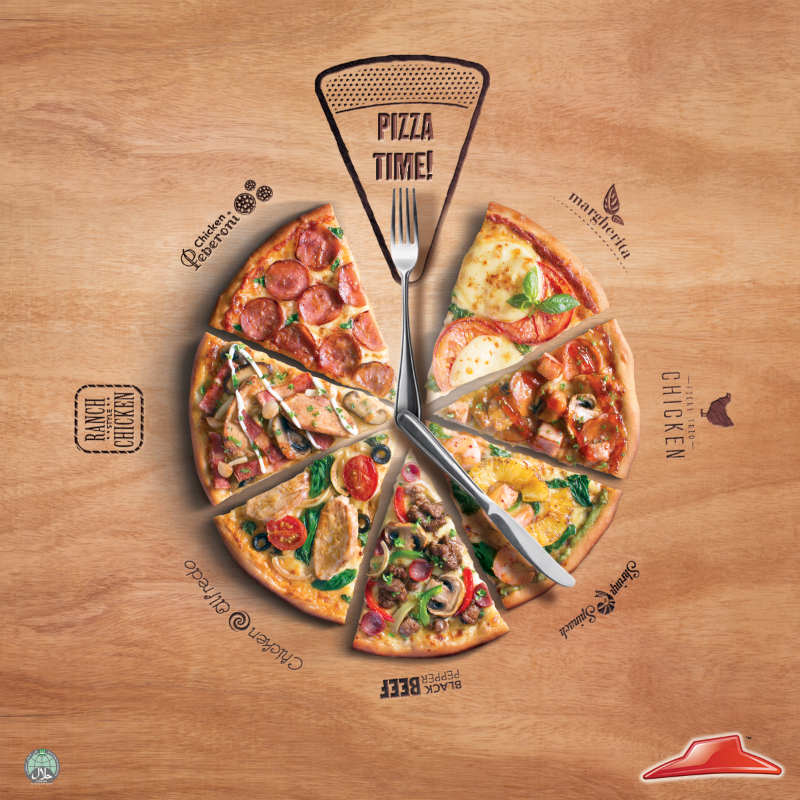
I really like the clock aesthetic that Pizza Hut has going on here. It almost alludes to the fact that the restaurant ad design is alluding to the fact that it knows that we tend to run pretty busy lives. However, it reminds us that we should always take a bit of time out to grab a bite to eat and what better way than by eating some pizza? I also love how different sections of time are represented by different types of pizza (I think 5 pm is my new favorite time!)
3. Legal Sea Foods
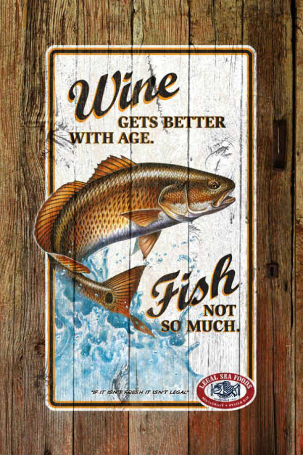
This restaurant ad design from Legal Sea Foods may have 2 simple lines, but I feel the impact that they carry, especially with the fish image. They reaffirm their policy with regards to their menu, citing that they only use the freshest of fish in their menu. But I can’t help that there’s a sense of boldness in this particular advert – almost as if they’re trying to call out a competitor on their own menu. Regardless, this is a particular ad design that can definitely turn heads.
4. Nu-Way Weiners
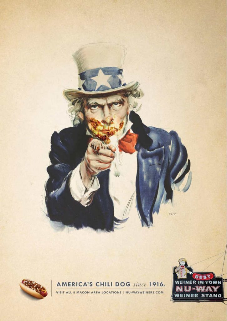
We all know Uncle Sam from Army recruitment posters, yes? Well, what we didn’t know was that he’s a massive fan of chili dogs. And he wants YOU to be one as well. This restaurant ad design from Nu-Way Weiners is a great display of Americana marketing, as it resonates with those that are especially patriotic. And, to be honest, there’s something a bit refreshing about seeing Uncle Sam after he enjoys a good chili dog.
5. Nandos
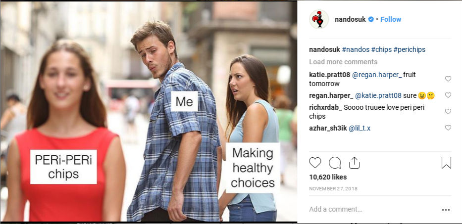
Sometimes the best restaurant ad design can be a simple meme. Take for instance this ad on Nandos UK’s Instagram account. It depicts the popular “Cheating Boyfriend” meme but wrapped around to bring attention to Peri Chips. It causes people to talk about the image and the restaurant. Plus, it’s quite funny to look at.
6. Brasa
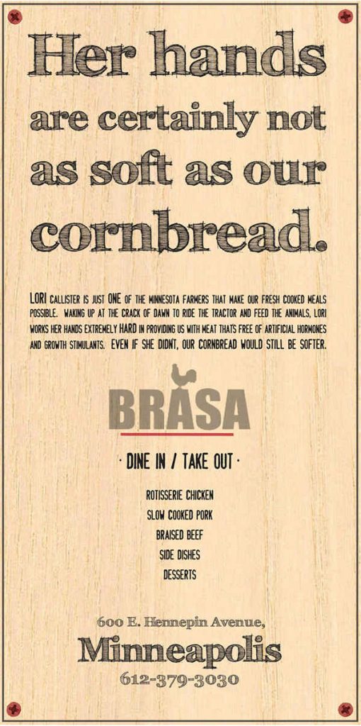
This restaurant ad design is just hilarious. It uses suggestive messaging to convey an image with regards to its cornbread that’s guaranteed to get a chuckle out of basically anyone who reads it. I also love the fact that they provide a little backstory with regards to the product itself.
7. Subway
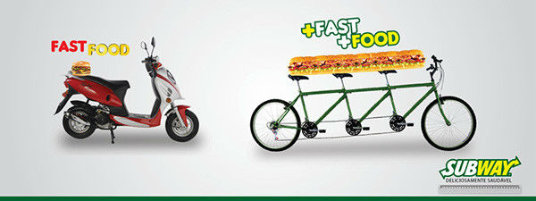
Subway’s not messing around at all in this ad design, are they? Not only does it brilliantly convey its message, but it also subtly throws shade to its competitors with regards to its service speed. Normal places give fast food. Subway gives quality food and gives it fast. Pretty cool ad, I’d say.
8. Il-Tramezzino
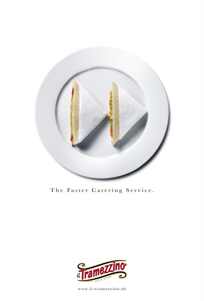
I really like this restaurant ad design. It’s simple, yet it shows its point well. Not to mention, it also uses one of the most recognizable icons ever. I mean, the sandwiches are representing a fast forward logo – what better way to show quick service do you need?
9. Ristorante Cantina
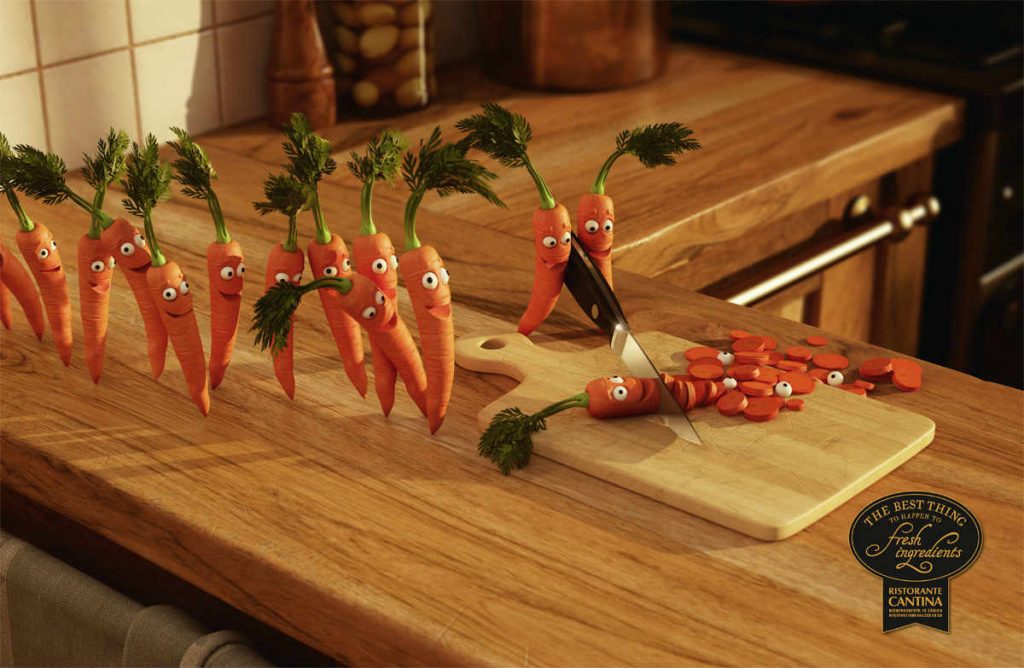
Okay, this restaurant ad design is a little gruesome if you think about it, isn’t it? It’s carrots literally lining up to die – how sad. But I do like that the purpose of this ad is to showcase that the ingredients used in their recipes are nothing short of the freshest around. But one must ask: will anyone hold a funeral for those poor carrots?
10. Jack Astor’s Bar And Grill
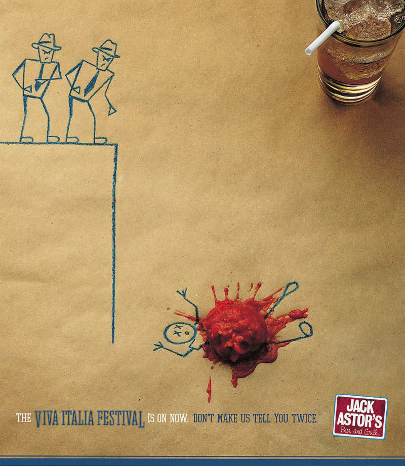
What’s with restaurant ad designs innocently killing characters just to prove a point? Shouldn’t these poor drawings sue or something? Well, empathy aside, this is a great use of the materials on hand to create such an ad. What better way to advertise a restaurant than by creatively using the actual food within said restaurant?
11. On Toes
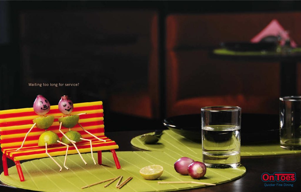
What do you do if you’re waiting too long for service? Why, you tend to play with the things on your table, of course. Although in On Toes’ case, I think they may have taken it a bit too far – I wish I was that deft with onions and limes. I guess if you dine at On Toes, you’ll be served long before you can create a lovely night out with vegetables.
12. South Sea
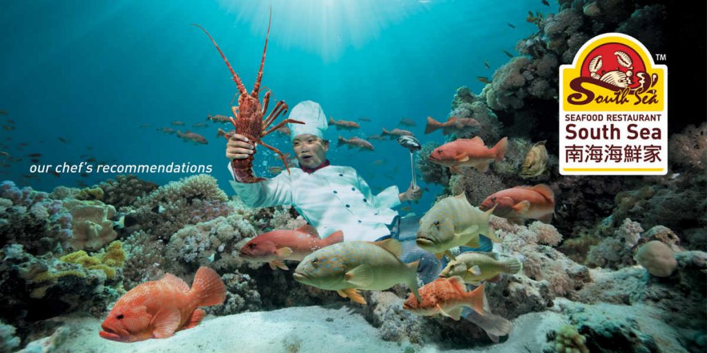
We all know that fresh food is good, yes? Well, South Sea definitely wanted to show just how fresh their seafood is by actually diving down to the ocean depths to get it. Although, he’ll probably need some proper gear…
13. Scores
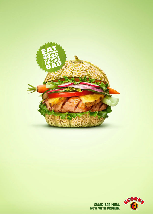
With healthy eating being on the forefront on everyone’s mind nowadays, it’s no surprise that restaurants are trying to appeal as such. Take this restaurant ad design, for example – wouldn’t you want to dig into such a healthy meal like this? If you were to ask me, I think that this design ‘scores’ with its audience!
14. McDonald’s
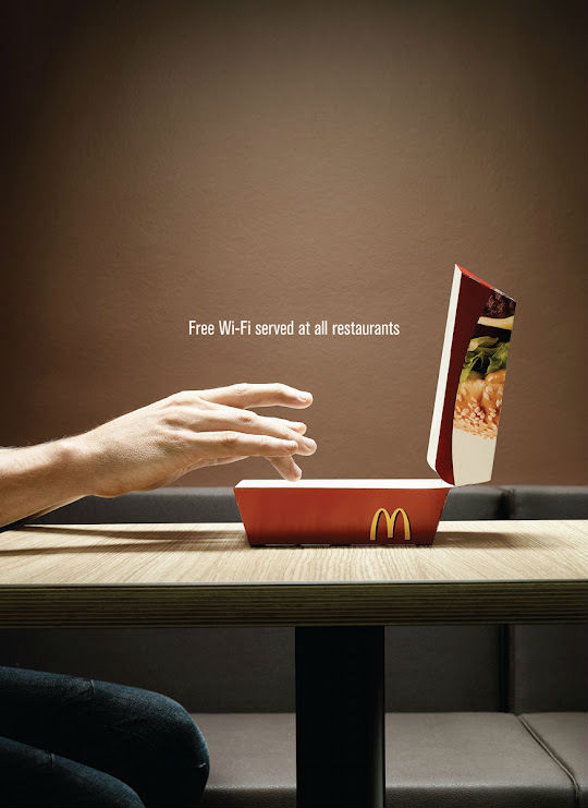
Now, this is pretty epic for an ad. It doesn’t even talk about food directly, yet it still compels me to want to go to McDonald’s to eat. Why? Free Wi-Fi while I eat. You can have a nice burger, and post about it on Instagram for free? Sign me up!
15. Harbor House Crabs
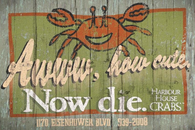
And again with the edgy advertising! I’m sure crabs have rights, right? Well, regardless of your ethical stance towards crabs, you have to admit that this ad is well done in order to capture our attention. I especially like the finish on it – makes it feel like it’s right by the sea.
16. Red Lobster
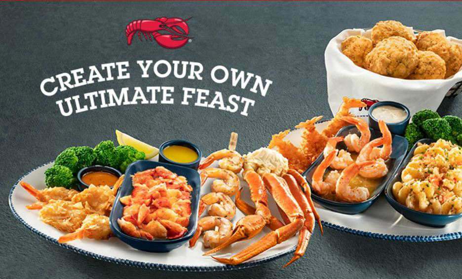
This restaurant knows just how to whet the appetite of seafood lovers. Their graphics for their Create Your Own Ultimate Feast shows photos of platters overflowing with culinary treats.
The simple layout and minimal text of the image allow viewers to focus more on the photo. In the same vein, the chosen background was a cool gray hue with subtle texture. In addition, the plates are plain white with blue trimmings and saucers. The simpleness of the background and plates draws the audience’s eyes straight to the colorful greens, oranges, and yellows of the food on showcase.
17. Olive Garden
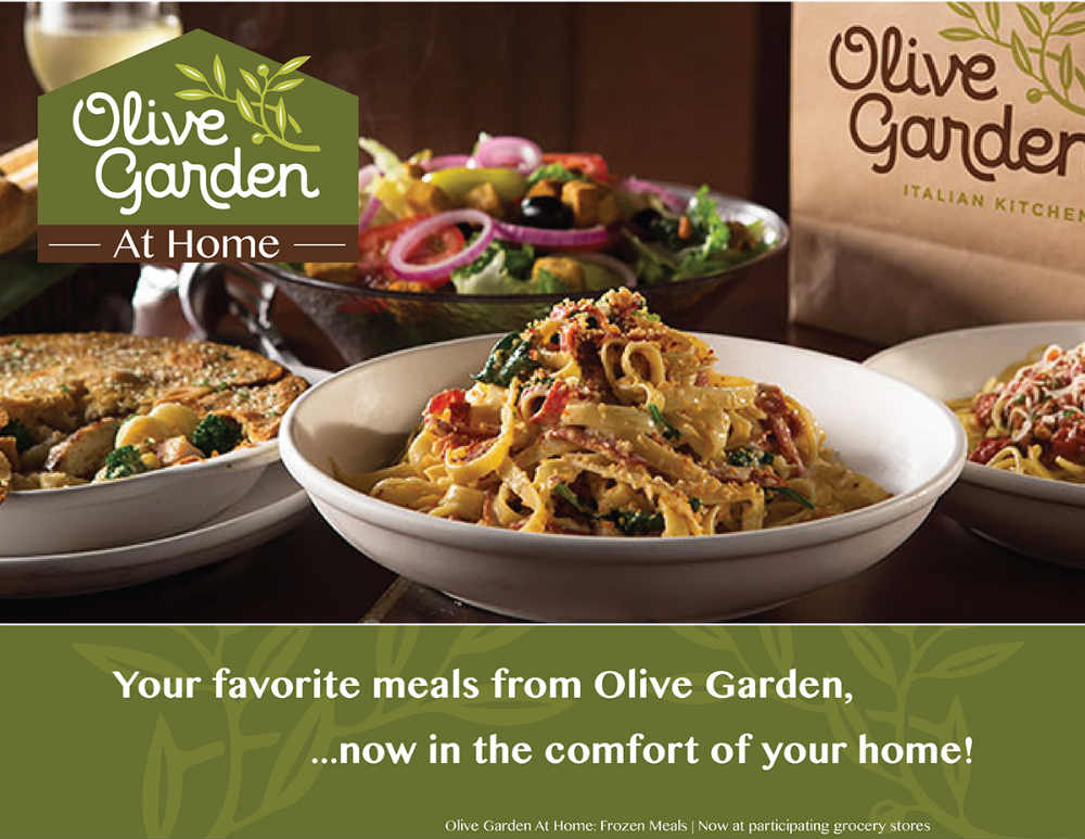
This material is for Olive Garden’s catering services which allows customers to either order food via pickup or delivery. The photo shows various Olive Garden items on simple plates beside a takeout brown bag. The copy is plain and simple: “Your favorite meals from Olive Garden, now in the comfort of your home!”
The image would make anyone crave for delicious Italian food and enjoy it in their jammies. The straightforward text layout and design allow the photo of the food to take the center stage. The foods seen in the photo noticeably have green hues, which is the main color of the restaurant’s logo.


