Packaging design as a service is an outsourced model where ventures hire external providers to handle their custom packaging design.
With studies showing that 81% of consumers have tried a new product simply because the packaging grabbed their attention, it’s clear that packaging design services can make a brand stand out in a crowded market.
Whether you’re subscribing to an unlimited graphic design service or hiring a package designer, making the most out of packaging design as a service can spell the difference between a worthy investment and money down the drain.
If you’re new to outsourcing packaging graphic design services or simply want to get more bang for your buck, here are a few hacks (along with awesome packaging design examples made by Penji) to make your packaging work harder and sell faster.
Hack #1: Ask for Strategic Use of Color to Boost Shelf Impact
When using a package design service, your designer isn’t on the retail floor—you have to communicate how and where your product will compete visually. Color plays a huge role in standing out and evoking the right emotional response.
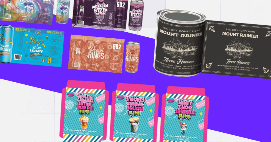
For instance, these vibrant 902 Brewing Co. cans use high-contrast, saturated colors that immediately grab attention:
As seen in the image, each color is dialed in to match the flavor or theme while maintaining bold contrast for readability. These are clearly designed to pop both in-store and online.
- Actionable Tip: When briefing your packaging design maker, ask them to explore color palettes based on target audience psychology and retail context, not just aesthetics.
Hack #2: Know Who You’re Hiring—Product Designer vs. Packaging Designer
One common pitfall when using packaging design as a service is assuming any designer can do the job. But there’s a difference between a product designer and vs. packaging designer, and knowing that leads to better results.
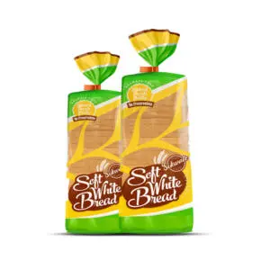
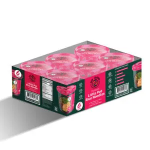
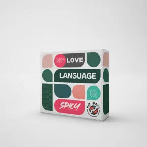
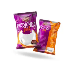
These designs are an awesome packaging design as a service example:
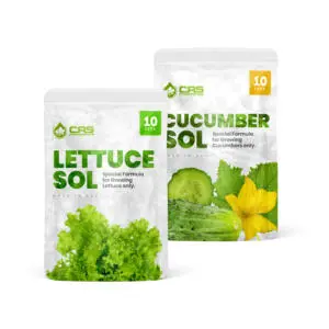
The designs showcase a clean, structured front with bold typography and well-organized information on the back. Without a doubt, the one who crafted it knows layout, labeling practices, and how to maintain brand consistency across SKUs – and that’s one of the reasons why clients across the globe choose Penji.
- Actionable Tip: When choosing a package designer, ask if they have experience with packaging (not just branding).
Hack #3: Bundle Your Branding Package for Better Storytelling
If you’re outsourcing through packaging design as a service, invest in a complete branding package or unlimited graphic design. Doing so ensures every version of your product (flavors, scents, strengths) tells a cohesive story and avoids a visual hodgepodge.
Let’s take these examples, for instance:
The cans feature three distinct, stylish male characters, each with its own color palette and mood. And yet, all of them are united under one bold layout. Sometimes, achieving this consistency can be hard with freelance, one-off jobs.
- Actionable Tip: Instead of comparing freelance packaging design rates, ask your package design service if they offer bundle pricing for complete product lines or a branding package.
Hack #4: Prioritize Packaging That Feels Like an Experience
One of the biggest wins of using packaging design as a service is the ability to turn your box into part of the customer experience. Whether you’re shipping directly to customers or selling on shelves, great design should delight before they even open it.
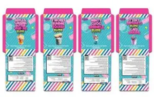
This concept can be seen from these packaging examples:
The bold visuals and interactive layout make the unboxing feel fun and engaging. Added to that, the entire structure also doubles as a retail-ready or direct-to-consumer mailing box design, meaning the box does double duty.
- Actionable Tip: When working with graphic design services, discuss the whole experience. Ask for dielines and mockups that treat the packaging as part of the product, not just a container.
Hack #5: Always Request Label Mockups on Realistic Packaging
When outsourcing through packaging design as a service, don’t stop at flat files. Always request realistic mockups so you can visualize how your label sits on curved surfaces, dark glass, or even inside mailers.
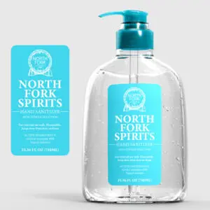
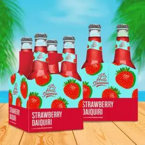
For instance, look at this packaging design we did for a beer brand:
We made sure that the client saw how the design would look and how the fine details would pop beautifully on the dark bottle.
- Actionable Tip: Don’t approve label designs in isolation. Ask your packaging design service to show how it looks applied, especially if you plan to use customizable mailer boxes or retail displays. This saves time and prevents costly print surprises.
Hack #6: Use Minimalism to Signal Premium Quality
When outsourcing packaging design as a service, it can be tempting to request “eye-catching” visuals. However, it’s crucial to note that colors and design must depend on the niche. Sometimes, less noise equals more trust and confidence.
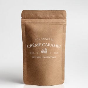
Take this packaging design, for example:
The soft hues and clean layout convey calm, trust, and elegance. It goes without saying that this design reflects how minimalism can communicate sophistication and justify a higher price point.
- Actionable Tip: When working with your packaging design website, provide visual references for brands you admire. If you’re aiming for stellar simplicity, ask them to balance function and form with clean, branded elegance.
The Lowdown
Packaging design as a service is a valuable tool if you want your brand to stay agile, consistent, and on-trend without stretching your internal team too thin. With the right partner, you can transform how your audience perceives your product and increase conversions while at it.
Ready to elevate your packaging without the back-and-forth? Penji can help!
Our vetted designers understand packaging design and everything else related to graphic design that could make your brand stronger and take you closer to your audience.
Watch a short demo or check out our design portfolio to learn why brands love working with us.
Frequently Asked Questions (FAQs)
What are packaging design services?
Packaging design services involve creating the visual and structural design of product packaging to ensure it is attractive, functional, and aligned with the brand’s identity and target market.
What is design as a service?
Design as a service is a model where businesses outsource their design needs (such as packaging, branding, or graphics) on a subscription or on-demand basis rather than hiring in-house teams.
What is the purpose of package design?
The purpose of package design is to protect the product, communicate brand identity, attract customers, and influence purchasing decisions at the point of sale or unboxing.
About the author

Carla Deña
Carla is a journalist and content writer who produces stories for both digital and legacy media. She is passionate about creativity, innovation, and helping small businesses explore solutions that drive growth and social impact.
Table of Contents
- Hack #1: Ask for Strategic Use of Color to Boost Shelf Impact
- Hack #2: Know Who You’re Hiring—Product Designer vs. Packaging Designer
- Hack #3: Bundle Your Branding Package for Better Storytelling
- Hack #4: Prioritize Packaging That Feels Like an Experience
- Hack #5: Always Request Label Mockups on Realistic Packaging
- Hack #6: Use Minimalism to Signal Premium Quality
- The Lowdown
- Frequently Asked Questions (FAQs)


