There are various reasons why your company newsletters are not read. And of course, you have to identify these so you can avoid repeating the same mistakes. Just imagine, you and your team spent a lot of time and effort coming up with a newsletter, only to find out that it will end up in the trash! Get inspiration from these newsletter examples and create newsletter graphics that captivate.
If you’re no expert on graphic design, entrust the task to Penji’s design team. Their graphic designers belong in the top two percent in the industry, ensuring that clients get quality and convertible newsletter graphic designs. Check out their portfolio here.
Reasons Why Your Newsletter is Unread
It’s All Promotional
While newsletters are considered a marketing tool, it shouldn’t be overly promotional. If you keep on sending similar emails showing only your products (and no added value), the tendency is that your recipients will unsubscribe. You have to make sure that you also provide new information. Say for example you are selling clothes. It doesn’t necessarily mean that your newsletters should only contain your products. Perhaps, create an article teaching your readers how to take care of clothes. Or maybe give fashion tips for winter.
The Writing Style is Dragging
If your headline is not interesting enough and your message is not clear, it would be really hard to gain traction. As much as possible, use a conversational tone when writing. Think of your recipients as your friends. Be excited and be filled with passion.
The Design is Just Messed Up!
Whether you like it or not, your newsletter design plays a big factor. Accept the fact that we are visual creatures and often times, we judge things based on how it looks. With email newsletters, you only have a few seconds to impress your clients.
Quite frankly, with all the emails that we receive every day, a plain and boring newsletter wouldn’t work. Thus, it is better if you hire a professional team such as Penji to help you with your newsletter layout and even with your content.
Best Newsletter Examples for 2020
If your current newsletter seems to be dull and boring, then perhaps our best newsletter examples can inspire you. We have chosen these samples based on different factors including layout, content, and overall appeal.
1. REI

Did you know that using photos with actual people is an effective way to promote products? This is clearly what REI did to their newsletter. Instead of just using plain photos of their garments, they made sure to add images of an active person wearing their products. In addition, you get to learn about their events and class schedules if you are up for something adventurous.
2. Brain Pickings
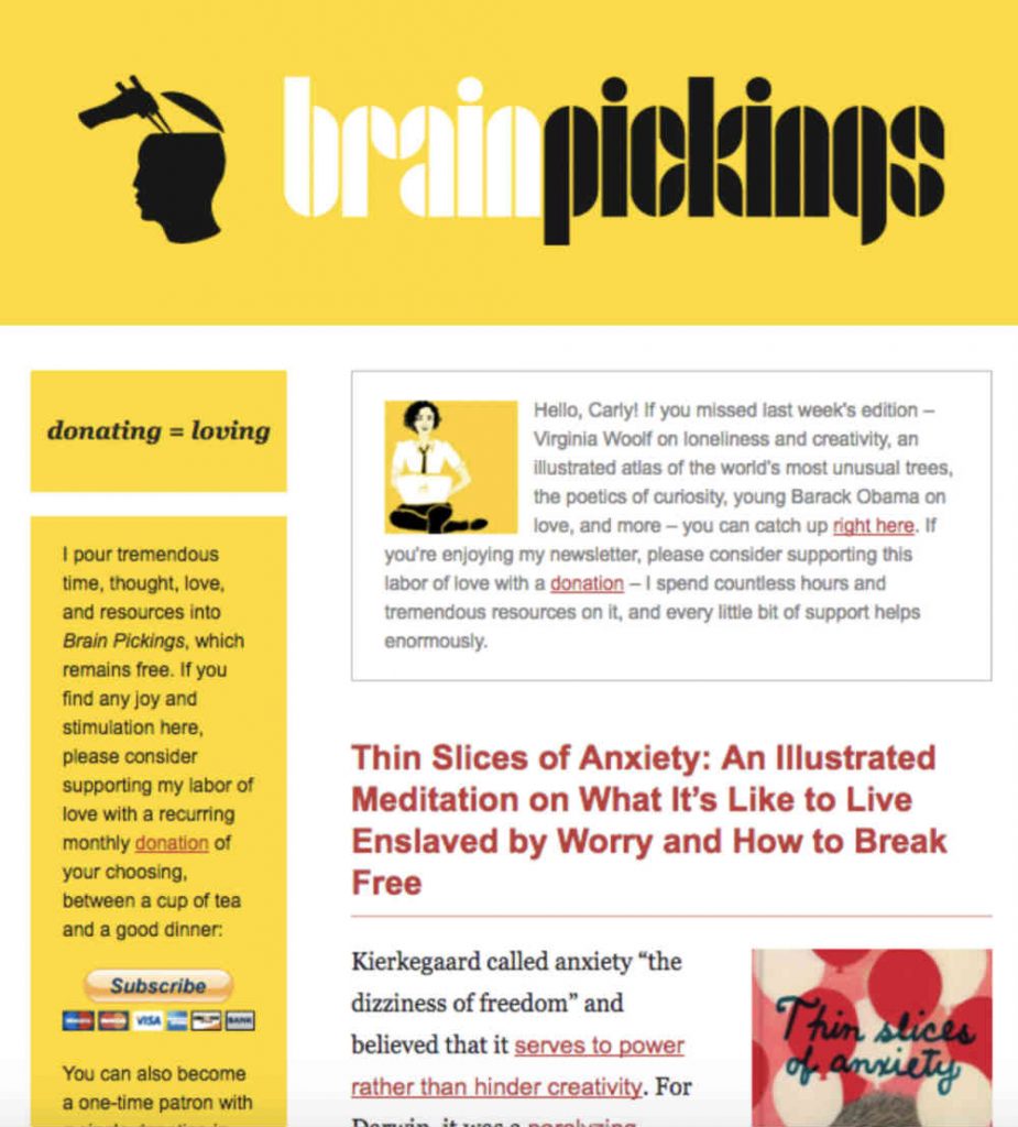
Brain Pickings was smart in using its signature yellow color which is bright and striking. It will definitely lure readers to check out what it is. The illustrations are unique and interesting as well.
3. National Wildlife Federation

What we personally love about the newsletter from the National Wildlife Federation is that it encourages readers to even take a quiz. This increases interaction and it helps the readers gauge their knowledge. It’s not just your usual FYI email.
4. SXSW
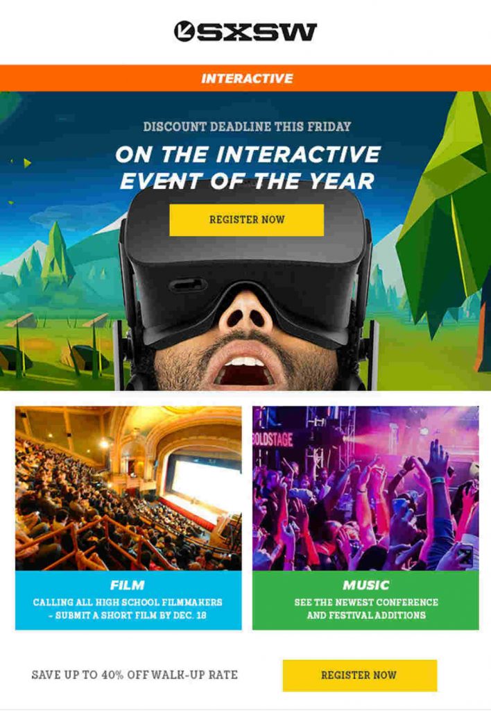
Using the right images can influence people as well. In the newsletter from SXSW, they are promoting an event and highlighting it with the use of people having fun. It gives you a preview of what to expect from the event, making you want to join and register right away.
5. Away Travel
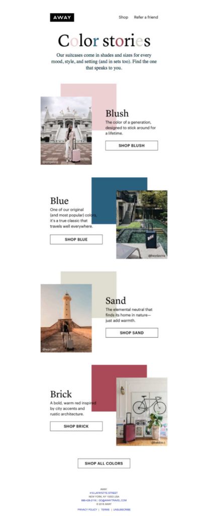
Instead of just using plain photos of travel bags, Away Travel used a different technique by using amazing destinations as a background. The brief description per travel luggage helps too in making the right decision. They also enlarged the colors or hues to give you a clearer vision of the travel bags.
6. Community

Again, content is the main ingredient in these newsletter examples. Thus, making it an important component. Apart from a good heading, the first few texts should be interesting as well. Community used questions to spark interest among its readers. This also gives an idea about what to expect from the entire newsletter.
7. Cook Smarts

We know that it can be hard to think about what dish to prepare every single day. But with Cook Smarts’ newsletter, you don’t have to worry about that. It has that value that most of us are looking for.
8. JINS
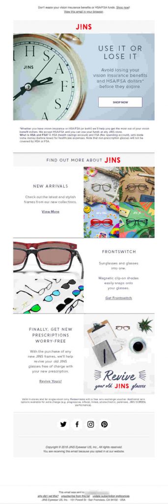
A good headline can make a big difference. JINS is apparently thinking of that when they created this newsletter. ‘USE IT OR LOSE IT’ might seem like a quick phrase but it created a big impact. The size of the font helped as well.
9. Fandango Now
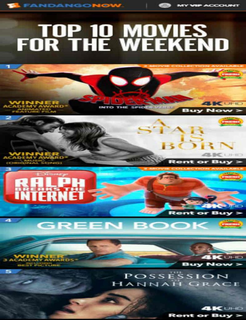
Fandango Now’s newsletter is pretty straightforward. It gives you the list of the top 10 movies you can watch during the weekend. It doesn’t need to have frills but a direct approach is necessary. Just photos of the movies, a ‘buy now’ button and it’s all good.
10. Unsplash
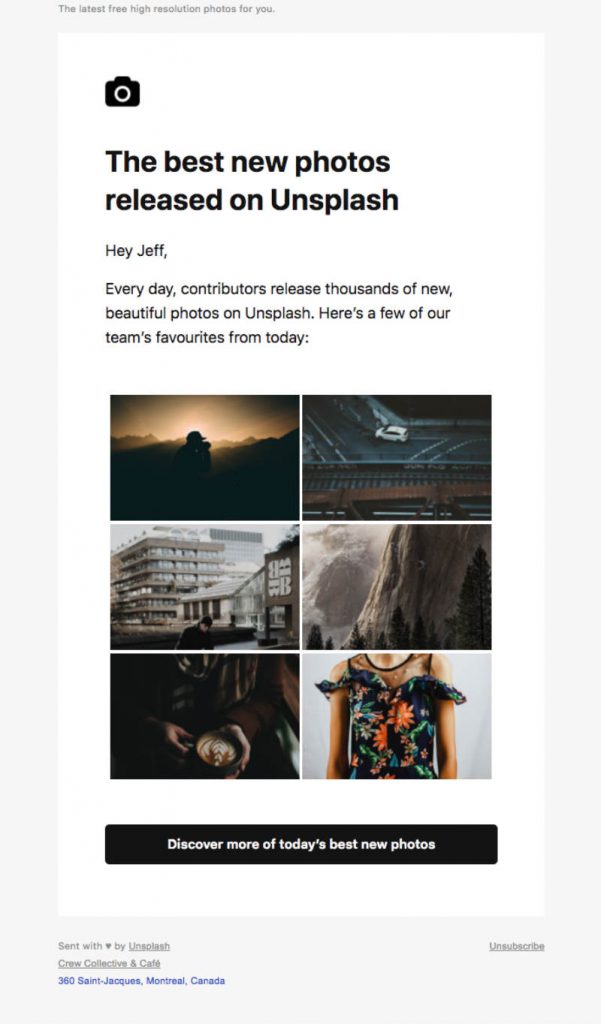
Now, who’s not familiar with Unsplash? If you regularly need stock photos, then this is probably one of the sources that you check out. Their newsletter gives the readers a glimpse of the latest and best photos they can freely use. Like Fandango Now, it has a straightforward approach, which is useful for specific industries and markets.
If you are unsure which type of newsletter is best for your business, then we recommend that you talk to Penji team. They have the expertise and the experience which makes them credible enough to suggest the most appropriate newsletter designs, format, and content.
11. The Nature Conservancy
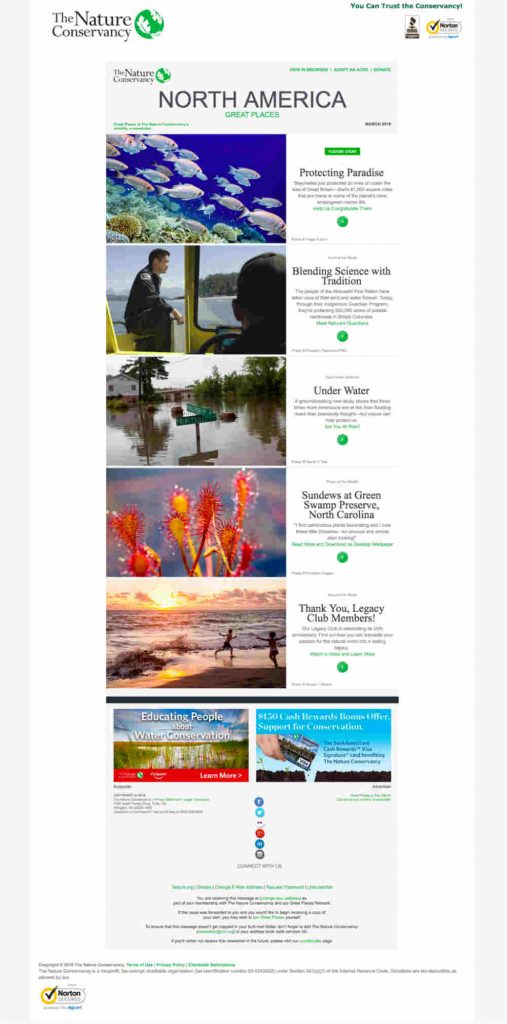
The Nature Conservancy used some of the best photos of nature and this is effective to capture the attention of their readers. The layout is conventional, crisp, and clean which shows how serious they are with their advocacy. Their contents are also well-thought-out and the right market will definitely appreciate the new learnings from the newsletter.
12. Adidas

Adidas is already a big brand, but that doesn’t mean they can’t take advantage of newsletters. In this particular example, they used the newsletter to promote an event. It has the right mixture of quality images and text, just enough for readers to understand what it is all about. The placement of call-to-action buttons helped a lot too.
13. GAP
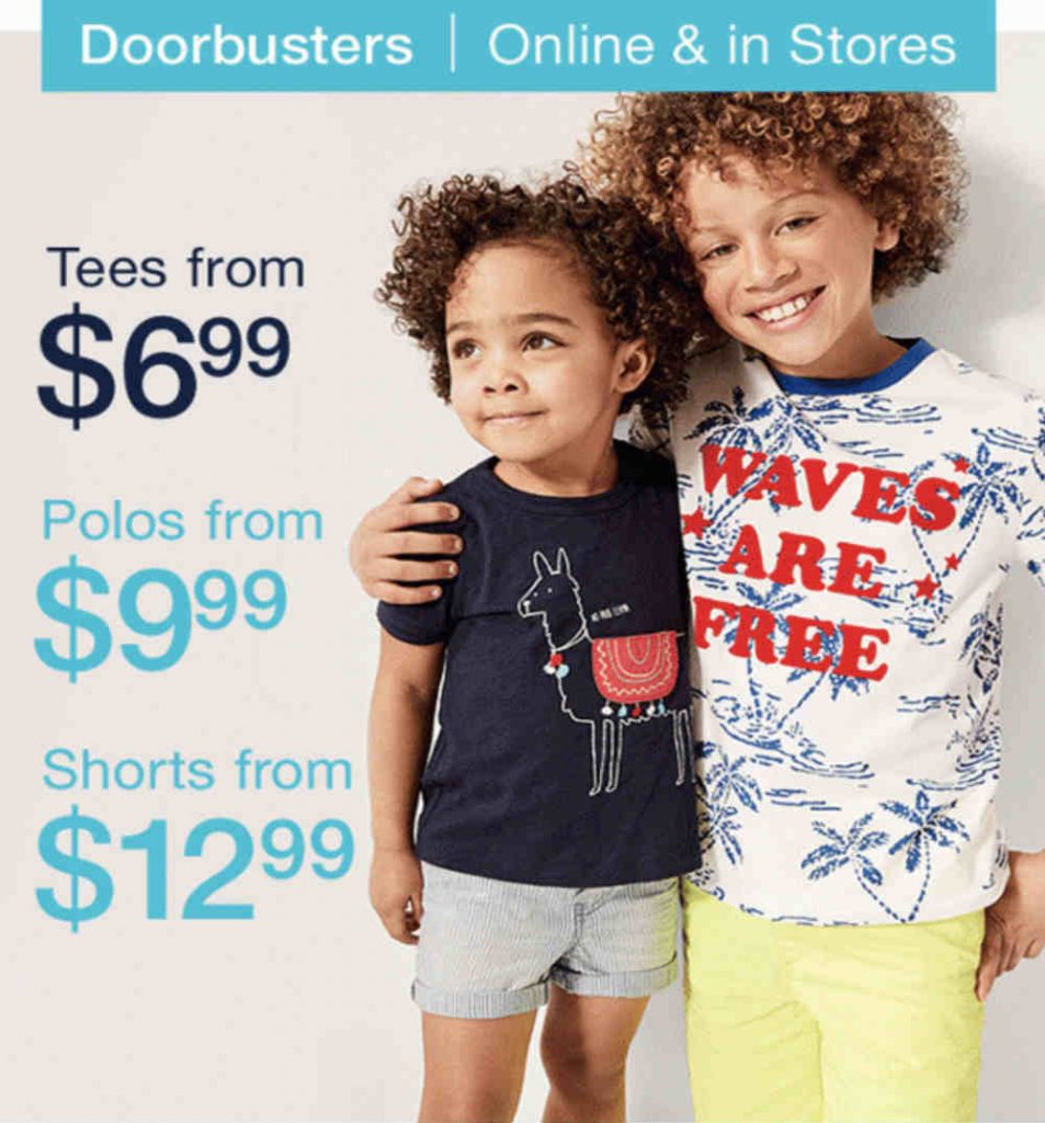
Instead of using videos, you can use GIFs for your newsletters. This is what GAP did and it proved to be effective. You see, micro-animations are already on the rise and you should ride the wave.
14. Tom Raffield
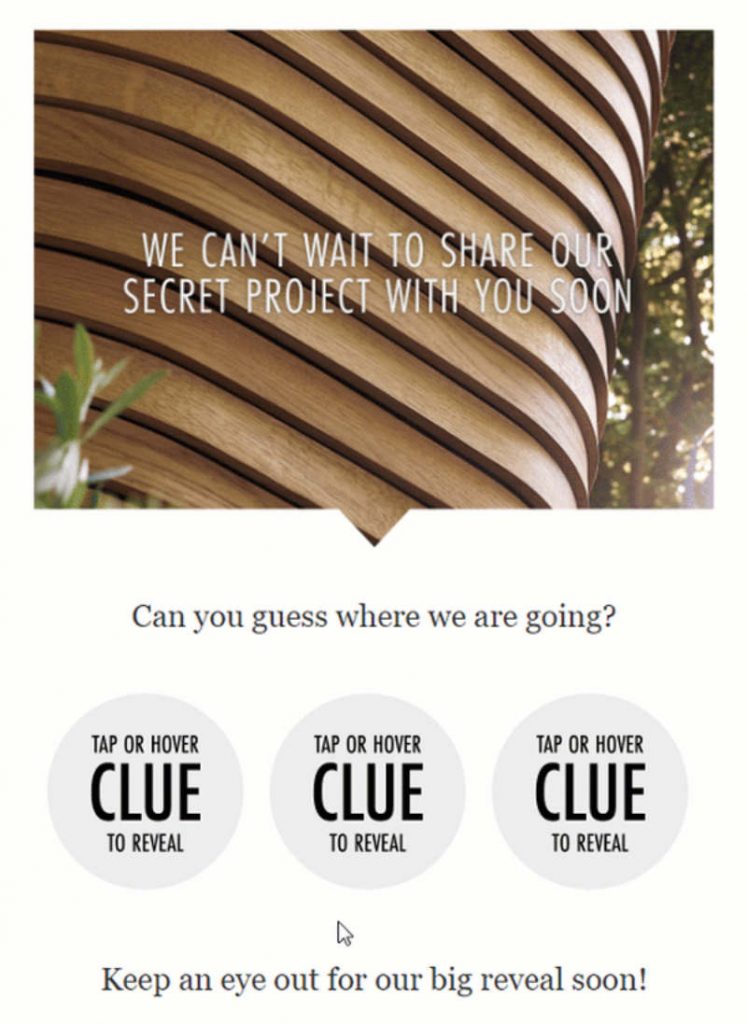
You can also tease your readers using a newsletter. This is what Tom Raffield’s team did. By using this strategy, you are slowly building momentum and people would be eager to know more.
Request Unlimited Newsletter Graphics from Penji
Whether you want graphics for newsletters, billboards, online ads, or websites, Penji does all those at a fixed monthly rate. Plus, requesting a design is easy through Penji’s platform. Here’s how:
Create a new project
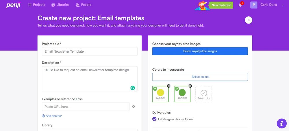
Create a new project on the dashboard by choosing from the list of design types. You may also create a customized one if your project isn’t on the list. You will then fill out a form that will have all the details of the design brief.
Review and revise
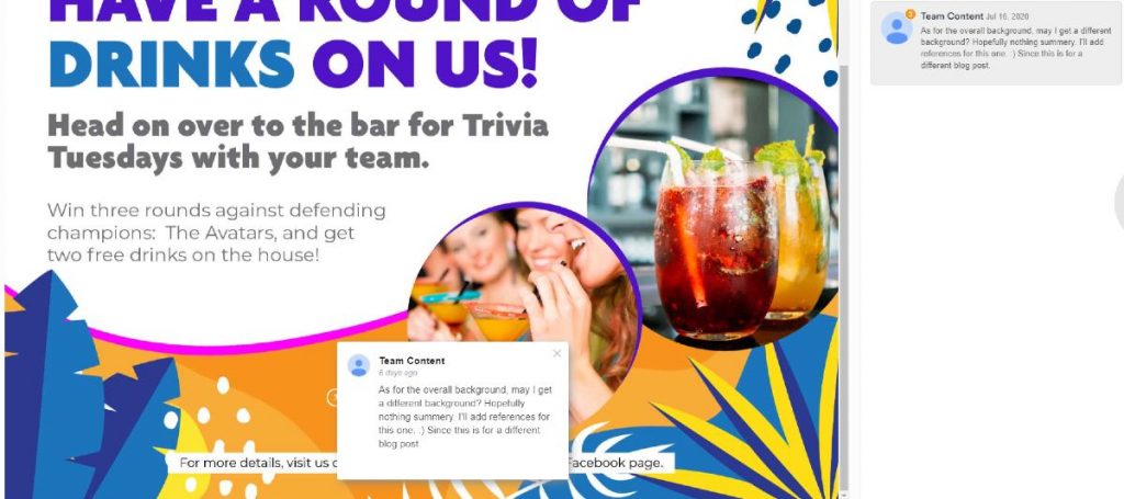
Once the designer is assigned and submits the first draft after 24 to 48 hours, you can either download or revise it. Don’t by shy about asking for revisions because all Penji plans come with unlimited revisions.
Download source file
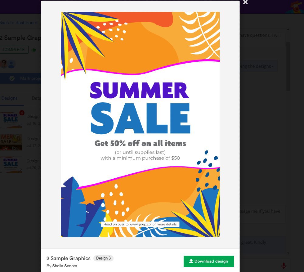
Penji’s platform makes it easy to request designs, revisions, and download source files. Just click on the “Download” button and the design will be automatically saved on your computer.
Conclusion
Perhaps you already have an idea which type of newsletter examples will serve as your guide. Yet again, the help of professionals is recommended so you will be able to finish on time. In that case, Penji’s team of graphic designers is here to help.
If you’re still a bit hesitant to commit to a whole month, sign up for a free trial for 15 days. Rest assured, you’ll get quality, efficient, professional, and fast graphic designs for your business!
About the author

Barbara Anne Isla
BA Isla is a Content Writer and also an Events Host. She left the corporate world to do what she loves and to spend more time with her amazing kids. She hopes to bring valuable change to society with her words.


