If you want your brand to exude prestige, elegance, and luxury, a crown logo is the way to go. To prove this point, here are ten famous brands that incorporate a crown in their logos. We also listed ten Penji-crafted crown logos to show you how we do it.
Table of Contents
- Why use a crown in your logo?
- Famous Logos with Crowns
- 10 Penji-Designed Crown Logos for Inspiration in 2024
- Elements of a Good Crown Logo
Why use a crown in your logo?
The usage of crowns goes back millennia, most commonly worn by monarchs as a show of power and dignity. The earliest findings date back to pre-historic times in Haryana, India.
As the centuries pressed on, the styles and materials have changed, with each country and monarch modifying the crown to their own preferences.
Despite the historical alterations, the one consistency lies in the symbolism. Crowns signify status, authority, and class. Throughout history, they’ve been used to convey these ideals in a number of manifestations — including commerce.
It’s easy to see why brands dealing in luxury goods would want to utilize this symbolism. But the crown shows up in the branding efforts of many different industries.
Let’s begin by taking a look at some of the more famous logos with crowns. Take note of how each brand utilizes the crown in its own way.
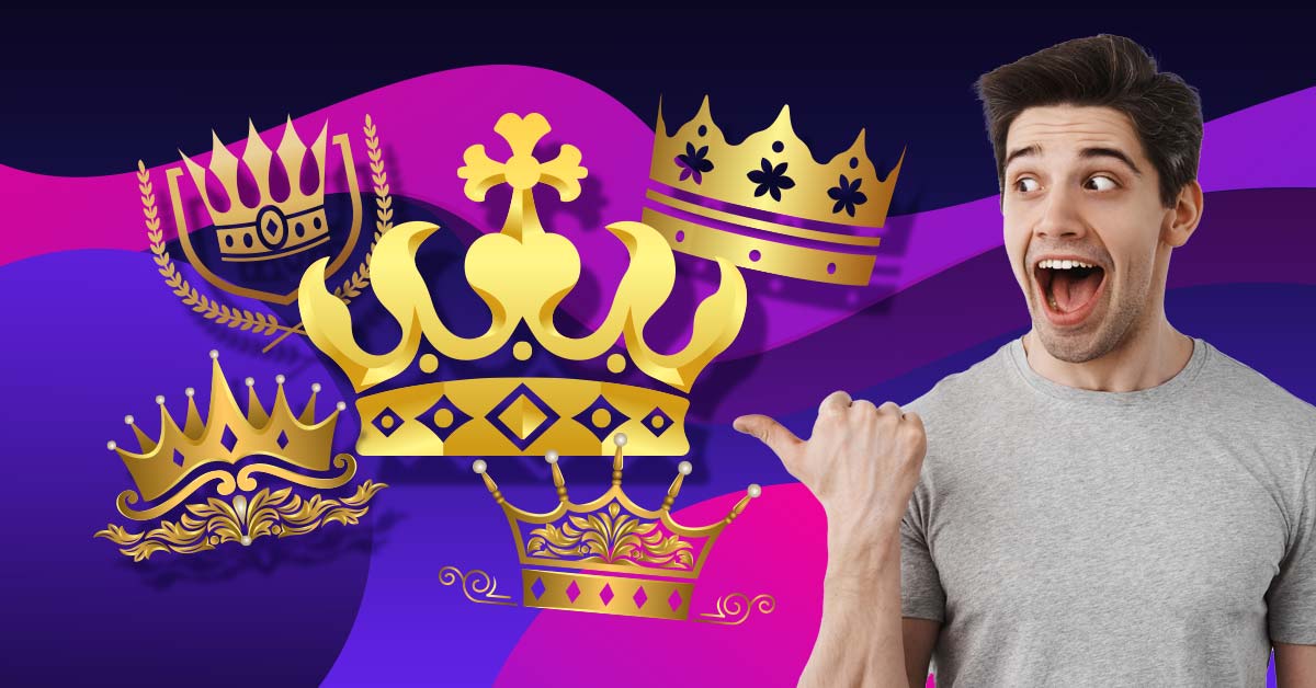
Feel like royalty with a crown logo
Start a project today, get designs tomorrow!
Famous Logos with Crowns
Here are 10 famous designs of well-known companies who deploy the crown in their logomark.
Rolex

Rolex watches are considered some of the most prestigious and expensive on the market. It’s easy to understand why they’ve incorporated a crown into their logo. Rolex has been around since the early 1900s and has only changed its logo three times. Which is quite the feat. They’ve utilized the crown since 1952 with only one minor change to the logo.
Corona
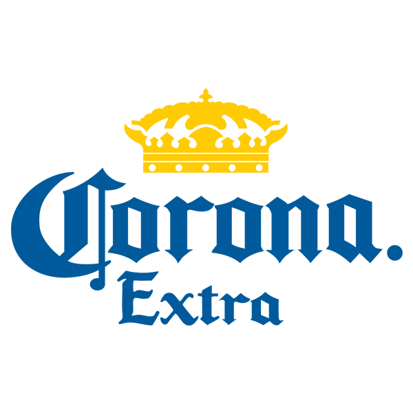
The Corona Extra brand strategy is all about conjuring sensations of relaxation in an exotic paradise. A carefree, luxurious existence. Sounds a lot like the life of royalty. This is conveyed through the minimalist color scheme: blue for the typeface and gold for the crown. Effortlessly graceful.
Juicy Couture

Juicy Couture’s logo suggests glamour and elegance and has many similarities to logo design trends you would have seen in the early part of the 20th century— before the mid-century race towards minimalism took hold. There are certain iterations of the logo that possess only the wordmark, but the whole logo includes the entire emblem shown above.
Budweiser
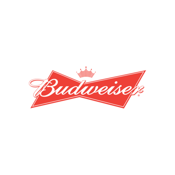
Budweiser is the second beer company on this list. Like Corona Extra, Budweiser uses the crown to signify a feeling of superiority in the industry. In fact, Budweiser refers to itself as “The King of Beers”. While this is certainly disputed, no one can take from Budweiser their long history. Since 1876, Budweiser has been considered an American mainstay in the industry.
Hallmark
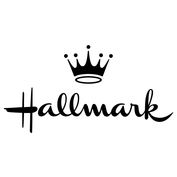
Hallmarks logo presents an interesting contrast. On one hand, it’s very minimalist and always has been. In fact, since its inception in 1923, Hallmark has consistently deployed a black monotone wordmark with subtle stylistic changes over the years. On the other hand, its wordmark is incredibly unique. The typeface could be picked out from a lineup with ease. The crown, too, can be distinguished from the mass of other logos out there. In a number of instances, the brand only uses its crown.
Royal Caribbean
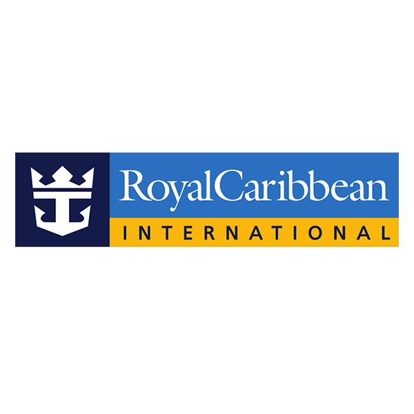
Royal Caribbean is a global cruise holding company. Cruises generally possess an heir of luxury to them. Images of tropical landscapes and bottomless pampering flood the mind. But these themes are only doubled down on when the company name actually includes the word “royalty.” The crown truly fits this brand.
Canada Dry
Canada Dry is a brand of soft drink known for its ginger ale. Its logo is certainly among the most regal looking of soda brands. Canada Dry deploys an emblem logo style, inside of which sits a globe-like grid. Atop the logo is a minimalist crown.
Starbucks
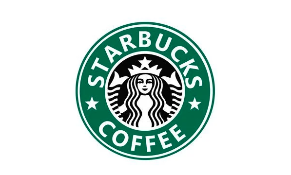
Starbucks has become a ubiquitous brand. Its brand is nearly synonymous with coffee. Lovers and detractors alike can spot the logo from a mile away. Its logo is an emblem, inside of which sits a mermaid with a crown. Starbucks’ branding actually has roots in literature. The company is named after the chief mate of the whaling ship in Herman Melville’s 1851 classic Moby Dick.
Rimmel
Rimmel London takes its inspiration from the land of its origin. Founded in London, England in 1834, Rimmel London has been in the cosmetics game since King Williams IV’s reign. Its logo uses the British crown in its logo, leaning into its royal quality.
The Ritz Carlton

The Ritz-Carlton is a well-known chain of hotels, often credited with revolutionizing hospitality in America by creating luxury in a hotel setting. The lion and crown Ritz-Carlton logo is a combination of the British royal seal (the crown) and the logo of a financial backer (the lion).
10 Penji-Designed Crown Logos for Inspiration in 2024
The following designs prominently feature the crown. Note the nuance and idiosyncrasies of each. These designs weave the crown’s imagery into the logo, instead of simply relying on the crown’s image itself.
The logo for Westbrooke Ventures uses the company’s initials to construct the arches of the crown. The Royal Home logo takes the company name literally and incorporates the silhouette of rowhomes into the crown design. Cake Queen deploys a similar approach, showing a minimalist crown placed atop a cake.
Other designs, such as the logos for Alexa West, Maven Collective, and Majestique Jewelry see more abstract takes on the traditional crown-laden design.
Elements of a Good Crown Logo
To guide you in the creation of your very own cron logo, here are a few design elements to consider:
- Simplicity: A well-crafted crown logo should be simple and not overly ornate. Clean lines add to its sophistication, making it more memorable and easily recognizable.
- Elegance and Grace: A crown is often associated with refinement and class. Use elegant curves and tasteful embellishments to give your logo an elegant appearance.
- Symbolism of Power and Authority: The crown is a universal symbol of leadership, excellence, and royalty. A good crown logo should evoke these qualities to convey strength and prestige.
- Balance and Proportion: A good crown logo is well-balanced and proportionate, thus making it look light and easy on the eyes. It also projects harmony and stability.
- Unique: While the crown is a common symbol in logos, you must craft yours carefully. You can use unique details such as shapes, colors, or creative concepts that make it stand out.
Are you convinced that a crown should be at the top of your logo? If so, Penji is ready to help you make that a reality. You can visit our Marketplace for a logo! But, you can subscribe to our affordable plans, if you need branding assets and more!
Solve Your Design Dilemma for Good
Try Penji risk-free for 30 days & get all the crown logo designs you need