TL;DR: Redesigning a logo helps brands stay relevant and connect with new audiences, but strategy is key to success. For hassle-free custom logo design, Penji’s on-demand team is here to help.
With so many companies we see rebranding themselves nowadays, you can’t help but think if you should, too. However, these rebrands often go from wildly successful to laughable failures. The very reason we need careful consideration before doing so. A modern, custom logo design is crucial because it needs to be versatile enough for both large billboards and small phone screens, reflect current design trends, and evolve with your company’s goals.
Let’s explore why consumers are vocal about rebranding and logo redesigns – and some logo redesign examples that worked/failed.
Looking for help with a logo redesign or other graphic design projects? Learn more about Penji.
Should you redesign your logo?
Logo redesigns are a delicate process. A company must balance the desire to modernize its image with the need to maintain brand recognition and loyalty. A poorly executed redesign can lead to confusion and a loss of brand identity. On the other hand, a successful redesign can breathe new life into a brand and improve its image.
Logo redesigns can occur for various reasons, such as:
- a change in company strategy or ownership
- an outdated or irrelevant logo
- a need to appeal to a new audience
- a desire to reposition the brand
- a change in values/mission
- new competitors
Regardless of the motivating factors, there’s a right and a wrong way to go about it.
Work with Penji for your logo redesigns
Get a logo redesign in 1-2 days
How to Redesign an Existing Logo

- Research and analyze the current logo: The first step in redesigning a logo is research. This means understanding the brand’s values, history, target audience, and future trajectory. It’s essential to identify what elements of the current logo are working well and what needs to be improved. Analyzing the current logo will provide insights into what changes need to be made and what the new logo should represent.
- Develop a design brief: Once the research is complete, it’s time for a design brief that outlines the objectives, requirements, and guidelines for the new logo. The design brief should include information on the brand’s personality and any specific design elements or colors chosen. Companies also need to share any restrictions or limitations such as budget, timeline, or legal requirements with their designers.
- Create and refine the new logo: With the research and design brief in hand, it’s time to start creating. This involves brainstorming ideas, sketching out concepts, and creating digital versions of the design. It’s important to involve stakeholders/brand’s leadership team in the process. The new logo should be tested in different contexts and on different backgrounds and platforms to ensure that it works well in all situations. Once the new logo is finalized, you can officially roll it out to the public.
Some logo redesigns are more dramatic than others. As you’ll see in the examples below, some brands wipe the slate clean and start from scratch. But others might tweak their logo in a way you wouldn’t even notice unless it was pointed out.
Successful Logo Redesign Examples
Every business prays for a hit rebrand, and with the right execution, it’s totally possible. The key is aligning all factors. You need to:
- Have at least one clear reason for the redesign
- Explore how your brand values and goals can guide the new design
- Consider current customers and any new demographics you hope to reach
- Consider the old design and whether or not you can build off it
- Explore color schemes, typography styles, and symbols
The following companies hit the jackpot, and now we can learn from their logo redesign examples.
Chobani
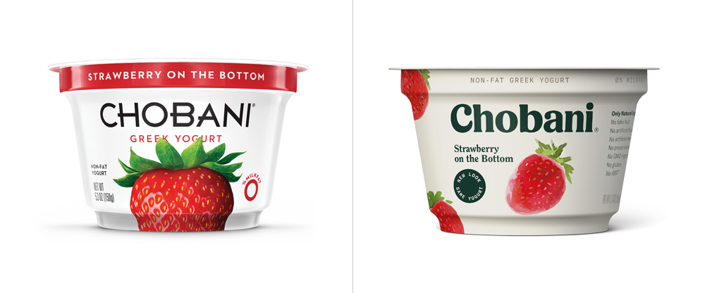
Often cited as the rebrand everyone loved, Chobani took a few risks that paid off. You can tell by looking at each design that one is outdated and the other is fresh and modern. The font is quite different, but the bold, distinct lettering only makes the brand more recognizable on the shelf. Switching the background from stark white to off-white and the letters from sharp to curved gave the brand a more approachable vibe. The logo redesign blended well with the brand’s overall design approach and how they were showing up on social media.
Airbnb
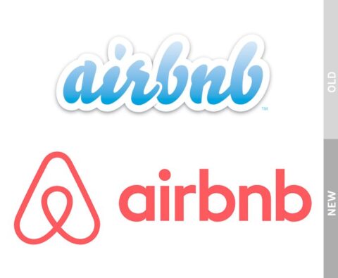
Another example of success was Airbnb’s smooth logo redesign. The original logo featured a simple blue bubble with the company name written in lowercase. However, the redesign was more interesting and memorable. The brand’s emphasis on “belonging anywhere” jived perfectly with the new logo, and they even named the symbol the “belo” (geometric shapes that when combined represent a person, a place, and love). While the concept is a bit involved, the redesign was a huge success, and the new logo became iconic.
Burger King
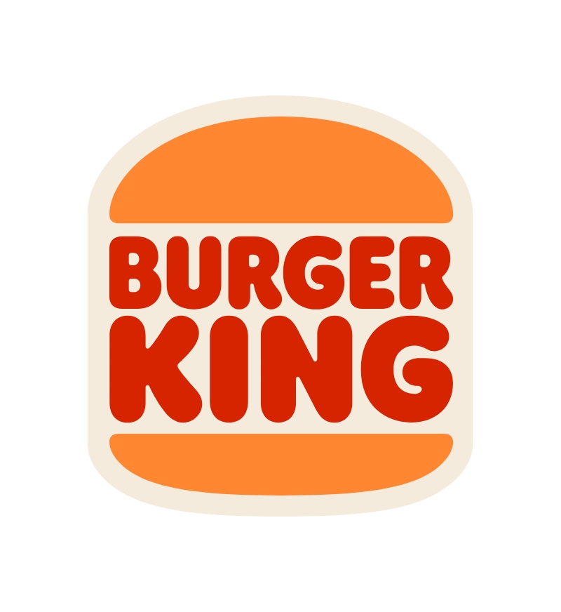
In a bold move, Burger King looked to its past to define its future. They ditched the shiny, artificial-looking blue curve from 1999 and returned to a flat, retro-inspired design reminiscent of their 60s and 70s look. The result? A mouth-watering, nostalgic identity that feels authentic and confident.
Failed Logo Redesign Examples
It’s not always easy to predict when a logo redesign is going to miss the mark. To further complicate things, your customer base may have a myriad of reactions to your redesign or rebrand. In these examples.. things just didn’t work out.
There is one vital thing to remember during a logo redesign: People don’t like change. We humans are slaves to familiarity, so if you’re going to do something different, it better be good.
Petco
This is a perfect example of a bad rebrand for several reasons. Companies generally shouldn’t eliminate what’s at the heart of the brand in favor of something more general. With no dog & cat and a basic font, the logo now feels unbranded. If you are going to eliminate something, it should be made clear what you are moving toward instead. For example, Petco decided to rebrand as a health company for pets. They made appropriate changes in this direction (eg. banning shock collars), but the logo itself was critiqued as cold and generic. If you visit their website today, you’ll see that the cute dog and cat made their way back into the logo (good move, guys).
Kraft Foods
A brand with such a huge reputation needs to be careful – especially a brand that relies on weekly grocery shoppers recognizing their packaging. While Kraft might’ve been due for a logo redesign, they went a bit too far in an attempt to modernize (another classic rebrand mistake). The random, colorful design on the left gives no indication of Kraft. In fact, it looks like an unknown food brand bound to be overlooked on the shelf. It’s another logo redesign example of a brand going too far in a new direction.
Get a Stunning Logo Redesign with Penji!
Our team of vetted designers from around the world is ready to help. Penji is a subscription-based design service that allows you to access the top 2% of designers for a flat monthly fee.
Once you sign up, you can submit design requests that will automatically be assigned to designers with relevant skills. Include all the details about what you want in your design projects, such as color schemes, font styles, and any specific images.
You’ll get a draft back in as little as 24 hours. Based on your feedback, the designer will continue to refine the design until you are happy with the final product.
Ready to see how it works? See our demo video here.
Frequently Asked Questions
How often should a company redesign its logo?
There is no set rule, but most brands refresh their identity every 7-10 years to stay current with design trends and technological changes (like ensuring a logo works on mobile screens).
How much does a logo redesign cost?
Costs vary wildly from $50 on crowdsourcing sites to $100,000+ with top-tier agencies. However, using a design as a service model can give you agency-quality work at a predictable monthly rate.
What is the biggest risk in redesigning a logo?
Loss of brand recognition. If you change too drastically without a clear communication strategy, loyal customers might not recognize your product on the shelf or app store.
About the author

Brianna Johnson
Brianna is a professional writer of 10+ years who specializes in branding, marketing, and technology content.


