
TLDR: Choosing the right typography for your logo is a strategic decision that communicates your brand’s personality and values. Mastering basics like readability, font pairing, and consistency is crucial for building a strong, recognizable brand.
While often overlooked, typography is a powerful tool every entrepreneur should use in their branding and marketing arsenal. It goes beyond choosing the most appealing font. It’s about conveying a brand’s personality and values. This guide will equip you with essential knowledge of logo design typography crucial to your website, social media, and marketing materials.
Great logo design goes beyond just choosing an appealing font. This guide will teach you the essentials of logo design typography, a crucial element for your website, social media, and marketing materials.
What is Logo Design Typography?

Typography is the art and technique of arranging type to make written language easy to read while being visually appealing. It involves choosing typefaces, point sizes, line lengths, and letter spacing and adjusting the spaces between letters. Below are key elements about logo design typography you need to know about:
- Fonts and Typefaces: While these two may seem similar, they’re actually not. A typeface is a family of fonts (e.g., Arial, Verdana), while a font is the specific weight, style, or size within that family (e.g., Arial Bold, Verdana Italic).
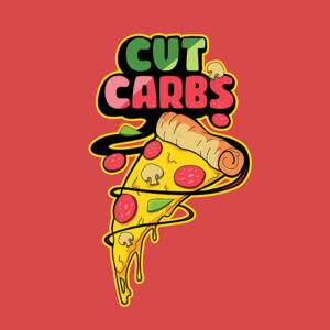
- Styles: This comprises different variations, such as bold, Italic, and underlined. These can help emphasize and add variety to your design.
Two aspects are vital to logo design typography: readability and legibility. The first refers to how text can be easily read in context. This involves line spacing, font size, and text colors. On the other hand, legibility refers to how easily individual characters can be distinguished from one another. The typeface design, character spacing, and font choice all influence this factor.
In summary, these are the basics for ensuring that the typography you choose for your logo is both aesthetically pleasing and functional.
Extend Your Creative Team the Affordable Way
Try Penji risk-free for 30 days & get all the logo designs you need

How to Choose the Right Typography for Your Logo

It’s easy to be drawn to a specific typeface for your logo design. But sadly, a memorable logo goes far beyond aesthetics. Typography in logo design has to communicate your brand identity, evoke the right emotions, and be easily read across various mediums and sizes. Use a visually appealing font as your starting point when crafting your logo. You can then give it a perfect balance of style and function, ensuring it showcases your brand’s message and values.
The goal is to choose a style that resonates with your customers and represents your brand authentically. Many companies turn to professional graphic design services to ensure this alignment is perfect.
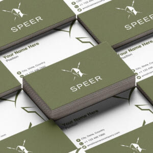
Serif vs. Sans-Serif Fonts: Usage and Impact
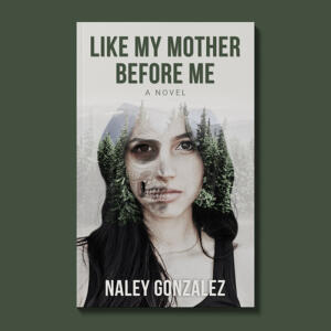
Serif Fonts: are fonts with small lines or extensions at the end of their characters. They can convey professionalism, trustworthiness, and timelessness.
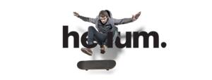
Sans-Serif Fonts: are those that do not have line extensions, giving them a clean and modern look. Good examples are Arial and Helvetica, ideal for giving your logo a contemporary, straightforward, and minimalist appeal.
To illustrate, Google’s logo uses a custom sans-serif font to convey simplicity and approachability to match its user-friendly image. The luxurious Chanel logo’s serif font exudes elegance and timelessness, furthering its high-end positioning. Lastly, Coca-Cola’s logo features a custom script to project friendliness and tradition, which is relatable to a broad audience.
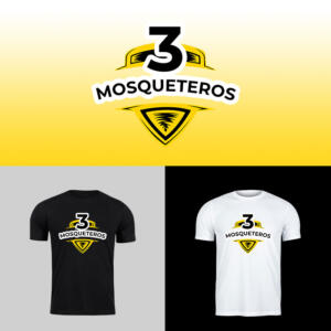
Logo Design Typography Pairing

Balance is an essential in design. To include this in your logo, you need to understand typography pairing. This is when you combine different typefaces to create visual interest and improve your brand’s overall impact. You can mix a bold, prominent typeface with a more subtle, secondary one to highlight vital elements while maintaining readability.
An excellent example is when you use a strong serif typeface for your primary brand name and pair it with a clean, sans-serif font for your tagline.
Typography Customization

Customizing typography is an excellent way to craft unique logos that reflect a brand’s personality. Instead of using an existing font, you can opt to have one made specifically for your business. This custom logo design approach allows you to create something that aligns perfectly with your brand values and messaging.
To give you a basic idea, kerning refers to the spacing between individual characters that brings balance and cohesion. Leading or vertical spacing refers to the space between lines of text. Finally, tracking deals with individual letter spacing. It adjusts the overall spacing across a range of characters.
Consistency and Application

Consistency is also essential in logo design typography, as it is in every aspect of business management. When you maintain uniform typography in all your branding elements, such as your website, social media, and print materials, you reinforce your brand’s image. This plays a major role in achieving recognizability and recall among your audience.
Furthermore, this ensures that your message, values, and tone work no matter where the customer sees your brand. This alignment preserves your brand’s integrity and builds trust. Your audience will then associate this consistency with reliability, dependability, and professionalism.
Common Typography Mistakes to Avoid

Common typography mistakes business owners commit when creating their logo design often end up impacting their brand’s visual impact and professionalism. Here’s what to avoid:
- Overuse of different fonts and styles: Too many fonts can create a cluttered and disorganized look, diluting your brand’s message.
- Neglecting readability and legibility: Avoid using overly ornate fonts that can hinder comprehension, especially on smaller screens.
- Inconsistent typography use: Switching fonts or misusing brand colors across platforms and materials can confuse your audience and weaken your brand’s recognition.
Avoid these mistakes to help create a polished look and cohesive identity for your business. If you find all these overwhelming, it’s best to run to the logo design services for help.
Working with Penji

Knowing the fundamentals of logo design typography can help business owners craft the best logo for their brands. It also enables you to make informed decisions that align with your brand’s vision and appeal to your target audience. However, nothing can beat the craftsmanship that only a professional logo designer has.
Let Penji do the heavy lifting by subscribing to a plan today. Our subscription-based graphic design services provide access to skilled designers who can create a custom logo that captures your brand’s essence.
Watch our quick demo video or click on this link to get your custom logo design started today.
Get a Design Team for a Fraction of the Cost
Try Penji risk-free for 30 days and get all your design projects done


Frequently Asked Questions
Why is typography so important for a logo?
Typography is super important because it sets the mood for your brand. Choosing the perfect font sends a message about your modernity, playfulness, and luxury, which helps you connect with target audiences and stand out from competitors.
How many fonts should I use in my logo?
One to two fonts is optimal. More than that can appear unprofessional. It’s common to separate the brand name from the tagline, which means using one font versus the second, but no more than two.
What’s the difference between a free font and a paid font?
Free fonts are accessible to everyone. Paid fonts are not only better designed but have more variety (weights) and uniqueness in quality. It’s better to go with a commercial font for branding purposes.
About the author

Celeste Zosimo
Celeste is a former traditional animator and now an SEO content writer specializing in graphic design and marketing topics. When she's not writing or ranking her articles, she's being bossed around by her cat and two dogs.


