As part of a business’s digital marketing scheme, landing pages are the bait that boosts conversions. Once you’ve finally polished your website, make sure you create landing pages to increase sales.
After all, landing pages have a primary goal, and that is to convert leads who land on them. According to Wordstream, having the best landing pages can surge your conversion rate up to 11.45 percent! That’s why it’s crucial to take note of these seven landing page design elements to maximize digital efforts.
If you ever need help with your landing page, hire marketing designers who know how to position your products or services along with killer visuals. Penji is an on-demand graphic design service that can handle any print marketing materials, website design, flyers, landing pages, and more. You can sign up right now and start creating different landing pages for your website.
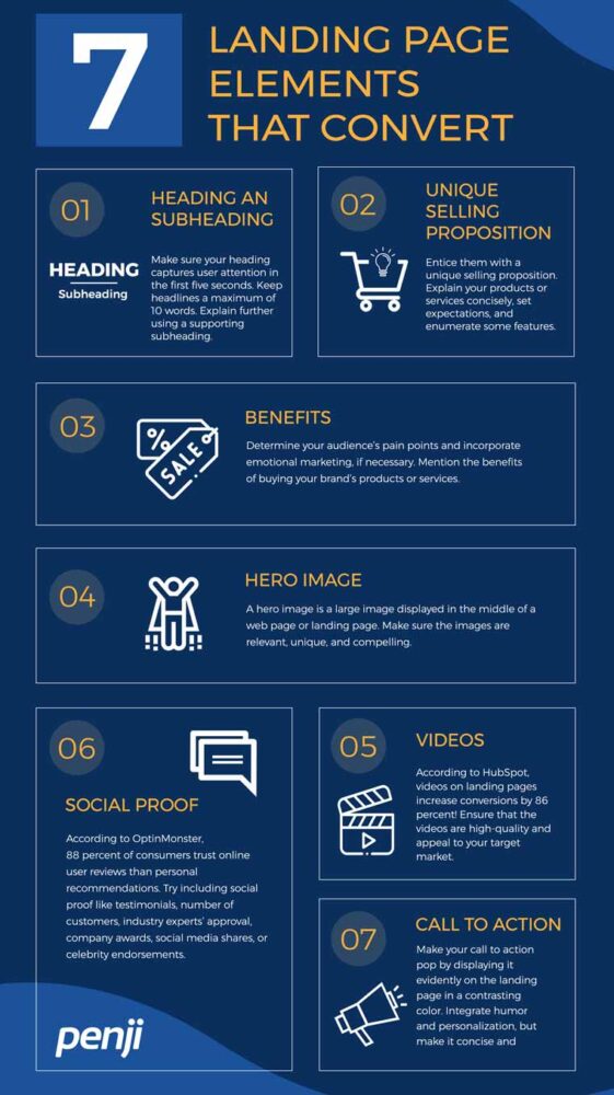
In the meantime, here’s an infographic on the eight essential landing page design components that convert:
1. Heading and Subheading
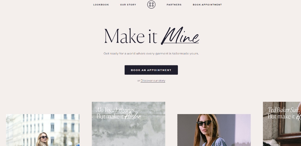
Make sure your heading captures user attention in the first five seconds. Keep headlines a maximum of 10 words. Explain further using a supporting subheading. Make sure that it’s succinct. This way, website visitors don’t lose their focus.
Here’s the example from Hemster. As indicated, the headline only has three words. And then, the subheading further emphasizes the headline’s point. Plus points for them for using a different font on the headline that represents personalization.
2. Unique Selling Proposition
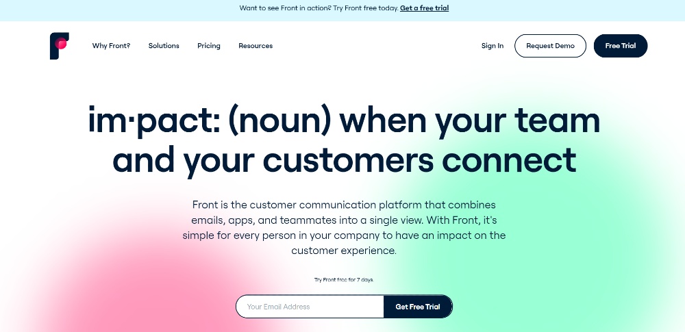
Entice them with a unique selling proposition (USP). Explain your products or services concisely, set expectations, and enumerate some features. If you can introduce your USP above the fold, that would be excellent. This way, website visitors can learn more as they browse below.
You can check out the landing page by Front. As you can see, they added their USP above the fold. Then as you scroll below, you’ll know more about what the application is about and how a potential user can use their platform.
3. Benefits
Determine your audience’s pain points and incorporate emotional marketing, if necessary. Mention the benefits of buying your brand’s products or services. This might help them decide to buy from you and not from your competitors. Make sure that your differentiator is always present on the landing page. This way, your visitors can navigate further, check your products or services, and take action.
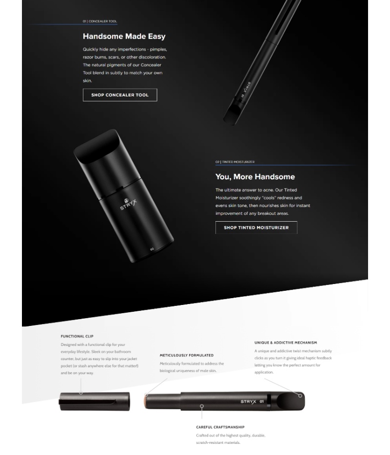
Since benefits might not fit above the fold, here’s how Stryx put the benefits of their products on the landing page. The landing page follows a Z-pattern, which will allow visitors to follow a flow. Another way they presented benefits was to break down the product too. So potential customers will know the function or component of the product much better.
4. Hero Image
A hero image is a large image displayed on the web page or landing page. Make sure the images are relevant, unique, and compelling. Plus, ensure that the images are high-quality too. This way, it’s much more engaging for visitors to view.
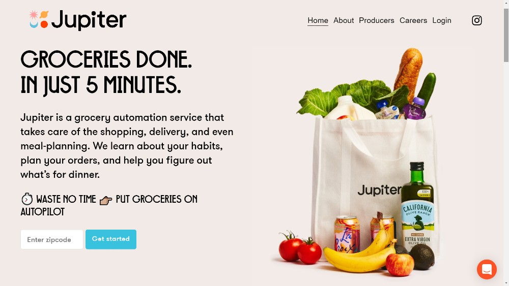
Check out this one from Jupiter. Their hero image is grocery items that they could deliver to users. It’s a great way to preview what’s in store for the user.
5. Videos
According to HubSpot, videos on landing pages increase conversions by 86 percent! Ensure that the videos are high-quality and appeal to your target market. Besides, by using video, you can show more how people can use the product. Or how potential customers can benefit by using the service. Sometimes it can be something aesthetically pleasing. So long as it will hook your website visitor’s attention and eventually entice them.
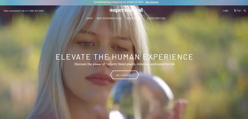
Here’s how Supernatural used video for their landing page. They used close-up shots of the models. It helps that the models smiled too. Plus, they even demonstrated how their products were being used.
6. Social Proof
According to OptinMonster, 88 percent of consumers trust online user reviews than personal recommendations. Try including social proof like testimonials, number of customers, industry experts’ approval, company awards, social media shares, or celebrity endorsements. This may establish trust and eventually get them to consider buying your product or availing your service.
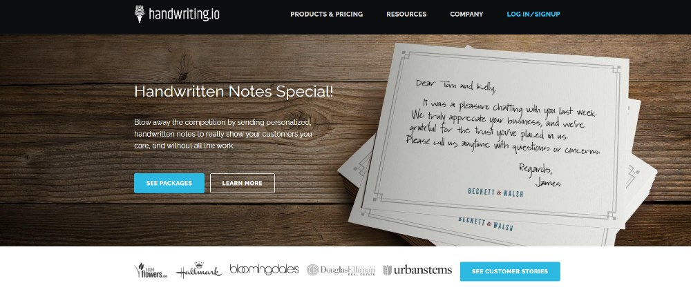
You can take inspiration from this landing page by Handwriting.io. They added customer logos below the upper section of the landing page. It’s to show which known companies and brands have used their service. That way, other visitors or customers might be convinced to use it for themselves.
7. Call to Action
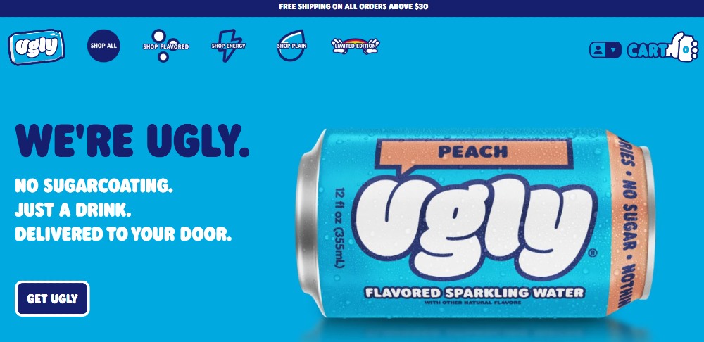
Make your call to action pop by displaying it evidently on the landing page in a contrasting color. You can also choose a different hue from the background, so long as it still stands out.
As for the text, you can go for the usual Shop Now or Discover More. However, don’t hesitate to integrate humor and personalization. But make it concise and straightforward.
Here’s what Ugly Drinks did for their CTA. For one, they used a different hue for the button. Plus, they even added a white outline to follow the color scheme of their website. Furthermore, their CTA isn’t your typical copy. They incorporated both humor and branding to make it enticing.
Let Penji Help With Your Landing Pages
To save time and effort, you can just hire a team that creates effective landing pages. Penji is one of the top on-demand design services. Also, we have an app where all our clients can easily request for unlimited designs. So if you need designs more than just for a landing page, we can certainly deliver.
Let’s share with you how our app works.
Request for a Design
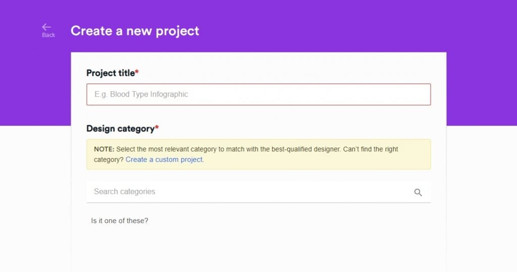
Requesting for a design through our system is as easy as ABC. Our dashboard is simple and you can immediately click the Create a New Project button. The next window shows you a form where you are required to provide necessary information about your design request. There’s also a checklist so that you can supply the right details.
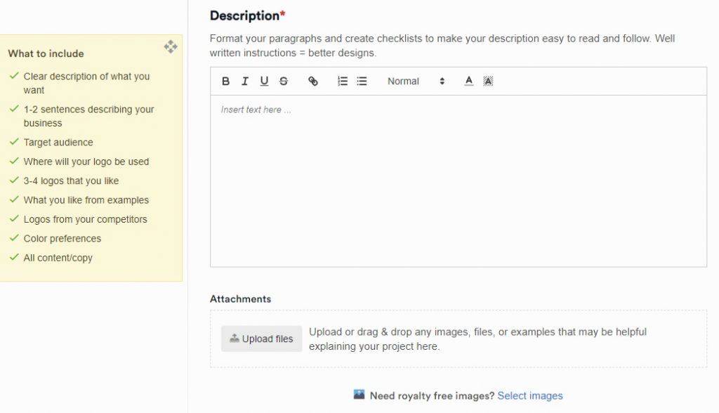
Once done, a designer will respond to your inquiry and will keep you updated on the progress of your project.
Wait for the First Draft
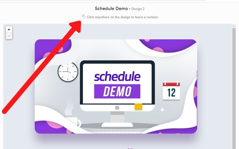
The initial draft will be provided within 24 – 48 hours. This changes depending on your request. If it is simple enough, then the designer can deliver faster.
If you are satisfied with the design, you can jump to the next step and download it. If not, you can click the image, type your feedback, and send it back to the designer.
Download the Source Files
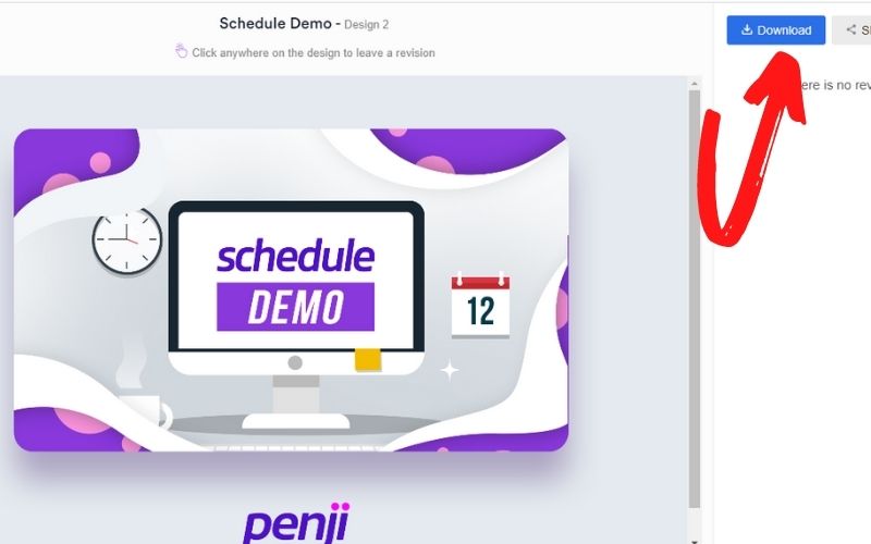
The advantage of working with Penji is that your source files are always available. When you are happy with the output, download the files and feel free to use it. All rights will be yours.
It will help if you provide feedback regarding your experience as well. That way, we can always improve our services.
We bet you are interested to know more. See why our clients enjoy working with us. We encourage you to get the Team package perfect for small teams and startup businesses. And it’s only for $499! This way, you get access to all design types. Some design services may require you to pay an extra plan for illustrations and website designs. Here at Penji, get all of it in one affordable plan. Sign up now and start submitting design requests on the Penji platform.
