Your website’s homepage is the face of your company online. It is often the first chance to captivate and engage your target audience. This means prioritizing clarity and precision makes it easy for visitors to find their way. Are you ready to design a homepage that converts? Keep reading for five fundamental principles and real-world examples to inspire you in your project.
1. Prioritize Homepage Accessibility

The homepage serves as the “front door” of your website and the primary entry point for most visitors. While users don’t always explore the website from the homepage, many go back to it when they get lost. That’s why making your homepage easy to find and navigate is essential.
Ensure every page includes implicit and explicit links to the homepage. A homepage link is your website’s “home base.” No matter where users click, they can always find their way back with a single click.
Use a simple URL for your site. A memorable URL based on your company name, such as company.com, is like a digital calling card. It’s easy to find and remember and helps you stand out online. If your product or company has an alternate name, like Coke for Coca-Cola, acquire ULRs for these names, too.

For example, attempting to open www.coke.com redirects to the main URL, which is www.coca-cola.com.
Give your homepage a unique look. Make your homepage stand out, but keep it part of the same family as your website. Use clear pictures and design choices to show visitors they’re in the right place. This will help them find their way around and feel comfortable from the very first click.
Create a homepage that captivates!
Hire a professional designer for your website


2. Highlight Your Value Proposition
Remember that first impressions matter. Consider your homepage as an elevator pitch to potential clients. It should convey what your company or organization does and what users can get from your website. Refrain from making people guess. Studies show that failing to tell your story at a glance causes prospective customers to leave the website.
One way to do this is to prominently display the company name and logo on your homepage. Place the company logo in the top-left corner of the homepage because this is often where people notice first.
You can also include a tagline that explicitly conveys what your site or company does. Do not assume visitors to your site know your brand. Unless your company name inherently gives away what you do, include a concise tagline on your homepage to communicate who you are and what you do.

TurboTax’s homepage effectively communicated its offering through a concise tagline, highlighting the accuracy and flexibility of its tax-filing service.
3. Disclose Content Via Examples
Make your homepage a shop window! Just like a physical store displays its best products, your homepage should showcase a taste of what your website offers.
Skip the vague labels: Show, don’t tell. Instead of generic links, highlight specific examples of your content.
This “sneak peek” helps visitors understand your offer and encourages them to explore further!
4. Prompt Actions and Navigations

The homepage often marks the beginning of a user’s exploration and acts as a central hub linked to other pages. Therefore, it should communicate available actions and guide users toward their next steps.
While straightforward, value-driven link labels are essential on all web pages, they are critical on home pages. Link labels and calls to action should be specific and highly informative.
Generic language like Click Here, Explore, or Learn More does not tell users what they will get when they click the links. It also makes it difficult for these links to differentiate from each other when users scan the page.
Give users a clear starting point by assigning visual prominence to critical tasks. This goes back to understanding your users and their needs. Begin by identifying a list of top tasks. Use hierarchy and visual weight to draw attention to your prioritized tasks. The most crucial tasks should be visually prominent. Avoid visual competition among your homepage elements — if everything is emphasized, nothing stands out.
Place primary navigation in a highly noticeable place. The homepage is a website’s most critical routing page, facilitating navigation. Therefore, the navigation UI on the homepage should be easily accessible and intuitive. Users need to find the navigation effortlessly and, with a glance, immediately comprehend the site’s offerings and where they are located.
5. Keep Homepages Simple
While homepages contain various content and links, they should be simple enough to avoid overwhelming users. Animated content should be kept to a minimum to eliminate distractions. Clutter and disorganization can harm homepage usability and destroy a brand’s credibility.

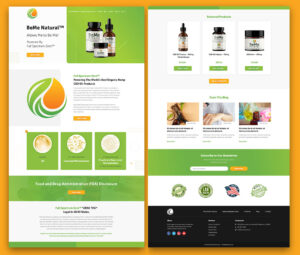
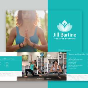
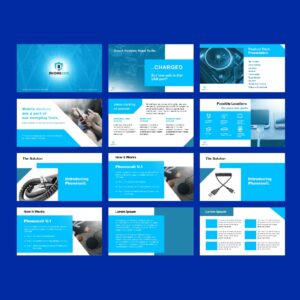
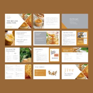
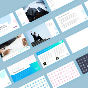
sample website designed by Penji
Sticking to established norms ensures consistency and reduces the cognitive load on users, particularly newcomers who rely on the homepage to familiarize themselves with your brand. Stick to conventional designs that users are familiar with so they can focus on getting to know your brand rather than learning how your website functions.
Minimize motion and animation. Don’t use animation or motion solely to draw attention to an element on the homepage—moving elements are often assumed to be ads. Moreover, excessive motion and animation raise accessibility concerns: parallax, auto-forwarding carousels, and scroll jacking can cause disorientation and trigger vestibular disorders.
Avoid auto-playing videos. Visitors to a homepage typically do not expect, nor appreciate, being greeted with loud, moving content upon arrival. An automatically starting video can be so intrusive that it hampers one’s ability to engage with any other page content.
Avoid popup windows and splash screens unless legally required.
Popups should be avoided before users can glean value from your website. Please adhere to the reciprocity principle: offer value to your visitors before requesting anything from them.
Conclusion
Don’t underestimate the power of homepage design! It can make or break whether visitors stick around and engage with your site. Understanding the fundamental principles can build a strong brand identity through a website. While there are many DIY website design tools, seeking help from professional designers is still the best option. Penji has a pool of expert graphic designers and illustrators willing to create stunning homepages to showcase your brand. View the demo video here to learn how things work here at Penji!
About the author

Rowena Zaballa
With a background as a former government employee specializing in urban planning, Rowena transitioned into the world of blogging and SEO content writing. As a passionate storyteller, she uses her expertise to craft engaging and informative content for various audiences.