
Today, we’re breaking down some of the best performing ads, and giving you an analysis as to WHY they work. Luckily for you, we’re not a marketing company or “guru”, therefore this information is free and not locked behind a paywall. This information was originally only sent to our clients via exclusive newsletter. But we finally decided to put together a blog and release it for the public.
Being that we’re an “unlimited” graphic design company that works with a lot of marketers and agencies, you bet we’ve seen a lot of ads. After designing over 100,000+ Facebook ads for our clients, we know a thing or two about what works and what flops.
If this information was helpful for you, please share it and give us a backlink. Enjoy! 🙂
Opteo
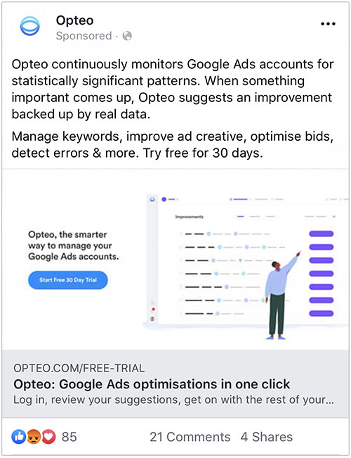
Why this ad work:
✅ Focused on explaining benefits to end user
✅ Written for their specific audience (not casting wide net)
✅ “30-day free trial” indicated TWICE to help eliminate risk for user
✅ “In one click” Ease of use benefit is clear
✅ Displayed link is “Opteo.com/FREE-TRIAL”, lowers barrier to entry and risks for user
Improvements:
❌ Constantly repeating “Opteo”
❌ Too much texts in every section
Webflow
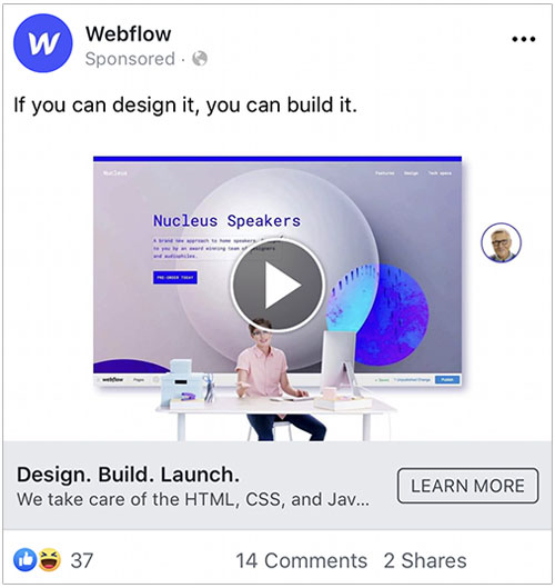
Why this ad work:
✅ “Design. Build. Launch.” is even shorter than the proposed 5-Word rule
✅ Very clear Headline “Design. Build. Launch.”
✅ Video is on-brand and related
✅ Not spamming their name everywhere in content
Improvements:
❌ Main texts says “If you can design it, you can build it”, but contradicts description “We take care of the HTMl, CSS, And Jav…”
❌ Doesn’t state a “Problem” or “Solution”, just state what they do
OnePlus 7 Pro
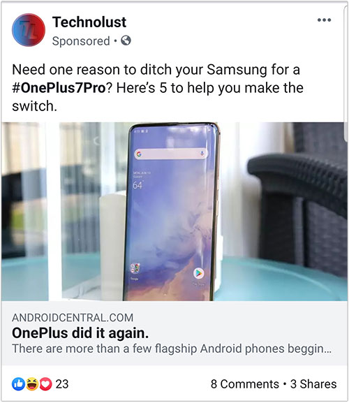
These are very clever sponsored ads. The product being sold is the OnePlus 7 Pro, but it’s being promoted and advertised on TechnoLust, a seemingly independent opinion. This is a common strategy, to have a 3rd party blog/reviewer promote your product instead. You’re much more likely to trust a 3rd party reviewer.
Why this ad work:
✅ Uses 3rd party to promote
✅ Photo looks like a regular photo that a reviewer would take
✅ Links out to Androidcentral, another seemingly trusted source
Improvements:
❌ The content makes it too obvious that this was a paid sponsorship and not an actual independent review
Scripted
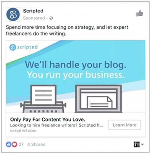
Why this ad work:
✅ Indirectly states the user’s problem in Main text “Spend more time focusing on strategy…”
✅ Clearly state the services they’re providing
✅ Clearly stated the problem/benefits for user
✅ Clearly states Unique Selling Proposition (USP) with “Only pay for content you love”
✅ Entire ad is on-brand and doesn’t over-do their branding
Improvements:
❌ Blue isn’t a good primary color choice for ads. It’s easy to miss because it blends in with Facebook’s own color.
❌ Doesn’t identify the target audience
Monday.com
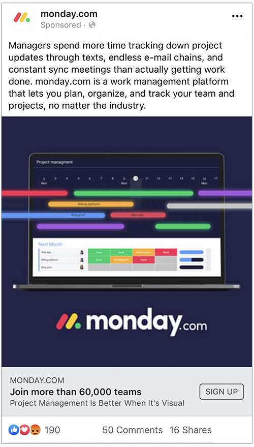
Why this ad work:
✅ Clearly identifies target audience – Managers
✅ Clearly identifies their problem
✅ Goes 1 step further and details their frustration using story-telling
✅ Clearly explains the benefit of using Monday
✅ Identifies both short-term and long term benefits for user
✅ Entire ad is on-brand and well designed
✅ Headline is 5 words long (most effective)
✅ Headline contains a number (would’ve been better if it started with a number)
✅ Uses Crowd Influence in headline. “Join more than 60,000 teams”
Improvements:
❌ Main text paragraph is way too long. Verbiage can be shorten or broken down into 2 paragraphs
❌ Description “Better when it’s Visual…” seems to come out of nowhere. Was not a part of the sales pitch in main text.
❌ Although well written, copy tries to do too much. Explains too many problems/benefits/features all at once. Overloaded for user.
TransferWise
Why this ad work:
✅ Sharing founder stories instead of sales pitch (builds trust, especially if trust is important for the product/service)
✅ Main text is a relatable quote
✅ Click-bait headline
Improvements:
❌ No clear audience
❌ Services unclear
❌ Leads to article on BBC. Very low CTR back to Transferwise main website
❌ Image only shows 1 person. Where’s the other founder?
❌ Square dimension images do better
Jet
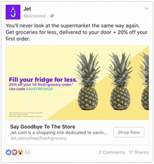
Why this ad work:
✅ Yellow works well on Facebook. It stands out and contrasts FB’s blue
✅ 5 words headline
✅ Clearly identifies benefits (Get groceries for less + delivered to your door…)
✅ Copy does a great job speaking to the customer
✅ Clearly identifies the user’s experience if they use Jet
✅ Has promo code offer to drive CTA
✅ Appealing link “/shop/freshgrocery”
Improvements:
❌ Square dimension images do better
AE Boutiq
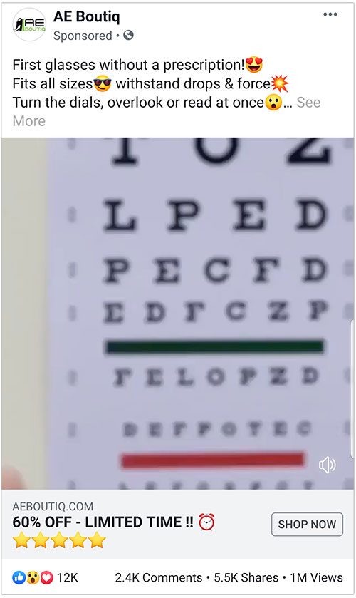
Why this ad works:
✅ 5 words headline
✅ Tasteful use of Emojis. Emojis increases CTR
✅ Square dimension clip
✅ Time sensitive 60% off offer
✅ Clever use of Description under headline. They added 5 Stars Emoji instead of texts
✅ Main text, they gave each sentence its own line for readability
Improvements:
❌ Too many emojis
❌ Identify target audience
❌ Only talks about features, not how it will make user feel or change their experience
Hubspot
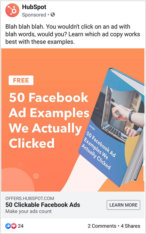
If anyone knows how to do lead capture ads, it’s Hubspot.
Why this ad works:
✅ Yellow/Orange/Bright red are great colors that contrasts with Facebook and stands out
✅ Follows the 5-word Headline rule
✅ Clearly identifies target audience
✅ Clear goal for ad (capture lead on landing page)
✅ Ebooks/offers generally do well
✅ Click-baity headline inside of image
✅ Square image does well
✅ On-brand and well designed graphic
Popdust
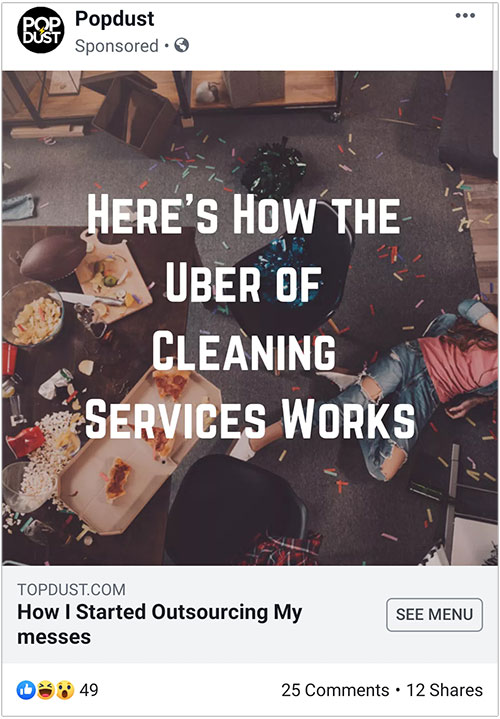
It’s rare to see a company leave the main text area completely blank. Popdust already has enough texts on their image explaining what they offer. The idea to forego main text completely was strategic and genius move in order to bring more focus and attention to the image.
Why this ad works:
✅ Intentionally leaving main text area empty to bring focus and attention to the image
✅ “The Uber of…” is effective analogy in this situation
✅ Good choice of image. It’s not a high quality image and looks like a natural organic post
✅ Starting with “How” invokes curiosity in headline
Improvements:
❌ Link text is “Topdust” while brand is “Popdust”, this can be confusing
❌ Headline is too long
❌ “See menu” is the wrong CTA for this type of ad
Dollar Shave Club
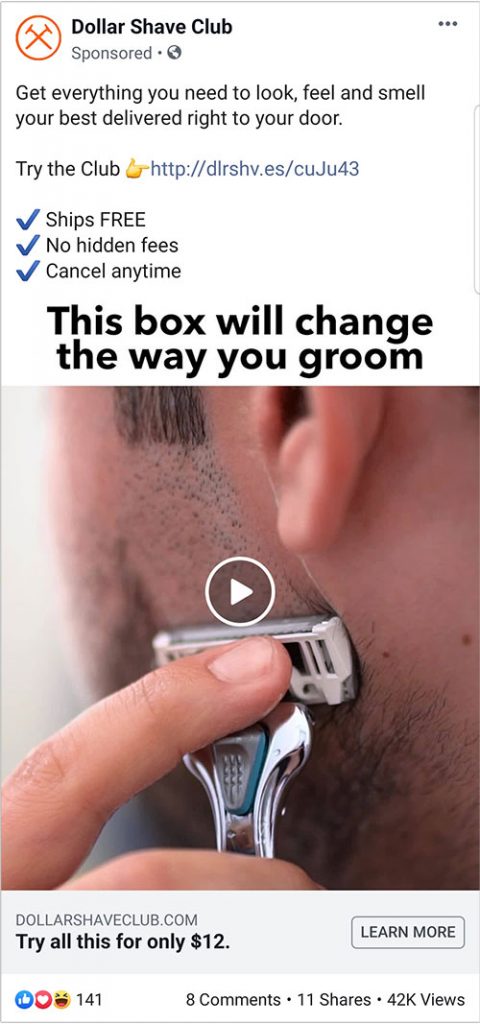
✅ Clearly identifies audience via video
✅ Identifies user’s feelings by stating “..Look, feel, and smell your best”
✅ Clearly define benefits
✅ Conservative and tasteful use of emoji
✅ Main text area is well spaced out. Easy to read
About the author

Khai Tran
Khai is the CEO of Penji and is passionate about the economic development of recovering communities.


