

Understanding the current font combination trends can make your brand stand out in 2024. But font pairing is like shopping for new clothes and accessories. Each element must complement the other, ensuring the overall look represents your style. Whether making a logo, brochure, flyer, website, social media ad, or any marketing asset, you must choose the best fonts visually representing your brand and values. Here, we’ll study effective, successful font pairings to help you feel more confident in your next design project.
1. Montserrat Bold and Roboto Slab
In this pairing, we’ve chosen Montserrat in bold and Roboto Slab in regular. The combination brings visual interest while remaining clear and readable. You can see how this font pairing works well in the example below.

This sample invitation is made by our talented graphic designers here at Penji. Watch a quick demo to learn more about Penji’s unlimited graphic design services.
2. Sans Serif Font Pairing
San serif is one of the most popular fonts because of its readability. It works well in both large and fine print and even in lower resolutions, making it perfect for digital uses like e-books and websites. Depending on thickness, this font can illustrate either a tough and hardworking personality or leave a glamorous and noble impression.
Need a design with the perfect font pairing?
Penji designers are experts in choosing the right fonts for logos, invitations, brochures, ads, and more!


3. Rye and Lora
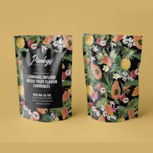
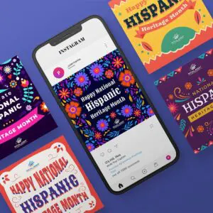
Vintage logos have grown in popularity in the past few years, and vintage-looking fonts are also rising in popularity. Thanks to their detailed and nostalgic vibe, these fonts work well for businesses like bespoke goods, craft stores, barbershops, and coffee shops.
Due to their intricacy, vintage fonts pair best with classic serif fonts to ensure readability while maintaining a consistent vintage look.
4. Sacramento and Playfair Display
Inject personality and flair into your branded app with elegant handwritten and script fonts. While undeniably eye-catching, script fonts can be tricky for quick reading. This makes them ideal for headlines, where they grab attention, rather than lengthy body text.
Their decorative nature makes script fonts perfect partners for serif or slab-serif fonts. This combination creates a visually appealing and easy-to-read design.
5. Parisienne and Lora
Like handwritten styles, calligraphic fonts exude elegance and offer a distinctive touch to your brand identity. When used effectively, they create a calming and sophisticated atmosphere. However, their intricate details can make them challenging to read in lengthy text. For this reason, they shine brightest in headlines, where their beauty can make a lasting impression.

Look how modern and elegant this example is. It shows that Parisienne and Lora complement each other to achieve a balanced design.
6. Arbutus and Montserrat
We classify “funky” fonts as bold, unique styles that add major visual impact. Due to their highly stylized look, they usually evoke a particular feeling in a viewer and pair well with clean, sans-serif fonts for balance and hierarchy.
While it can be tempting to go with a funky font, beware of using ones that are super trendy or that don’t match your brand personality. These types of fonts are never a good choice for body copy, so stick to using them in headers.
7. Orbitron and Roboto Slab
Futuristic fonts evoke a particular feeling and often make people think of robots, computers, or space. However, be cautious when using this type of font, as it will only work for a handful of brands.
Due to their shape and attention-grabbing qualities, futuristic fonts often pair well with slab-serif or serif fonts for a visually balanced look.
8. Arvo and Montserrat
The slab serif is a bolder and blockier serif font than traditional serifs. It brings an old-school, nerdy charm to a project or brand and harkens back to a typewriter font. Because of their inherent boldness, slab fonts are good for logos and headings. They can also be used for body copy, but this is a less frequent application.

9. Bungee and Open Sans
Bubbly fonts are fun, friendly, and statement-making. As we’ve pointed out with other highly stylized fonts, it’s best to use them in headings only, as they’re too bold for body copy. Also, beware of styles that are too trendy, or that may look dated quickly.
10. IvyMode and Century Gothic
Sometimes, you need a font combination worthy of the runway. If you own a fashion, beauty, or home design brand or offer a professional service, this font pair is for you.
3 AI Font Pairing Generators to Explore
We have a list of free font websites for those who crave even more options to fuel your creativity!
1. Simplified AI Font Generator

This interactive tool uses deep learning to analyze your desired contrast level and suggest font pairings. You can choose high contrast for a bold look or balanced for a more subtle pairing. It also allows you to paste your copy and experiment with different fonts to see the combinations in action. Simplified AI Font Generator is perfect for beginners who want to explore various options and understand how contrast affects the overall look.
2. Monotype Font Pairing Generator

This generator utilizes Monotype’s AI engine to find perfect font pairings. It doesn’t offer extensive customization options but delivers well-balanced combinations based on its vast font library. This is a good choice for those who want a quick and reliable suggestion without needing to delve into specific details.
3. Typotheque Font Combinator

Typotheque Font Generator focuses on curated font pairings rather than AI suggestions. It showcases classic combinations, like Roboto and Merriweather or Open Sans and Lora, that work well together. You can explore these pre-selected pairs and see them displayed with sample text. This is an excellent option for inspiration and a reference point for established pairings that suit various design contexts.
No matter your design experience, these font pairing generators will be valuable tools on your typographic journey.
The Basics of Font Pairing
A font pair or combination is a set of two complementary fonts that give you options when designing branded assets. This pairing is available for heading and body copy, which are crucial elements of any content you write. Font combinations can be cohesive. Sometimes, they can use contrast to accent certain elements of your typographic theme and make them shine.
By having strategically chosen font pairings that work well together, you’ll be better able to achieve interest, readability, balance, visual hierarchy, and contrast in your branding.
We often confuse “typeface” and “font,” but there’s a subtle difference! Think of a typeface as a design family with a distinct style. A font, on the other hand, is a specific member of that family, like the bold or italic version.
About the author

Rowena Zaballa
With a background as a former government employee specializing in urban planning, Rowena transitioned into the world of blogging and SEO content writing. As a passionate storyteller, she uses her expertise to craft engaging and informative content for various audiences.
Table of Contents
- 1. Montserrat Bold and Roboto Slab
- 2. Sans Serif Font Pairing
- 3. Rye and Lora
- 4. Sacramento and Playfair Display
- 5. Parisienne and Lora
- 6. Arbutus and Montserrat
- 7. Orbitron and Roboto Slab
- 8. Arvo and Montserrat
- 9. Bungee and Open Sans
- 10. IvyMode and Century Gothic
- 3 AI Font Pairing Generators to Explore
- 1. Simplified AI Font Generator
- 2. Monotype Font Pairing Generator
- 3. Typotheque Font Combinator
- The Basics of Font Pairing


