Every business needs a website, but not everyone is able to make it themselves. There are free sites available to create a website on your own, but you won’t get the result you deserve. The best way to make sure your site matches your industry and market is by finding a web designer.
Here at Penji, we have the best web designers. We offer on-demand design requests and revisions. If you’ve never used our services before, Penji offers unlimited design services at a flat monthly rate. With us, you’re able to get exactly what you want without overpaying. Apart from websites, we work on logos, social media posts, t-shirt designs, and more. But right now, let’s talk more about website designs. What should you consider when hiring a designer? Make sure that they know the following:
Visual hierarchy
Every website benefits from some form of visual hierarchy. It balances out your website while appearing effortless. The best way to achieve it is to think of your website as a triangle. This means you need fewer things at the top of your site to emphasize their importance. it could be information about your company or the latest products.
As you go down, there’s room for more. The content doesn’t have to be as important as the ones at the top, but consider what your audience needs to know. It could expand onto other, less relevant products or related articles.
At the bottom of your page, this is where you’ll put the bulk of your content. You’ll typically find a list of links from the site or sometimes, you can add your copyright information. Don’t forget this area. While it’s placed at the end, it’s still absolutely important. This is where people who are interested in your website will go to learn more. If you have their attention at the top, then it’s easier to maintain it.
Web Safe Fonts
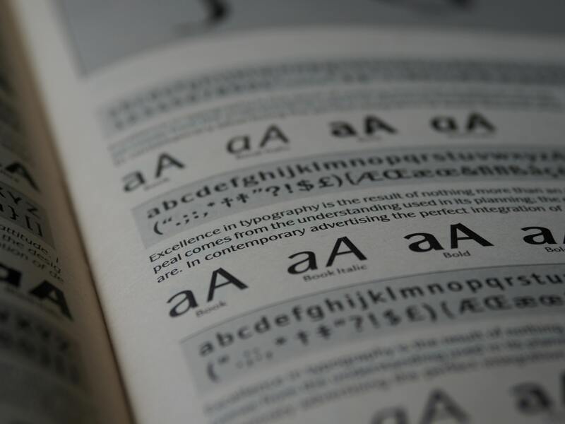
When it comes to your text, make sure your web designer is using web-friendly or web-safe fonts. There are thousands of fonts available, but not all of them are ideal for websites.
Generally, sans serif fonts are safer for websites. But this is not always the case. Some companies use serif, but they do so with caution. Again work with a designer to see if your chosen fonts are good for websites and for your overall theme and design.
It’s okay to use a variety of fonts and sizes so long as it’s not overdone. You’ll lose readers on your style alone, so make sure you’re thinking about the typography.
Color Palettes
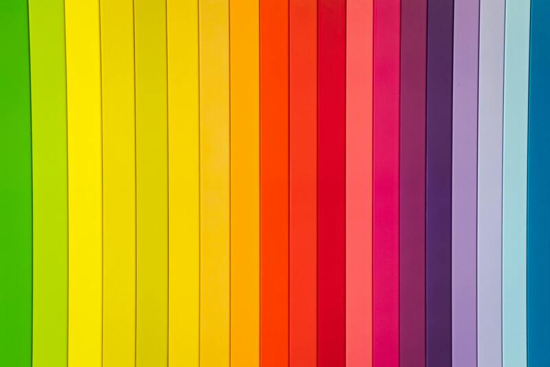
Choosing the right colors is also as important as choosing your font. Apparently, several colors are available, but that doesn’t mean they’re web-friendly. Contrasting shades are helpful but beware of how bright or dark they are. Bear in mind that you can’t predict how bright the user’s screen is going to be when they’re looking at your site. If it’s too light, you’ll hurt their eyes. If it’s too dark, they’ll struggle to see the content.
In addition, your webpage doesn’t always need to have a white background either. But it should be a color that a reader can look at for long periods of time. It’s hard to predict how long they’ll be looking through your content, but it’s best to be prepared.
And most importantly, consider your audience. What mood or certain feeling you want them to have as they look at your website? Cooler colors like blue and green are calm, while warmer tones like red and orange are vibrant. It’s a small detail, but it’s still something to consider when picking shades. However, we are not suggesting to heavily focus your design on colors. Take note that the percentage of your audience could be colorblind. And so if you use colors to suggest instructions or to show information on your website, it will not help them.
Include White Space

Don’t underestimate the power of white space on your website. The term ‘white space’ doesn’t always mean ‘white-blank-plain-space’. It means you need room for your content to breathe, and you can use other colors or patterns. Without it, your design with look cluttered. You would often hear your users say, “There’s too much going on”. And that’s not a good sign.
Consistent Branding
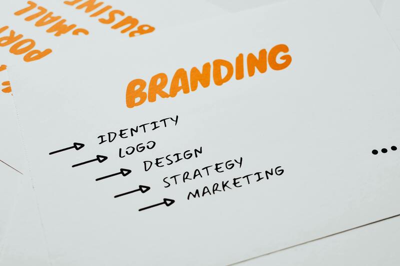
Perhaps the most important web design basic is having consistent branding. As a rule of thumb, your designer shouldn’t use different colors, typography, and pattern when creating your website. It has to be cohesive with your overall branding as a company. If there’s no consistency, your users will get confused if they are still on the same website. The consistency is why some businesses stand out. If you think about some of the largest companies in the world, like Nike, Coca-Cola, Adidas, or even Amazon, they are particular with their branding not just on their website but with all their marketing tools. This is proof that consistency is vital.
Clean Contact Page
To make sure your customers can reach you, it’s crucial to have a clean contact page. It shouldn’t have to be design-heavy, but it should be easy to follow. Every section should have enough space for a good response. Consider the type of responses you’ll get and design your contact form from there.
Likewise, include a phone number, email, or social media on your contact page. Your consumers shouldn’t have to guess where they can reach you. Everything must be readily available to them.
When looking for a web designer, you should ask them about these design elements. Gauge how much they know so that you can guarantee an excellent website if you hire them. But, if you don’t want to spare time looking for an expert, sign up with Penji.
Use Penji for Website Design
We can highly recommend the services of Penji because they have the best designers, plus their platform is easy to use. Getting your website design is as easy as ABC. They are so efficient, and it’s not surprising that they get clients month after month! Here’s how you can enjoy their app.
But first, make sure that you sign up for one of their plans. Choose a package where you can get website designs, among other projects. That way, you can maximize their unlimited graphic design offers.
Request Web Design
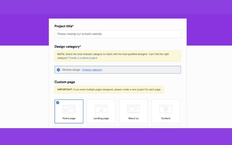
Once you have access to their platform, you will notice how simple, straightforward, and easy it is. Quite frankly, you don’t need assistance to understand how it works. But just in case you need some help, the team can do so right away.
You will see a New Project button located at the top right side of your screen. Click that so you can start requesting a web design. When you are on the new page, you can supply the necessary information about your project. There are questions and a checklist to guide you. At least you won’t miss any details that are important for the designers.
When you submit your request, it will have its own project thread. And in this thread, you can receive your design and communicate with your designer. Again, with Penji, everything is made to be efficient and fast.
Wait for the First Draft and Send Back for Revision
Your first draft will be submitted within 24 – 48 hours. This is dependent on how simple or complex your requested project is. Meanwhile, your designer will provide updates and progress reports as necessary. Make sure to check your account regularly.
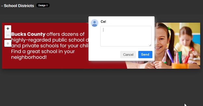
If you already have the initial design, have a closer look and see if there are areas that must be changed. To do so, just click the image. Check every detail and click on the parts that you want to be revised. A box will appear where you can type your comments. Send it right away so that the designer can work on it. This is another great feature of the Penji app, which most of their clients enjoy.
The designers will not stop revising your website design until you are 100% satisfied.
Download and Publish Your Website
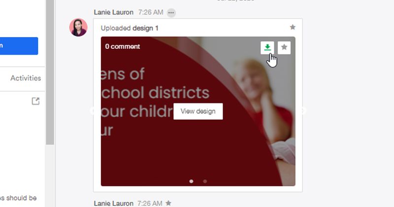
Once you see that everything is in place and that the design is perfect, you can now download all the source files. You don’t have to inform your designer, and you can do so whenever you want to.
Can you now see why more people sign up with Penji? It makes their lives easier, and they get the best and most amazing designs, whether for their website, logos, or even social media posts. If you want to know their affordable plans, check their website right now.
About the author

Erika Solis
Erika is a Content Writer & Marketing Associate for Penji. She has a background in social media marketing, graphic design and copywriting.


