
Have you ever noticed that many fast food restaurant color schemes are yellow and red? It’s not a coincidence. Research shows that colors can provoke different emotions and bring feelings of thirst, hunger or comfort. The color scheme of an establishment also impacts what customers order, how much money they spend, how long they spend inside the restaurant and much more.
So, it’s important to have an understanding of color theory and learn how to create a visually pleasing and business-boosting color scheme.
In this post, we’ll explain how to choose the best fast food restaurant color scheme that will keep diners coming back for more.
Get a taste of unlimited design
Try Penji risk-free for 30 days and get all the custom graphics you need


Food and Color Psychology
Colors can impact appetite, mood and heart rate, and how long diners spend inside your fast food restaurant. Here’s a guide on how humans typically react to various colors:
Yellow: Yellow can increase energy and trigger feelings of happiness. It can also stimulate appetite and generate excitement.
Red: A stimulating color, red can boost customers’ heart rates and increase excitement. Like yellow, red can boost appetite. Red may also make customers eat quickly and leave.
Orange: Orange is another appetite-boosting color. It can also increase feelings of cheerfulness and contentment.
Green: The most common color in the natural world, green is a soothing shade representing freshness. It increases relaxation and contentment.
Brown: Earth tones like brown can bring on feelings of relaxation, stability and comfort. It can also make people want to return to your establishment.
Blue: This color isn’t found naturally in many foods and is known to cause humans to lose their appetites. The same applies to purple.
White: White makes a space seem larger. It’s also associated with cleanliness, but too much white can appear sterile.
Black: Too much black can make a space look small and dark. But when used sparingly, black can make other colors pop.
Which color schemes work best for fast food restaurants?
As you can see, yellow, red and orange are the colors that work best for fast food, while blue and purple should be avoided. Green is a suitable choice for establishments that offer plant-based options.
Now that we’ve shown how colors will affect your customers, the next step is understanding which colors go together and how to make a cohesive, attractive color scheme. Here are three ideas:
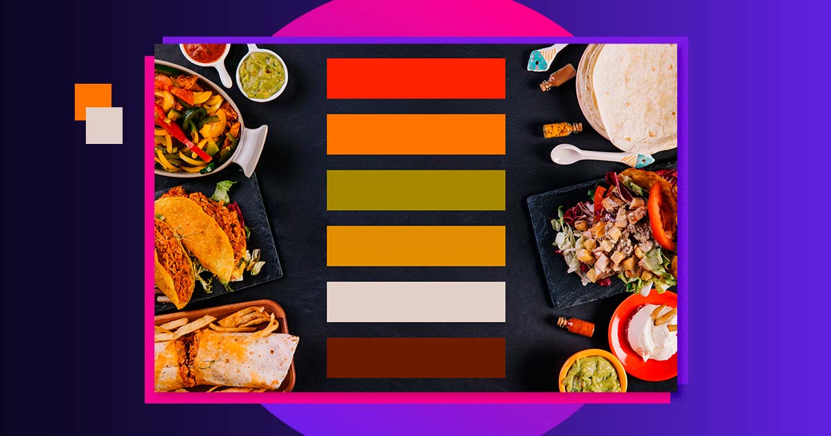
1. Warm (red, orange, yellow and gold)
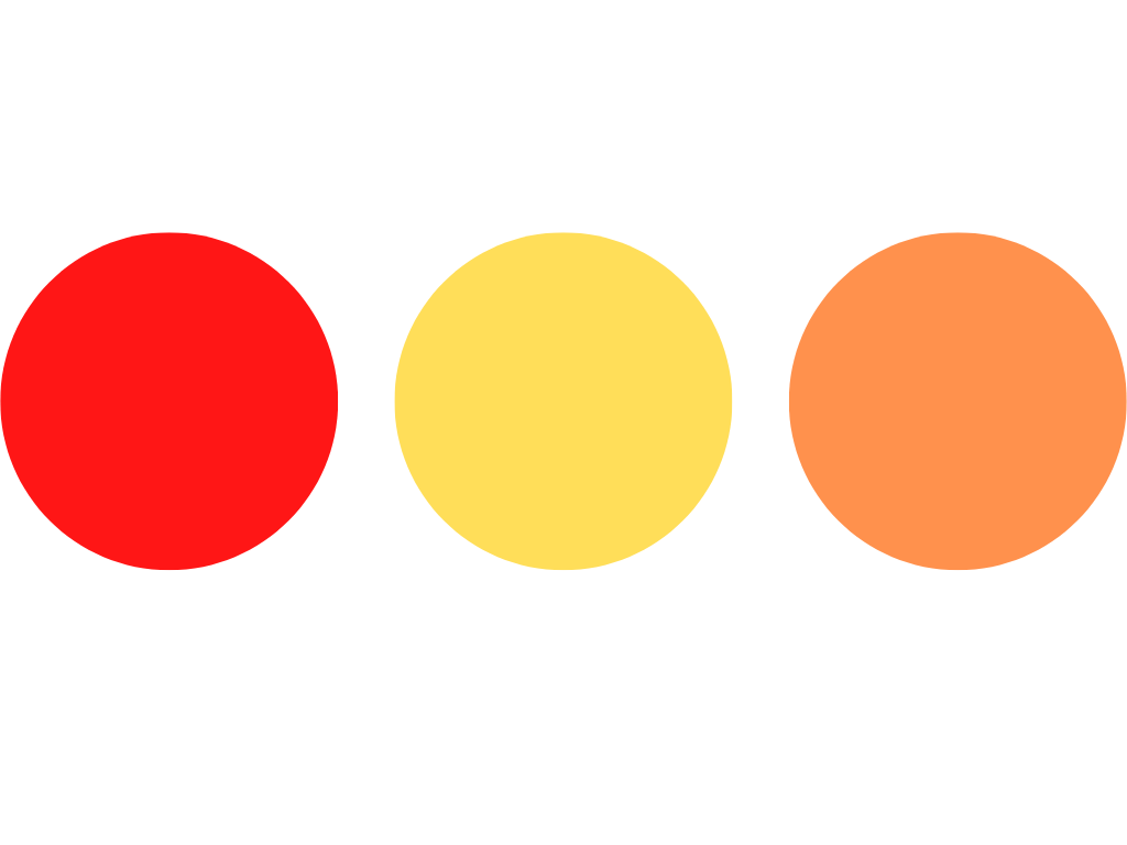
A warm fast food restaurant color scheme offers a lot of visual stimulation, which can be overwhelming after a long period of time. Because of this, warm colors can help to increase your turnover rate and are ideal for high-volume establishments. (Think: McDonald’s, Wendys, In & Out.)
2. Nature-Inspired (green, white, yellow)
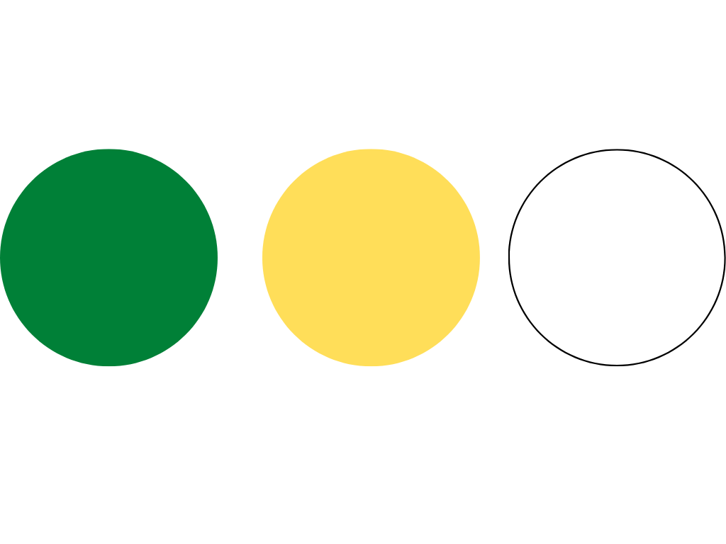
If a fast food restaurant wants to be known for its healthy options, a nature-inspired color palette might fit. Green suggests freshness and yellow is energetic, which sends the message that diners can expect a quick yet healthy meal. (Think: Subway.)
3. Pastel (pink, light yellow, sky blue, lavender)

This light, soft color palette suggests a fun, casual dining experience geared toward people of all ages. Fast food establishments that offer sweets, like ice cream shops and cookies, could benefit from a pastel color scheme. (Think: Baskin-Robbins.)
Try Penji Risk-free for your business
Running any kind of business means you’ll need custom branded designs – whether it’s for your logo and branding assets, websites and landing pages, custom apps, digital ads, or anything else. Penji’s platform gives you the opportunity to request designs anytime and get all your design needs met in one place.


