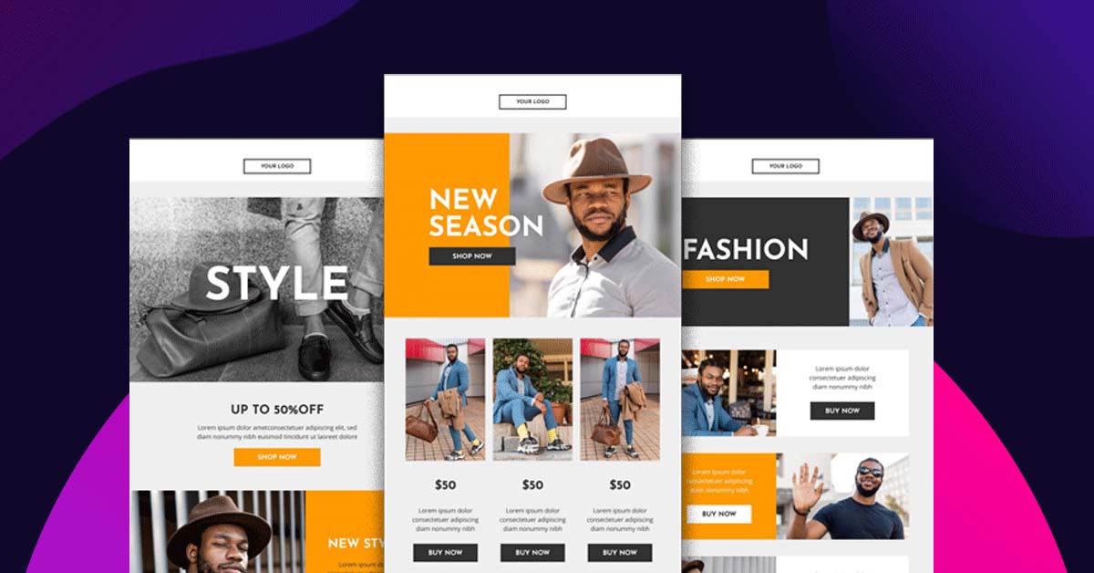
Email marketing is an effective way to get in touch with your audience – if you’re doing it right. Unfortunately, many marketers get tired, burned out, or run out of ideas to share. It’s perfectly understandable. But especially if you’ve built up a large list of subscribers, there’s no reason to waste that list. Reconnect with your subscribers with these email design examples that convert.
What is an email open rate?
Email open rate simply means the percentage of your subscribers who actually opened your email. As a rule of thumb, aim for at least 20%.
Getting a decent score includes a lot of factors. You have to create an interesting subject line and an effective email design. There are thousands of articles about how you can make a good subject so we will not cover that in this article.
Instead, let’s talk more about the actual look of your email. In case you haven’t noticed, most people configure their email accounts to see the message previews. Think about how ‘Outlook’ was designed. Gmail has that option too.
What we’re trying to say is that, you need to make a good impression if you want your subscribers to check out your email. The best solution is to hire professionals that do email designs for you. Penji can create visually appealing emails that are proven to get a high open rate. This is why graphic design is important for sales.
Best Email Design Examples
But just in case you want to see amazing samples of email designs, we have here 15 of our favorites. Take a look and get ideas.
1. Uber
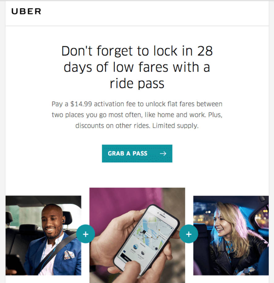
What we love about Uber’s email design is that it is sleek, simple, and easy to understand. This is the perfect strategy most especially for people who do not have the luxury of time to read lengthy emails. Uber’s message is also straight to the point and the call-to-action is evidently clear. Lastly, they use quality photos which add to its visual appeal.
2. Udemy
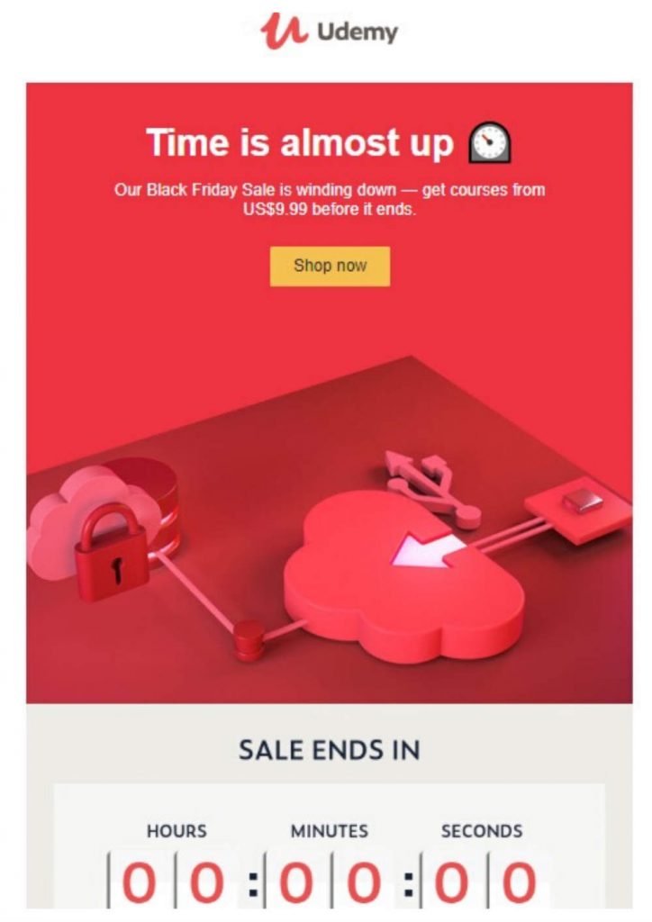
This email from Udemy uses bold colors which makes it instantly captivating. And what did you notice about their text? ‘Time is almost up.’ If you are someone who’s always on the lookout for discounted e-learning materials, you will definitely click and open this email.
3. TripAdvisor
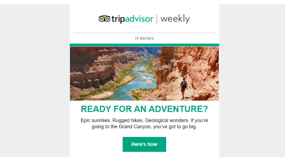
‘Ready for an Adventure?’ This is a smart move from TripAdvisor. It doesn’t have a lot of frills and it only takes 5 seconds to know what the email is all about. And with that enticing question, it could be a real challenge not to click the email. Simple looks like this can be executed with email template designs.
4. Grammarly
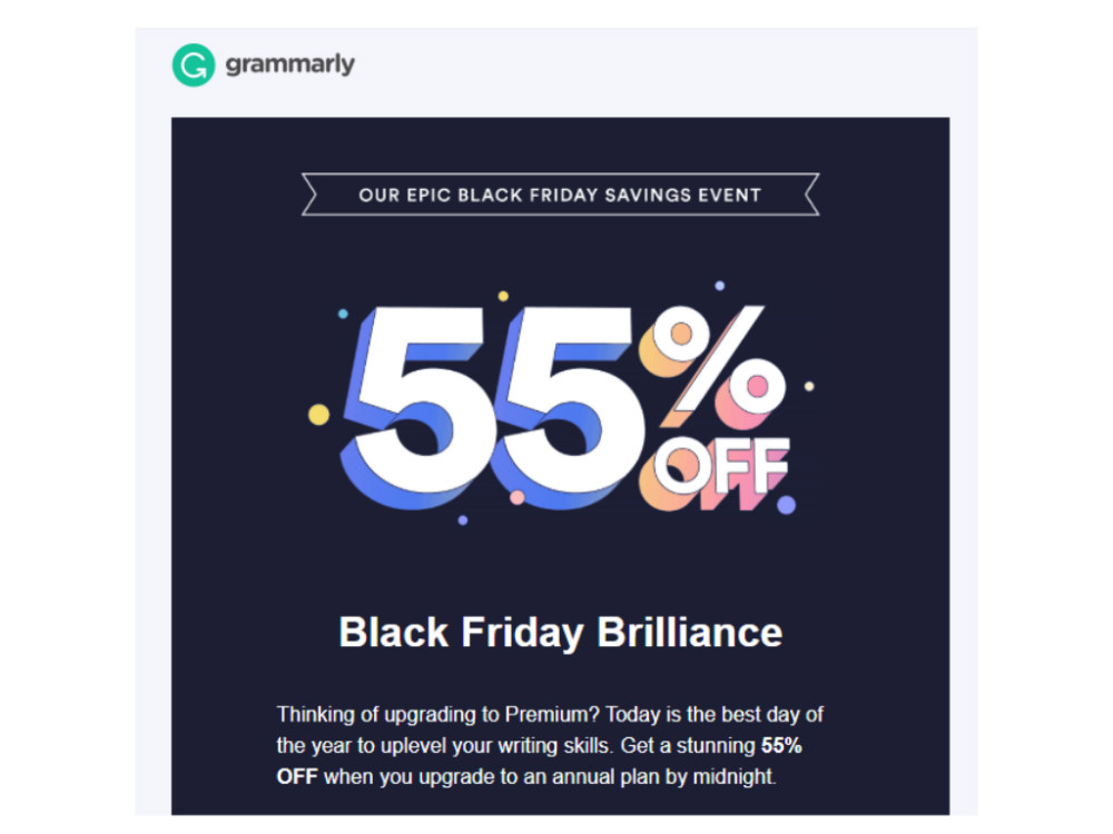
Like most companies, Grammarly took advantage of Black Friday and they went a notch higher by using micro-animation in their email. If you received the same, you will notice that the ‘55% off’ seems to be subtly blinking. That’s already enough to pause for a while and check the entire message.
5. Ben & Jerry’s
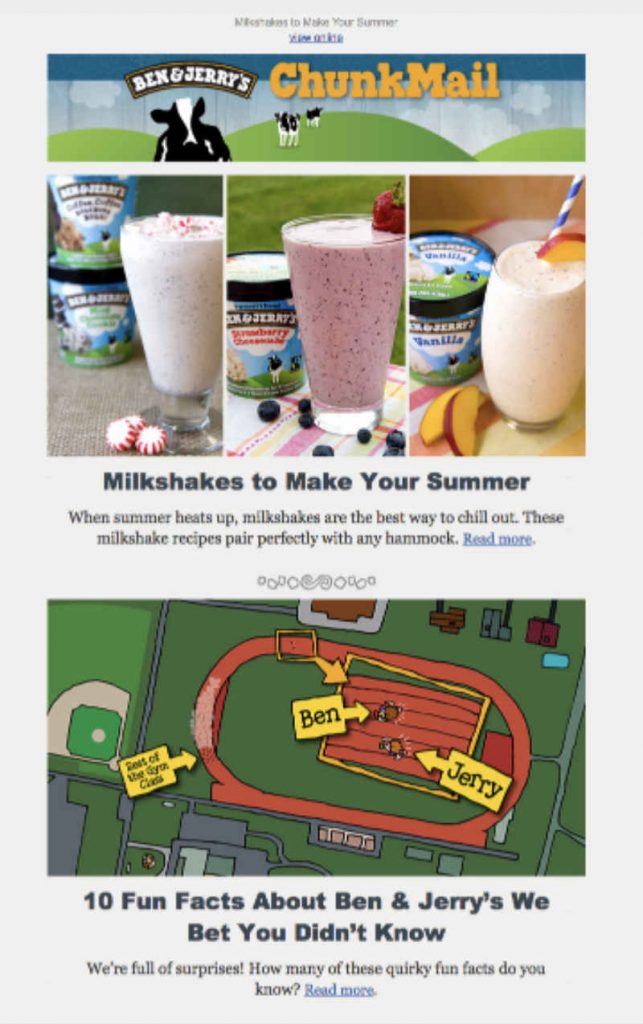
Ben & Jerry’s is consistent in placing their products in their newsletters. But that’s not all. They make sure to give tips to their subscribers. It’s like hitting two birds with one stone. And let’s not forget about their kid-like illustrations that generally breaks the norm. It’s all working if you ask us. Check out our portfolio for other spot-on email design examples to inspire your next email template.
6. Ever Note
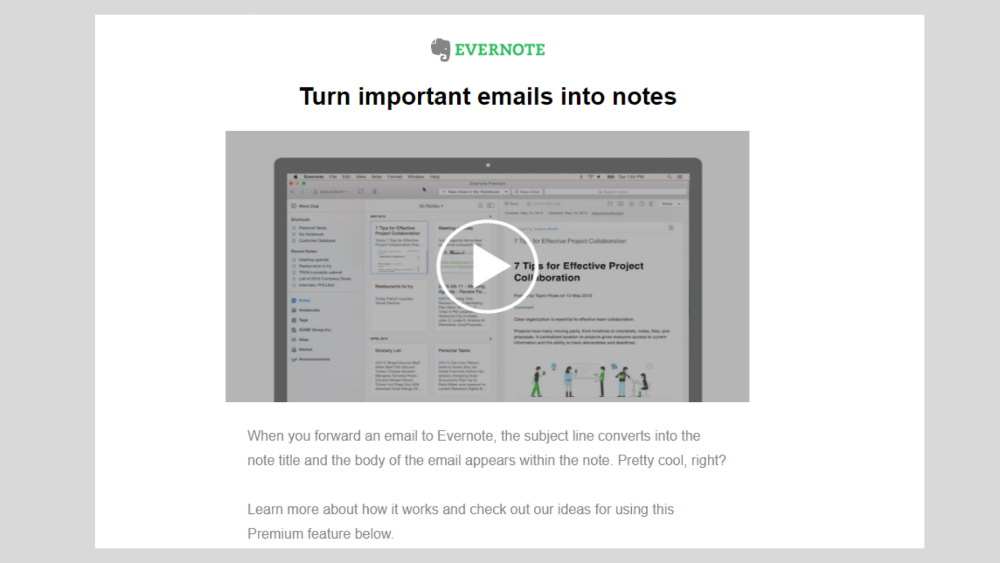
Ever Note sends good email designs as well. Instead of just texts and images, they place videos that most people are fond of. Embedded videos are highly effective most especially if you are a new brand or you just built a new website for your product.
7. Booking.com
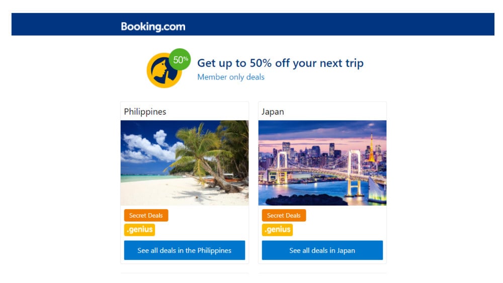
Booking.com’s design looks pretty neat and simple. What’s good is that they highlighted discounts only available for their members. And they also added ‘secret deals’ which could definitely spark one’s curiosity.
8. Room Sketcher
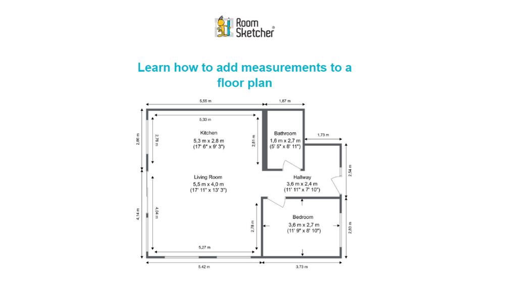
What we certainly love about Room Sketcher’s email design is that it gives out something new to learn. The heading and even the floor plan image says it all. If you are an amateur wanting to learn how to make plans, this is effective. This email design example gets straight to the point.
9. BarkShop
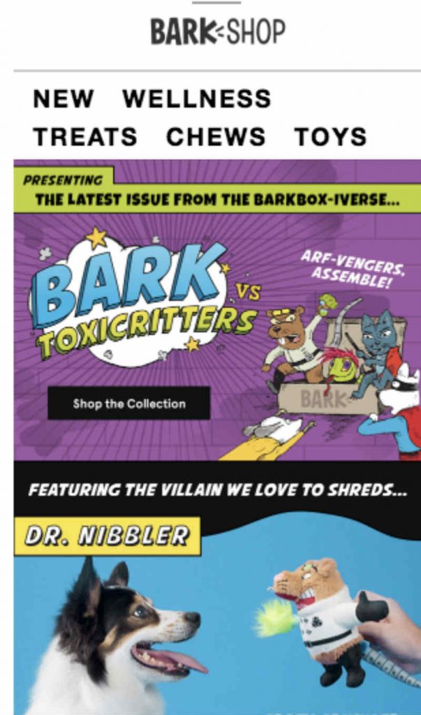
This email design example appeals to both kids and kids-at-heart. Who wouldn’t fall with this comic-like newsletter? They also use a story-telling technique and this is effective if you want to have a break from conventional emails.
10. MyFitnessPal
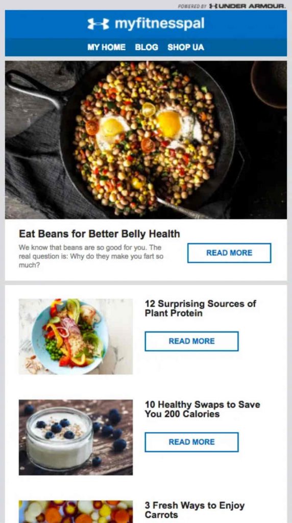
MyFitnessPal did a fine job with their newsletter. Instead of directly promoting their products, they created more valuable content. The use of images was helpful too. There is just enough text for readers to understand your message and to eventually click ‘Read More’.
11. New York Times
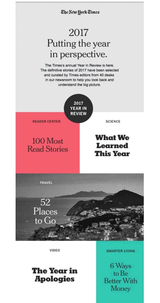
This sample from New York Times a few years ago is still applicable as an email design example. If you will notice, they made sure to use white spaces. This technique can draw attention to certain points of your newsletter. And of course, adding white space balances the entire email.
12. Rip Curl
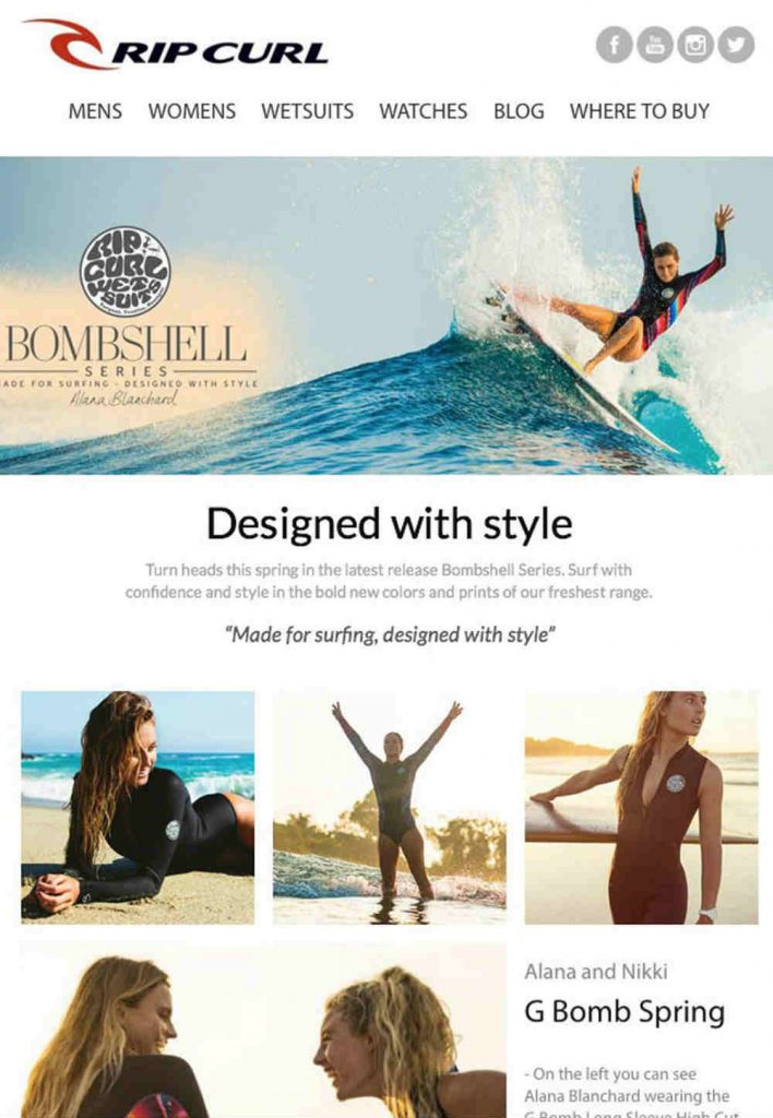
Rip Curl is already a known brand, but obviously, they still take their email designs seriously as seen in this sample. While simple, it has professional photos that emphasize the product and its target market.
13. 1Password
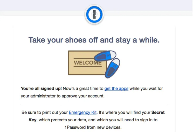
1Password created a unique email by starting with an unconventional greeting. Instead of just a plain ‘welcome’, they used a warmer approach. In addition, they direct new users to download their app as they wait for their account to be approved. Now, that’s a smart strategy.
14. UNICEF

The email design used by UNICEF includes a perfect balance of strong images and texts. Because of the image alone, you will be automatically drawn to the text. You begin to crave for more information. It has that convincing power and the call-to-action button is strategically placed as well.
15. Netflix
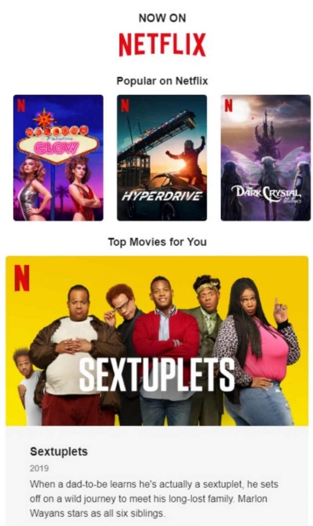
And the last one that made it to our list is Netflix. Now, you might think that there is nothing unusual about the design. But what makes it effective is that it is functional. Instead of just sending similar emails to everyone, it is personalized. You even get to see the movies you need to continue watching. It’s like a reminder and not just another newsletter that promotes their services.
Getting Email Designs from Penji is Easy
As seen from the examples above, crafting a good email template requires creativity. But more than that, it also requires design expertise. After all, a poorly-designed template can make your brand look spammy and unreliable. And as any entrepreneur would know, a stellar reputation is old in business.
Luckily, we’re here to help you with your design needs. Best of all, it only takes three easy steps to request a design from us.
1. Create the Project
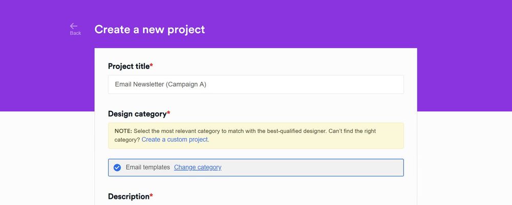
In the Penji dashboard, click New Project. Type in the title of the project. In the categories, select Email Template or Email Graphics. Then, in the description box, put in as many details as you can about the project you need. Once done, click Create Project. It will be assigned to a designer who’ll get in touch with you if anything needs to be clarified.
2. Review and Revise
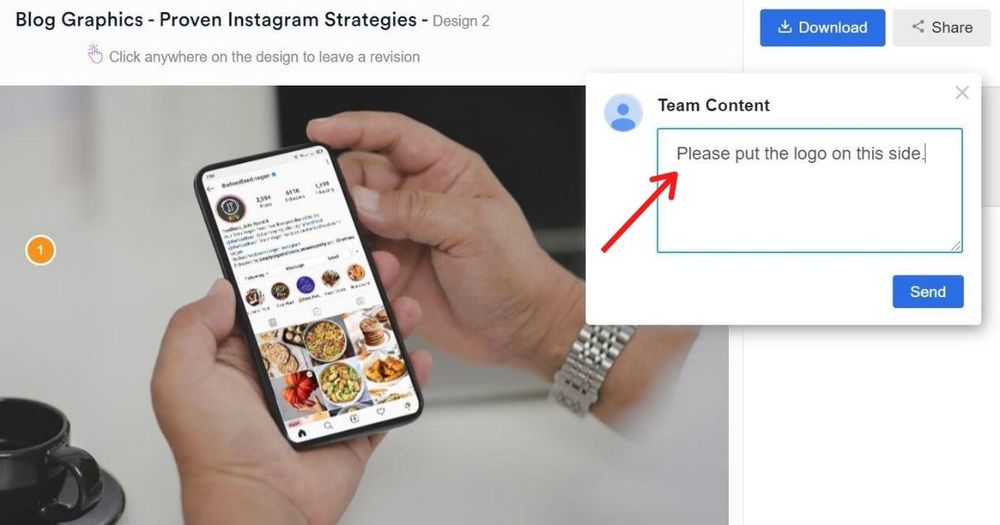
Within 24 to 48 hours, the assigned designer will get back to you with a draft. Simply click on the file within the thread to view it. If you need anything revised, click on that part and type in your comments. All our packages come with unlimited revisions, so don’t be shy! Get as many email design examples as you need.
PRO TIP: Make sure to be as clear and concrete as possible when requesting for revisions. This way, your designer will better understand what you need and hit the mark in no time.
3. Download
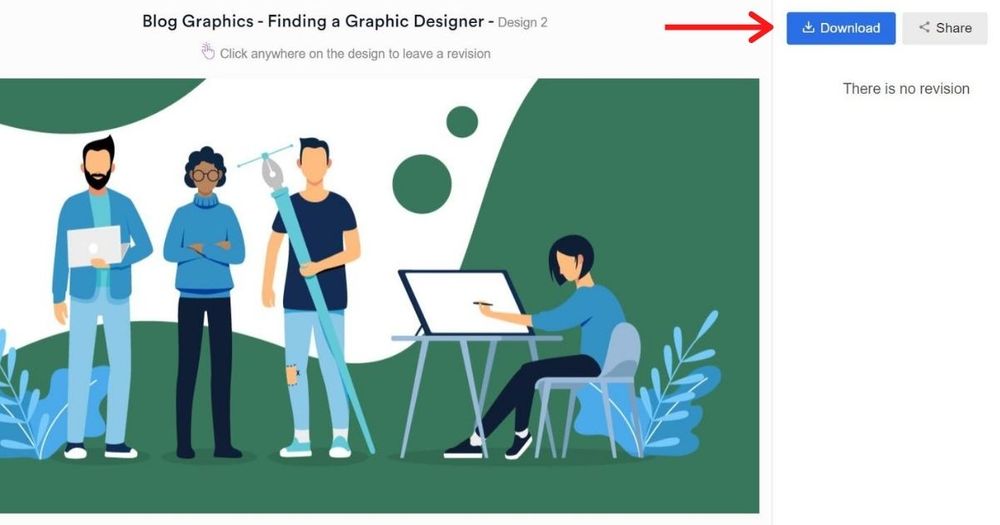
Once you’re happy with the design, click the Download button and it will automatically be saved to your computer.
Why focus on your email designs?
As we always say, everything that you use to represent your brand can make or break your business. In this case, you need to make sure that your email designs are unique, effective, and functional.
It Gives a Good Impression
Your email is a representation of your brand. Sending out a lousy design will not help you in any way. Spend time thinking of the best format and the right content for your audience. Remember what we said about open rate?
Now, here’s the thing. You don’t have to do it on your own. Penji has a team of professionals that can help with your email designs. They deliver fast and will not stop until you are satisfied.
You can Reach Out to an Already Established Audience
Chances are, your subscribers are already loyal to your brand. It is only right that you update them with news or with valuable information. Perhaps, give out promos. If they love it, they might even forward your email to their contact list. And this, of course, can organically widen your market.
It Drives Out Immediate Sales
And lastly, your email design can potentially bring sales to your company. With the right images, texts, even colors, it can influence your readers to buy whatever it is that you are offering. It’s definitely worth the effort.
Get an email design that converts. Sign up today and try any of our packages risk-free for 15 days.
About the author

Barbara Anne Isla
BA Isla is a Content Writer and also an Events Host. She left the corporate world to do what she loves and to spend more time with her amazing kids. She hopes to bring valuable change to society with her words.


