
Having an ecommerce business entails much more than when you’re creating regular blogs or websites. Your online store has to look and feel like a real brick-and-mortar store where everything is neatly laid down to give easy access to your shoppers. Your store has to give the best buying experience to keep you ahead of the competition.
Growth-driven entrepreneurs who want a high-quality website turn to Penji for their design needs. We offer beautiful eCommerce websites crafted by the top 2% of designers. Stick until the end and we’ll tell you how to get your own website design in three easy steps.
Here are 20 ecommerce website examples to give you inspiration for yours:
1. Death Wish Coffee
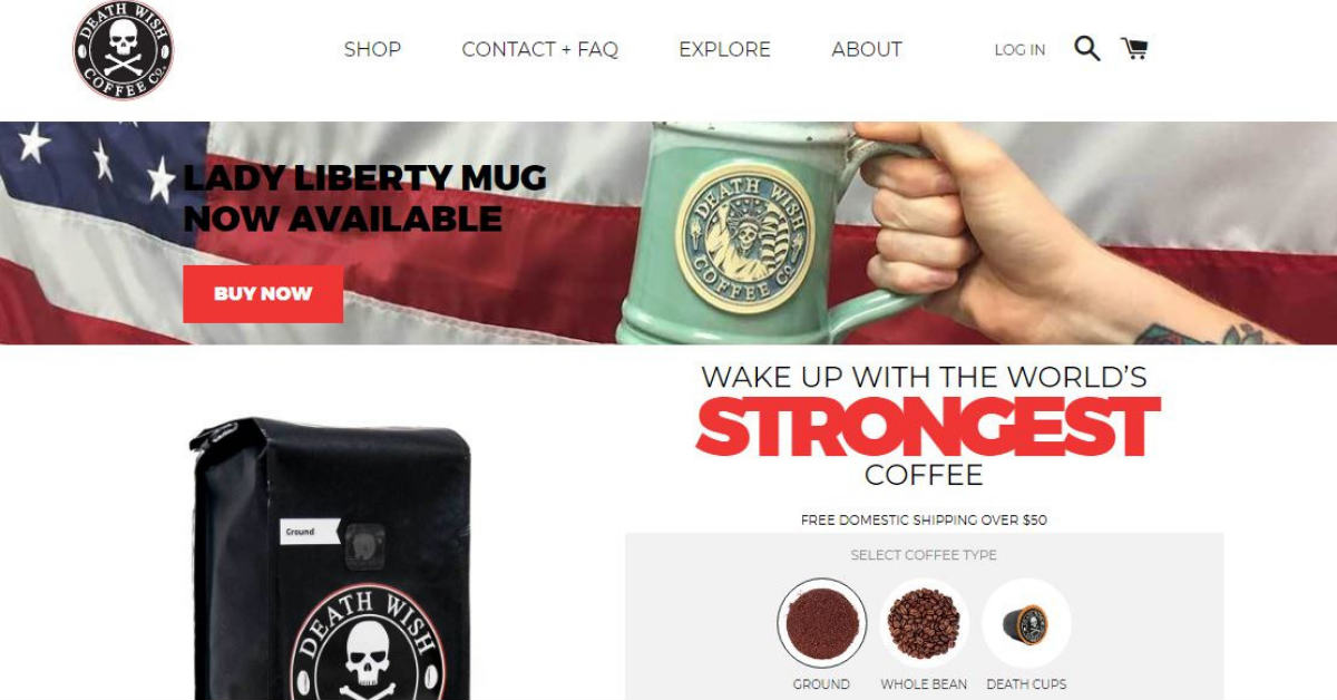
Nothing more suited in their brand’s design than the colors red and black, and the skull and crossbones symbol that we commonly see in poison, Death Wish Coffee has creativity written all over their website. Once you arrive on their landing page, you’ll instantly see their packaging that is pleasantly shocking. All these and more are very effective in getting you to buy their coffee with no hesitations.
2. Mahabis
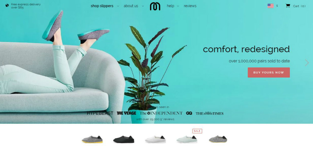
Mahabis is one of the ideal ecommerce website examples. It’s a fashion company based in London, values beauty, simplicity, and functionality which they successfully managed to show on their website.
3. x-doria
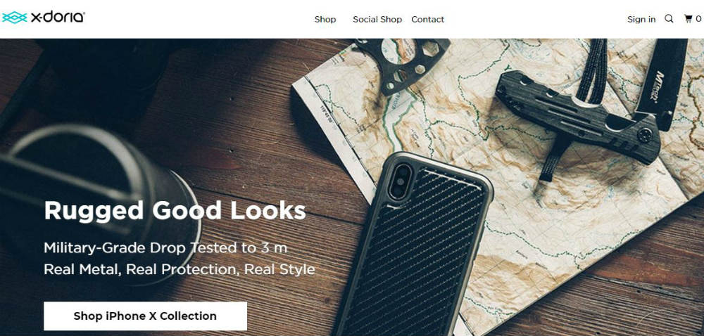
A good ecommerce website is one that lets customers search for what they want in an easy and convenient way. x-doria does this best by having a design that makes product navigation a breeze. Plus the website has a trendy and edgy look that clearly illustrates their brand.
[in_content_ads gallery="websites" logo="off" title="You don’t have time to become a self-taught website designer" subtitle="Get a website that generates the revenue you’re looking for and encourages repeat customers." btntext="Let’s begin" btnlink="https://penji.co/pricing/?affiliate=J2O5AB8RAR3386837"]4. Esqido
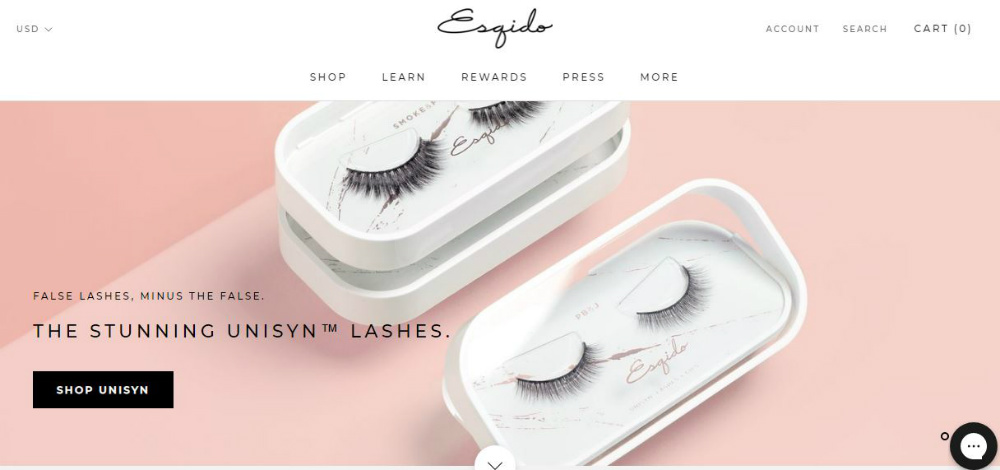
Selling mainly fake eyelashes on their website, Esqido uses brilliant photography to highlight even the minute details of their products that are diminutive, to begin with. They also have a short video of how to apply them which leaves customers no excuse not to get them.
5. Father Rabbit
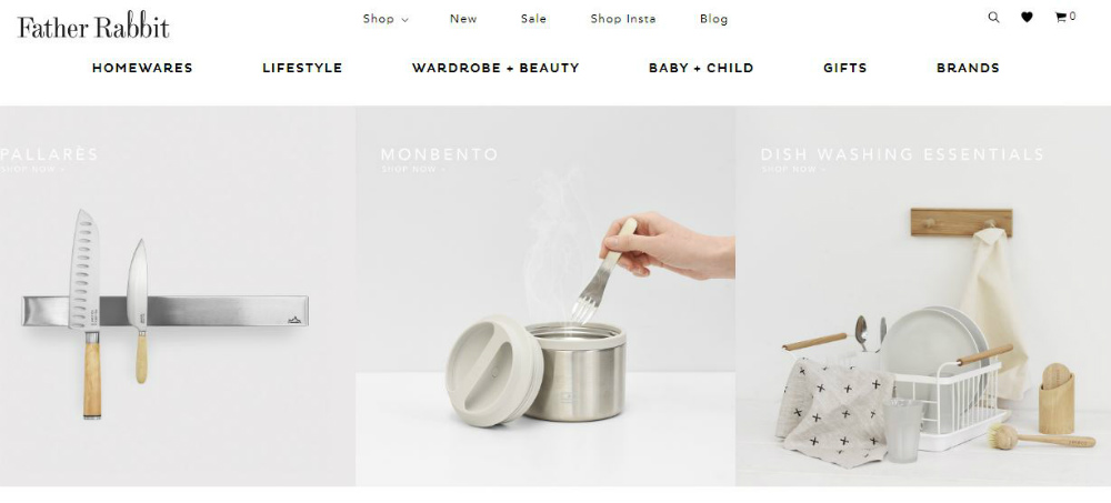
As mentioned in their website, Father Rabbit appreciates simplicity which is very evident on every page of the site. Its use of a variety of typography adds to the elegance along with an almost monochromatic choice of color combinations. It also has text content that effectively describes the products which is what most people look for in online stores, no guessing games there.
6. RSVP
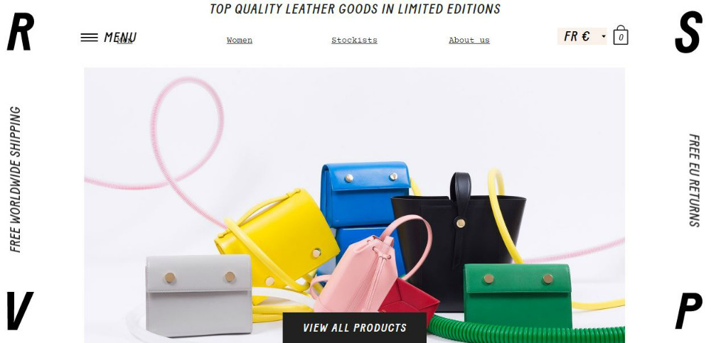
The letters R, S, V, and P are displayed on each corner of the page adding to its delightfully interesting look. The products are listed in an organized manner making it easy for customers to choose. The photos are clear and crisp thoroughly showing the beauty of each product.
7. thing IND.
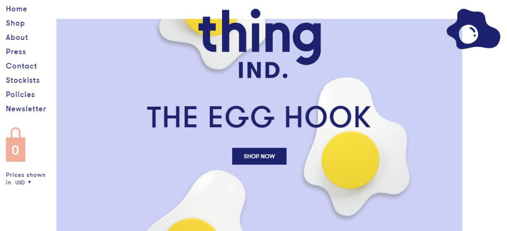
The creative use of typography is essential in designing effective websites and is best exemplified by thing IND. The website sells amusing and humorous products. Overall, their site shows fun and playfulness, giving their visitors an entertaining shopping experience.
8. Bellroy
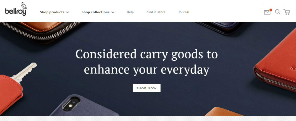
Using the traditional approach in design, Bellroy’s website uses illustrations, videos, and images all in a layout that is simple and easy on the eyes. It uses different types of fonts that add to its stylish and trendy branding. The videos are quirky but show perfectly why you need their products.
9. Ratio
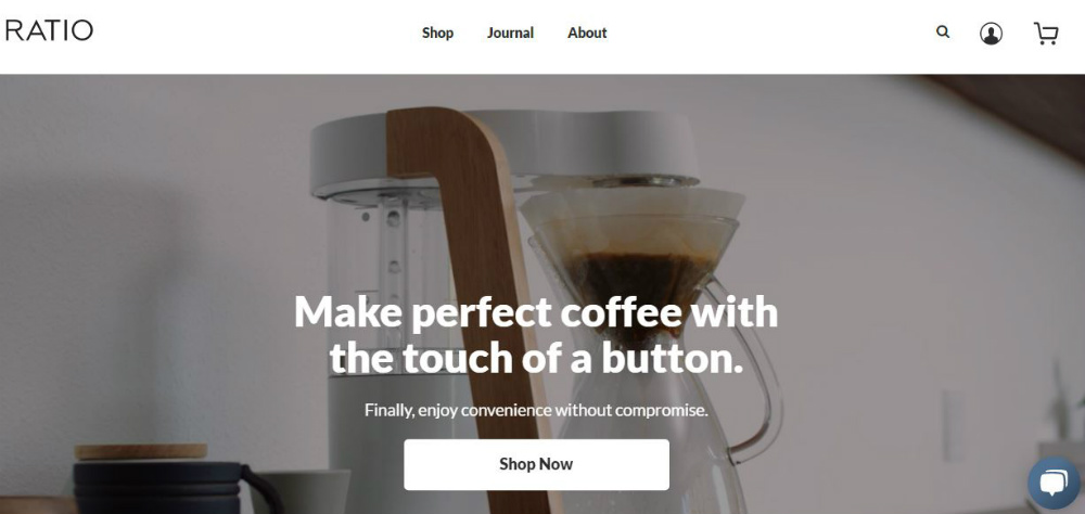
Selling high-end coffee, Ratio uses typography, images, and color with the right amount of white space. The website oozes with elegance and sophistication, perfect for the image that they’re projecting.
10. Mollusk
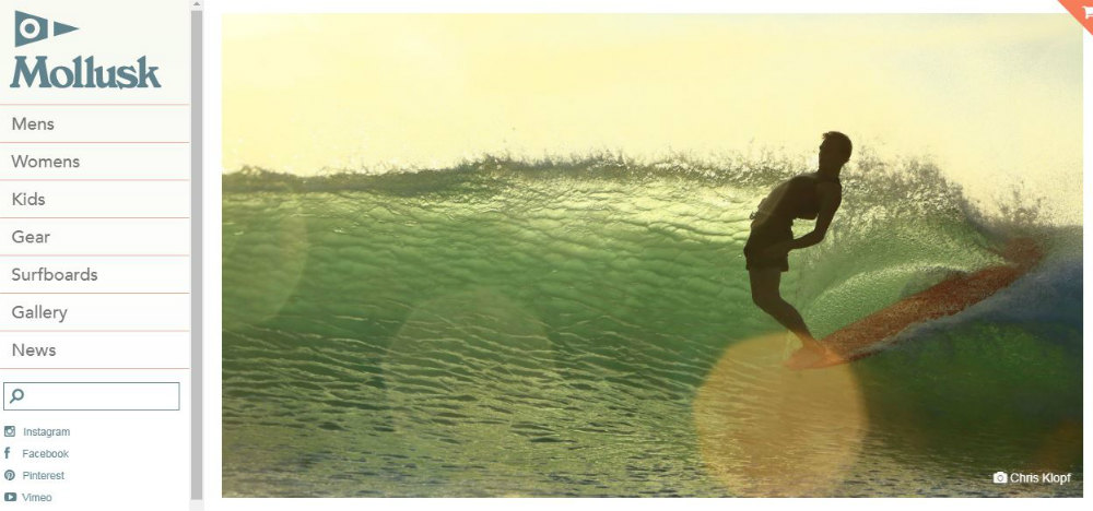
Mollusk is a surf company that offers a chill-out style of clothing that surfers love. They are organic and locally made and is shown perfectly in their ecommerce site. It is easily navigable and gives you the option to see full photos of their products. At Penji, we also make it a point to design clients’ websites to reflect the brand’s heart and unique story. Check out our portfolio to see our previous works.
11. ETQ
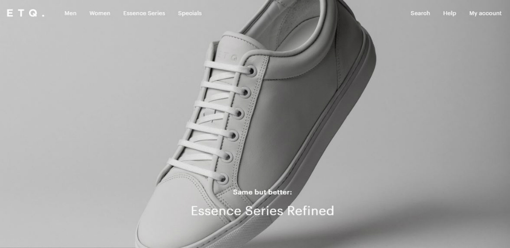
Based in Amsterdam, ETQ places quality and elegance in their products and this shows quite well on their ecommerce website. The overall look is centered on a minimalistic design approach by using subtle colors, simple layout, and images that look fresh and fashionable.
12. Di Bruno
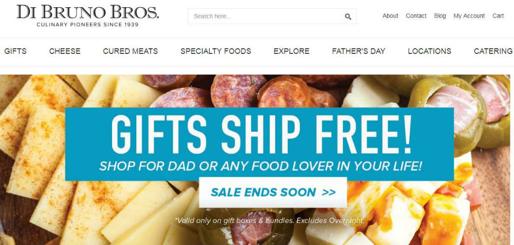
Di Bruno’s website gives visitors a quick view of each of their products. They also use high-resolution images that are mouth-watering. This will give them an idea of what the product is about so even if they can only look at the item, they’re given a good idea of what it tastes like.
13. Tinker
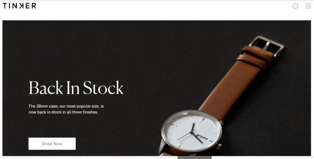
Tinker’s website has a Build a Watch feature that allows you to create your own watch. The lovely thing we found on their website is the watch that tells you the current date and time wherever you are. The design is very simple yet entices you to create your customized watch.
14. Shwood
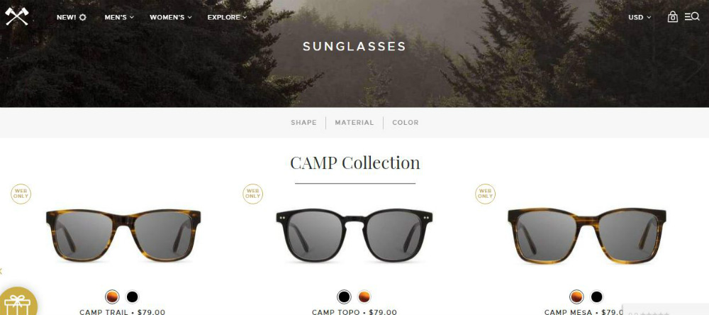
Shwood is one of the best ecommerce website examples. This website uses photography that clearly shows each of their glasses made with wood. They made it responsive so that it shows two different sides of them. This makes viewers stay longer on the site as they can see what the products are all about in a convenient way.
15. BlackMilk
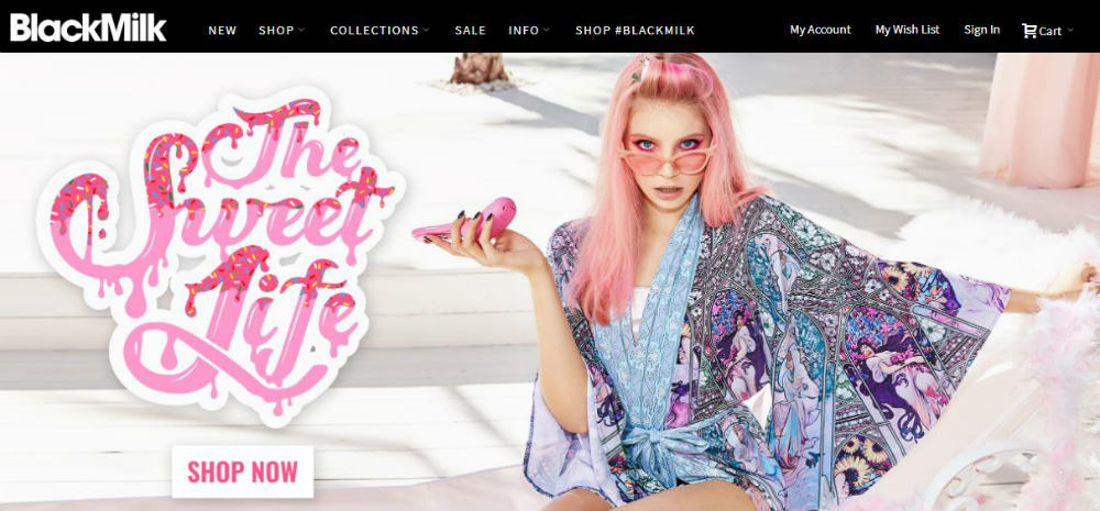
A fashion line that caters to free-spirited women who want to express themselves through their clothing. This resonates well on their website with its use of bright colors, contemporary design, and a variety of fonts that range from flirty to romantic.
16. Bootstrap Themes
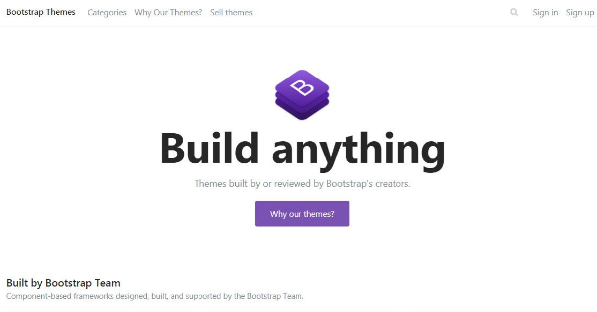
At first glance, there’s nothing much to see on this website. It sells virtual technology which many people may find intimidating. But a closer look at the site, you’ll find photographs, boxes, and texts that explain clearly what their products are, making the customers understand everything they’re offering.
17. Best Made
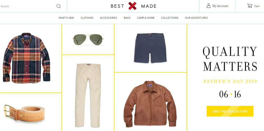
This ecommerce site has a totally no-nonsense approach as it shows their products without much ado. They’re what you see first which is a good strategy as they’re what you’re in the market for. Not much fanfare here, you can go straight shopping and they made it easy that way.
18. No. 22 Bicycle Company
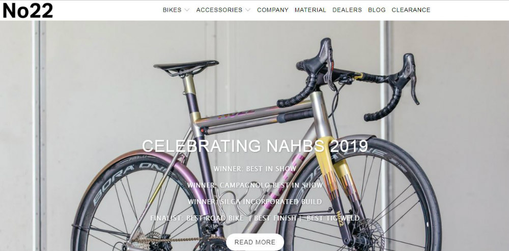
Selling bikes online can be tricky but No. 22 Bicycle Company has made it simple and easy with their website that gives every little detail (plus gorgeous pics) of each bicycle, the only thing missing is the test ride.
19. Press
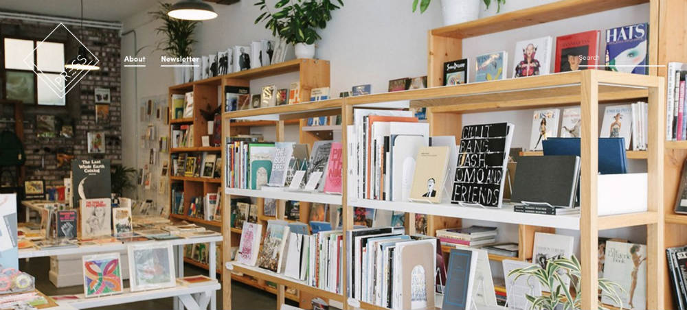
Press sells specialty books, photography, crafts, and many others. These items are neatly displayed that makes browsing easy. When you click on an item, it shows more of the product and gives a brief description. The overall design gives the feeling of browsing through a real physical bookstore which is a hit with book lovers.
20. Patagonia Provisions
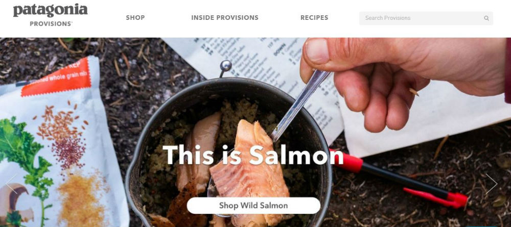
Patagonia Provisions sells food online and does it quite well with their website that has food deliciously showcased with simple layouts and clear photographs. Makes for mouth-watering images that jump out of the screen. The top eCommerce website examples should have the power to make that kind of impact.
21. Hebe
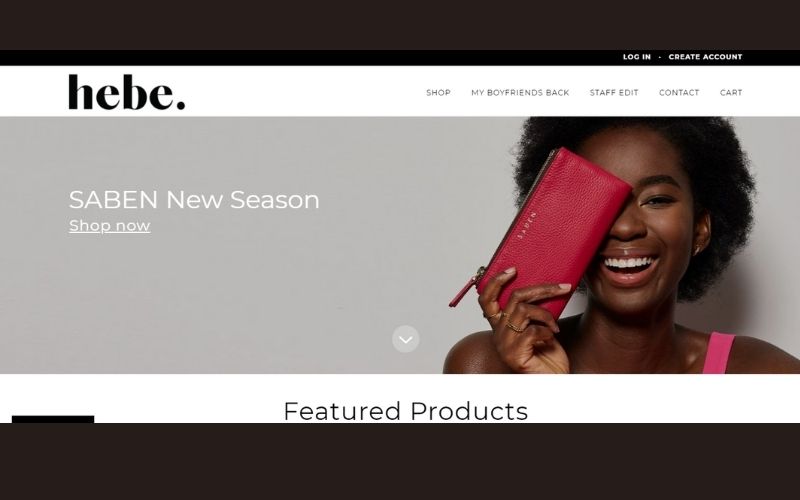
What we appreciate about Hebe’s website is its straightforward design. Their call to action, Shop Now, is strategically placed on the main image. Yet, it is not disruptive in any way. Simply put, it goes well with the overall aesthetic of the website. And as you scroll down, you get to see their top products together with its price tag. Thus, it makes it easier for customers to come up with a decision.
Just click on the item and you will be directed to a new page providing more details about the product.
22. Jackie Smith
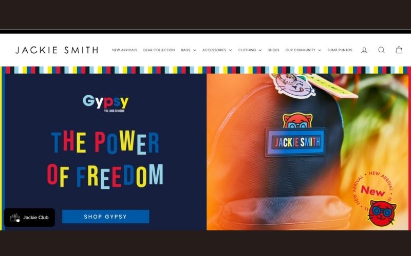
This eCommerce website sells a variety of products from bags to clothes, down to accessories. And if your designer isn’t knowledgeable enough, your website will be chaotic. That could be a huge turn off for your potential customers. Fortunately, Jackie Smith’s website has an organized design. It’s easy to navigate even with their huge selection. Plus, the choice of photos is amazing too. They even incorporated micro-animations, making it more interactive.
23. Bohemian Traders
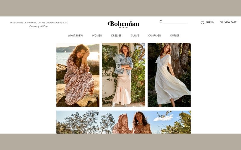
The Bohemian Traders’ website is true to its name. Everything screams Bohemian from their products down to the typeface they used. When you enter the website, you will be welcomed with a pop-up announcing a 10% discount in exchange for your email and name. Now, that’s a smooth technique if you want to get leads. They also allow their website visitors to change the currency to AUD, EUR, NZD, or USD. With this, it’s easier to penetrate a global market.
24. The Horse
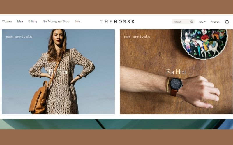
Like most of the eCommerce websites in this list, The Horse did not disappoint. They have successfully organized their products, separating the ‘For Her’ and ‘For Him’ collection. Plus, they made sure to put the new arrivals at the top of the website. So, if you are constantly visiting their page, you will know what are the latest products to check out. They also added client testimonials, which we all know is helpful to establish trust.
25. Helbak
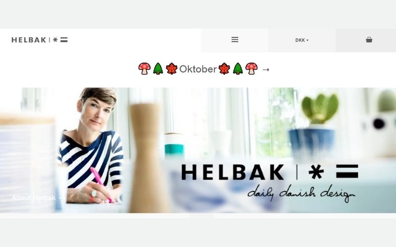
And lastly, we have Helbak. Their website is not overwhelming and you can easily navigate through it. That makes a lot of sense considering that their market is adults who do not have the luxury of time to browse. That’s a great technique you can use as well. Always understand the behavior of your audience and pattern your website design from there.
Requesting an Ecommerce Website Design from Penji
As illustrated by the examples above, the website’s look can immensely affect the prospects’ impression of the brand. And when visitors see a website design they can trust, they’re more likely to be encouraged to purchase something from it.
Putting up an ecommerce store can be a handful – from sourcing products to day-to-day operations and marketing, there’s just so much to do. But you’re in luck because you can leave the heavy-lifting to our experienced designers. It only takes three steps:
1. Create the Project
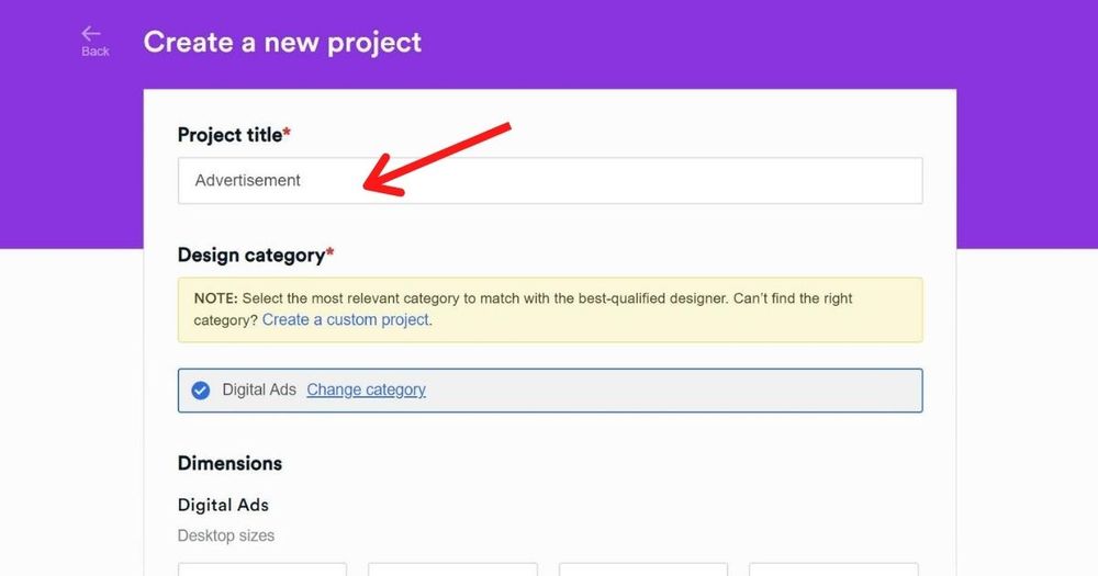
Before you can have access to our app, you need to choose a design plan and sign up. It should be easy and will only take a few minutes.
In the dashboard, click New Project. Type in the name of your project and click Website Design. You’ll be asked what type of page you need. You can choose from the following:
- Home page
- Landing page
- About us
- Contact
- Pricing page
- How it works
- Checkout pages
- Custom page
Type in details about the project. This includes your target market, what your company does, and a link to the existing web page. Then, click Create Project. The task will be assigned to a designer well-versed in web design.
2. Review and Revise
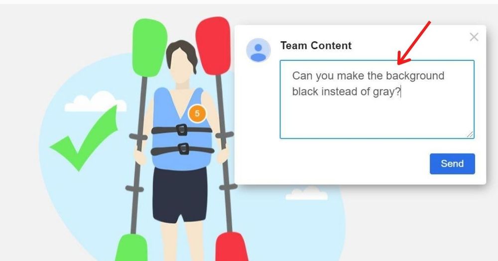
Within 24 to 48 hours, the assigned designer will submit a draft of the design. This depends on how complex your design request is. When you already have the initial output, simply click on the file in the thread to review the graphic. You can enlarge the images and have a closer look. If you want anything revised, click the pointer on that part, and a comment box will appear. From there, you can type in your comments. The designer will revise the design over and over until you’re 100% satisfied.
In rare cases that the designer is not able to satisfy your style, you can request a replacement. This doesn’t come with a fee.
3. Download
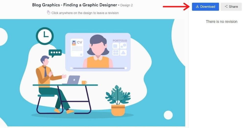
Once you’re happy with the design, click the “Download” button and it will automatically be saved to your computer. You don’t have to send a different email to your designer asking for source files. You can download it whenever you are ready.
This is the reason why a lot of businesses enjoy using Penji. We have a great team to work on your website. Plus, the process is easy and efficient. And let’s not forget, it’s also affordable. You can get unlimited graphic designs for a fraction of the cost. Now, who wouldn’t want that?
With the right service provider, website design doesn’t need to be a burden to you. Check out our packages and see which one fits your brand’s unique needs. Try it today and get a 15-day 100% money-back guarantee.
About the author

Celeste Zosimo
Celeste is a former traditional animator and now an SEO content writer specializing in graphic design and marketing topics. When she's not writing or ranking her articles, she's being bossed around by her cat and two dogs.
Table of Contents
- 1. Death Wish Coffee
- 2. Mahabis
- 3. x-doria
- 4. Esqido
- 5. Father Rabbit
- 6. RSVP
- 7. thing IND.
- 8. Bellroy
- 9. Ratio
- 10. Mollusk
- 11. ETQ
- 12. Di Bruno
- 13. Tinker
- 14. Shwood
- 15. BlackMilk
- 16. Bootstrap Themes
- 17. Best Made
- 18. No. 22 Bicycle Company
- 19. Press
- 20. Patagonia Provisions
- 21. Hebe
- 22. Jackie Smith
- 23. Bohemian Traders
- 24. The Horse
- 25. Helbak
- Requesting an Ecommerce Website Design from Penji


