These ecommerce logos are super easy to spot right away, and there’s a good reason for that. When it comes to your logo, it’s best to hire a pro designer. After all, your logo is like the face of your brand, and it deserves some serious thought and planning.
Believe me, the right logo can work wonders for your business. It’s actually one of the smartest investments you can make for your brand, so you definitely don’t want to take it lightly, especially in the world of ecommerce.
Lucky for you, we’ve put together a list of some seriously impressive ecommerce logos to give you some inspiration.
Need an awesome logo for your brand? Check out Penji for unlimited graphic design services or one-off logo designs.
1. Amazon
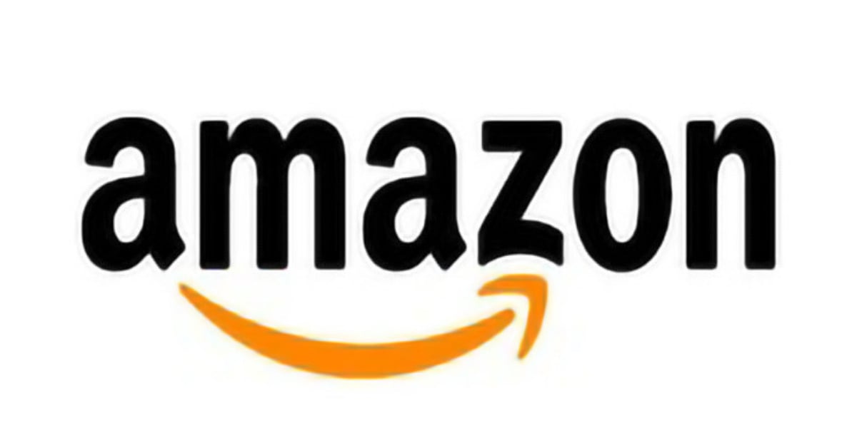
One of the most popular ecommerce logos, Amazon has an arrow that starts from the first A of the name then points to the Z in the middle to show that they have everything from A to Z. This projects the image that the company can meet the consumers’ every need.
2. Aida Eats
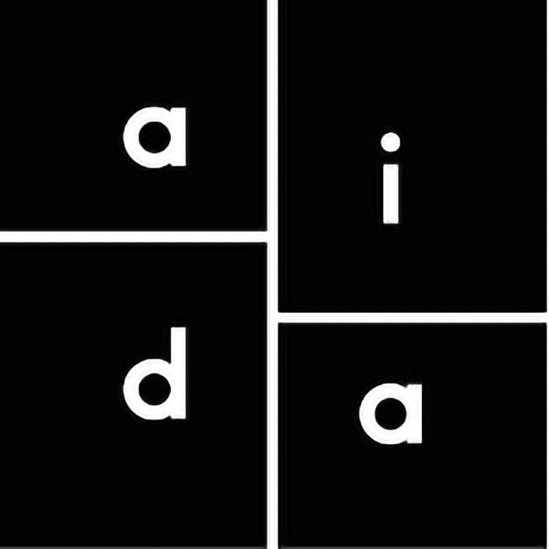
This logo’s design is quite the opposite of what you’d expect from a website that sells food. It is a black box with smaller boxes in it that has the letters a, i, d, and a. It has a very modern feel and fits in well with their web and print graphics.
3. eBay
The eBay logo is one of the most well-known ecommerce logos. It has colorful letters that reflect the image of it being a fun place to sell and shop. It has gone through a lot of changes but still hasn’t ventured far from its original idea.
“I loved the colors of the Apple logo and the fun movement of the Twister game and somehow that gave me the idea of eBay. The overlapping colors were designed to convey the sense of community on eBay.” – Elissa Davis, first designer of the eBay logo.
4. Snapdeal
Snapdeal’s logo resembles an open box. The company’s tagline, “Unbox Zindagi” means unbox life in India. It represents the excitement that you feel when your package arrives. From a different perspective, the logo can be seen as two arrows that the company claims to be them as being the ones behind this elation.
[in_content_ads gallery="logos" logo="off" title="Get a logo as timeless as your brand" subtitle="Logos should be as unique as your business. Hook your audience with a 100% custom logo design." btntext="I need this!" btnlink="https://penji.co/pricing/?affiliate=J2O5AB8RAR3386837"]5. Alibaba
The Alibaba logo is a lowercase letter “a” with a human face inside, which is supposedly the face of a satisfied customer. Their logo has been critically judged by designers for things like the typeface, Linotype Univers, being too generic. However, their online sales and profits are higher than those of all US retailers combined.
6. Best Buy
It’s so clear in their logo that Best Buy offers nothing but the best buys. It has a price tag under the name and it is in yellow as most discounted price tags are. Simple, yet impactful. The logo looks great on digital and print, showing it’s versatility in the modern design.
7. Flipkart
The F inside the shopping bag image on their logo has lines that denote speed which is an important asset in the shopping business. Everyone wants to get their packages ASAP and their logo speaks clearly about that. The bright yellow bag stands in contrast against the blue background adding emphasis to its business of retail online shopping.
8. Port of Mokha
Port of Mokha is an online shop that sells coffee from Yemen. Their logo shows a boat going forward leaving behind a trail of waves. Very much like what the owner of the company has done, he left for Yemen to bring back its coffee for the world to taste.
9. Read Only Memory
A website that publishes and sells books about video games, Read Only Memory’s logo looks very much like an icon that you normally find in virtual reality. This adds a fun and playful quality to it despite it being black.
10. Walmart
The logo is made of yellow spokes which Walmart says represent the sparks of creativity and innovation that they and their employees embody. They are one of the biggest and most popular retail stores and it’s no surprise that this logo is recognized everywhere.
11. Target
Target’s logo is an iconic white bullseye with a peppermint red background. The color offsets the seriousness of the bullseye making it a multidimensional logo that is memorable among its customers. Because of its minimalist nature, Target’s logo is easily recognizable and can easily be spotted in print and digital forms.
12. NewEgg
A computer hardware and consumer electronics website, NewEgg has a logo that is made up of, you guessed it right, eggs. The egg symbolizes birth and unlimited potential. And the founders of the company claim that the logo and the name signify hope for the new business in a world that was previously a struggle for ecommerce businesses. Today, NewEgg is the leading retailer of tech products in North America and has a reach across the world.
13. Malika Favre
There are factors you need to consider when designing, but there are no hard rules. Take for example the website of Malika Favre. White space is an essential element you see in top ecommerce logos. But in their case, you can hardly see any, which makes them unique and memorable in their own special way. Their logo fits in well with the overall design which is a must as everything has to have a look of being one.
14. Magento
This logo is inspired by the Dragonlance logo from the game Dungeons & Dragons where the word Mage means Wizard. Magento’s logo is an orange block that has white space in it that forms the letter M. The name itself was derived from the color magenta, which was used in the first version of its logo.
15. Satorisan
This clothing retail store uses a mythological creature from the book “The Book of Monsters” as its logo. It resembles the Yeti or the Bigfoot and is described as a creature that can read people’s hearts. It may seem brawny for a retail store, but the use of the character is meaningful.
16. Shopify

A popular eCommerce platform, Shopify’s logo says it all—shopping! The logo consists of a wordmark and an emblem and looks calm and professional. The green color symbolizes comfort and growth, giving the viewer a sense of reliability.
17. WooCommerce
Inside of a word balloon is the word “Woo” in a design that seems cartoony and quirky. WooCommerce is a top player in the open-source eCommerce platform field, and its logo is easily recognizable because of its simplicity. The emblem is usually used on its own and evokes a friendly feeling.
18. Craigslist

Craigslist logo is that of a sign that’s universally known as a sign for peace. It is iconic and remarkable amidst all the controversies that go along with it. The classified advertisement website has gained popularity, which can be readily associated with its logo.
Need a logo of your own? Try Penji.
As you can see from the logos above, each company carefully considered the meaning, color, and design of each logo. In order to create the perfect logo, countless revisions and updates were made to make it what it is today. Penji designers are trained in logo design and offers unlimited revisions which make it a great graphic design service for creating your ecommerce logo.
If you’re inspired from the logos listed, we can help you create the best brand asset for your business in as little as 24 hours! As a special promo, use code “ECOMMERCELOGO” for 25% Off your first month.
Logos created by Penji
Want to some some of our work? Here are a few logos we created for our clients.
How Penji works
Select a plan you need – Pro, Team or Agency. Fill out the form and click the “Create account” button. Once your account is up and running you can request a logo design in three easy steps:
1. Create
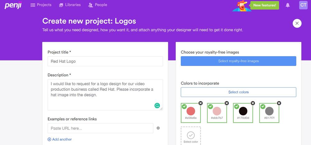
In your Penji dashboard, click “Create new project.” It will take you to a task card you need to fill in with details like title, description, and size. You can also include a specific color palette you want to be used on the design. Click “Create project” and the request will be lined up on the queue.
2. Revise
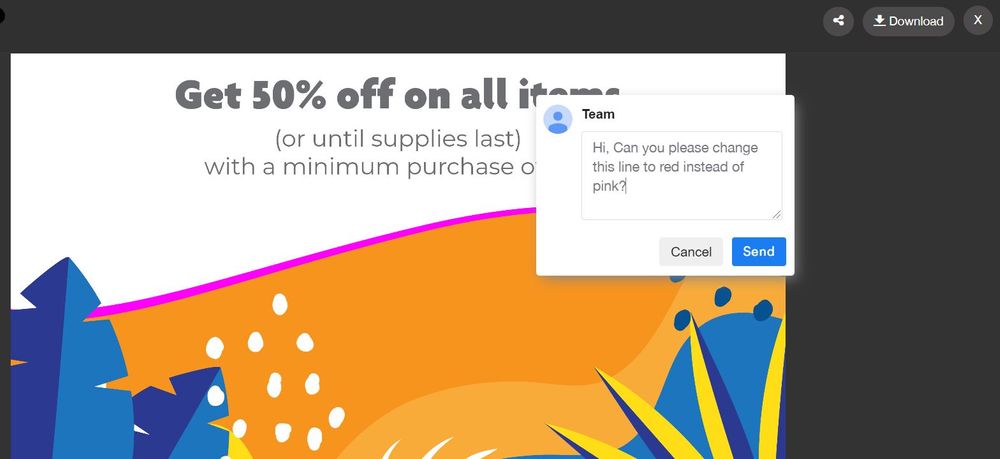
Within 24 to 48 hours, your designer will deliver the design. If you want to revise anything, simply click the pointer on the part you want to change and type in your comments. The designer will revise the image according to your instructions.
3. Download
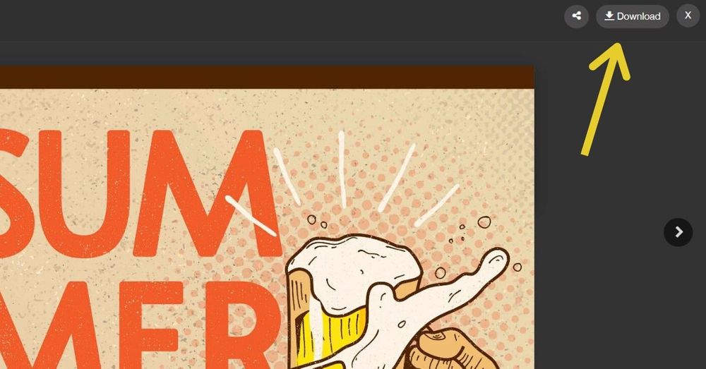
Once you’re fully satisfied with your design, click “Download” and it will automatically be saved to your computer.
The Bottom Line
As seen from the examples above, the right logo can make your ecommerce business connect better to your audience and stand out from your competition. It takes a professional designer to get your audiences’ attention and introduce your brand identity all in one image.
Sign up now, and get unlimited graphic design services or one-off logo designs.
About the author

Celeste Zosimo
Celeste is a former traditional animator and now an SEO content writer specializing in graphic design and marketing topics. When she's not writing or ranking her articles, she's being bossed around by her cat and two dogs.
Table of Contents
- 1. Amazon
- 2. Aida Eats
- 3. eBay
- 4. Snapdeal
- 5. Alibaba
- 6. Best Buy
- 7. Flipkart
- 8. Port of Mokha
- 9. Read Only Memory
- 10. Walmart
- 11. Target
- 12. NewEgg
- 13. Malika Favre
- 14. Magento
- 15. Satorisan
- 16. Shopify
- 17. WooCommerce
- 18. Craigslist
- Need a logo of your own? Try Penji.
- Logos created by Penji
- How Penji works
- The Bottom Line

