The ecommerce industry has seen a massive surge in 2020 and is projected to continue with the trend in the following years. For the consumers, this means more choices, while for the entrepreneurs, it means more competition. To get your business ahead, it pays to keep up. Here are ten ecommerce design trends you need to look out for in the coming year:
1. Eye-Catching Animations

To get more engagement from your website visitors, incorporate animations throughout the site. Consumer expectations are getting higher. According to research, 80% of customers consider experience as equally important as a brand’s product or service. When static design is already a norm, use animation to make things more interesting.
From product reveals and micro animations to web page transitions, they provide powerful innovation in conveying a message. It adds an engaging factor that’s also good for explaining things without using a word.
2. Creative and Unconventional Layouts

Layout is crucial in web design as it allows you to organize all the content in ways that are practical and appealing. Thus, for the coming year, it pays to add more creativity to your web design by using unconventional layouts. Take a leaf from the structure of The Goonies website:

It has animations, interactions, page transitions, and many other interesting design elements. It keeps the viewers engaged with imaginative storytelling. This is an excellent example of a website that added innovations to the usual F-layout or the singular-column layout.
3. Vaporwave Aesthetics

Described as the use of vintage photos and site design from the early days of the internet, vaporwave aesthetics is an ecommerce design trend you need to know about. It comprises psychedelic colors in backgrounds, vintage fonts, and abstract forms, among many other old-school design elements.
This may have stemmed from the previous trend of having simple and minimalistic designs. People are looking for new designs, making minimalism outdated. Of course, this will depend on your business nature, but for 2023, bold and bright will be the key identifying features.
4. Immersive Designs

Since consumers are expecting more from their ecommerce experiences, you need to develop improved ways to get their attention. This calls for creating an atmosphere that gratifies their senses. It is an excellent way to add value to your ecommerce web design while giving your viewers a memorable visit.
You can do this by incorporating music, sound effects, 3D images, and other elements that show your customers how they can benefit from your brand.
5. Voice Activated User Interface

To make your website more appealing to customers, add voice-based chatbots and virtual assistants. This provides a personalized touch that is more welcoming to a prospect. Not only is this trendy, but it is also helpful. It makes your site easier for people to use, especially mobility-challenged customers.
As you try to work this into your website design, make sure to include voice search optimization so you can get the most out of it. Voice-based e-commerce is expected to reach a massive $23 billion by the end of this year and will continue to grow.
6. 3D Images

To give your customers the in-store experience of shopping, use 3D images. You can use a wide array of tools, such as 3D product configurators and View-in-Room AR. All these can provide fun and different ways of showing off your products.
You can also use 3D images for your infographics, charts, and tables. Interactive graphics, like 360-degree views of furniture or other items, also improve the user experience.
7. Big, Bold Fonts

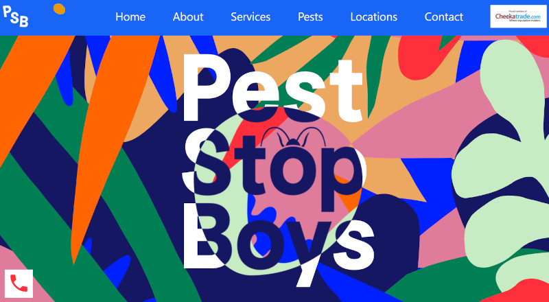
Brand personality is a vital part of a business’s success. The more people know and remember you, the better for revenues. And so, to make your brand stand out in the noise of the coming year, use big and bold fonts. To complete the picture, use the brightest and most vibrant of colors, like what the website Pest Stop Boys has done:

Although the example above won’t fit a cosmetics brand, it’s safe to say that using fonts and colors out of your norm is what you can do in this situation.
8. Artificial Intelligence

More and more businesses are harnessing the power of AI. Don’t let your brand be left behind. When you use AI on your website, you give users a more personalized and well-rounded experience.
This creates a connection between producers and consumers based on a customized experience that is different for each user. AI on e-commerce sites can come in the form of virtual assistants, chatbots, or suggestions for products based on a user’s past purchases. AI is becoming a more significant part of online business because users love how it improves their experience.
9. Page Transitions

Get creative with your ecommerce website’s page transitions. With these, you can show that you are going from one page to the next quickly and, when done right, can keep your visitors engaged. They can make users feel like they’re going from one page to the next with an exciting twist.
Let’s say you’re making an app that people use to order food, and you can use page transitions to show them the progress of their order and other details about their transaction. You can also use it for your blog posts and let your readers know when they’ve reached the end so they can click the “next” or “back” buttons.
10. Vertical Menus

The horizontal menu style has been the default for websites for a long time. That’s mainly because websites were made for the big screens of laptops and desktops before smartphones came along. But this is starting to change as more and more people use their phones for online shopping.
This means going mobile-friendly is imperative. In order to be mobile-friendly, more eCommerce sites are switching to vertical menus, which work great on mobile devices.
Final Thoughts
As ecommerce is becoming more widespread and competitive, customers are continuously expecting more. For the new year, reinventing your brand or adding design elements that can catch your customers’ eyes is vital. Use these ecommerce design trends to make your site more interesting for users.
Let Penji help you achieve this by working with us. Click on this link to start using these trends for your ecommerce web design.
About the author

Celeste Zosimo
Celeste is a former traditional animator and now an SEO content writer specializing in graphic design and marketing topics. When she's not writing or ranking her articles, she's being bossed around by her cat and two dogs.


