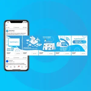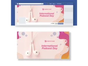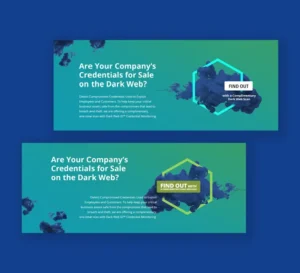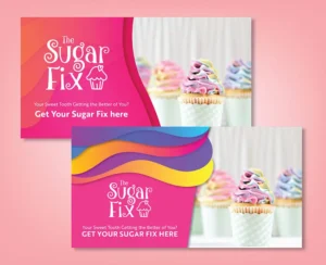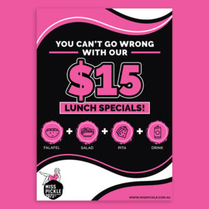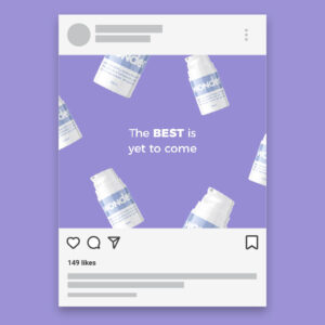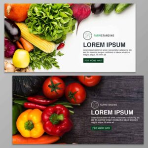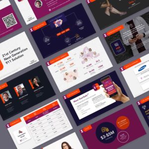
An excellent way to get the attention of prospects is to create eye-catching banner ads. However, if you’ve tried all the tricks in the trade and still come up short, you need to use different techniques. Here is a list of the new essentials in designing banner ads:
Table of Contents
- Craft Audience-Centric Designs
- Add Visual Appeal
- Create Effective Messaging
- Place Your Ads Strategically
- Use Interactive Elements
- Be Consistent with Your Brand
- Optimize for Mobile
- Adhere to Compliance and Accessibility Guidelines
- Go for Personalization
- Always Test and Optimize
1. Craft Audience-Centric Designs
It is crucial to consider your audience when designing banner ads. This places their needs, preferences, and behaviors above all else, resulting in a brand message that resonates with them. Knowing your audience’s unique characteristics allows you to craft banner ads that are relevant to them.
The key components of an audience-centric design involve understanding their demographics, interests, and behaviors. You also need to delve into their values, beliefs, attitudes, and lifestyles. This may seem like a Herculean task, but its benefits far outweigh the hard work. It increases your brand’s relevance, improves engagement, and enhances brand loyalty, among other things.
2. Add Visual Appeal
Visual appeal is the first thing your audience sees, and it can significantly impact their perception of your brand. Here are a few things you need to do to achieve this:
- Use attention-grabbing visuals: Your images should be clear, crisp, and sharp. Invest in professional-quality photos that are relevant to your brand image and message.
- Choose your colors wisely: Colors can evoke emotions, and you can use them to align with your brand identity.
- Experiment with layouts: Explore different layouts to craft a visually exciting and memorable design.
- Maintain simplicity: Design with a clear focus, ensuring all elements add to the overall message.
- Use white space: This creates a balance that makes the banner ad easy to read.
- Use minimal text: Limit the amount of text and use fonts that do not clutter the space.
3. Create Effective Messaging
Connecting with your audience and driving them to do your desired actions can be difficult. But with effective messaging, this is possible. You need to write compelling headlines that use strong words and phrases that pique curiosity. And since space is limited with banner ads, it’s important to be specific.
Avoid vague or generic headlines that don’t provide enough information. Convey your message clearly by focusing on your offer’s main benefit or value proposition. Do the same for your calls to action (CTAs) by creating a sense of urgency and prominently displaying it.
4. Place Your Ads Strategically
Strategic positioning of your ads ensures that your audiences see them. Identify the platforms and websites they frequently visit and place your ads accordingly. Of course, you need to make sure that your ads are relevant to the content and context of the platform where you will display them.
Visibility is also an essential factor when strategically placing your banner ads. Ensure your viewers can see your ad without scrolling by placing them above the fold. This means you must place your ad on a visible part of the webpage before the user starts scrolling.
5. Use Interactive Elements
Interactive elements are a great addition to your banner ads, making them even more engaging. An immersive experience also makes your campaigns more memorable. You can include animations, clickable features, gamified offers, or augmented reality (AR). These can help increase engagement, improve click-through rates, and drive conversions more effectively than static ads.
6. Be Consistent with Your Brand
Maintain a consistent style across your banner ads to reinforce your brand and build trust with prospects. Ensure that your logo is displayed in a visually appealing way. While we encourage using various styles in your banner ads, ensure that your logo and brand colors are placed harmoniously within the design.
7. Optimize for Mobile
Most people are on their mobile phones, so it’s natural for any entrepreneur to optimize their banner ads for mobile devices. This is what’s called responsive design, ensuring your banner ad looks great on whatever device you place it on. You must also consider loading times when you design banner ads.
This is why optimizing your images is a priority. Furthermore, minimizing your scripts can also help keep your banner ads lightweight and fast-loading. Doing these helps improve user experience, reach a wider audience, and maximize ad spend.
8. Adhere to Compliance and Accessibility Guidelines
To design a banner ad, you also need to consider adhering to industry standards and accessibility guidelines. This ensures that your banners are ethical, inclusive, and effective. You may want to review the guidelines set by organizations like the Interactive Advertising Bureau (IAB) to see if your ads comply with industry best practices and avoid misleading your audience.
Additionally, you must ensure that your banner ads provide descriptive text for all images to help the visually challenged understand your content. Keyboard navigation also needs consideration as it ensures that your ads are navigable using a keyboard, specifically for users with limited mobility.
9. Go for Personalization
While personalization may seem similar to crafting audience-centric design, they have distinct differences. Personalization goes a step further by tailoring the ad experience to individual users based on their specific actions, preferences, and past interactions. To customize the banner experience for your audience, do the following:
- Include dynamic content: Gather data from user interactions, such as browsing history, purchase history, or demographic information.
- Update your ads in real-time: Base this on your users’ current behaviors or interests.
- Include personalized recommendations: Recommend products or services relevant to your audience’s preferences.
- User retargeting: Show your ads to users who have previously visited your website to remind them of your brand. You can also use this strategy on users who abandoned their carts and didn’t complete the purchase.
- Create custom audiences: Use specific criteria like interests, demographics, and behaviors to target these audiences.
10. Always Test and Optimize
Creating a banner ad doesn’t end on the design board. You have to know if they are delivering their intended results. This is where testing and optimization comes in. Perform A/B testing by creating multiple ad versions and varying the layouts, headlines, CTAs, and other elements. Compare and identify which performs better based on metrics like conversion and click-through rates.
In addition, you need to monitor your ads’ performance to help you identify areas for improvement. This also enables you to optimize those that produce optimum results. Continuously test and refine your campaigns based on the insights you collected.
Final Thoughts
This list of essential rules to design a banner ad can help make the job easier. However, if you don’t have the time or patience to follow these, you must work with professional banner ad designers. Click here to start working with our talented Penji designers to create effective banner ads for your brand.
About the author

Celeste Zosimo
Celeste is a former traditional animator and now an SEO content writer specializing in graphic design and marketing topics. When she's not writing or ranking her articles, she's being bossed around by her cat and two dogs.
Table of Contents
- 1. Craft Audience-Centric Designs
- 2. Add Visual Appeal
- 3. Create Effective Messaging
- 4. Place Your Ads Strategically
- 5. Use Interactive Elements
- 6. Be Consistent with Your Brand
- 7. Optimize for Mobile
- 8. Adhere to Compliance and Accessibility Guidelines
- 9. Go for Personalization
- 10. Always Test and Optimize
- Final Thoughts

