The consulting field is constantly growing, covering various skill sets and areas of expertise. As a consultant, you must have a distinct blend of analytical and interpersonal skills. A well-crafted logo is proof that you have what it takes to make a significant impact on businesses. If you’re seeking inspiration for a consultant logo, you’re in the right spot. Here are ten Penji-made consultant logos that can get you an edge over your competitors. Plus, see what else Penji can do for you!
1. The Help Desk Consultation Services

A consultant logo should have a straightforward and professional design. For this logo, the artist used a chat bubble instead of a human face in this example. The icon represents the objectives of a help desk management business. Similarly, the color and fonts match the brand’s personality.
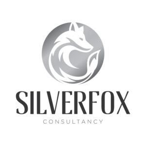
2. Silver Fox Consultancy
This is the best example if you’re looking for a gray or silver logo. The elements are perfectly balanced, with emphasis on the brand name. It’s a great symbol that tells the world your true identity and purpose.
3. Highmindz Advice for Millenials

It is also essential to consider your market demographics in designing a logo. In this logo, the owner opted to include the term “millennials” to tell the world that the consultant primarily caters to millennial clients or the so-called Generation Y.
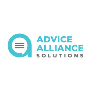
4. Advise Alliance Solutions

This logo features a pretty icon on the left showing the letter “a” with three lines inside, representing a document or a report. The color tone is very pleasing to the eye and is flexible. The designer and the business owner can adjust the logo’s color to match a specific marketing material.
5. Eagle Business Reviewer

In modern Feng Shui, the eagle symbol represents success and freedom. The symbolism might be one of the reasons why businesses and organizations widely use it as a brand mark. In terms of layout, the eagle’s head icon and grayish fonts stand out in the solid blue background.
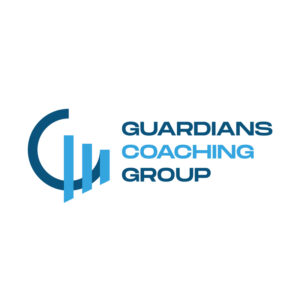
6. Guardians Coaching Group

The vertical text layout is the distinguishing factor in the consultant logo example. Aside from being space efficient, it makes the design more eye-catching. And don’t forget the slanted letter C (which can be viewed as G) icon with three vertical lines that look like a bar graph. Overall, the design is worth noting, especially if you’re into simple and clean layouts.
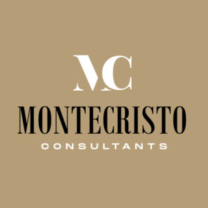
7. Montecristo Consultants

This mocha-colored logo is well-balanced and intuitive. Montecristo Consultants’ clear image and lettering make it a timeless and professional emblem. The design is one of our list’s most flexible and ageless logos.
8. The Big Oak Advisory Center
The oak is known as a symbol of wisdom, endurance, and strength. These are the qualities that a credible consultant should possess. That’s why it is imperative to integrate these positive traits in the logo to bring good luck and success to the business endeavor.
9. Prime Power Management and Co.
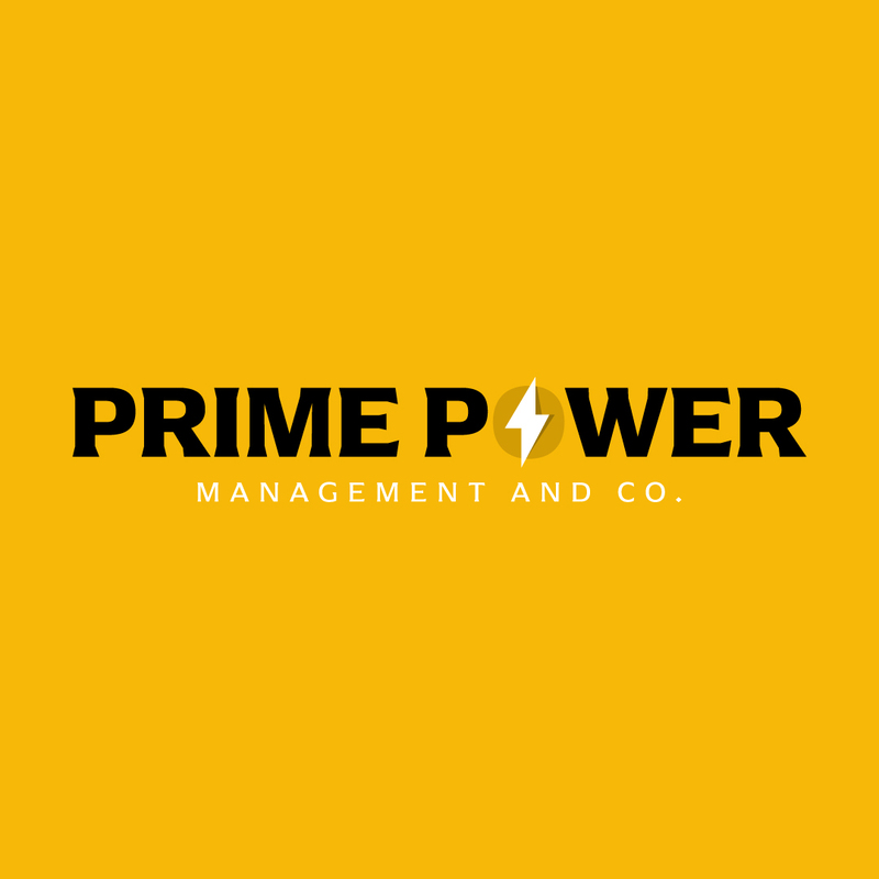
You don’t need to hesitate to experiment with the color palette when making a logo. This bright yellow logo exudes power and authority. The simple logo and letter marks were combined to ensure the logo was readable and left a positive impression on audiences and future clients.
10. Wisdom Center

The last logo in our collection carries an iconic “W” logo. If you want a simple logo in a green color tone, we’re pretty sure you’ll be amazed by Wisdom Center’s eye-catching consultant logo. Likewise, it is also easier to adjust the color depending on the type of marketing material you’ll create with your logo.
How to Get an Excellent Consultant Logo Design

In our previous blog, we discussed various types of modern logos. Some businesses choose a minimalist or geometric look, while others use unique fonts to achieve a modern logo design.
In comparing the best sites to get logo designs, we explained the four options for creating a logo. Let’s review them:
- DIY Logo maker. With entry-level design software or a web-based logo maker, you can design your logo with premade templates and stock images/icons.
- Hire a design agency. You can hire a design agency’s suite of specialists to handle everything from logo conceptualization down to the final revisions. However, this is quite an expensive option.
- Go to a freelancer marketplace. Instead of handing the job to a team of professional designers, you can work with an individual logo designer. If you go with this option, you’ll save time and money.
- Host a design contest. With a design contest, you provide information like your visual preferences and business objectives in a description. Then, designers worldwide will submit logo designs based on the description. A contest gives you plenty of options to choose from. You choose the best strategy you love and revise it into the suitable face of your brand—and that’s the only time you pay.
Your logo is an essential element of any brand. Now that you understand how much goes into designing an effective logo, you see how choosing not to go the professional route can cost you in the long run. If you want to work with a professional, there are two factors you have to consider to help you determine which of the abovementioned options works best for you: preference and price.
Consultant Logo Best Practices

A well-designed consultant logo not only communicates professionalism but also establishes a memorable brand identity. Here are some logo design best practices that you must consider.
Color
Color is crucial in logo design because it conveys emotions, sets the tone, and creates brand recognition. Different colors evoke specific feelings, and when used effectively, they can help communicate your core values. It makes the logo more memorable and relatable to your target audience.
When designing a consultant logo, choose a color that resonates with your clients and the industry you are consulting in. To stand out, pick a color palette that is different from your main competitors.
Layout
A well-considered layout influences how the design is perceived and its overall effectiveness. Think about where you will use your logo most. Choose a simple format that looks great on various applications, from business cards to billboards or websites.
Typography

Consultant logos can vary greatly in design. In traditional sectors like law and finance, consulting logos often use serif fonts to symbolize proficiency and reliability. However, if you are consulting in PR or marketing, you may prefer a more decorative typography, such as a bold sans-serif or a script font. It’s crucial to pick a font style that mirrors your clientele and ensures readability across different sizes and platforms.
Symbol
If you want to incorporate a symbol in your logo, match it to the consulting service you provide and ensure it complements other design elements. It doesn’t have to correlate with your services directly, but it can be used to convey how people will feel working with you.
Final Thoughts
Want more logo design tips and ideas? Please read our blog on the ultimate guide to custom logo design.
One more thing: don’t launch your consulting firm without a logo. Before you help clients make better decisions with their businesses, you need a logo to establish your professionalism and credibility. And you can stop your search for a logo designer. Penji has the best logo designers in the industry! And if you want our designers’ magic touch with logos, subscribe here! Or, you can go to our Marketplace!
About the author

Rowena Zaballa
With a background as a former government employee specializing in urban planning, Rowena transitioned into the world of blogging and SEO content writing. As a passionate storyteller, she uses her expertise to craft engaging and informative content for various audiences.
Table of Contents
- 1. The Help Desk Consultation Services
- 2. Silver Fox Consultancy
- 3. Highmindz Advice for Millenials
- 4. Advise Alliance Solutions
- 5. Eagle Business Reviewer
- 6. Guardians Coaching Group
- 7. Montecristo Consultants
- 8. The Big Oak Advisory Center
- 9. Prime Power Management and Co.
- 10. Wisdom Center
- How to Get an Excellent Consultant Logo Design
- Consultant Logo Best Practices
- Color
- Layout
- Typography
- Symbol
- Final Thoughts


