


A good design does not automatically mean great content. But, you need to understand that visitors will judge your blog by how it looks. Your blog’s design could be one factor that separates you from the competition. Keep in mind that first impressions count. Having all the elements of a great blog design ensures that readers will enjoy your content. Let’s find out the essential characteristics of a solid website design.
Why Do You Need To Create An Eye-Catching Blog Design?
A High-quality and eye-catching layout makes a difference in the success of your blog. Below are the advantages of an appealing blog design.
Maximizes The Limited Time To impress Your Audience
Reports say that people can view an image and decide how they feel in about 50 milliseconds. That’s fast! It means you have less than a second to impress, attract and convert your audience. A well-written article won’t do that, but a graphic might.
They Help Establish Your Site’s Authority
First impressions are essential to attracting and maintaining an audience. Therefore, well-designed graphics add a level of professionalism to your site. Have you ever visited a visually mind-boggling blog that is very hard to navigate? If you have, you understand that the content doesn’t matter anymore because you’ve never stayed long enough to read them.
They Are Shared More Often
When you post high-quality content, there’s a greater chance that your readers will share it. The more shares your blog has, the more traffic driven back to your website. And that gives you a better chance of converting a reader into a customer.
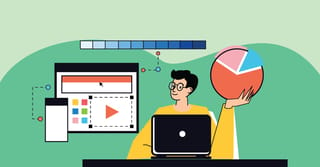
Visual Appreciation
Since most people are visual learners, they understand and appreciate concepts far better when they are in a graphic format. Things like icons and infographics are essential to communicating effectively with your audience.
What Goes Into A Good Blog Design
You might think that a fantastic blog design requires a bunch of flashy animations, fancy typography, and all kinds of cool widgets. Well, that’s not the case.
If your blog design has too much stuff, it can distract visitors. It defeats the most important factor of a good blog design – Readability.
Visitors should be able to read your content easily. Otherwise, they won’t return.
So, here are some elements of a great blog layout and design that considers readability:
White Space
White space isn’t necessarily white. It is an empty space between and around elements on the page. Be sure to utilize white space in your blog layout to draw the readers’ attention to specific areas, like your content.
Navigation
Your blog should have a navigation menu so that visitors can easily find their way around and get to the pages or posts they enjoy.
Blog Header
The header section is often the first thing visitors see when visiting your blog. It sets the mood for your blog and attracts readers. Typically, the header includes a high-quality image, your logo, and a brief blog description.
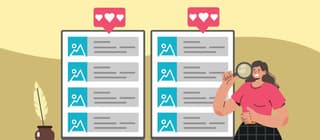
Blog Cards
Showing your blog posts in cards (or thumbnails) will let you show your articles to your visitors in an organized manner. Thumbnails usually include a featured image, title, date, author’s name, blog snippet, category, and a “Read More,” “Continue Reading,” or “View All” button.
Social Sharing
Integrating social sharing into your blog makes it easy for readers to share your content online. A hassle-free way to add social sharing buttons to your blog is by using a plugin such as SharedCount.
8 Amazing Blog Design Examples
1. Sincerely Jules
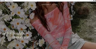
Sincerely Jules is a famous fashion and lifestyle blog by Julie Sariñana with a fantastic design. Her blog’s homepage loads by displaying a full-width header image of the latest post and a link to read the post.
In addition, there is a navigation menu in the top-left corner that links to her social media platforms are displayed vertically on the right side.
Her other latest blog posts are shown with large, eye-catching thumbnails as you scroll down the page.
Insert 1-1. Sincerely jules IG feed.jpg
At the bottom of the page, the author has embedded her Instagram feed. Having a social sharing element allows you to:
- Keep your blog updated with fresh content
- Increase engagement
- Get more social media followers
2. Cookie + Kate
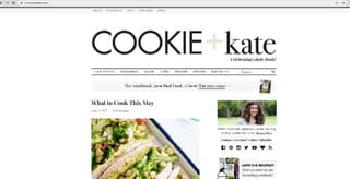
The food blog Cookie + Kate has a minimalist and modern layout. The navigation bar lets visitors quickly find the type of recipe they want to try. At the bottom of the page, the readers can see the newest recipes posted.
Cookie + Kate’s sidebar is perfectly designed as well. It features several widgets that help boost engagement and make visitors stay on the site longer. The sidebar includes:
- An About Page with the author’s photo and link to the about page
- Social media icons
- An email newsletter opt-in form
- Links to buy her cookbook
- Popular blog posts
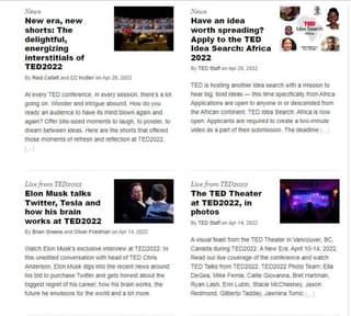
3. TED Blog
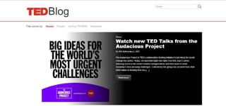
The TED Blog has a professional design recommended for news blogs or websites. The full-width header image promotes the latest article. A call-to-action button under the blog title and description encourages visitors to read the post.
Underneath that section, visitors can see all of the latest articles on the blog. Visitors can also filter the pieces displayed by the newest, famous, or other specific TED categories.
4. The Sartorialist
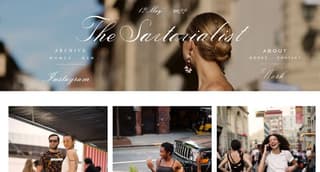
The Sartorialist is a famous fashion and photography blog. Its layout mainly showcases the photographer’s beautiful work.
And instead of having to click a traditional “Next Page” button to see more photos, infinite scrolling is used to improve the user experience.
Visitors can also navigate the blog using the links in the website header. There are links to the following:
- Photograph archives
- About page
- Contact page
- Instagram profile
5. Dan Flying Solo

This travel blog design by Dan Flying Solo is simple but practical. The website header includes an about section. Meanwhile, you can see the latest blog posts.
Dan also embeds his travel videos posted on YouTube on the site. This is a great strategy to engage visitors and grow his YouTube channel.
6. Copyblogger
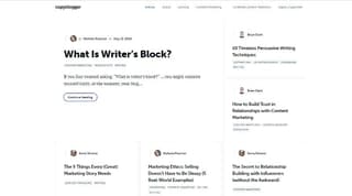
The Copyblogger blog also has a minimal design that adopts plenty of white space. This design shows that you don’t have to cram a lot of elements onto the page to make it practical or exciting. Instead, you can let your unique content speak for itself.
The page has thumbnails of the latest articles. Visitors can click on the thumbnail to read the entire article.
Copyblogger provides a lead magnet to encourage visitors to sign up for their email marketing list at the bottom of the page.
7. Afford Anything

Afford Anything blog tackles finance, psychology, and investing. It follows all blog design best practices like adding social sharing buttons, displaying popular blog posts, and using eye-catching images.
Plus, there’s a strong headline and a call-to-action button at the top of the page. When visitors hit the Let’s Get Started button, a popup appears offering a free ebook in exchange for their email address.
8. The New Yorker
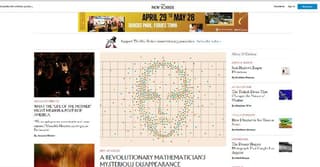
The New Yorker blog design also works well for news websites. The page is full of their latest blog posts, separated into categories like the spotlight, humor, fiction and poetry, videos, etc.
There’s also an element that displays notable contributors and guest writers. If you’re publishing lots of content regularly or running a multi-author blog, a design like this might work best for you.
If you want to create a fantastic blog design like the examples above, don’t worry, it’s easy. Penji can give your blog a professional look instantly. Website design and blog graphics are included in our extensive portfolio of 120+ services supported by the world’s most talented design team. See the complete list of Penji’s design services here.


