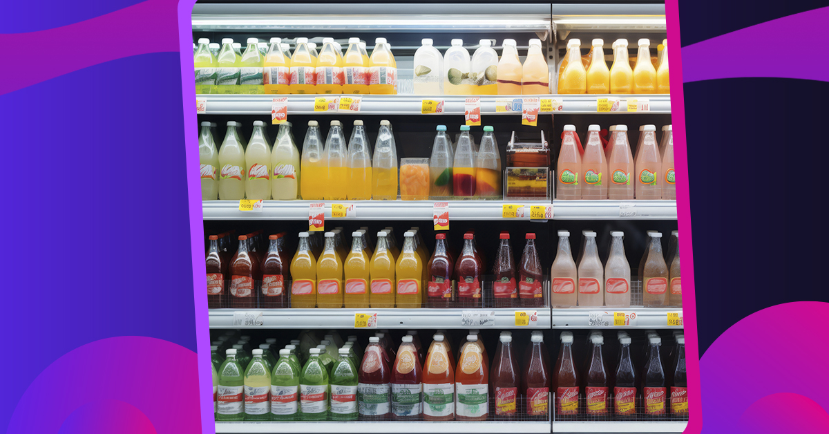
When we go to the grocery store, we usually make a beeline for our refreshments in the beverage aisle. That’s because these brands have maintained an excellent reputation to broadcast consistent branding offline or online. But what consumers are possibly doing, either consciously or subconsciously, is choosing liquid products enclosed in a good beverage packaging design.
A beverage package with excellent graphic design profoundly impacts the consumer’s buying decision. For companies, packaging serves as “bait” to trigger the consumer’s desire. It’s your first chance to communicate with your consumers through high-quality graphic design and unique branding. So, we’ve chosen the top 33 beverage packaging designs from some of the most successful companies in the world.
1. Red Bull
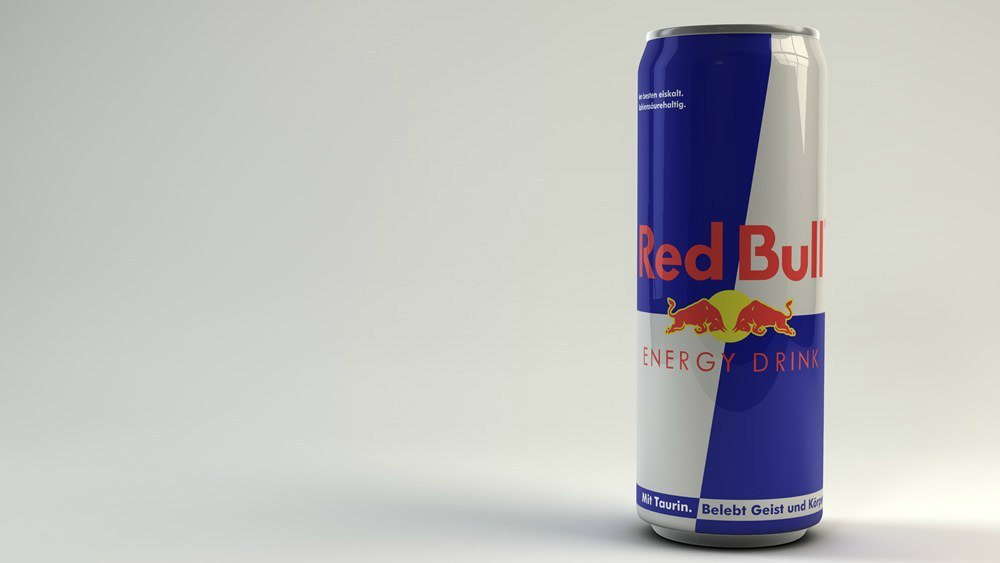
A household name in the sports and lifestyle industry, Red Bull has revamped their can containers to reduce their carbon footprint. Their cans are now made of aluminum which is 100 percent recyclable and can be melted down and reused infinitely. And they’ve also managed to stay on top of branding consistency and versatility.
2. Monster
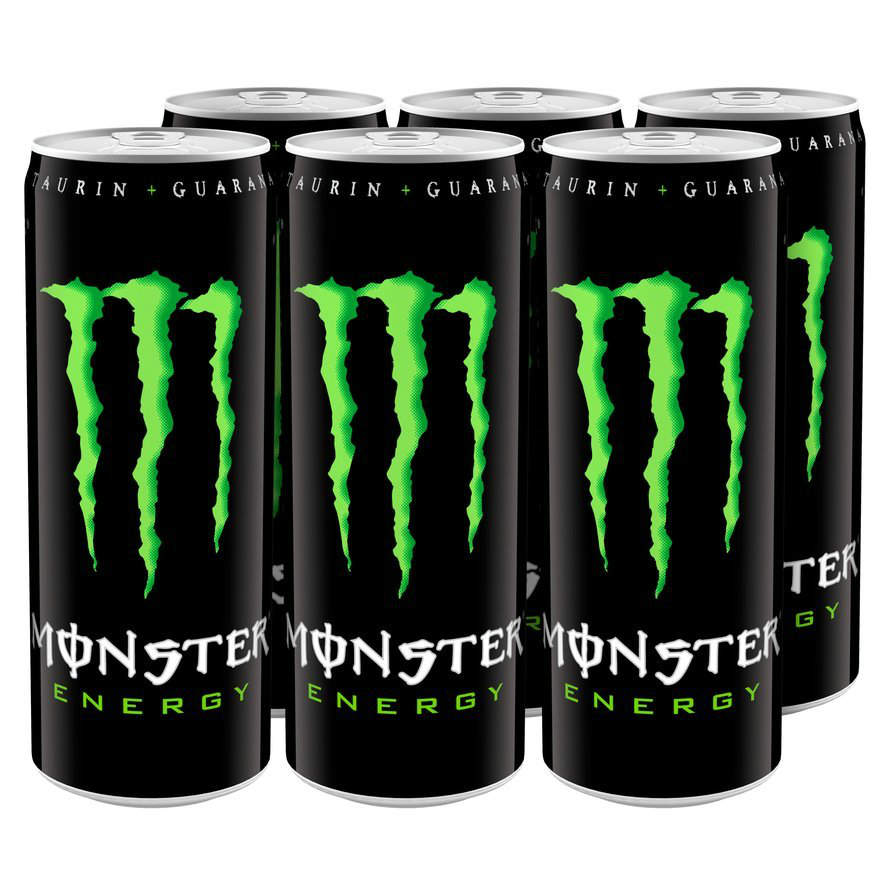
Monster is an energy drink designed for the untapped consumer. Sometimes, a simple beverage packaging design is all it takes to capture your consumer’s attention. We like how Monster has made their design simple yet powerful and iconic.
3. Monster Assault
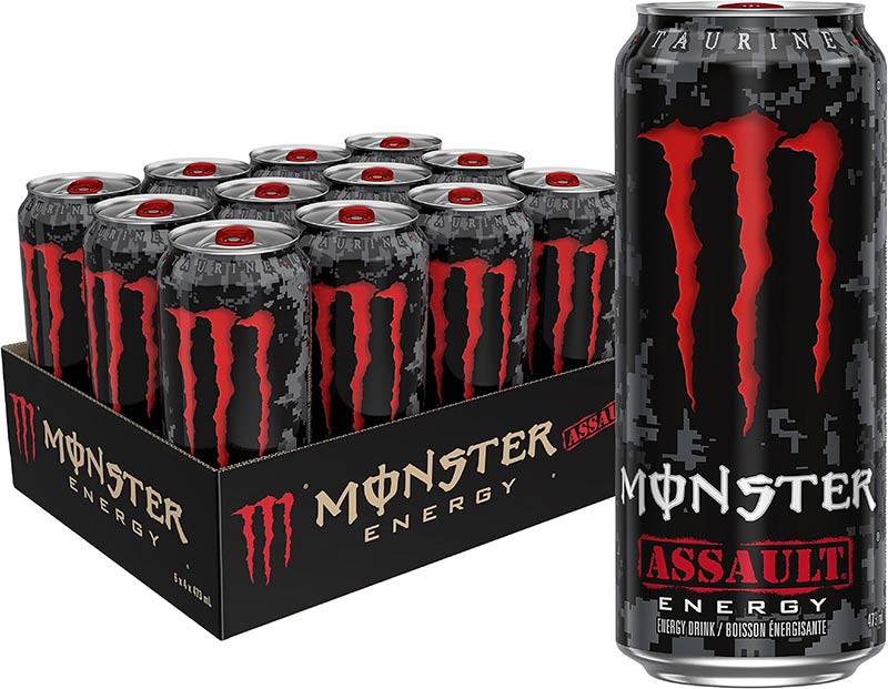
We love the aggressive attitude of Monster’s packaging design that their Monster Assault energy drink also deserves a spot on this list. It’s a fruit-punch flavored beverage from the same company. So, the branding on their cans is consistent yet distinct which makes their packaging impactful.
4. Rockstar
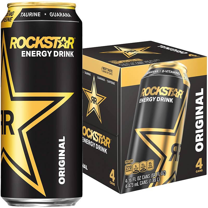
We love how the Rockstar packaging is simple and yet communicates in a mature manner to their consumers. This indicates a fine distinction that this energy drink is not for kids even though the name would somehow attract the younger fellows.
5. No Fear
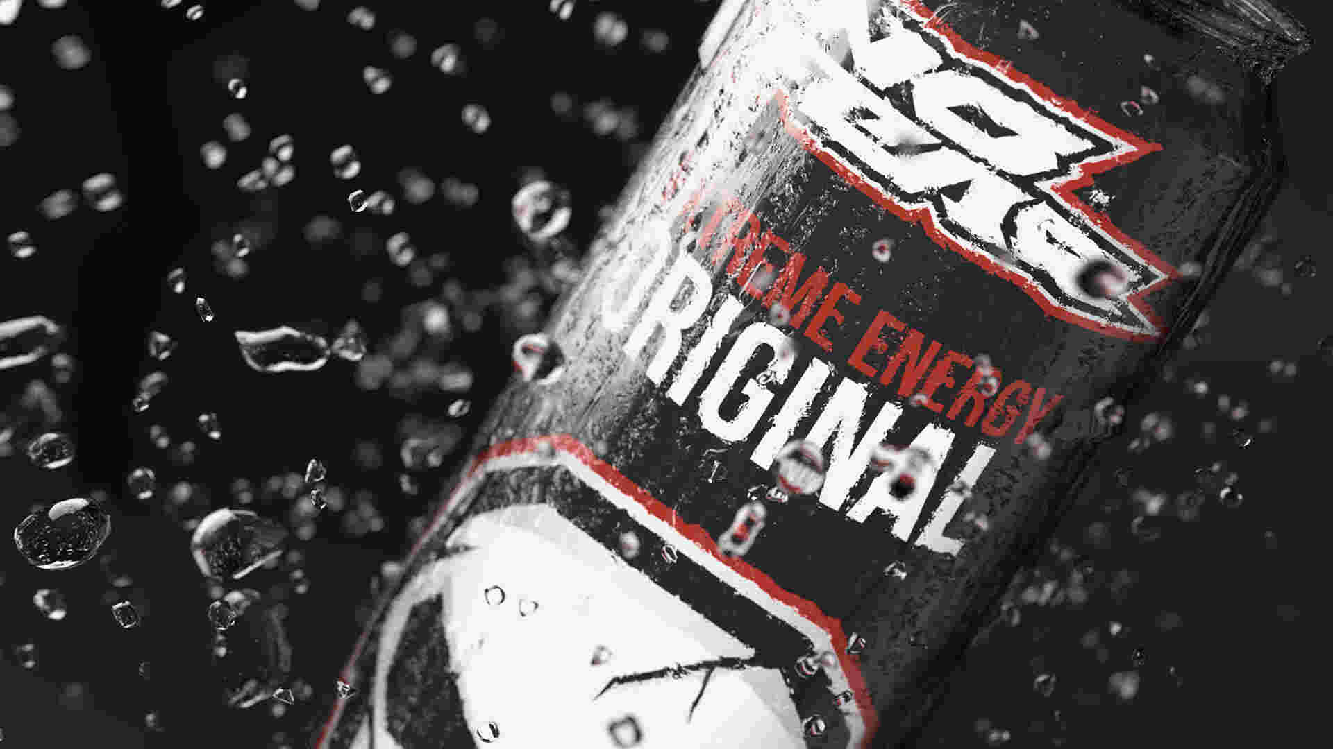
In a beverage section, you will be competing with different small and big brands. It’s vital that your packaging design stays unique and recognizable like No Fear’s skull logo.
[in_content_ads gallery="packaging-labels" logo="off" title="Become one of the world’s most recognizable brands" subtitle="Custom-designed packaging will take your brand to the next level. Don’t miss out." btntext="I want this!" btnlink="https://penji.co/pricing/?affiliate=J2O5AB8RAR3386837"]6. XS Energy Drink
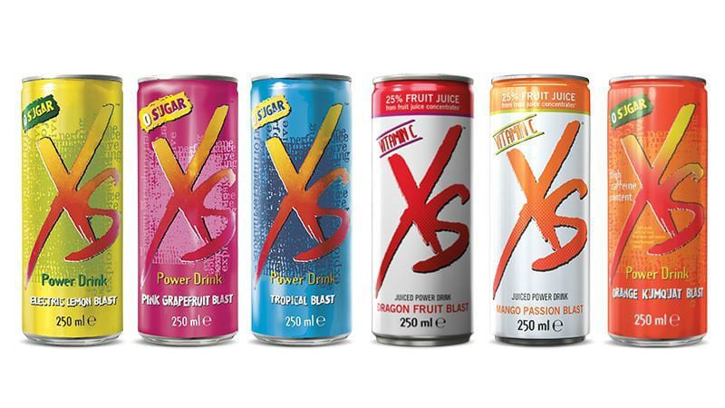
Let your packaging compete with your other packaging designs too. It doesn’t matter which design wins, as long as you give your consumers a broad comparison when choosing your products. XS Energy Drink has 11 different flavors with three caffeine-free options, and their designs clearly show it.
7. Full Throttle
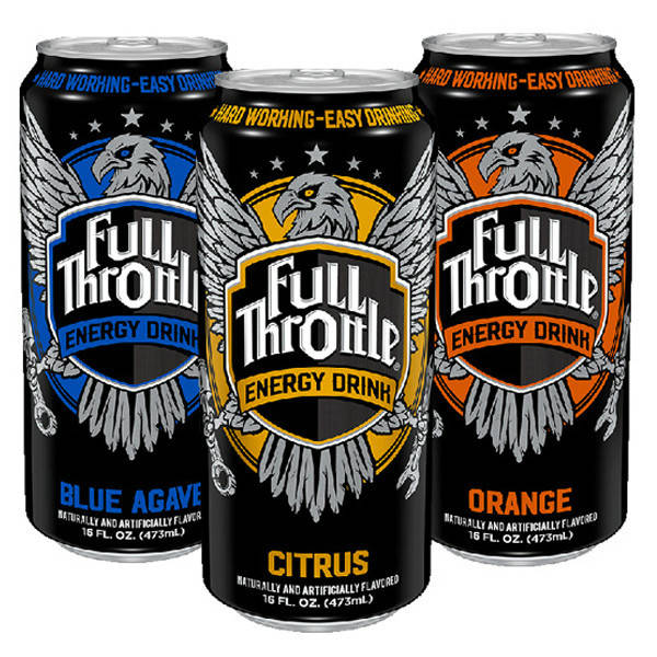
Another creation from Monster Energy, Full Throttle’s beverage packaging design motivates consumers by encouraging hardworking individuals for an easy-drinking energy refreshment, and they’ve conspicuously indicated that on their packaging.
8. Mountain Dew AMP
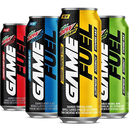
Mountain Dew AMP knows who their target market is. And even at first glance, the “Alertness, Accuracy, and Vitamins A&B” will already captivate sports enthusiasts or people who have an active lifestyle who lack these benefits.
9. NOS
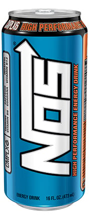
NOS has participated in significant motorsports events in terms of advertising. And true to its design, the nitrous oxide systems tank does resonate to motorsports fanatics.
10. Milo
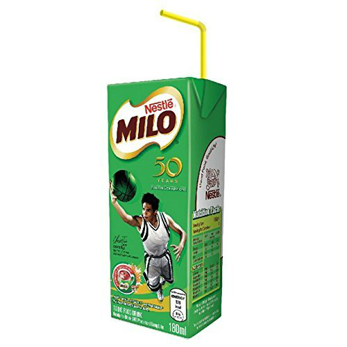
Milo is a leading chocolate malt beverage in Asia. An excellent beverage packaging design should break the monotony. Since Milo caters to different kids and teens involved in sports, they put real athletes on their packaging which makes it versatile and appealing.
11. Bawls
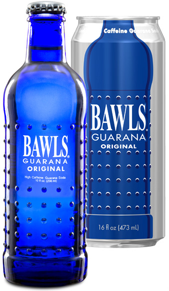
The packaging should also focus on consumer convenience. Some of those factors should include easy handling, gripping, and drinking. Bawls is a caffeinated soda drink which designed iconic bumpy bottles and cans.
12. 5-Hour Energy
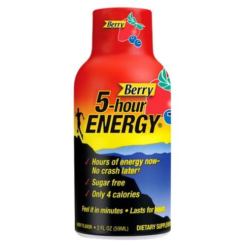
Another good packaging design feature is convenience. The 5-Hour Energy shots are only 57 mL in size. However, that doesn’t mean it’s less effective as the packaging clearly says it has as much caffeine as a cup of the leading premium coffee. Now consumers can keep a bottle in their bag at bay.
13. Frooti
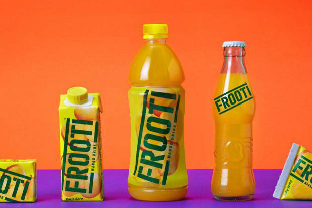
High-quality packaging is also essential for consumer safety. Frooti not only breaks the mold in their various packaging design styles but their PET bottles provide durability.
14. Del Monte Pineapple Drink
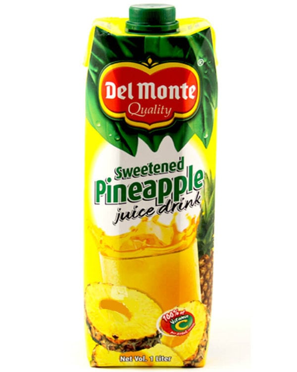
An incredibly refreshing pulpy pineapple drink, Del Monte is empathetic to their consumers’ needs by providing them with easy-to-open packs that consumers can store for later without any problems.
15. Ocean Spray
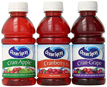
For the more environment-oriented consumers, reusable packaging is also crucial in their buying decision. Take for example Ocean Spray’s cranberry juice cocktail.
16. Apple and Eve
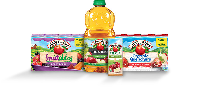
Apple and Eve’s goal is to provide families with pure and healthy juices that adults and kids can enjoy. And they have been consistent in their design. It’s fun, colorful, and creative which is appealing for both adults and kids.
17. Minute Maid

Minute Maid is the leading fruit juice manufacturer in the world. And they offer versatility and convenience in their packaging design by making it easy to handle and reusable too.
18. Tropicana
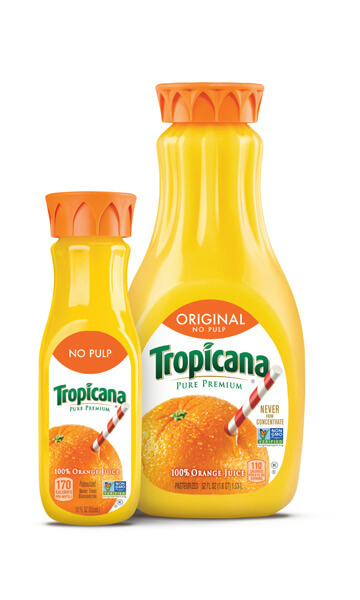
Tropicana is also an American-based company which specializes in natural orange beverages. The design is simple and features an “orange” image. Plus, the packaging is also transparent which entices consumers craving for natural orange juices.
19. Coca-Cola Zero
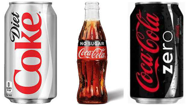
Remember what I said about letting your packaging design compete with your other designs? Coca-Cola always gives their consumers something to look forward to. Their Coca-Cola Zero can design is consistent yet distinctive enough for those who don’t want sugar on their soda.
20. Coca-Cola Mystic
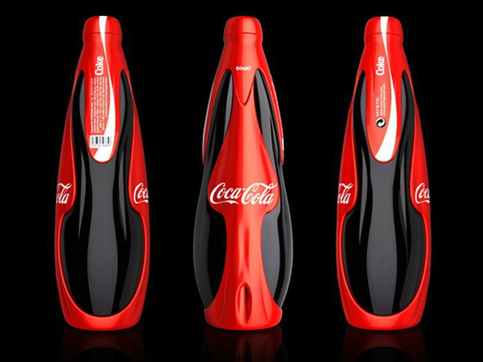
Coca-Cola has done a great job in making the most creative packaging designs which appeal to playful consumers. Their limited edition Coca-Cola Mystic done by a French designer is a thing of beauty. You would’ve never guessed it’s soda!
21. Pepsi “Chinese New Year”
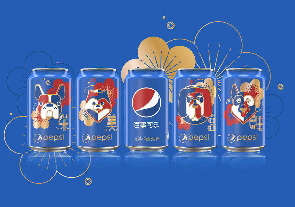
Creating special edition packaging designs will also grab your consumers’ attention. Pepsi has outdone itself with a couple of eye-catching designs like this 2018’s Chinese New Year special.
22. Pepsi “Back to the Future”
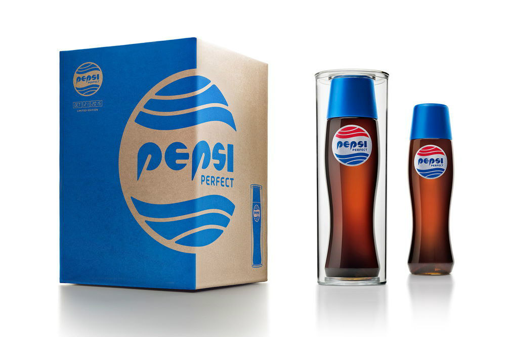
Oh, we’re not done with Pepsi’s creative intelligence yet. This “Back to the Future” bottle was made in anticipation of the 30-year celebration of the famous movie.
23. Yakult
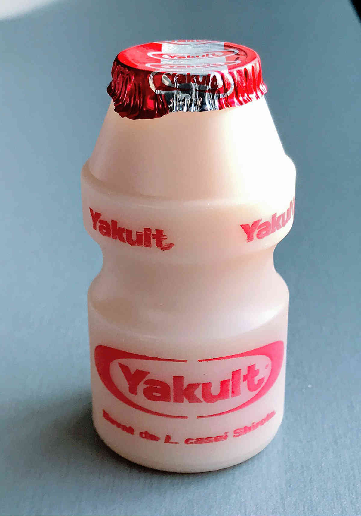
Yakult is a well-known probiotic milk drink which originated in Japan. So, the best part about their design is that it’s iconic yet straightforward and the packaging is extremely convenient to carry around the entire day.
24. Starbucks Frappuccino
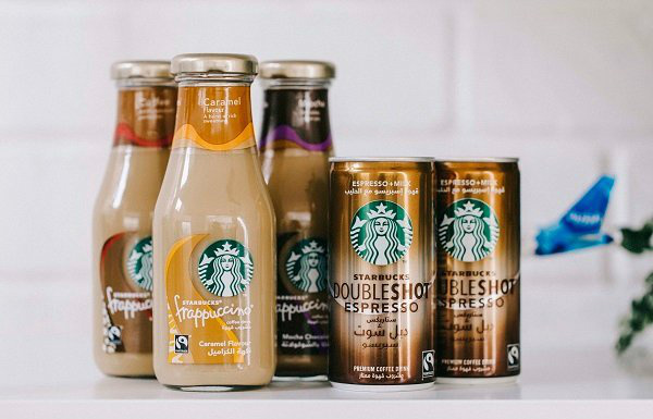
Starbucks is a prominent company which has established its stardom worldwide. They also have a particular target audience which ranges from 22 to 60. So, their elegant design appeals to yuppies and adult professionals.
25. 7 Up
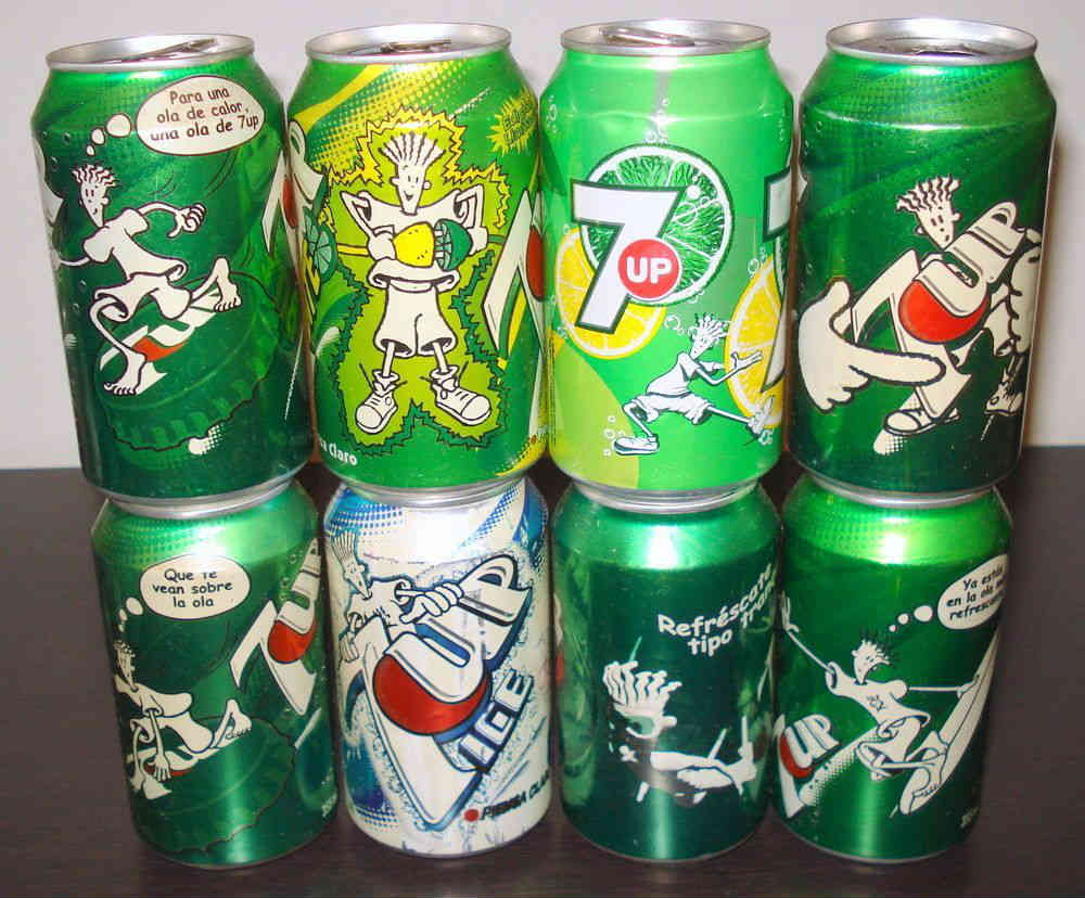
7 Up did a great job in creating a funny mascot for their brand. PepsiCo originally licensed Fido Dido. Unfortunately, it didn’t gain their audience’s attention. Fido Dido reappeared in 7 Up cans and has been a favorite character since.
26. Kitu Super Espresso
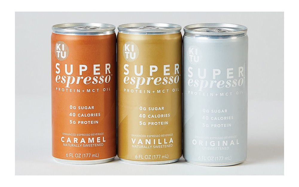
Super Espresso was designed strategically to maintain consistency among Kitu’s products. The company made sure to prioritize a more uniform look to the aesthetic of their packaging. Its subtle “victory stripe” is said to be a tribute to their sports heritage. The stripe is reminiscent of a team jersey and anchors the brand’s culture and camaraderie philosophy. Furthermore, the upward angle represents the following characteristics:
- Forward change
- Positivity
- Human improvement
It serves as a visual “co-pilot” of the brand to remind their customers to grow constantly.
27. Just Water
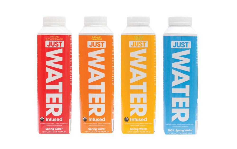
Just Water’s packaging has a sustainable advantage compared to PET plastic bottles. It has at least 82% renewable materials, including its cap and shoulder made from a material based on sugar cane. Overall, it has a simple and minimalistic design.
28. Recess
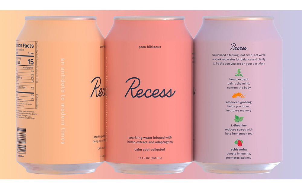
Recess’ CBD-infused line of sparkling water has a color scheme that leans more to pastels. The beverage has a light and minimalist design that stays true to its branding. According to Recess, their drink helps consumers feel calm, relaxed and collected despite the stressful environment. Some products have a cloud illustration on their skin, while others stay minimalist with only a solid color.
Furthermore, they coined Recess to be an “antidote” to modern times. So far, the Recess’ design team did a good job providing a beverage design that’s easy on the eyes. It also has playful icons for the ingredients included in the drinks. Personally, this is my favorite beverage design on the list.
29. Olipop
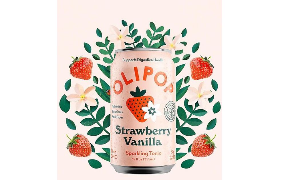
Olipop also uses pastel for its brand’s color scheme. However, their overall design is more on the playful and quirky concept compared to Recess. It’s introduced to the market as the “new kind of soda.” This new beverage is a fizzy tonic drink that combines botanicals, prebiotics, and plant fibers.
30. Nootra
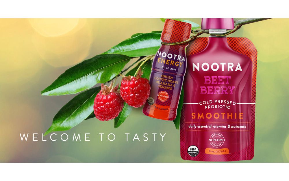
Nootra has two types of packaging for their beverage— pouch, and shots. However, both of them have a vibrant and eye-catching color scheme. The color of the beverage packaging reflects the flavor it carries, making it more convenient for the consumer.
31. Jimmy’s Iced Coffee
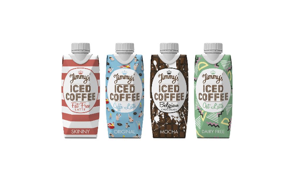
Jimmy’s Iced Coffee has a unique packaging per flavor. Each has its pattern or print that makes every taste stand out among the other beverages. This brand also has different designs that are more simple compared to the sample photo above. However, the playful prints are more eye-catching and will make consumers curious about the brand.
32. Minor Figures
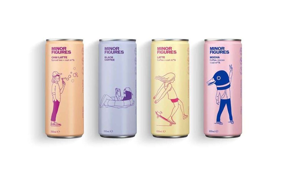
The packaging design of Minor Figures has a quirky line art for each beverage type. These fun illustrations suit the brand name “minor figures.” Meanwhile, the brand chose contrasting colors for their packaging scheme that perfectly fits their quirky art. Minor figures’ beverages are available in cans and cartons.
33. Equinox Organic Kombucha
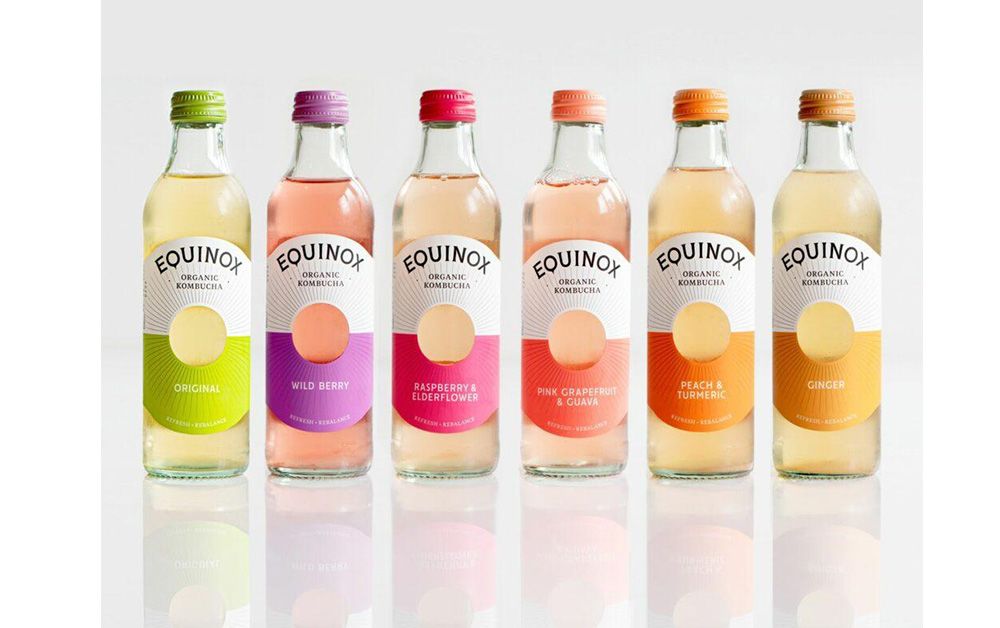
Equinox’s beverage design is also minimalistic. The design’s focal features a circular hole that shows the color of the beverage inside the bottle. Each flavor also has different color schemes for its skin and bottle cap. This is a helpful strategy that guides consumers to discern which flavor is which.
About the author
Table of Contents
- 1. Red Bull
- 2. Monster
- 3. Monster Assault
- 4. Rockstar
- 5. No Fear
- 6. XS Energy Drink
- 7. Full Throttle
- 8. Mountain Dew AMP
- 9. NOS
- 10. Milo
- 11. Bawls
- 12. 5-Hour Energy
- 13. Frooti
- 14. Del Monte Pineapple Drink
- 15. Ocean Spray
- 16. Apple and Eve
- 17. Minute Maid
- 18. Tropicana
- 19. Coca-Cola Zero
- 20. Coca-Cola Mystic
- 21. Pepsi “Chinese New Year”
- 22. Pepsi “Back to the Future”
- 23. Yakult
- 24. Starbucks Frappuccino
- 25. 7 Up
- 26. Kitu Super Espresso
- 27. Just Water
- 28. Recess
- 29. Olipop
- 30. Nootra
- 31. Jimmy’s Iced Coffee
- 32. Minor Figures
- 33. Equinox Organic Kombucha


