Dolphins are known for their intelligence, playful nature, and gracefulness. This is why companies often use them to convey those qualities in their brand image. Dolphins are also highly social creatures. This aspect of their behavior symbolizes cooperation, teamwork, and community, which companies may want to associate with their brand.
Whether you want one or multiple dolphin logos, work with Penji’s experts and get a unique logo that conveys your branding. Here are 10 examples to inspire you.
1. Deep Dolphin Swimming Club

Everyone knows that dolphins are incredible swimmers. This is why a swimming club has to have a dolphin logo for its branding. In the Deep Dolphin Swimming Club, the designer chose to create a circle logo with the animal in it. This is a good move, as you can use the logo on its own even without the brand name, and it would still look great and memorable.
While dolphins are generally gray in color, it is mostly depicted in illustrations as having blue skin. Not only is this a good color choice, but blue is also typically associated with the sea and nature. This makes it a perfect choice for the brand.
2. Dolfitness Gym

Dolphins are sea creatures that are commonly associated with industries that are related to water and the ocean. Thinking out of the box, Dolfitness Gym chose to use the cute creature as their brand icon. In the design, a dolphin is incorporated into a barbell but still uses the blue color scheme. It is a color commonly used in logos, but in this instance, it is a nod to the sea creature’s natural habitat.
The font type the designer used for this logo fits the design superbly. It is done in the same color as the dolphin, tying it down to make a harmonious look.
3. Doll Fine Hair Extensions

A salon specializing in hair extensions uses the name Doll Fine, the reason it chose the dolphin as its brand identifier. In the design, you’ll find dolphin features cleverly incorporated in the letters D and F. The font used has a flowing feel to it as a reference for water and the sea.
As a business that specializes in hair beautification and has mostly women as its primary clientele, the pink background color is a suitable choice. The white main font makes the brand stand out, while the accompanying line comes in a slightly yellowish shade to emphasize it.
4. Orca Beach Resort

While the brand name of this establishment is Orca Beach Resort, it still chose to use a dolphin logo. This is to project a friendly and welcoming nature that anyone would expect from a business that caters to vacationers. The design includes a full silhouette of the animal seen jumping out of the water in an attempt to show its non-conforming personality.
The logo is typical of a design for resorts, hotels, and restaurants associated with the sea, swimming, and surfing. It gives off exciting feels that we usually experience when promised a relaxing time or an adventurous trip.
5. Purple Fins Scuba Diving Equipment
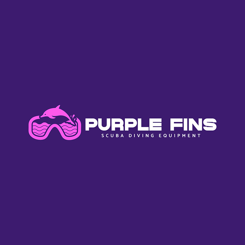
Using a diving mask with waves in it and, of course, a dolphin swimming makes this logo a great fit for Purple Fins Scuba Diving Equipment. The illustration perfectly sums up what the brand is about, which is the main purpose of a logo design. The background color is a no-brainer, as having the word purple in it necessitates the design to use it.
The fonts used complement each other and are an excellent balancing feature of the design. The icon has a somewhat complex design and so it needs fonts that aren’t as complicated or overly ornate.
6. Queen Dolphin Hotel
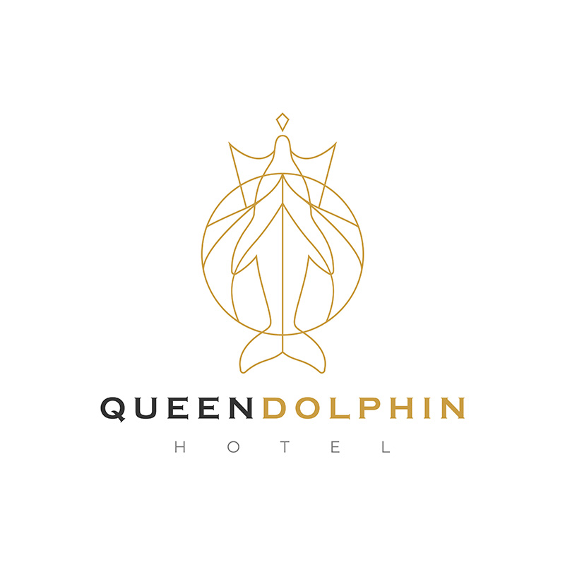
Hotels, restaurants, and bars that want to exude a sophisticated and elegant personality would do well with a dolphin logo. The Queen Dolphin Hotel did just that. The design uses a linear approach to give it a classy and luxurious appeal. If you want to dive in style, this dolphin logo is the perfect inspiration.
The font choice is also exquisite, as it projects a regal personality that befits a true queen. The logo design uses a black and gold color combination that adds to its stunning beauty. For businesses similar to this, this is an excellent logo to emulate.
7. Saltwater Spa
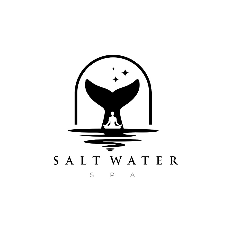
With a meditating person in the middle, you’re sure that Saltwater Spa offers only the most relaxing of experiences. A giant dolphin tail is in the background, with waves of water in the front. This image clearly expresses what the brand is about. No second-guessing there.
The designer chose to use a thin font with serifs, effectively adding elegance to the design. The secondary line is sans-serif type which goes well with the first font. Black is a good choice for the brand as it gives it a mysterious and enigmatic appeal.
8. Sea Dolphin Aqua Park

As mentioned above, businesses related to the ocean, water, or nature can benefit from a dolphin logo. The Sea Dolphin Aqua Park logo has an illustration of sea waves that is carefully crafted to look like a dolphin’s head. This design has great flexibility as it is highly scalable, meaning, it will look as good wherever you place it.
And as expected, it uses a blue background, which suits the brand very well. The fonts used are suitable, too, as they don’t overshadow the wave and dolphin icon.
9. The Quick-Witted Learning Center

Dolphin logos aren’t limited to businesses that are water-related. They can also be an excellent choice for other industries, such as The Quick-Witted Learning Center. Dolphins are intelligent animals, making the perfect brand ambassadors for learning and educational institutions.
The designer carefully incorporated the dolphin in a light bulb that we commonly see as a symbol of intelligence. The background color is dark purple which makes the light bulb/dolphin icon stand out. The bright and vibrant colors are perfect choices as it signifies youth and energy.
10. WaveMate
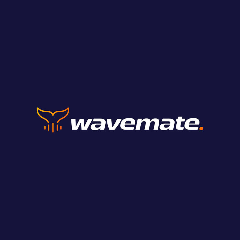
Another business unrelated to water, DJ services company WaveMate uses a dolphin logo. The design uses a dolphin tale with sound waves underneath it instead of water. It uses lowercase letters for the brand name to depict familiarity, friendliness, and a less severe persona.
The blue and orange combination sits well as these colors complement each other. The white used for the name itself highlights it so well, giving emphasis where it is needed. The dot at the end is also done in orange, which serves as a pop of color that enhances the overall design.
Final Thoughts
Dolphin logos offer versatility and style that you can use whatever your nature of business is. If you want to use these beautiful animals for your branding, work with us at Penji. Our talented team of graphic designers can craft you the most fantastic dolphin logos. We offer unlimited designs at fixed monthly rates, or one-off logo designs for an affordable fee. Tap here to get started.
About the author

Celeste Zosimo
Celeste is a former traditional animator and now an SEO content writer specializing in graphic design and marketing topics. When she's not writing or ranking her articles, she's being bossed around by her cat and two dogs.

