The Hispanic diaspora in the United States reached 62.1 million in 2020, and two-thirds are Mexicans. This is why Mexican cuisine is well-embraced by Americans and why more Mexican restaurants are sprouting like mushrooms. And because the competition is fierce, creating a Mexican restaurant logo is key to standing out.
In this article, we’ll give you some tips on creating a Mexican restaurant logo and 15 logo examples for inspiration.
How to Design a Mexican Restaurant Logo
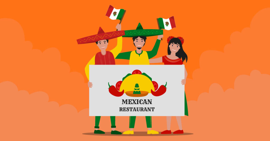
Mexican food is flavorful, with lots of variety and fresh ingredients. A Mexican restaurant logo should showcase this variety and represent the country’s colors. If you browse online, you’ll see that most Mexican restaurant logos are vibrant, representing the country’s colors.
Apart from that, most of these logos don symbols and icons that scream “Mexico.” So here are some tips on how to design a Mexican restaurant logo.
1. Align with the restaurant’s theme
Your Mexican restaurant logo shouldn’t only carry the country’s colors. It should also symbolize the restaurant’s theme or ambiance. For instance, if you’re opening a fine-dining Mexican restaurant, make the logo a bit more formal.
On the other hand, if you’re running a taco business, a livelier and casual logo should suffice. A restaurant logo should have consistency to ensure consumers remember it.
2. Choose the right colors
Mexican cuisine is flavorful which can be represented by various colors. Moreover, the country itself is dominated by bright colors such as yellows, reds, greens, and oranges. Also, Mexico is filled with deep canyons and high mountains.
You’ll see dense rainforests in the east and south and sweeping deserts far north of the country. Overall, it’s a land of extremes in terms of landscapes. If you choose to include these representations in your logo, make them pop out by using bright colors. You can create bright yellow sunsets on a desert horizon and colorful sombreros.
The trick is to choose one of those primary colors and pair it with an accent color. Or you may put all colors together to make a statement.
3. Let consumers know what you’re offering
When you think of Mexican cuisine, you’ll instantly think of guacamole, enchiladas, and the most popular one — TACOS! If tacos are your best seller, showcase this symbol on your logo.
If you’re serving something else, include several textures representing your food. This way, your logo will be more understandable to consumers, which will add up to memorability.
For instance, make it known if you’re running a Mexican bar and restaurant serving the best tequila. You could integrate a tequila bottle or shot glasses, with some cacti in the background and a sombrero on top.
Make sure that consumers can have a glimpse of your Mexican restaurant through your logo symbols and textures.
4. Select the right symbols of Mexico
If you’re not too keen on putting cliche symbols on your logo, select other symbols of Mexico instead. You can choose icons such as maracas, sugar skulls, tacos, cacti, maize, Cempasuchil flowers, perforated papers, chilis, and more.
Though these might not showcase your food, these symbols are associated with Mexico. These representations allow you to flaunt the country’s identity and rich culture.
15 Mexican Restuarant Logo Designs to Inspire You
If you want Mexican restaurant logo design inspiration, we’ve picked these 15 examples for you.
1. Tacos La Fiesta
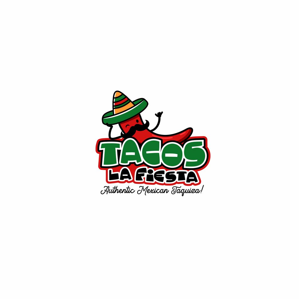
This is a simple and classic example of a Mexican taco restaurant. It depicts the primary food offering, which is tacos. The chili that looks somewhat like a Mexican with a mustache and sombrero on is a nice touch. The font “TACOS” is also more prominent than the rest of the design elements, which attracts consumers’ focus.
2. The Most Amazing Tacos
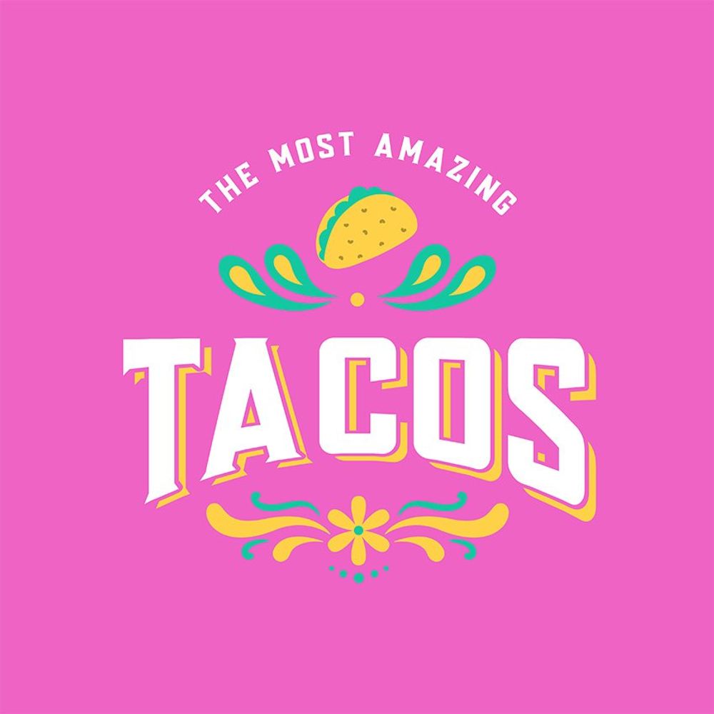
The Aztecs who inhabited some parts of Mexico and Central America wore Aztec tattoos. The Mexican culture adopts these Aztec symbolisms through the Day of the Dead or Día de Muertos.
During this celebration, you’ll see a lot of sugar skulls, also known as Calaveras de azúcar. Some of the design elements are tribal lines, dots, and flowers. And this logo example shows just that.
3. Hugo’s
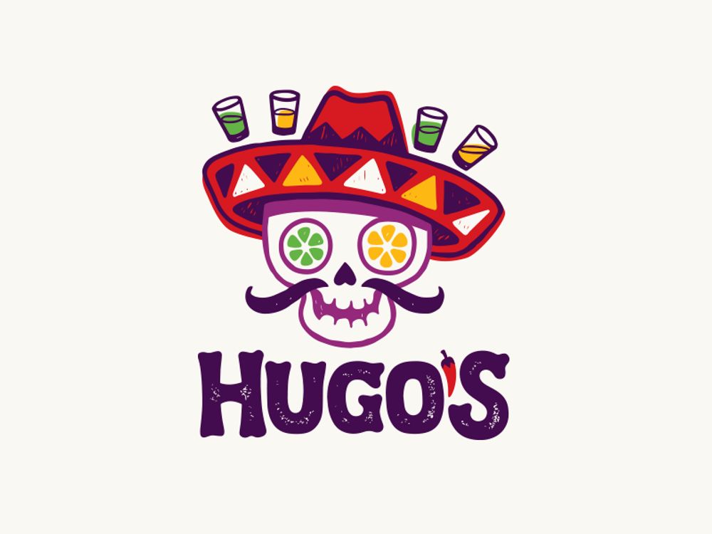
In Mexico, a sugar skull represents “death” depicted in Día de Muertos. Mexicans would leave sugar skulls decorated with their dead loved ones’ names as an offering to the departed souls.
Here is an example of a caricature sugar skull with a fun twist. Hugo shows some tequila shot glasses and replaces the skull’s eyes with lemon. The overall look is casual and playful, perfect if you’re running a tequila bar and restaurant.
4. Hot Taco
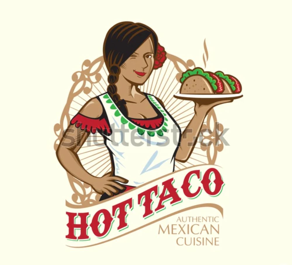
Putting an image of a person on your logo makes it look more inviting. In this example, Hot Taco showcases a Mexican woman wearing traditional Mexican clothes with a red rose on one ear.
She is holding a plate of hot tacos, which is symbolic of the restaurant’s name. The contrast between the red text and the brown frame and background is also an attractive way to make the name stand out.
5. Mexican Restaurant Template
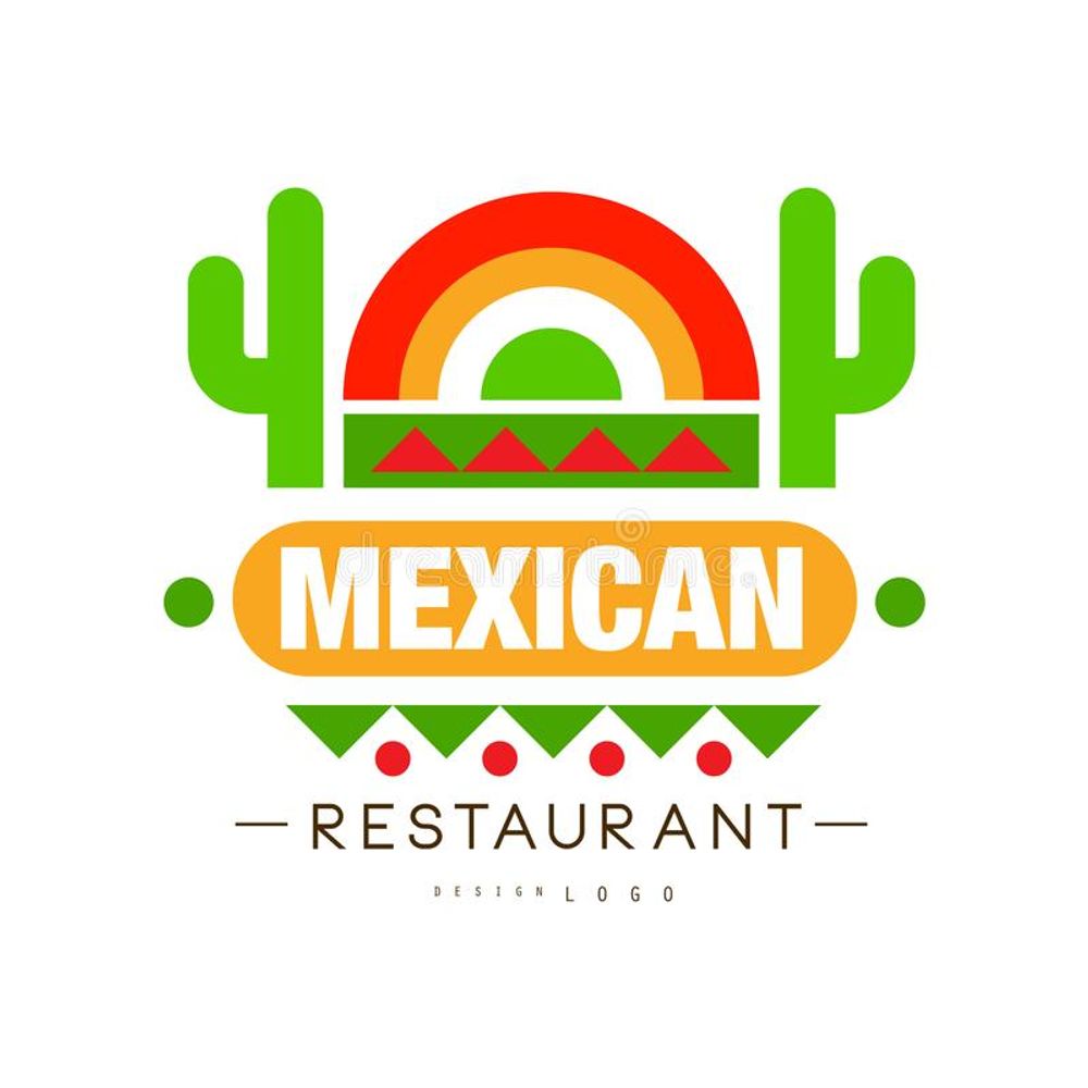
Here is a template you can use for your Mexican restaurant logo. It’s a simple template donning all of Mexico’s colors and some icons that show its tradition and culture. You can identify the perforated paper, cactus, desert, and sunrise. Overall, this playful template is fitting for food truck restaurants or small Mexican food stalls with a few food offerings.
6. Paprika
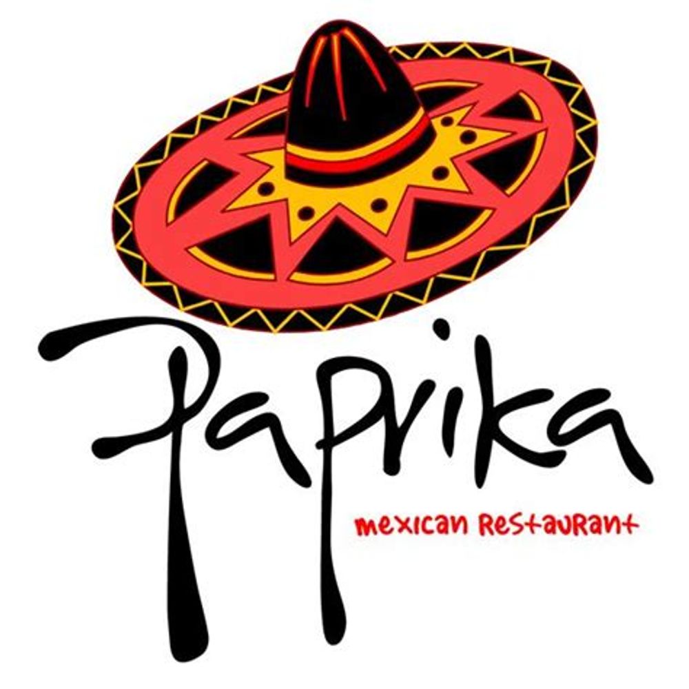
Mexican food is cooked with different spices, and one of them is paprika. In this example, the restaurant uses a unique decorative font style for the restaurant’s name Paprika. The black-and-white combination is also a good contrast. Plus, the sombrero icon ties everything together and makes the design cohesive.
Don’t be afraid to play with font pairings. In this case, you can see two decorative fonts paired together, contributing to excellent typography.
7. Tequila and Taco Bar
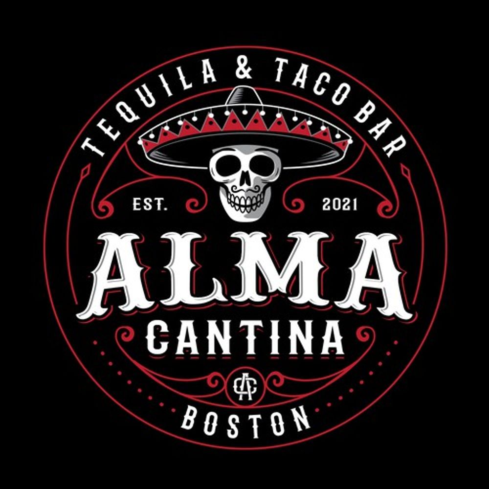
Here is a beautiful example of a restaurant and tequila bar. The emblem-style logo works because every design component is spaced out nicely. The layout is also clean and straightforward. Your eyes will initially focus on the most significant text ALMA Cantina, then it brings your focus to the text on top and at the bottom next.
You’ll then switch your gaze to the skull wearing a sombrero. Overall, this logo design is a perfect example of how structuring makes all the difference.
8. Chillies
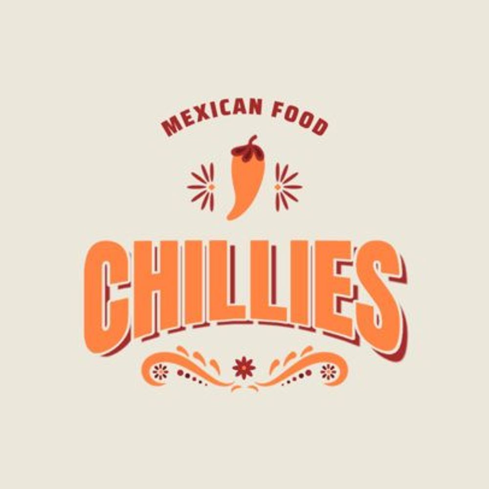
This logo uses orange as the dominant color on all design elements. You’ll see that the most prominent component is the restaurant name, with red accents to make it pop even more. The orange chili and intricate design details at the bottom also give it a Mexican theme. The logo only uses two colors, orange and red. However, the bright colors are still in line with the Mexican taste and culture.
9. Chipotle Mexican Grill
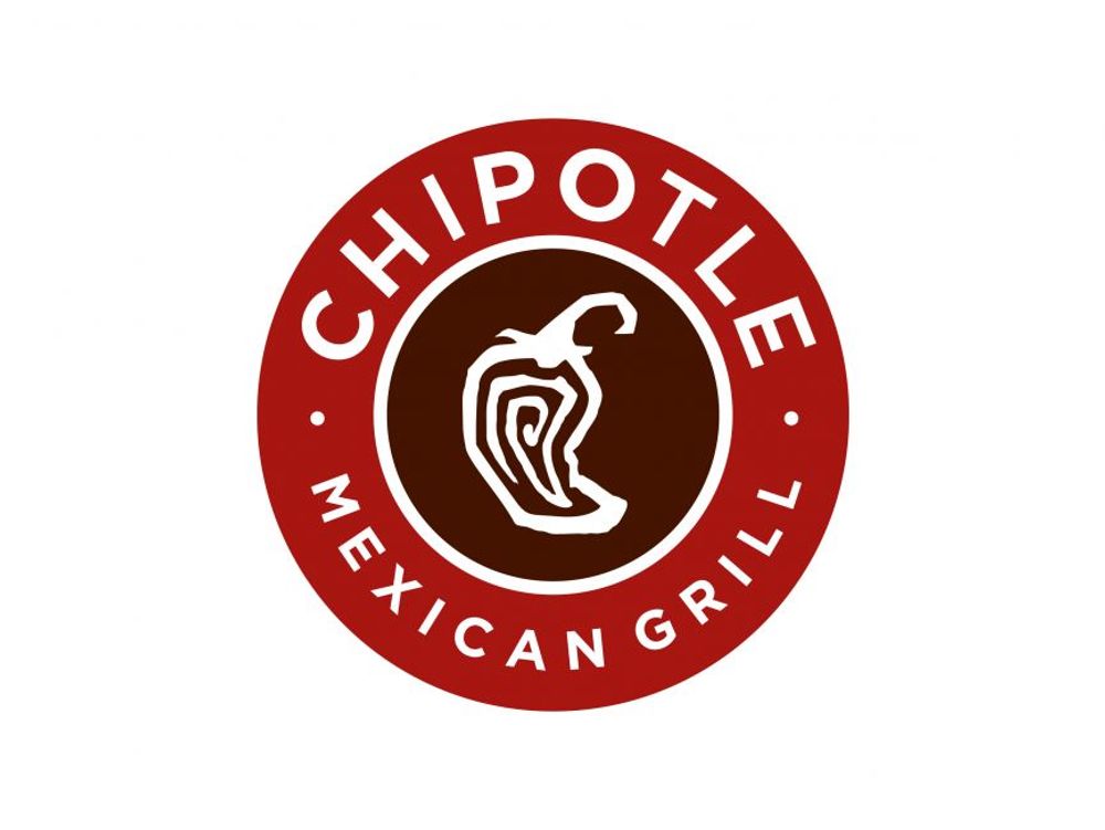
Chipotle Mexican Grill has a simple yet memorable logo. It has a more traditional appearance with an emblem encompassing all design components. First, you’ll see a fiery red circle encapsulating the text and icon.
Next, you’ll see that a ripened jalapeño sits in the middle to represent the main offering, chipotle. Chipotle Mexican Grill’s white text surrounds the design and stands out amidst the red background color. The brown color in the middle also emphasizes the jalapeño and gives the design a nice contrast.
10. Original’s
The Original’s is a Mexican restaurant located in British Columbia. The restaurant has been serving authentic Mexican food since 2013. The logo has unique typography that combines both decorative and simple serif font. This can be an excellent way to evolve as a restaurant and cater to the more modern and younger consumers.
The image is also of a Mexican wearing an Aztec-inspired headdress, which is a perfect way to show the history of Mexican cuisine and culture.
11. The Smokin’ Jalapeno
This Smokin’ Jalapeno depicts the restaurant’s offer through the image. It portrays a hungry diner, represented by the sugar skull wearing a sombrero. It looks like a cowboy, ready to munch on the food using his weapons, a knife and fork. The skull is also smoking a chili, which depicts the restaurant’s name, “Smokin’ Jalapeno.”
12. Sombrero
If you’re looking for a Mexican restaurant logo that’s more lighthearted, try a caricature design like this example. The Mexican with a mustache is wearing a sombrero. However, the top part is replaced with maize or corn instead of a normal sombrero cover.
As you know, maize is one of the main staple food in Mexico. It’s also the principal crop cultivated by Mexican farmers before. Plus, Mexico is home to a variety of maize crops. So this icon is symbolic of the taste of Mexico, which amplifies this logo’s overall look.
13. TexMex Fun Stuff
Tex-Mex cuisine is derived from the words Texan and Mexican. This cuisine is from the culinary creations of Texas’s Tejano people. Most of the ingredients in TexMex are found in Mexican food. However, some ingredients that aren’t used in Mexican cuisine are also added to TexMex dishes.
The logo shows a Texas cowgirl wearing a Mexican sombrero and carrying a platter of tequila and shot glasses. The Mexican colors balance out the Texas cowgirl images, which are an excellent element that represents this TexMex restaurant.
14. Hello Burrito
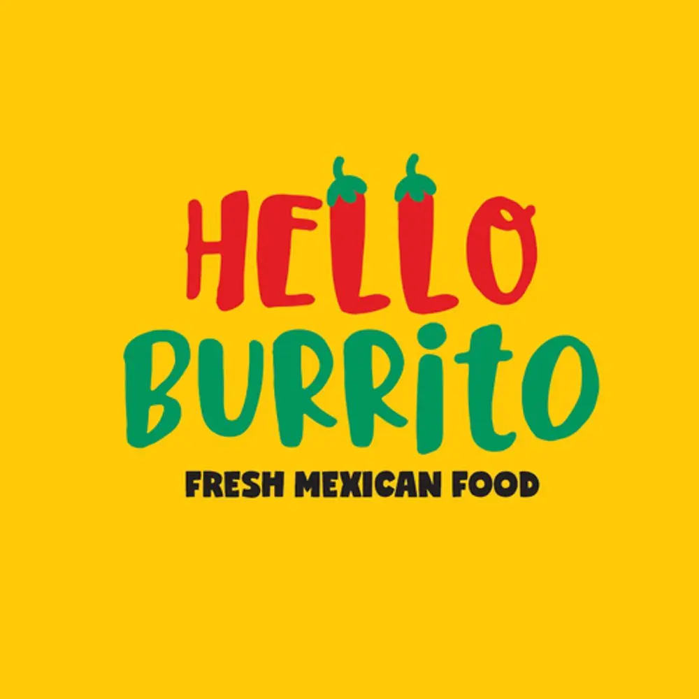
Here is a Mexican restaurant logo example that dwells on typography alone. It’s simple yet exudes a playful vibe that fits your casual burrito restaurant. The red and green colors are excellent choices that depict the country’s vibrant cuisine and culture. Plus, the chilis as the letters “L” give the logo a unique touch.
15. El Pueblo Taqueria
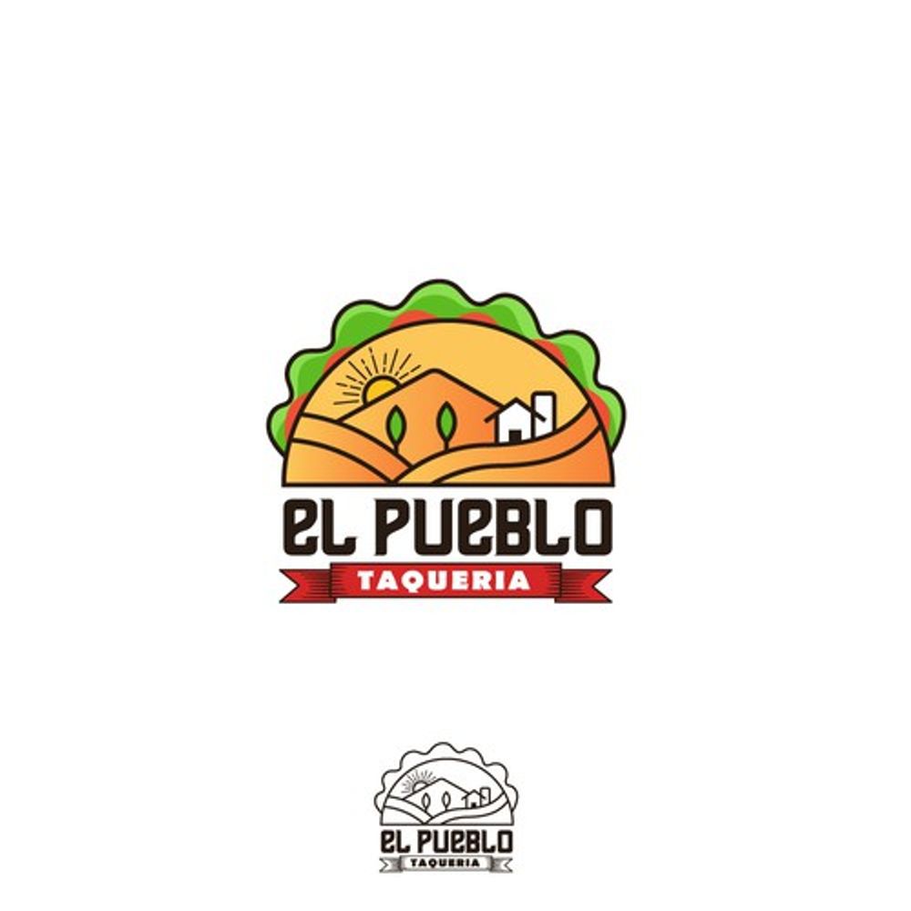
This is another Mexican restaurant logo made with style and creativity. It shows a taco with the green leafy vegetables sticking out. However, it’s designed with little Mexican elements such as a desert, sunset, mountains, and cacti. The restaurant’s name also captivates the eyes due to its bold nature.
Wrapping It Up
Mexican restaurant logos are recognizable with vibrant colors and distinct symbols and icons. It’s all up to you to design yours with a unique and memorable twist. Don’t be afraid to play around with unpredictable elements that still represent your Mexican offerings.
If you need help with your Mexican restaurant logo design, work with professional logo designers from Penji. Our bespoke design platform makes it easy to submit design briefs, request revisions, and download files. Try Penji for 15 days risk-free, and sign up now!
About the author
Table of Contents
- How to Design a Mexican Restaurant Logo
- 1. Align with the restaurant’s theme
- 2. Choose the right colors
- 3. Let consumers know what you’re offering
- 4. Select the right symbols of Mexico
- 15 Mexican Restuarant Logo Designs to Inspire You
- 1. Tacos La Fiesta
- 2. The Most Amazing Tacos
- 3. Hugo’s
- 4. Hot Taco
- 5. Mexican Restaurant Template
- 6. Paprika
- 7. Tequila and Taco Bar
- 8. Chillies
- 9. Chipotle Mexican Grill
- 10. Original’s
- 11. The Smokin’ Jalapeno
- 12. Sombrero
- 13. TexMex Fun Stuff
- 14. Hello Burrito
- 15. El Pueblo Taqueria
- Wrapping It Up


