The information superhighway has made it possible to make almost every task a lot more convenient and hassle-free, including shopping. According to statistics, the number of global digital buyers is growing rapidly and is expected to hit a 2.14-billion mark in 2021. That’s why using the top online shopping apps can help you.
Furthermore, ecommerce has become a very important entrepreneurial trend over the past few years. And with almost every business being present online through websites, apps, and social media platforms, competition over shoppers’ attention has never been this stiff. So, how does a business go against its counterparts amid an aggressively competitive digital environment? Design is not the only factor. It keeps shoppers interested and engaged.
The visual element of online shopping apps plays a significant part in encouraging shoppers to browse the online catalog, add items to their cart, and proceed to checkout. One important factor to consider in app design is color psychology. In an interview with Forbes, an environmental psychologist and person-centered design expert Sally Augustin, Ph.D. said colors could evoke similar emotional responses in most people. However, there could also be discrepancies in color response depending on culture and individual experiences.
Related article: Complete Guide To Hiring Freelance App Designer
How Design Plays a Role in Online Shopping Apps
Despite the complexity of color responses, there are a few general guidelines. Colors like green inspires creativity, red decreases analytical thinking, and blue is the most loved and accepted. There’s also yellow, which is the least favorite among the general public, and pink has a calming effect. Take these basic color meanings in mind when brainstorming for your business’ online shopping apps, website, and other marketing collaterals to be able to evoke the feeling you’re aiming for among prospective clients.
Below is a list of some of the top online shopping apps in the US. Let’s take a look at how each app utilizes various design elements like color and layout to be able to get through their target market and leave a lasting impression.
Amazon
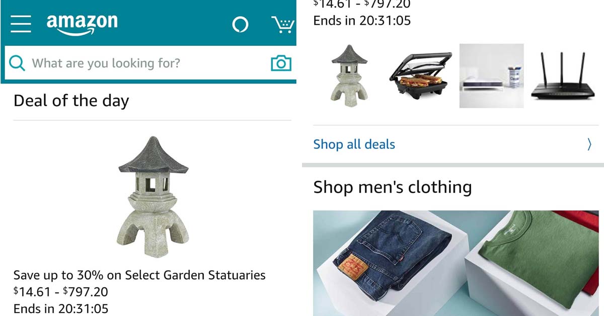
Amazon is considered one of the big four tech companies in the USA alongside Google, Apple, and Facebook. It is arguably the biggest ecommerce venture all across the states. Amazon’s shopping app includes three colors: rich black, green-blue and a contrasting pale gold called vivid gamboge. This color combination is not so different from its website palette.
This includes gunmetal, charcoal and eerie black, combined with a contrast of mellow apricot. The dark gray to black hue radiates a feeling of strength and provides a good background for the blue and orange-yellowish accent. Furthermore, Amazon offers a neat layout and clean-cut shapes that do not confuse, encouraging users to check out various items without being overwhelmed visually.
Check out this article on How To Make Freelance App Design Work For Your Business
Ebay
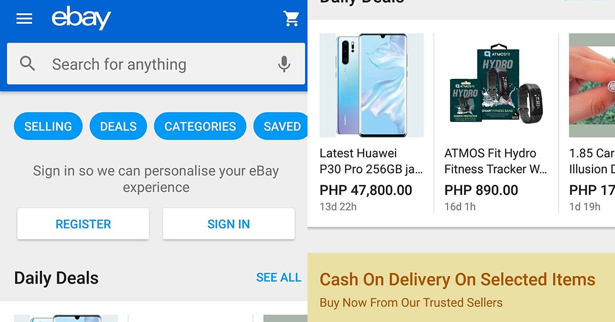
Ebay’s shopping app is mostly white with an accent of blue. The dominantly white color of the app goes well with the vibrant colors of the company’s logo that includes deep carmine pink, true blue, American yellow, and dark lemon lime. According to color theory, white evokes an atmosphere of purity, wholesomeness, and clarity. Having white space around elements in the design allows consumers to have breathing space. It helps avoid the feeling of being bombarded with too much information.
AliExpress
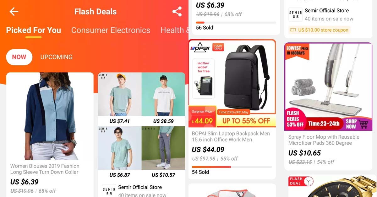
AliExpres’ shopping app interface mostly includes the color of its logo palette. Beer, which lies somewhere between yellow and orange, and permanent geranium lake, which is a bright red hue with a pinkish tinge. Instead of a white background, the app offers a light gray background under white product cards with rounded edges. The product cards that are not perfectly aligned with one another giving a feel of dynamism and energy.
Sephora
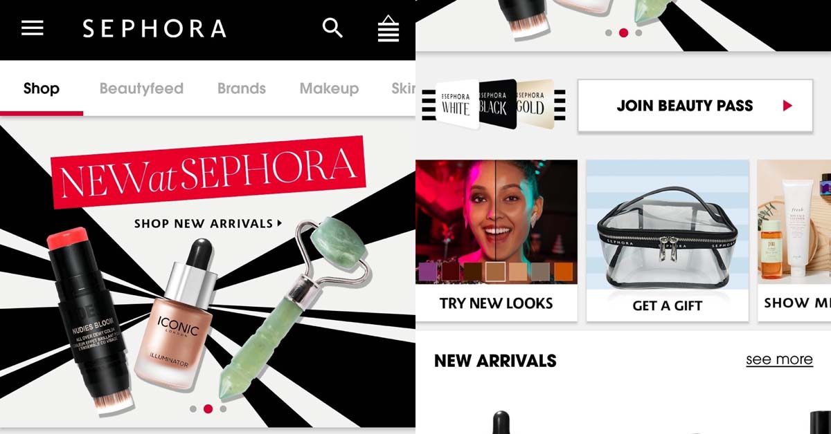
Sephora’s color template basically consists of black and white, much like its logo. It does have a simple color template. However, the shopping app of this multi-national personal care and beauty stores chain is anything but boring. In addition, Sephora takes advantage of the simplicity of its mobile app design and palette. It highlights colorful and animated promotional sliding banners on top of its interface. The ample amount of white space on each page makes sure that colors pop. After all, makeup is a product line where a slight distinction between crimson and garnet makes all the difference in lip color.
Etsy
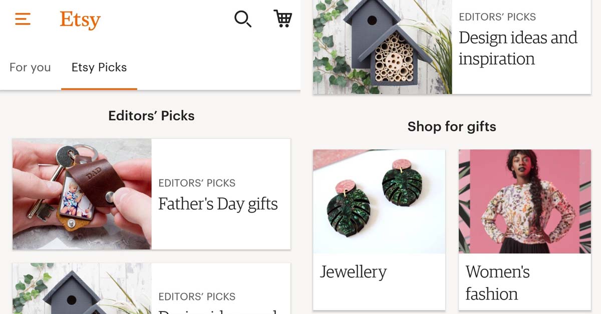
Most ventures focused on handmade crafts and vintage items run the danger of appearing shabby, scruffy, or overwhelmingly extravagant. Etsy, however, manages to keep its shopping app clean and easy to browse without appearing dull. The app features a white and ivory template peppered with an orange accent – the same color as its logo.
In color psychology, orange exudes ambition, originality and energetic warmth. It’s very fitting for an ecommerce shop that sells products made by hand and vintage finds loved through decades or even centuries. Unlike other ecommerce shops that feature photos of products against white background, Etsy photos show products in varying environments. This further implies that its merchandise exudes personality.
Louis Vuitton
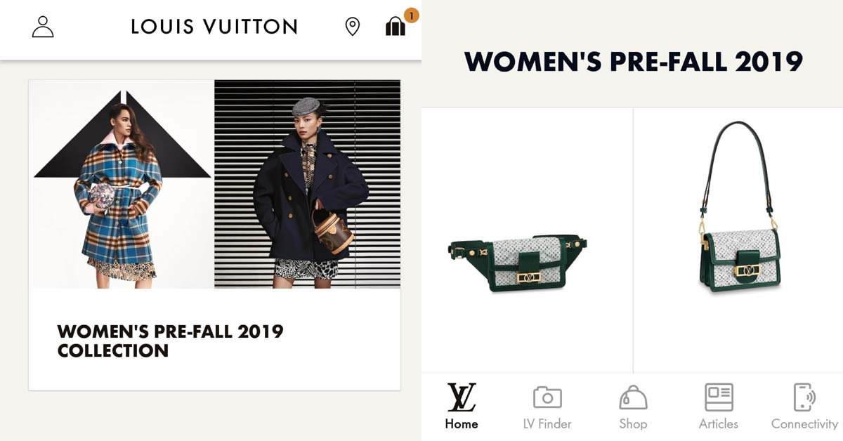
Despite its consistent elite following and popularity as a luxury brand, Louis Vuitton still keeps up with digital trends and proves to be good at it. This fashion house’s shopping app is simple, subtle, minimalist, and modern. All its design elements spell out elegance without trying hard to do so.
Aside from black and white, the app template includes a tiny muted orange accent. The background of the interface is ivory. According to color psychology, neutral colors create a classic European look but poses a danger of appearing unenthusiastic or lacking passion. This risk, however, works in the favor of Louis Vuitton. The app design aesthetics express that LV is confident in its own branding. It doesn’t need to do more to attract shoppers or push visitors to buy anything. Their real patrons will add to cart and checkout without much prodding.
About the author

Carla Deña
Carla is a journalist and content writer who produces stories for both digital and legacy media. She is passionate about creativity, innovation, and helping small businesses explore solutions that drive growth and social impact.


