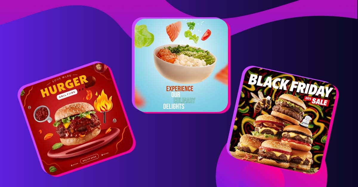
Food ads need to make consumers salivate and wish they could have a bite of what you’re selling.
But it’s not that simple. While appealing to your customer’s taste buds is important, your advertisements also need to be recognizable and memorable. And no one does food advertisements better than the major brands already on our minds. If you’re looking for inspiration for your next food ad, then you’ve come to the right place. Here are 35 of the best examples of food ad designs that would make you ask for more:
Quick plug: If you’re too busy to design ads, Penji got you covered. We’re an on-demand design service that specializes in designing ad creatives for big and small brands. Watch our demo and try us out 15-day risk free.
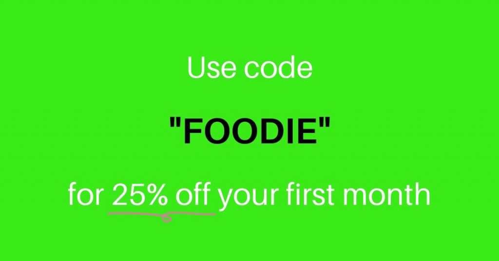
Want to try Penji? Use the promo code FOODIE for 25% off your first month!
1. Chupa Chups Sugar-Free Lollipops
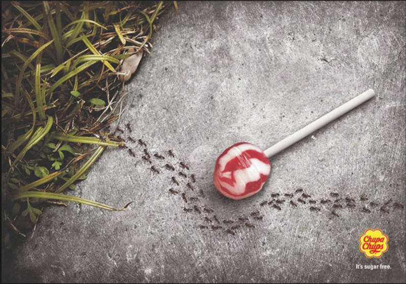
This ad doesn’t need a lot of words, the visual storytelling is more than enough to show how appealing the lollipop looks. It may take a bit of time, but you’ll see the reason why the ants are ignoring the lollipop. It’s sugar free! Get it? This ad works quite well especially for the health-conscious.
2. Smirnoff Sorbet Light
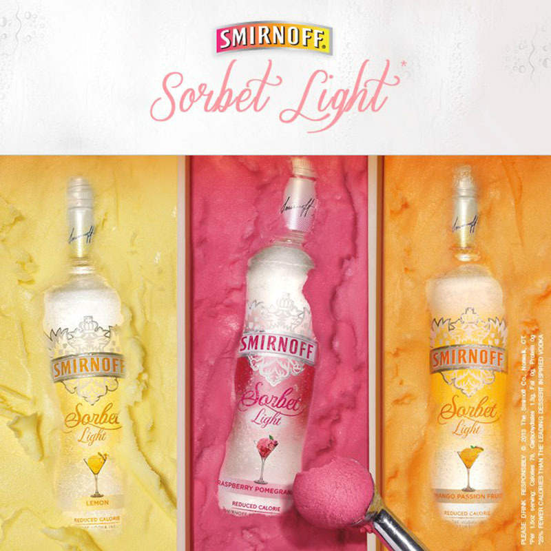
This is a clever way to introduce their new Sorbet flavors. Just looking at this ad will make you feel refreshed and light. You can actually feel the tingling sensation of raspberry and pomegranate in your mouth. The bottle is perfectly laid out to make it look like you’re scooping it out from a tub of sorbet.
3. Nutella
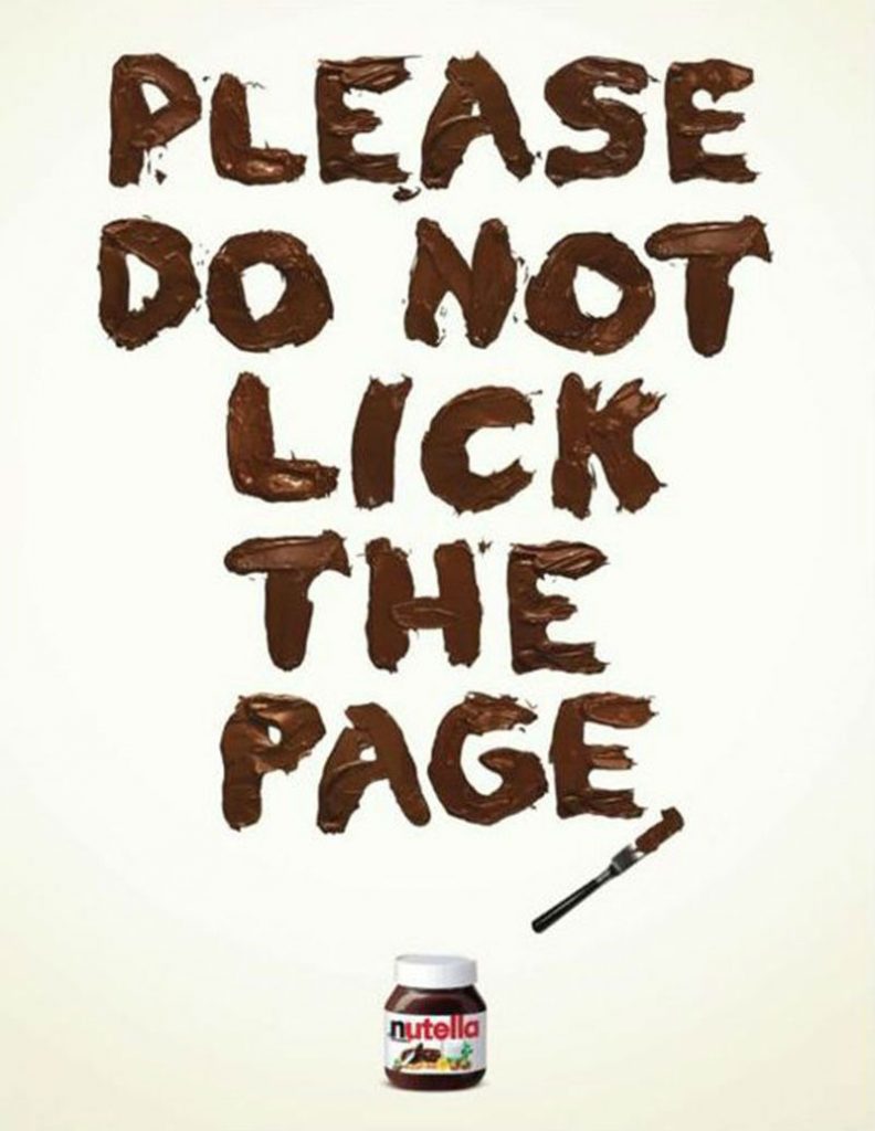
Nothing shows the playfulness of Nutella better than this ad that uses reverse psychology to get you interested. Instead of doing what the ad tells you, you’d want to actually do the opposite.
[in_content_ads gallery="digital-ads" logo="off" title="Generate leads the most obvious way" subtitle="Your next ad will do well...if the design is right." btntext="I need this!" btnlink="https://penji.co/pricing/?affiliate=J2O5AB8RAR3386837"]4. McDonald’s
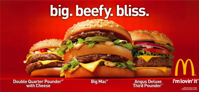
McDonald’s has some of the best ad designs ever and we’re lovin’ it. Here’s one example of how good they are in making you crave their food. It shows three of their burgers in all their beefy glory, right off the bat, no fluff needed.
5. Newman’s Own Pizza
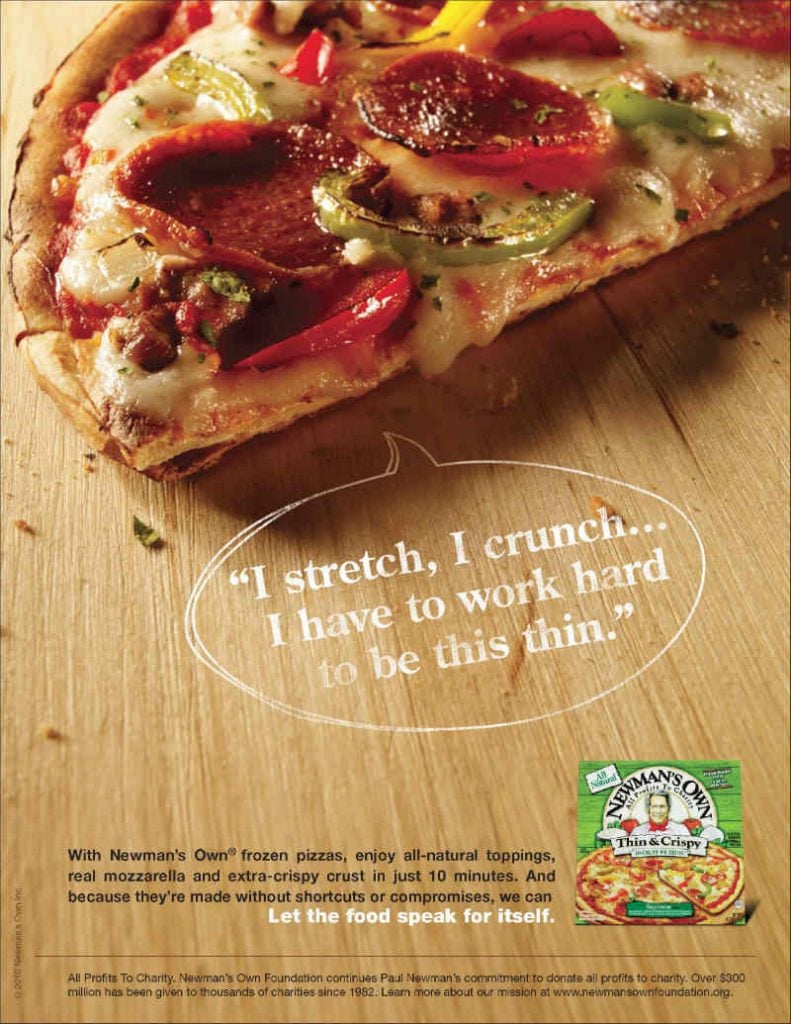
Clever how they put the packaging design of the pizza in the advertisement. This makes it easily recognizable in the supermarket among other frozen pizzas.
6. Burger King
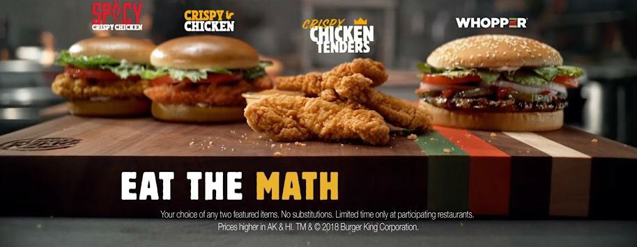
This ad promotes Burger King’s Eat the Math offer for their chicken burgers and chicken tenders. It lets customers choose any two of the featured burgers for just $6. The mouth-watering photos and the excitement of getting more for less are incredibly exciting to make you want to head out to their nearest joint.
7. Panera Bread
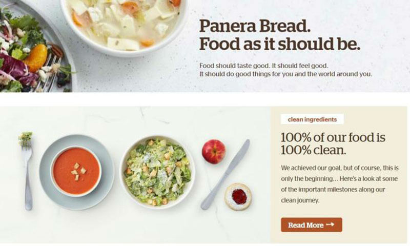
Panera Bread takes pride in using no artificial flavors, preservatives, or sweeteners in their food and this ad clearly sends out their message. Using white for the background really emphasizes the copy.
8. Chili’s
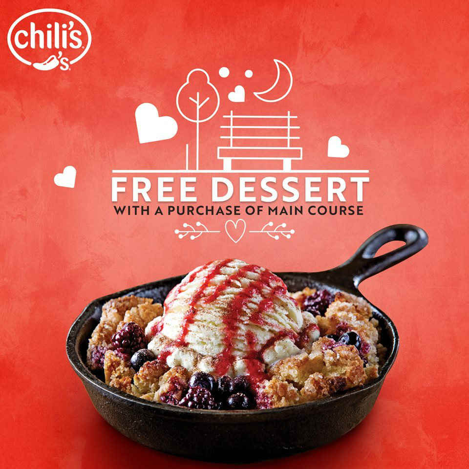
This Chili’s ad features their appetizer and dessert promo using high-quality photos that wonderfully capture the lusciousness of both items. All you need is the entrée and you’re good to go!
9. Heinz
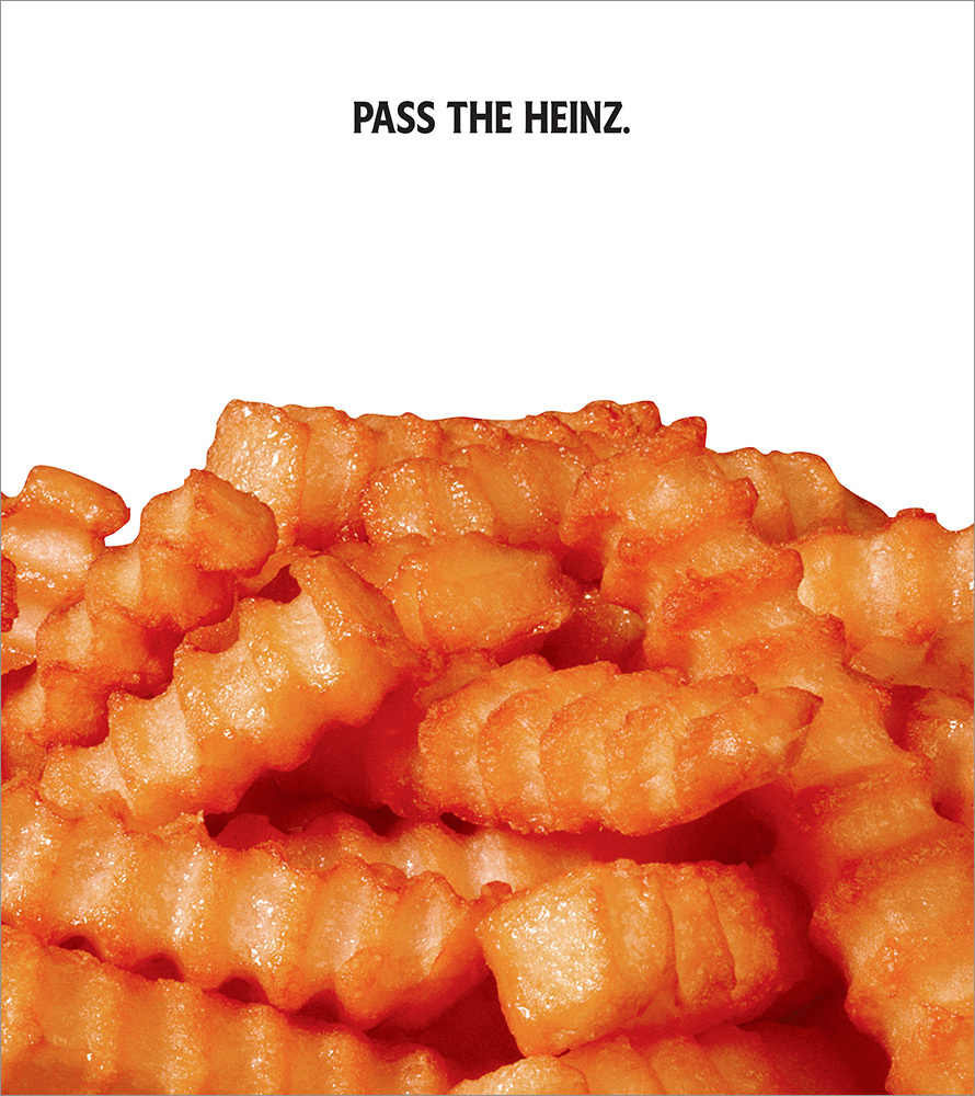
A cleverly thought of ad of a ketchup brand that has no ketchup in it, but works quite well. You see the fries that look very tempting, all it needs is the ketchup.
10. Magnum Temptation
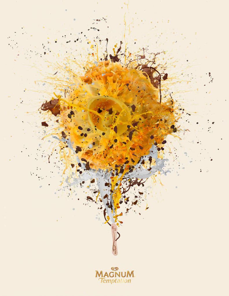
An image of a Magnum ice cream bursting with fruit, chocolates, and cream, what more can make you want one? The ad’s simplicity is what makes it effective. You’ll want to drop everything and go grab one.
11. KFC
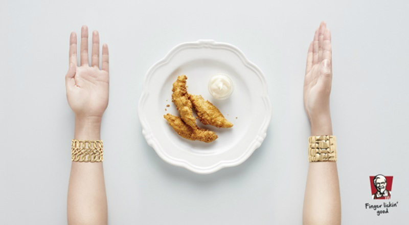
It’s always been finger-lickin’ good for KFC, and this ad creatively shows that their food is best eaten with your hands. The layout is very straightforward and the image is clear, clean, and crisp and very inviting.
12. Eini & Co.
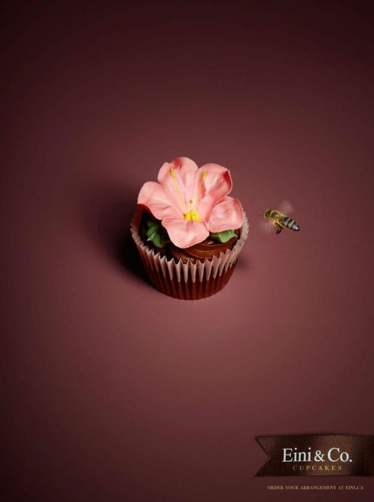
Eini & Co. is a bakery in Canada that released a series of ads that are as beautiful as their cupcakes. They are simplistic in design but are full of inspiration and imagery. They perfectly embody what the brand is while making you crave for something sweet and sugary.
13. Curtis Tea
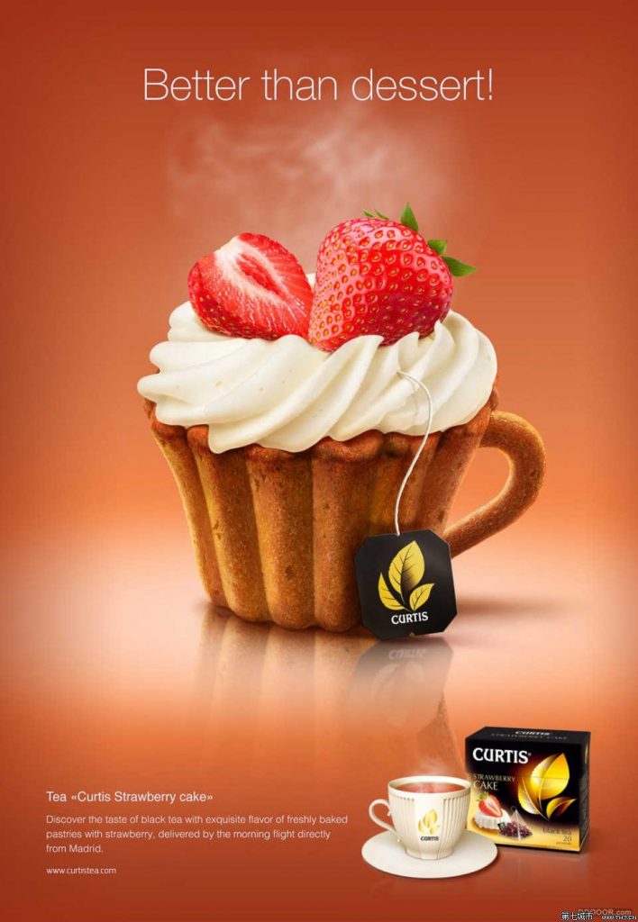
Another series of thoughtfully created print ads for a tea company in the Czech Republic, Curtis Tea. Their dessert tea collection ads are brimming with charm, appeal, and a certain level of cuteness that you’d want to stop everything and take a tea break.
14. McCormick
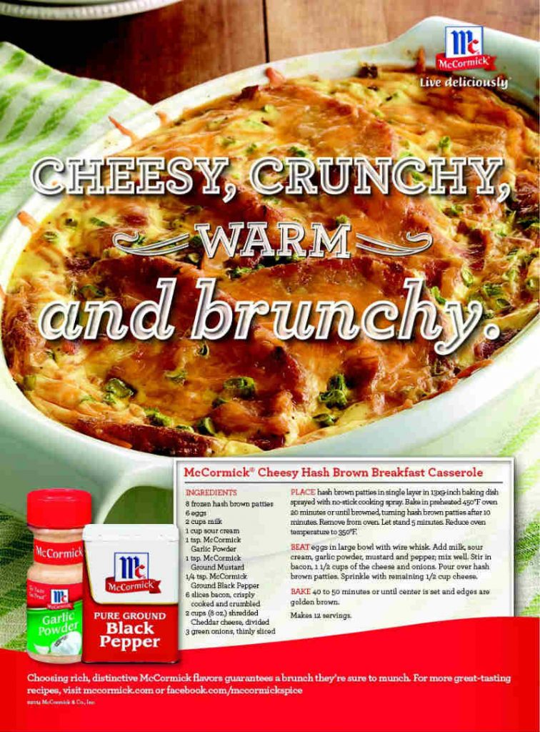
In this McCormick food ad for their black pepper, a recipe for a casserole is included to show how their seasoning makes food even better. It works very well in showing how good the product is and making you hungry at the same time.
15. Godiva
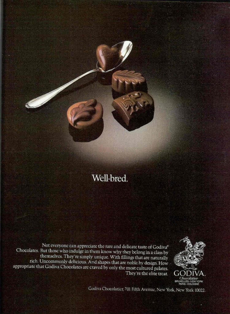
Godiva is one of the biggest names in gourmet chocolates and this food ad perfectly shows their timelessness, style, and elegance. Created in 1983, the ad can be used today and would still get every chocolate lover’s attention.
16. Kraft Mac & Cheese
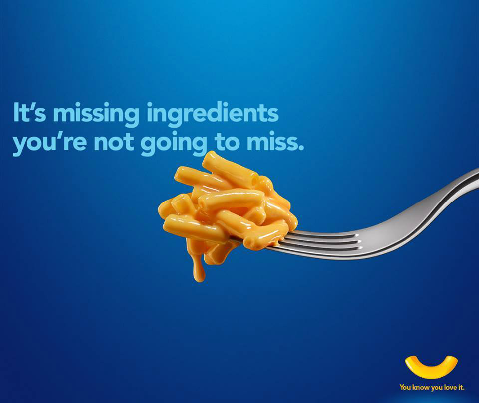
Kraft has upgraded their Macaroni & Cheese and this witty ad says it clearly. With no artificial ingredients in it, it looks more appetizing now that you can eat it guilt-free. It projects a healthy façade and does it with justice.
17. Hard Rock Café Pattaya
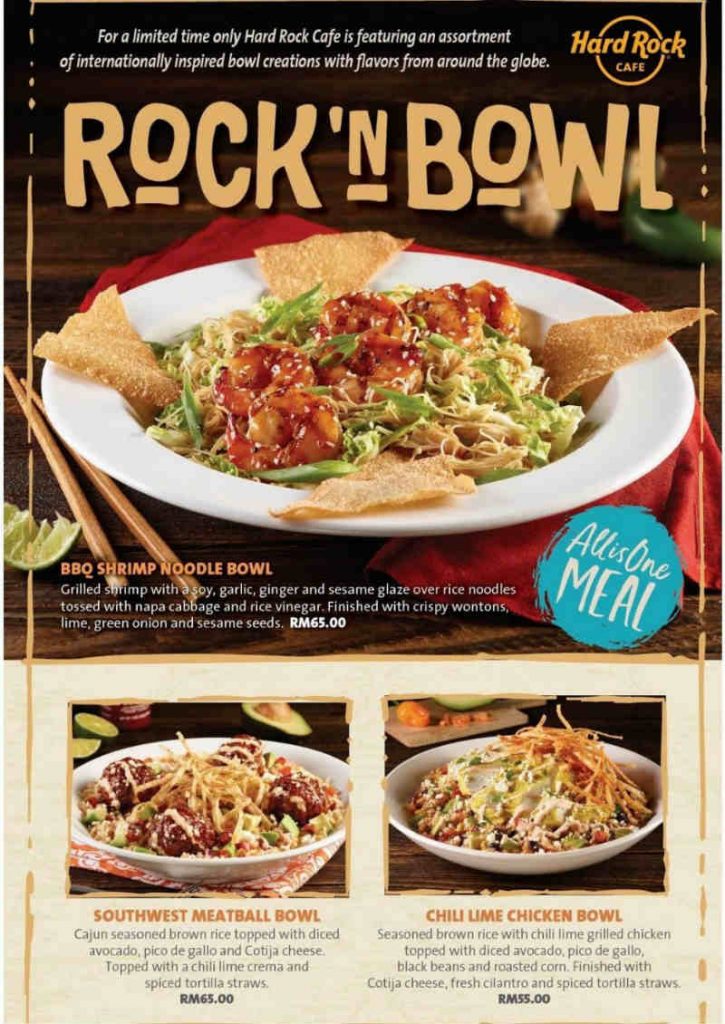
Hard Rock Café in Pattaya, Thailand, released a food ad campaign for their Rock’n Bowls offering. The ad features a bowl of rice topped with hot beef chorizo meatballs infused with a blend of Cajun and Southwest seasonings. Makes you want to hop on that plane on a trip to Southeast Asia, doesn’t it?
18. Krispy Kreme
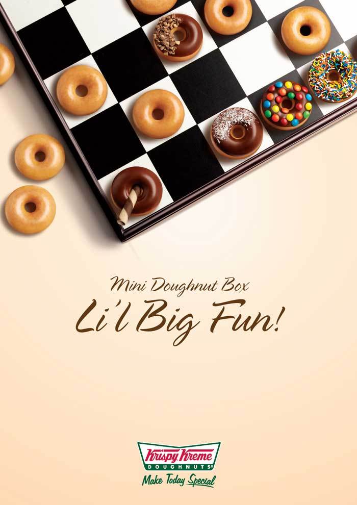
This food ad features a variety of Krispy Kreme’s mini doughnuts and it’s fun, delightful, and very light. Not only did they use a fun image, but also a fun font. It is so easy on the eyes because of its simple layout and crystal clear photo, but most importantly, the doughnuts look good enough to bite!
19. Snickers
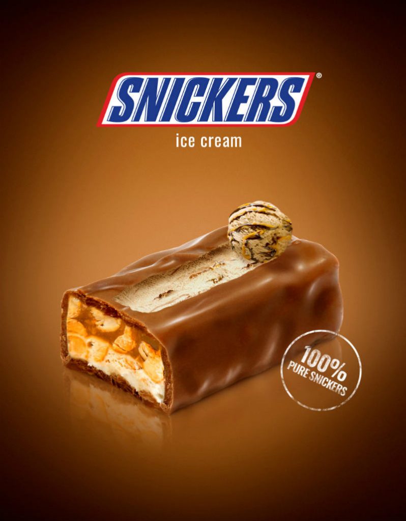
This food ad from Snickers has released tons of creative ads but this one stood out from the rest. Their Snickers ice cream ad effectively shows the goodness of a Snickers bar in a scoop of ice cream. You can enjoy having a candy bar and ice cream at the same time for an extreme sugar fix.
20. Maggi
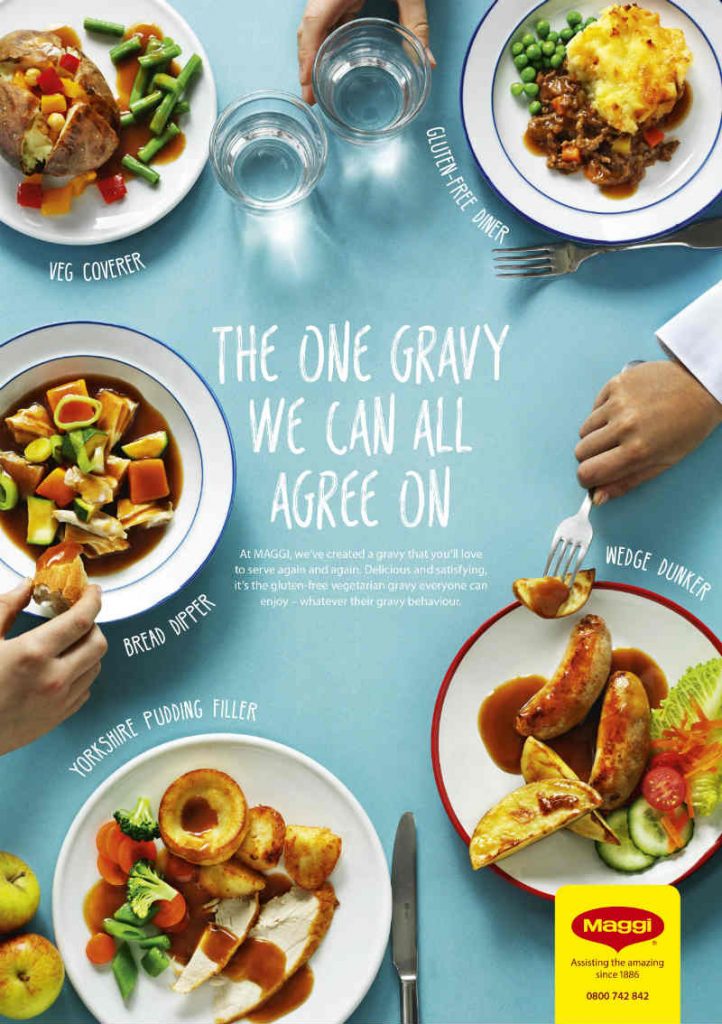
This Maggi Seasoning ad showcases different recipes that can get better with ‘the one gravy we can all agree on’. It cleverly shows different dishes you can use their gravy on. After seeing this ad, you’ll probably head to the supermarket and start whipping up these dishes.
21. Wagamama
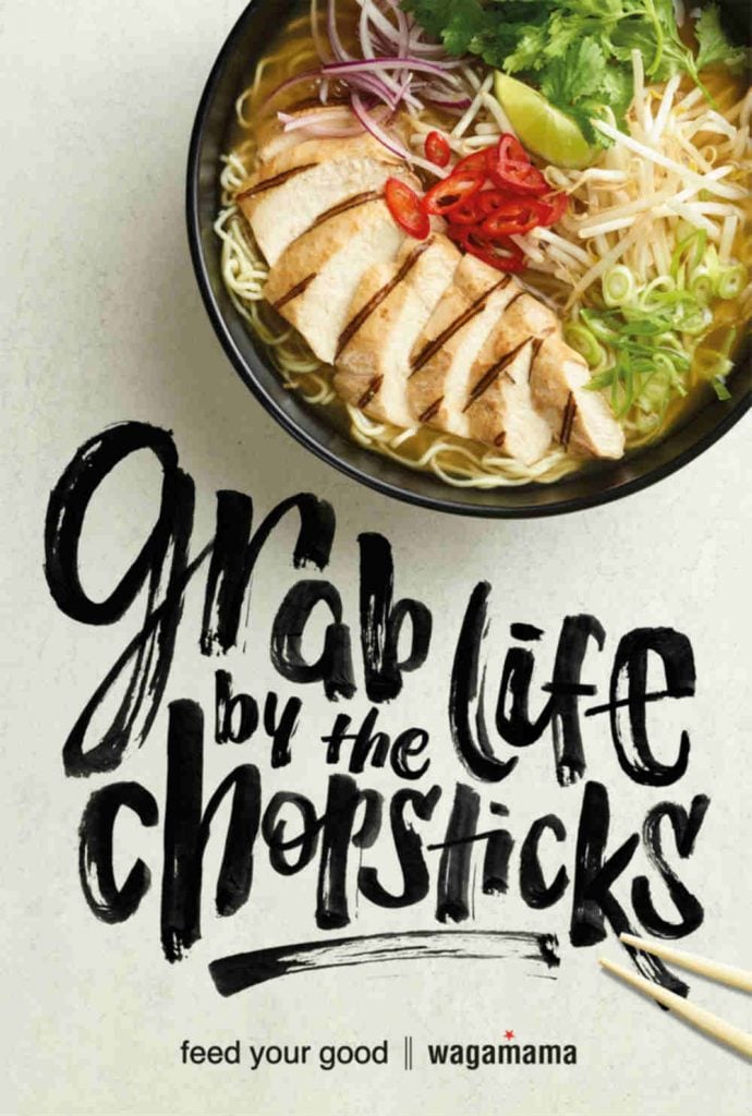
Wagamama is a British restaurant with locations in the US and specializes in Japanese food. Their ad below gives a bit of life advice with a yummy looking pic of one of their dishes.
22. KitKat
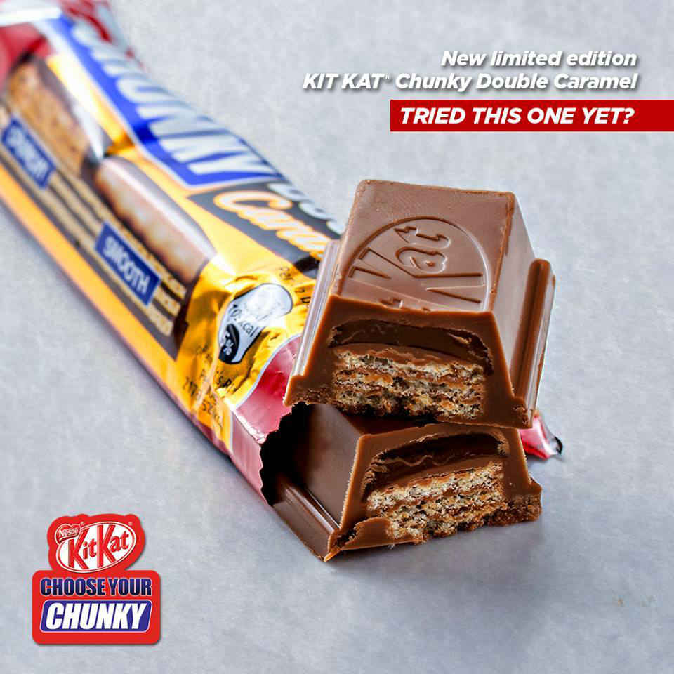
This KitKat ad gives you no excuse to take a break with a bar of chocolate. Most of their ads are plain looking but what makes them great is the addition of creative content that uses humor and wit to get people’s attention.
23. Starbucks
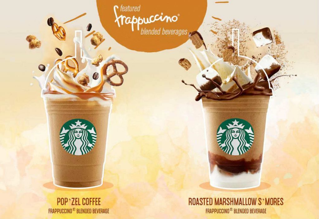
Starbucks introduced its most playful and creamiest addition to their menu via an ad that is both inviting and invigorating just by looking at it.
24. De Morfi
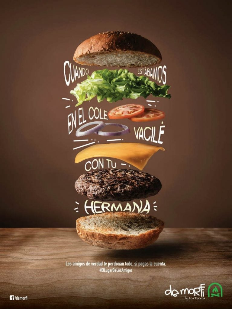
De Morfi is a hamburger restaurant in Ecuador and their ad caught our attention as everything from the bun to the vegetables looks delicious! If we can only scoot over there this instant.
25. Taco Bell
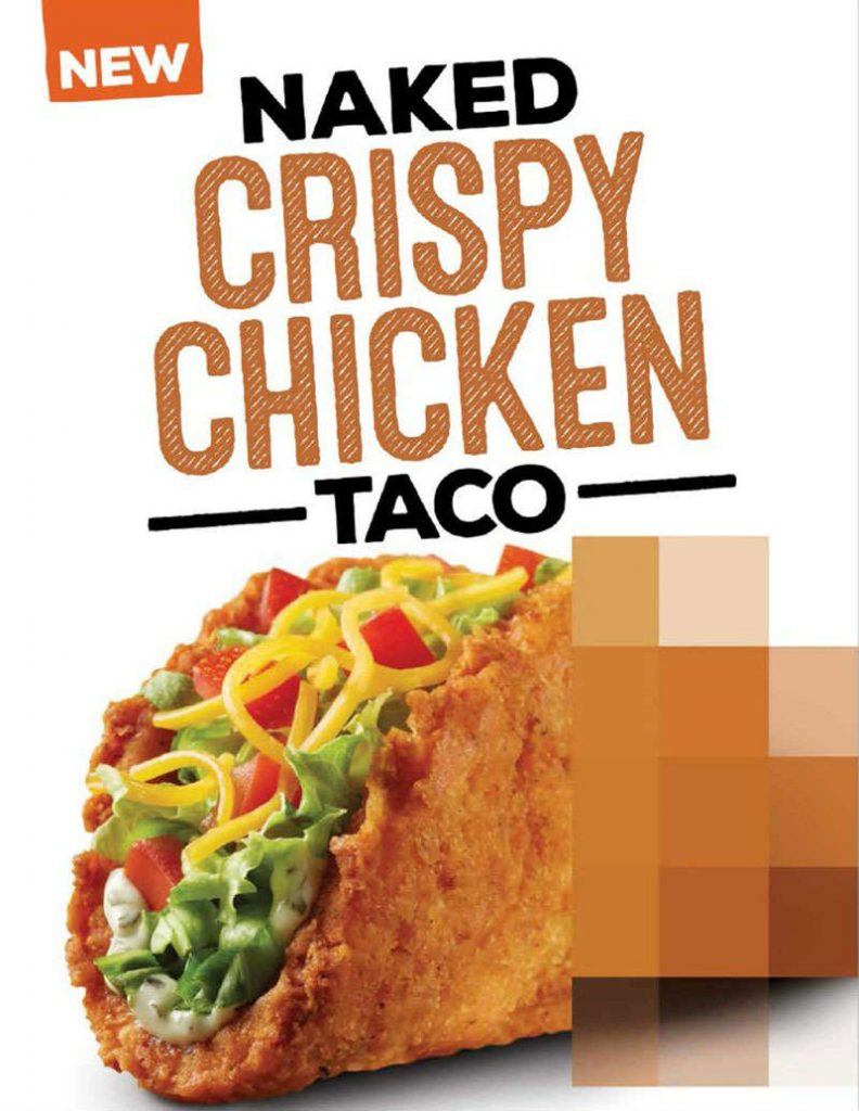
Taco Bell’s Naked Crispy Chicken Taco ad is funny with a part of the taco blurred to hide its naked part. It still shows the good part of the taco though, enough to make you hungry for some.
Penji Food Ad Designs
The following food ad designs are from Penji’s previous works. This is to show you how versatile our graphic designers are.
26. Dad’s Cafe
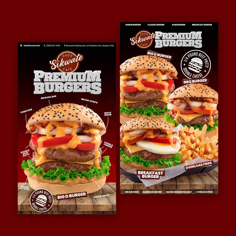
Color psychology in advertising tells us that red is ideal for use as it encourages a hearty appetite. This ad didn’t shy away from the color and used different shades of red. There isn’t also much need for blocks of texts as the pictures spoke a thousand words.
27. Walker’s Doughnut
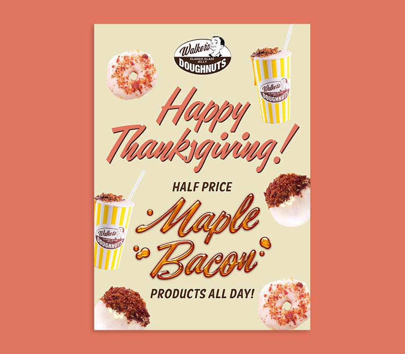
Paying homage to the American post-war era classics in dining, Walker’s Doughnut in Australia requested this poster. The overall design captures the vibes of the ’50s quite well. Not to mention the mouth-watering pics of the food and drinks.
28. Chill Town Crusher
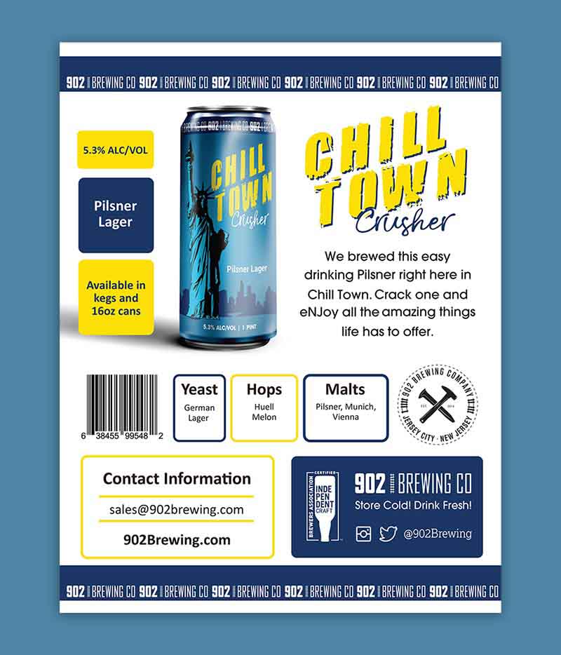
This 902 Brewing Co.’s Chill Town Crusher ad design is a great example of a perfectly laid out ad. There is enough white space on it without having to omit any information that the readers need to know. It doesn’t look cramped and actually leads the eyes where you need to.
29. Chuyax Diner
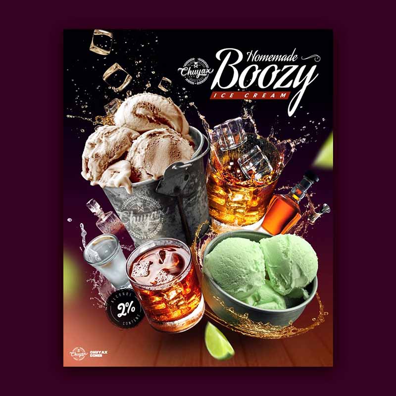
This social media food ad for Chuyax Diner is so visually pleasing, refreshing, and enticing. It was specifically designed for their Homemade Boozy ice cream. The ad includes bottles of alcoholic beverages to emphasize the booze-spiking they’ve done to their creamy concoctions.
30. New York Minute
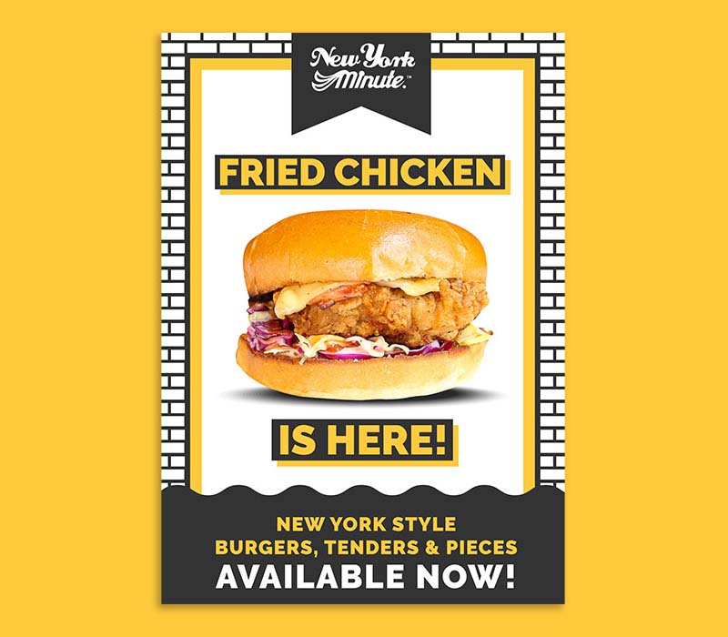
Aussie burger joint, New York Minute released this food ad design for their fried chicken burger. The design is reminiscent of the main designs of their restaurants which is inspired by the city it’s named after.
31. The Clayton Hotel
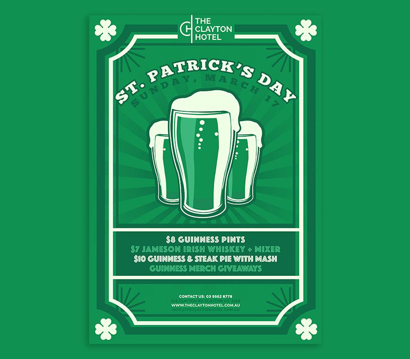
To celebrate St. Patrick’s day, The Clayton Hotel published this food ad design. It’s automatic that the ad will be in green and will include elements related to St. Paddy: drinks and clover leaves.
32. Lemonade Stand
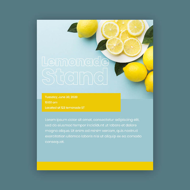
A food ad design for a hypothetical lemonade stand, this one uses colors that evoke positive emotions. Looking at this ad will remind you of freshness, crispness, and rejuvenation.
33. Christina’s Birthday Weekend
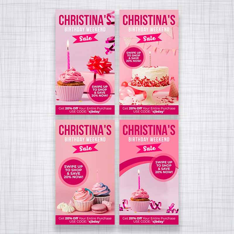
This Instagram food ad for Christina’s birthday weekend showcases cakes, cupcakes, and every reason to celebrate a birthday. It has discounts galore in an ad that oozes with fun and enjoyment.
34. Cafe Zouz
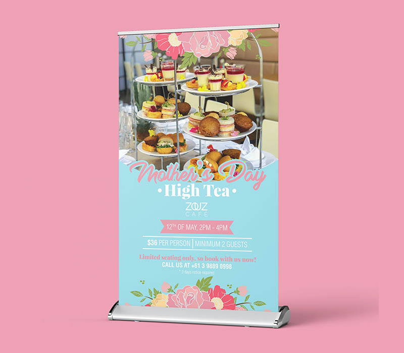
What’s a food ad design without food in it? Penji designed this ad for Cafe Zouz to promote their Mother’s day offerings. It added a photo of what High Tea delights await their guests.
35. Miss Pickle 1971
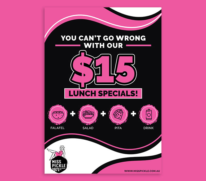
Choosing pink as their brand color, it’s evident that Miss Pickle 1971 knows how to stand out from the crowd. So, it’s only natural to use the same color for their food ad designs. This ad shows you consistency with the company’s brand identity. If you’re familiar with the restaurant, you’ll know it’s from them at just a glance.
The Bottomline
Your product may smell marvelous and taste divine, but it takes a design expert to make it look awesome on an ad. But you don’t have to worry because we’re here to provide the creative chops to make an enticing ad for your brand. Check out our plans and sign up with a 15-day 100% money-back guarantee.
About the author

Celeste Zosimo
Celeste is a former traditional animator and now an SEO content writer specializing in graphic design and marketing topics. When she's not writing or ranking her articles, she's being bossed around by her cat and two dogs.
Table of Contents
- 1. Chupa Chups Sugar-Free Lollipops
- 2. Smirnoff Sorbet Light
- 3. Nutella
- 4. McDonald’s
- 5. Newman’s Own Pizza
- 6. Burger King
- 7. Panera Bread
- 8. Chili’s
- 9. Heinz
- 10. Magnum Temptation
- 11. KFC
- 12. Eini & Co.
- 13. Curtis Tea
- 14. McCormick
- 15. Godiva
- 16. Kraft Mac & Cheese
- 17. Hard Rock Café Pattaya
- 18. Krispy Kreme
- 19. Snickers
- 20. Maggi
- 21. Wagamama
- 22. KitKat
- 23. Starbucks
- 24. De Morfi
- 25. Taco Bell
- Penji Food Ad Designs
- 26. Dad’s Cafe
- 27. Walker’s Doughnut
- 28. Chill Town Crusher
- 29. Chuyax Diner
- 30. New York Minute
- 31. The Clayton Hotel
- 32. Lemonade Stand
- 33. Christina’s Birthday Weekend
- 34. Cafe Zouz
- 35. Miss Pickle 1971
- The Bottomline


