They say that a picture is worth a thousand words, and that isn’t any more apparent than with creative billboard ads.
Here are 50 of the most creative ads that must’ve been designed by someone with 300+ IQ. There are ad designers. And then there are mad geniuses who just happen to design ads.
And speaking of mad geniuses who offer affordable and quality graphic design, Penji’s graphic designers are the experts you can trust. The unique business structure will surprise you how easy it is to request and download final designs on its platform. Check out their portfolio here.
There’s definitely something we can learn from these mad geniuses though. When it comes to advertising, especially billboard advertising, it’s all about getting their attention, nothing else matters. It doesn’t matter how great your promotion is or how fantastic of a service you offer if you can’t get people’s attention, no one will care.
I’m going to update this post fairly frequently with all the latest and most creative billboard ads design, so make sure to bookmark and check back often.
Alright, let’s begin!
Billboard Ads: Overview
Before we jump right into the most creative billboard ads. Let’s check out a brief introduction to billboard advertising. In a nutshell, it’s about displaying an advertisement placed on elevated boards along the roadside. Billboard ads are often visible to pedestrians, and whoever drives along the road.
Digital billboards are considered to be the fastest-growing section of the billboard industry. Currently, it’s known that the construction of new billboard locations is now prohibited in the U.S. It only makes the existing ad locations more valuable than ever.
Due to the recent COVID-19 outbreak, the industry for billboard ads had a slow growth from 2019 to 2020. However, according to Globe-News Wire, the market is expected to recover by 2023, reaching at least $81.35 billion.
Type, Pricing, and Impression Rate
Although the existing billboard ad location is more valuable, the rental remains at a competitive rate. First, you need to know that the estimated rate depends on the impression and location. You’ll encounter the following:
Contract Due Date
Contract due date has a “first come, first served” basis, so the ad is executed as soon as possible.
Creative Due Date
- Printed billboard ads
A creative due date is usually two to three weeks before the start of the advertising date.
- LED billboard ads
Usually within three business days before the start of the advertisement date.
Aside from your advertisement designer budget, it is important to consider how much the final billboard format will cost you. Typically, advertisers who use billboard media calculate the rent per CPM or cost-per-thousand divided by the monthly cost-per-gross-impression.
Bulletin
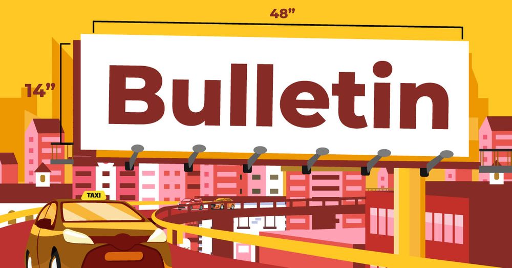
This billboard format is also known as large or classic billboard. It’s commonly found along highways, expressways, or heavy traffic streets.
Size: 48’ Width x 14’ Height
Pricing Rate: $1,500 to $30,000 (per location per 4-week period)
Impression Rate: 20,000 to 50,000 (per location per day)
Poster
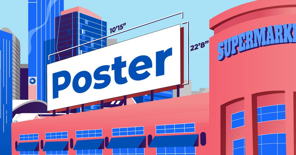
This type of advertising billboard is at least half the width of a classic billboard. It’s commonly used for a local product at a local market.
Size: 22’ 8” Width x 10’ 15” Height
Pricing Rate: $750 to $2,000 (per location per 4-week period)
Impression Rate: 10,000 to 20,000 (per location per day)
Junior Poster
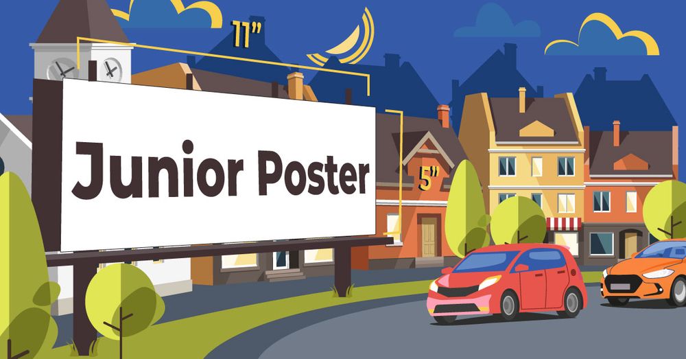
Junior posters are considered the smallest type of billboard. Typically, it’s used within urban neighborhoods and minor roads. Also, this type of advertising targets a local audience.
Size: 11’ Width x 5’ Height
Pricing Rate: $300 to $750 (per location per day)
Impression Rate: 8,000 to 12,000 (per location per day)
LED Bulletin
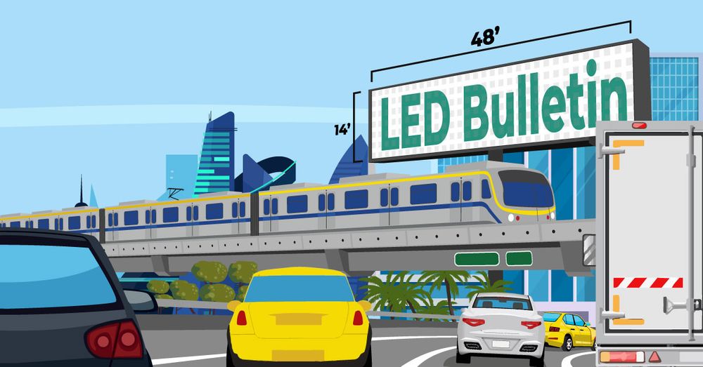
Digital bulletins are more eye-catching than most traditional billboards. Its popularity is one of the reasons why many billboard operators are considering going full-on digitized.
Size: 48’ Width x 14’ Height
Pricing Rate: $3,500 to $25,000 (per location per 4-week period). Typically, around an approximate of 8 seconds in an advertisement loop of at least 64 seconds.
Impression Rate: 35,000 to 65,000 (per location per day)
Wallscape
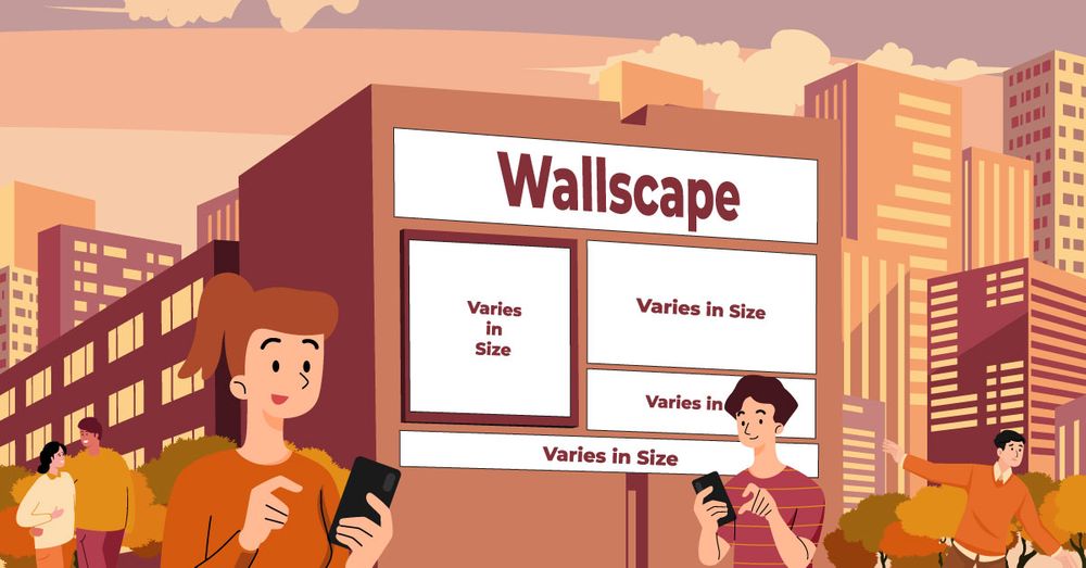
Wallscape advertising is impossible to ignore in any given environment. This type of advertisement generates the most impression rate compared to others.
Size: (Varies)
Pricing Rate: $10,000 to $50,000 (per location per 4-week period)
Impression Rate: 50,000 to 100,000 (location per day)
1. Cossette and Spencer & Jordan Collab
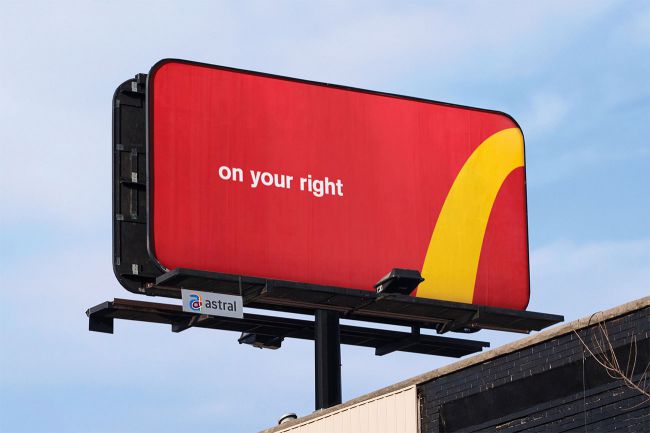
From what I can say, this billboard from the collab of Cossette and Spencer & Jordan tells me 2 things. One, this ad had the audacity to butcher the McDonald’s logo and brag about it. And two, it may imply that there’s a McDonald’s on the next right turn of this ad. But it works. This ad won a Follow The Arches campaign, and it inspired me to get a cheeseburger.
2. Anando Milk
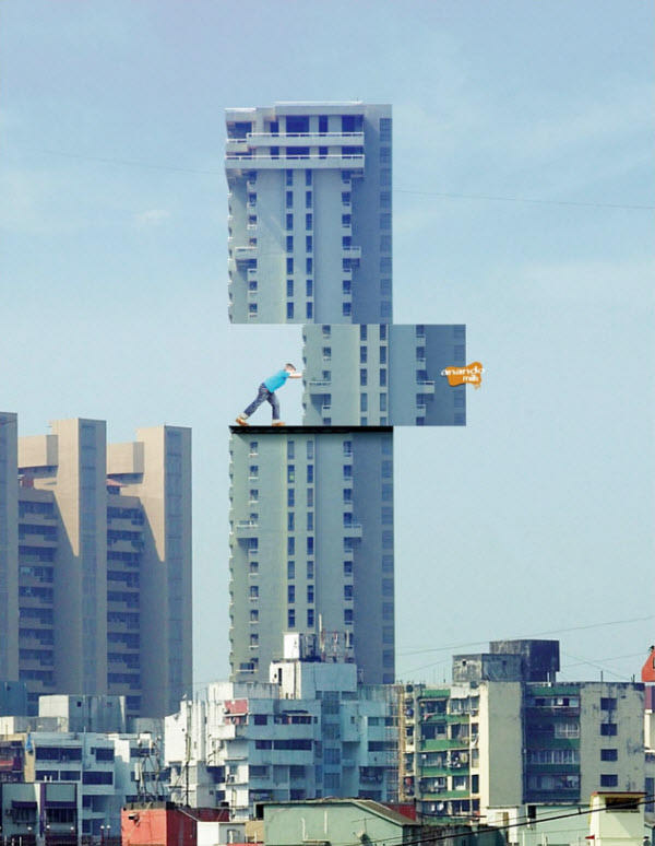
You know, if I was a kid and you told me that I could develop amazing powers by drinking milk, I’d probably believe you after seeing this. This billboard from Anando Milk shows that fantasy is a great medium to appeal to children. Also, using two billboards to achieve this optical illusion was nothing but pure genius!
3. Seat Belt Billboard Ad
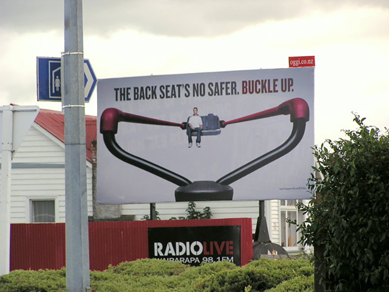
One great tactic would be to use everyday objects to complement the billboard’s message and get people talking about it. This ad shows just how dangerous it can be without having your seatbelt on – back seats are no exception. Talk about clever ad design!
4. Spotify
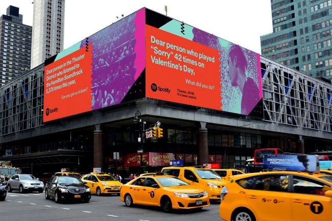
How can you look at this and NOT chuckle? I agree, Spotify: 2016 was indeed a weird year. Those whimsical messages in their ad are really relatable, and I love the bright colors used to make the billboard ad stand out. Also, very clever of the designer to point out the person who played “Sorry” 42 times. Definitely makes you stop and think a little…what did he do?!
[in_content_ads gallery="digital-ads" logo="off" title="Generate leads the most obvious way" subtitle="Your next ad will do well...if the design is right." btntext="I need this!" btnlink="https://penji.co/pricing/?affiliate=J2O5AB8RAR3386837"]5. LEGO
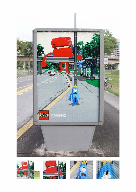
Growing up, I’ve always enjoyed playing with LEGO bricks, so this billboard ad tugs at my nostalgia. Plus, I just love how they were able to blend the surroundings into it – reminds me of a lot of augmented reality! And the use to re-create this SPECIFIC scene means this ad was made specifically for this location. That’s a lot of work and dedication for just ONE ad.
6. Berger
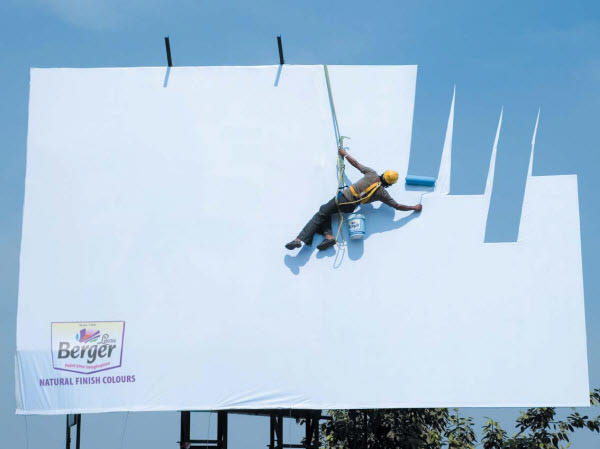
I’ve known for a while that there was a color in Berger’s arsenal called Sky Blue, but I never thought that this billboard ad would take it literally! Great blending of color compared to the sky! However, it may lose some of its impact at night, but that’s just me.
7. Law & Order
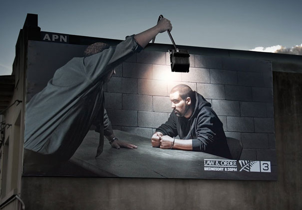
Any fans of Law & Order here? Perhaps you can tell me the scene this billboard ad is pulling from? Anyway, I find this ad absolutely captivating, and the integration with the light is top-notch. Love it when the ad uses the surrounding to its advantage.
8. The Economist
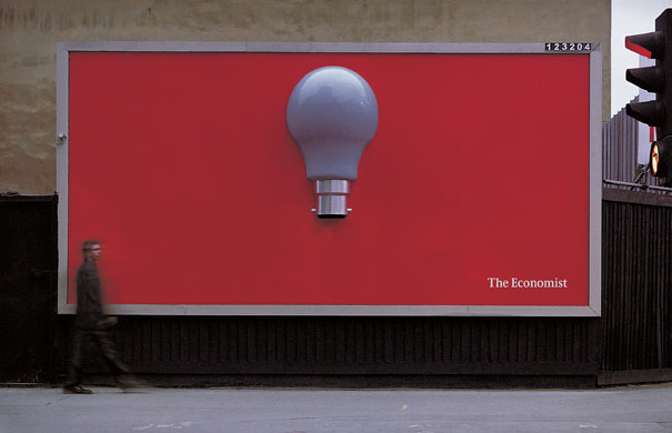
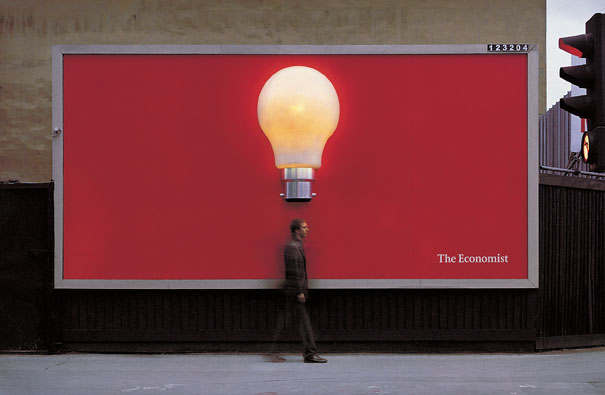
Okay, now this billboard ad from The Economist is just a brilliant idea. Having a giant light bulb with a motion sensor built-in is just great to look at when driving by and seeing all the smart folk interacting with it. This doesn’t surprise me that much actually. Of course, The Economist would have a few smarty-pants hanging around the office.
9. Science World
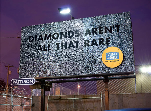
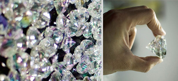
This billboard ad by Science World is a beautiful representation of how diamonds are a lie designed to fool consumers into thinking that they’re valuable. I’m not sure if the diamonds on the billboard are actually real or synthetic diamonds (both are expensive). But this definitely makes me want to stop by Science World to find out why.
10. BiC
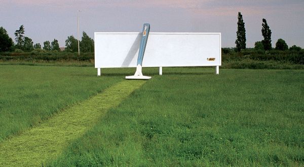
I never figured that the Earth would have a need for a razor, but this ad from BiC does more than enough to get the point across with its simple design. Bonus points for use of a non-electric model! But it does make you wonder…do they have to come by every 2 weeks to mow just that specific area?
11. Smirnoff
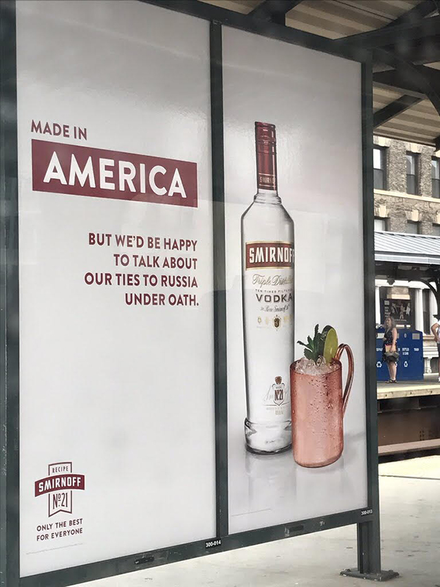
Now, I wouldn’t call myself much of a political commentator, but Smirnoff just couldn’t help taking a jab at our Commander-In-Chief with this witty billboard. The madman behind this ad must be drunk or ungodly brave. Regardless, props to Smirnoff for having the balls to approve of this ad. Does anyone have any aloe vera?
12. Netflix
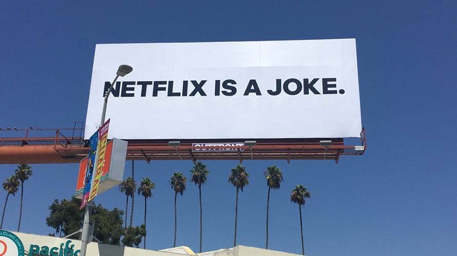
This billboard ad is quite simple, but it’s bound to trigger a lot of people who are loyal to Netflix, so it’s already turning heads. The plot twist? Netflix is the one that put it up! Talk about reverse psychology. It also makes you wonder who would spend this money to trash Netflix and yet not give a source or name? Obviously it would be Netflix themselves.
13. Nationwide
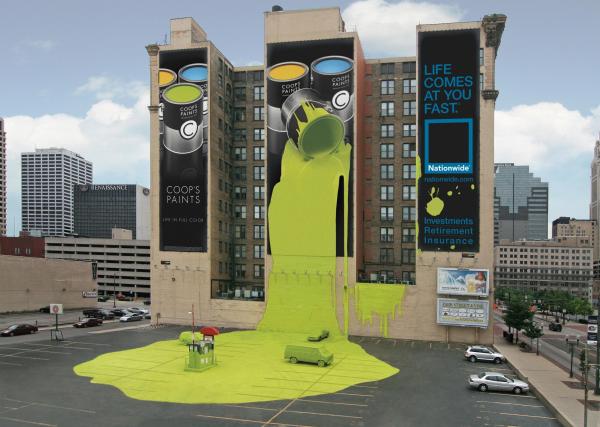
Insurance companies are the wildest when it comes to advertisements. After all, you’re advertising a boring product that can’t really be shown. Nationwide certainly didn’t pull any punches with this billboard ad – great use of pseudo-3D to have the paint spill out in the real world! This is going to be a massive pain to clean up. And did they really do that to the van and 2 cars in the parking lot?
14. Allstate
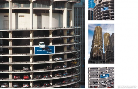
See, this is why having car insurance is so important – it’s all fun and games until your car is dangling from a 10 story parking lot. Amazing ad from Allstate, but that car owner looks like he needs a hand.
15. Formula
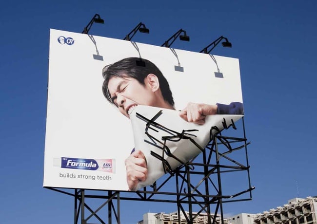
According to this creative billboard ad from Formula, you can have strong and healthy teeth too! Strong enough to tear off metal, even! Well, iron is in fact good for your diet…
16. Tylenol
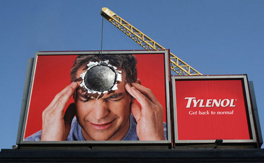
I can totally relate to this guy. My headaches can be the absolute worst with the stress of work sometimes. But Tylenol skillfully uses the wrecking ball to get its point across.
17. Maker’s Mark
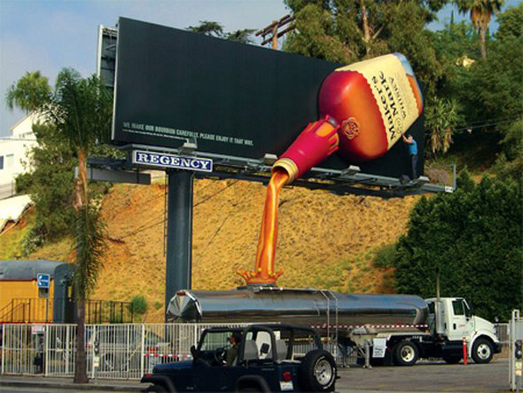
3D billboard ads are always such a joy to see, and this simple, yet effective one from Regent demonstrates this. I also learnt that oil tankers contain whisky – interesting to know.
18. Nike
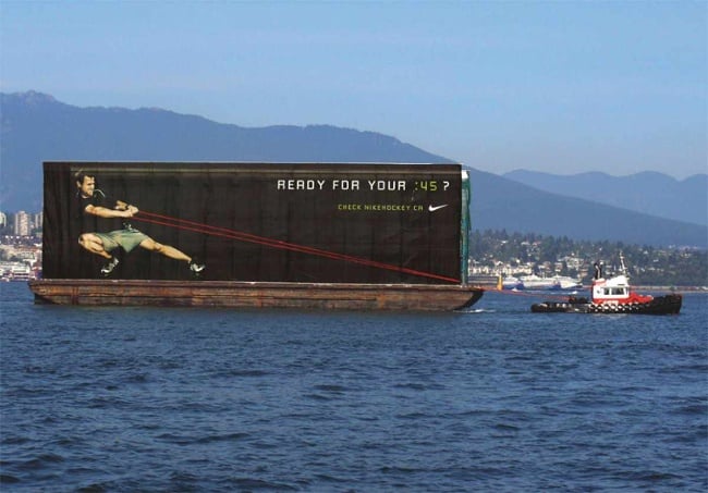
Nothing says getting in shape with Nike gear than being able to move yachts. A pretty smart combination with the boat makes this billboard ad even more eye-catching.
19. KFC
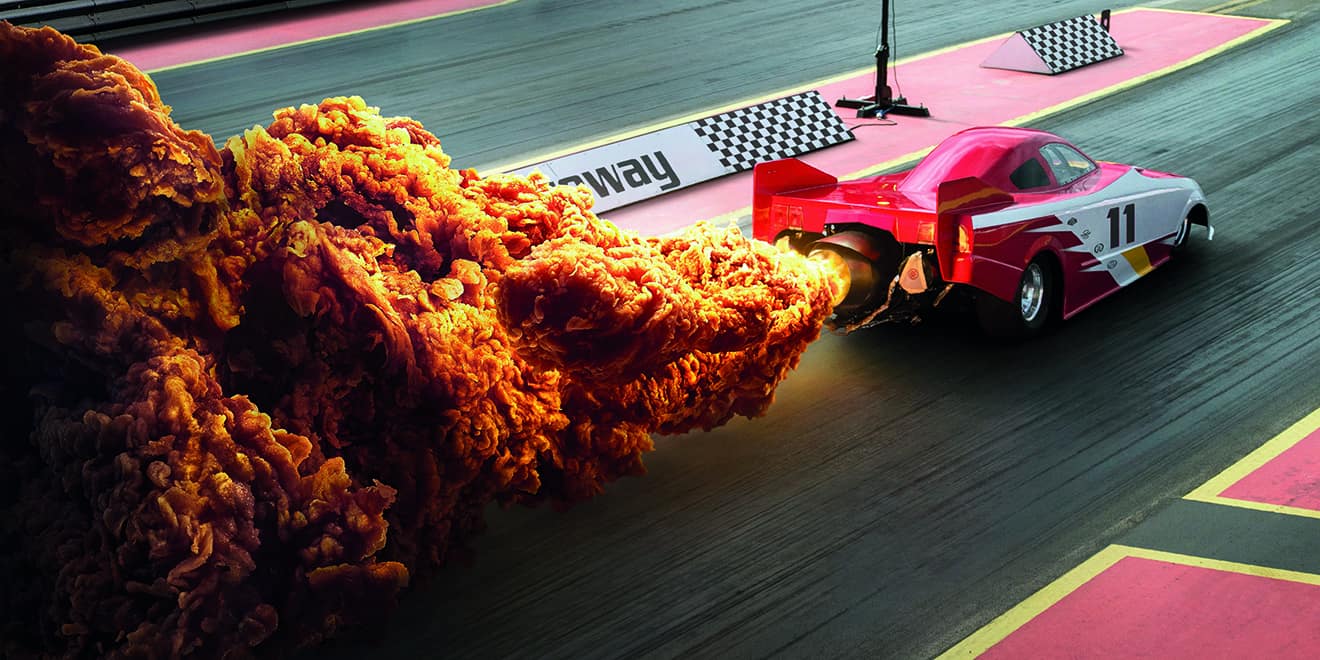
Believe it or not, this billboard is from KFC. That’s right – they incorporated fried chicken as fuel exhaust. That’s just crazy. But it’s making me hungry, so I say this ad definitely did its job.
20. McDonald’s
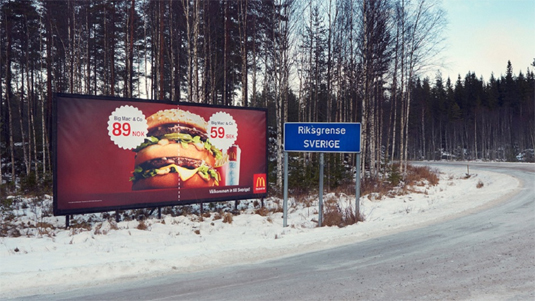
This billboard ad located at the Norway/Sweden border may come off as a bit obscure, but it humorously shows that there’s a big price difference in the cost of food. I guess I know where I’m going for my next big Mac. Sweden, here I come!
21. Sky, Now You Know, Discovery Channel
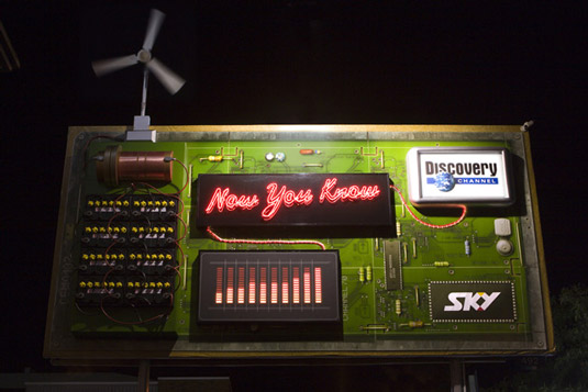
Now this billboard ad is really cool – not only does it advertise two firms at once, but it’s a working circuit board! The fan turning generates the electricity for the neon light – pretty green, I’d say.
22. BBC
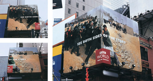
“See the other side of the story” by literally turning a corner. Pretty ingenious to use the sides of a building to showcase your billboard ad. Well played, BBC.
23. Miele
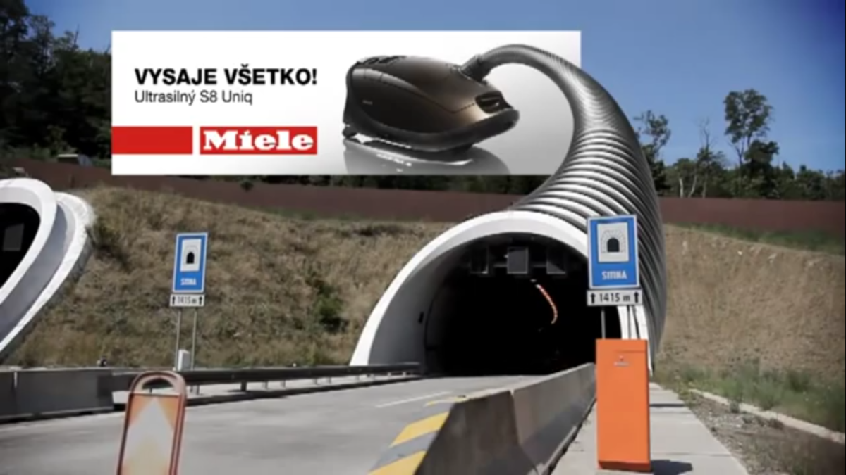
Since when would anyone consider driving into a vacuum cleaner nozzle? This interesting billboard ad does a great job with perspective, and actually made me consider this.
24. Tailgating Awareness
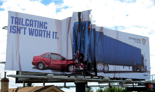
Yes, I agree. Tailgating is totally not worth it – don’t overtake a trailer unless you want to end up like the car in this brilliantly produced ad.
25. Panasonic
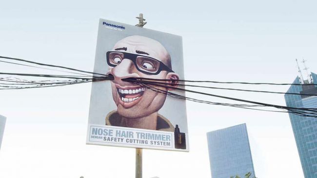
Creating a billboard ad around electric wires to demonstrate nose hairs is just a great idea – if a little weird. But at least I see a need for a nose hair trimmer very clearly.
26. Levi’s
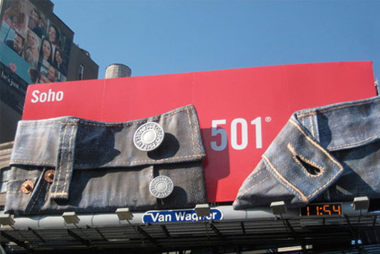
Anyone that knows high quality denim jeans should know instantly what this billboard from Levi’s. Simple, but directly effective. The open button is also a great touch.
27. Coca Cola
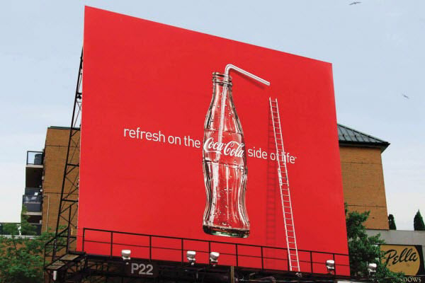
Refreshing is right! And this subtly amazing billboard ad brings the point home. The straw and the ladder just further exemplifies the need to have a Coke.
28. Audi and BMW
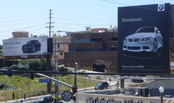
This ad pair between Audi and BMW is just plain eye candy to car lovers. It almost seems as if it was a planned collaboration. It also reminds me of chess. (notice the car colors?)
29. Apple
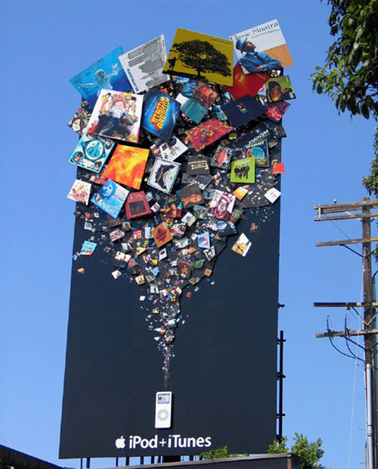
This billboard ad just demonstrates what I’m sure what many people who love music are already aware of – iPods are a massive storage hold of music. But I never thought it would be THAT much.
30. Tiger Beer
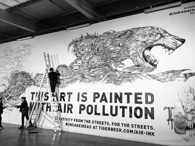
Not only is this billboard carrying some great art, it also shares an important message. Pretty interesting to know that it’s completely made of soot from pollution as well.
31. Subway
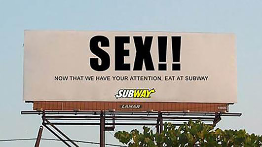
Subway knows what’s up with this simple ad – they know that sex sells and catches attention, so they exploit it to quietly share their message.
32. Racers, Dallasburg Baptist Church
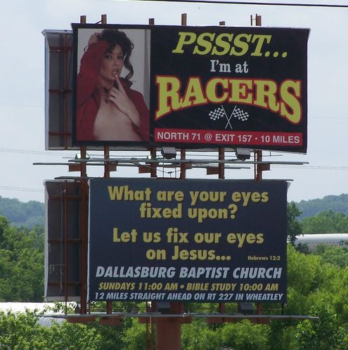
I love that these billboard ads complement each other so well, especially since most eyes would be pulled towards the first.
33. Air Asia
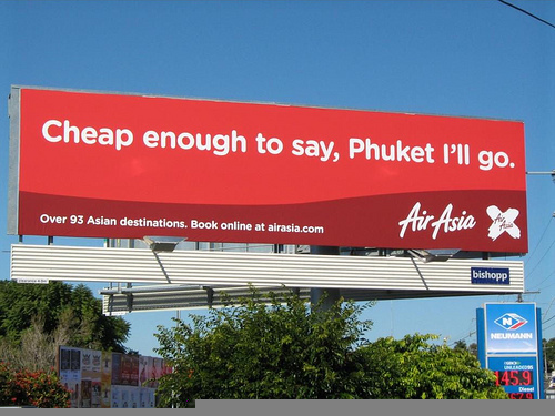
Brilliant wordplay from Air Asia here to get me interested in planning my next trip to the Far East – Phuket, I want to go to Japan now.
34. Oldtimer
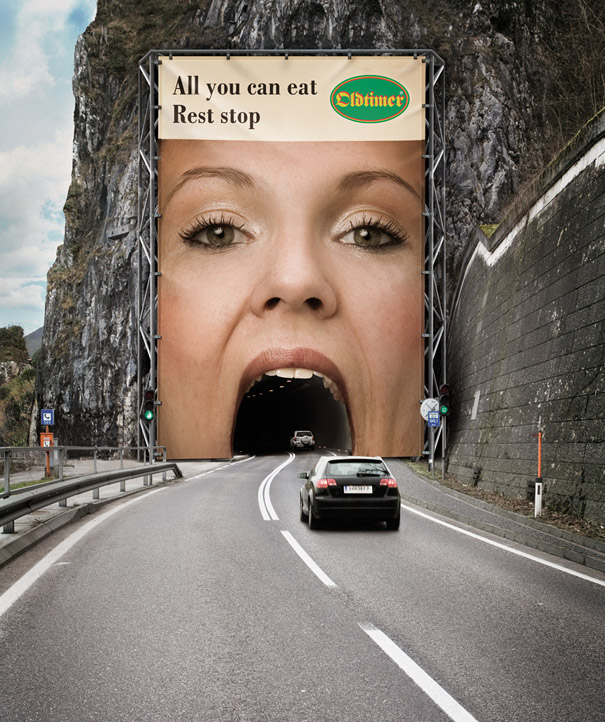
Great billboard ad outlining a rest stop and a place to eat. Also, I find it funny that I would want to be eaten by a giant woman.
35. 2006 World Cup
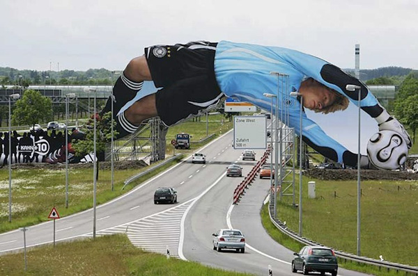
This is a great save in this billboard ad promoting the 2006 World Cup – I also love the arch, interacting with the road.
36. Cadbury
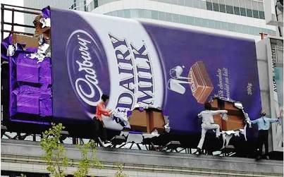
Anyone in the mood for some chocolate? This delicious ad showcases multiple people getting a piece – but they’re just well-placed mannequins.
37. Donatos
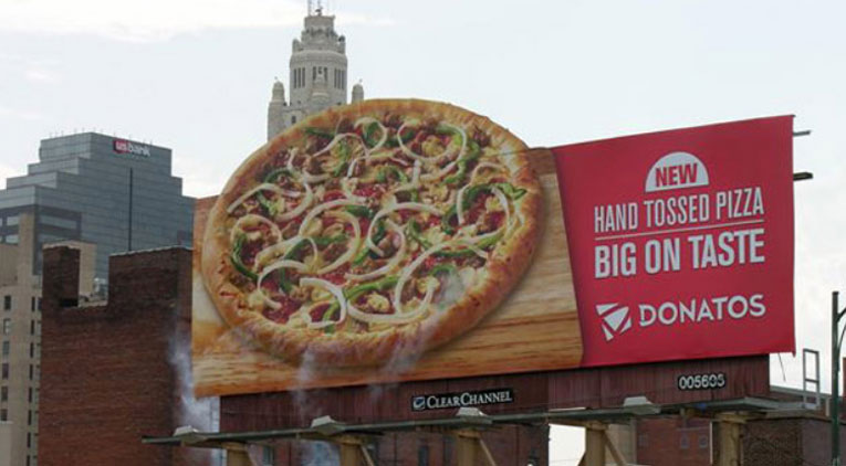
This ad just shows a steaming hot pizza in all of its deliciousness – the ’steam’ is actually a well-placed blower.
38. Colorado Crisis Services
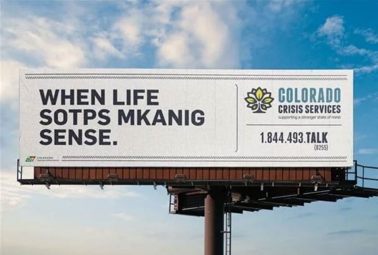
This billboard is a great example of using brain teasers to get your message across. Are you able to read this?
39. Kit-Kat
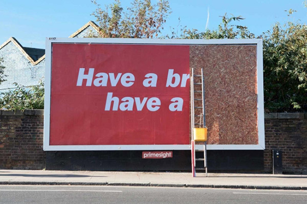
Just how powerful does a brand have to be that you could even recognize them without their logo, without their branding, without their product, and even with half their slogan missing? There’s no logo in this ad; not even complete phrases, but the sheer power of this billboard ad can tell you that it’s Kit-Kat.
40. IBM
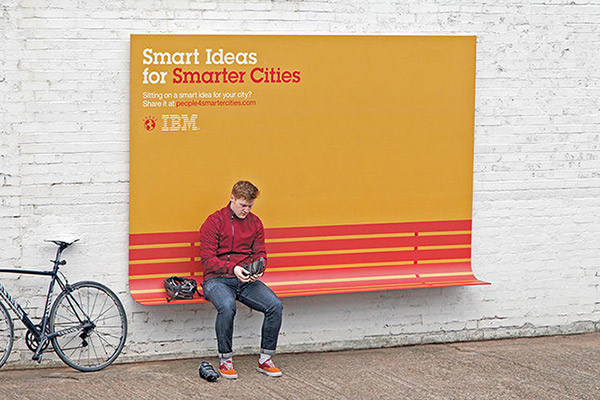
IBM is a company that’s known for its innovation and I wouldn’t expect anything less from them when it comes to their billboard game. This innovative billboard ad is not only getting IBM’s message across, it even doubles as a cool bus stop bench. I wonder what the weight limit is. Doesn’t look like it’ll hold up with too many people.
41. A/C & Appliance Service
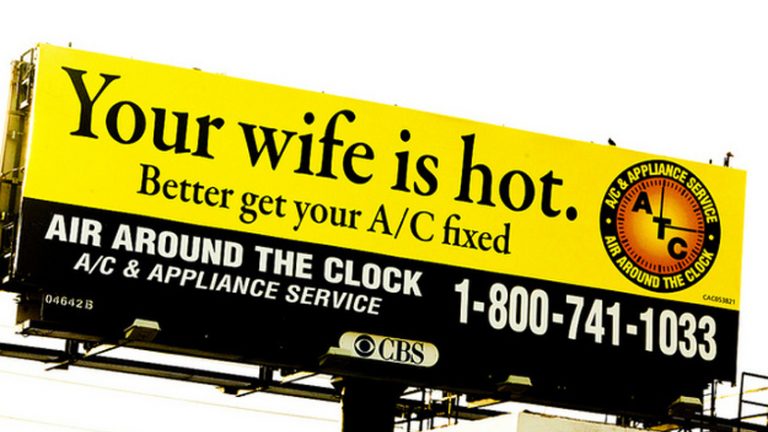
Smart billboard ads aren’t exclusive to big brands. I love it when local companies are also brave enough to show their wild and creative side. I love the brilliant wordplay that A/C & Appliance has going on here in this billboard ad. Conveying a double entendre is always humorous to read.
42. Craftsman
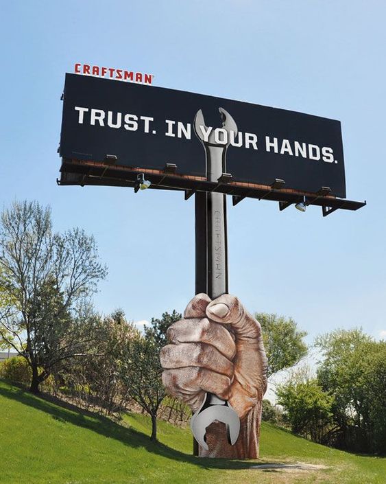
This Craftsman billboard ad shows a dynamic side by interacting with the wrench and ’supporting’ the billboard – love the shift in the wrench!
43. Donatos, Chaz
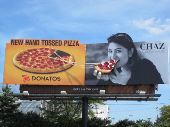
Another collaboration between billboard ads I found to be amazing, it’s telling me that great fashion goes hand in hand with great pizza. The girl’s hand is a bit creepy and weird though.
44. Royal
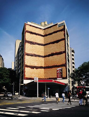
In order for Royal to show their message, they turned an entire 7-story building into a cake? That’ll definitely turn heads, and this billboard ad is a work of art. If there’s one billboard you can’t miss, this would be it.
45. Korean Police
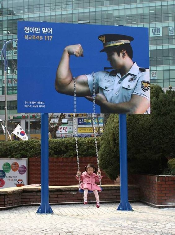
This Korean billboard ad just goes to show that the police exist to protect and reassure. And support swings – a really heartwarming message. And a sick billboard! If only we have more positive messages like these for our law enforcers here in the states.
46. Heineken
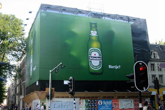
You may need to take a second look here, but this billboard ad from Heineken is simple, yet brilliant with its subtle hand reaching out for a drink. Not gonna lie, it was a bit creepy at first when I noticed the hands. Don’t want to see this ad when you’re drunk walking home late at night.
47. Martor Solingen
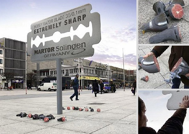
Wow, Martor Solingen isn’t kidding about the sharpness of their blades with this billboard ad – I think they conveyed their point quite well. The dummy pigeons was a nice, albeit morbid touch. Have you seen a more creative ad for a razor blade? Didn’t think so!
48. Siemens
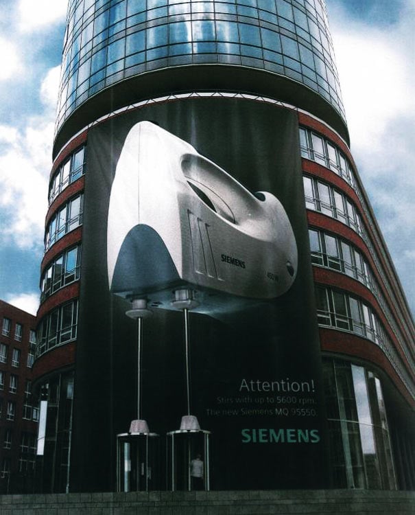
Alright, who came up with this one?! Seriously, who looked at two revolving doors and saw an add for cake mix?! None-the-less, an outstanding ad from Siemens for their cake mixer, using revolving doors. I’m just glad that elevator doors aren’t particularly fast, in this case.
49. Silberman’s Fitness Center
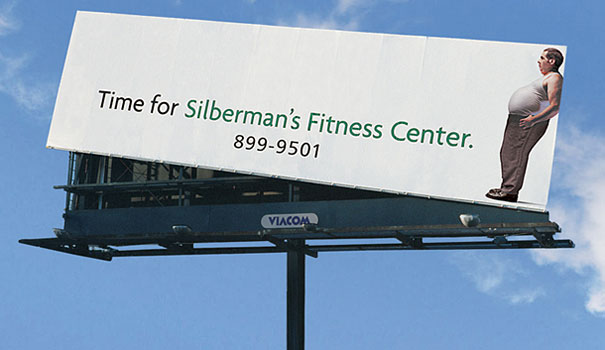
I’ve seen a lot of clever weight loss billboards, but this one was just so simple and creative. This ad by Silberman’s Fitness Center may just take the cake in terms of weight billboard ads. Amazing use of the tilt to convey an important message – get in shape!
50. YMCA
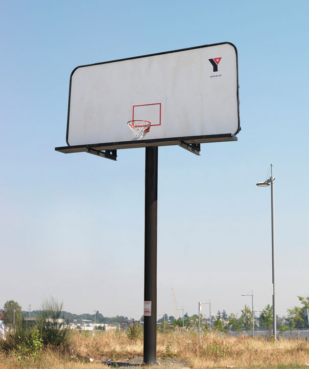
A simple billboard ad from the YMCA, but pretty cool in my opinion. I also believe that hoop is at the appropriate court height too; it’s a shame I suck at basketball. Would be even more clever if there was a blacktop paving around the billboard so you can actually try to take the shot.
Request Billboard Designs from Penji
If you need help with your billboard designs and other advertising materials, Penji’s seamless platform will not hinder your busy schedules. All you have to do is these three easy steps:
Step 1: Create a new project
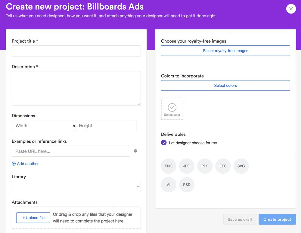
Once you’ve signed up for a Penji plan, go to your dashboard. Then click the “Create new project” button. Either choose from the various design types or the “Create custom project” button.
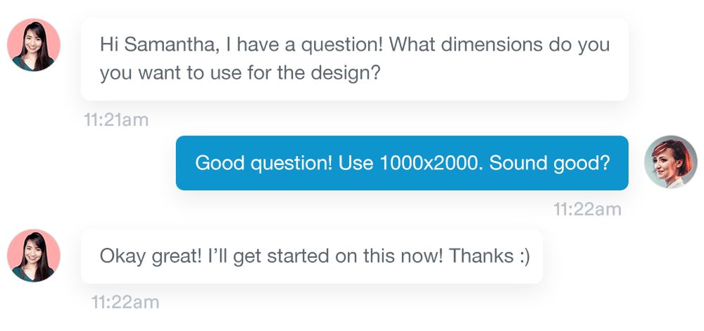
Fill in the form for all the design details your designer needs then hit the “Create project” button. You will then be assigned the perfect designer. Wait for 24 to 48 hours for the first draft.
Step 2: Review
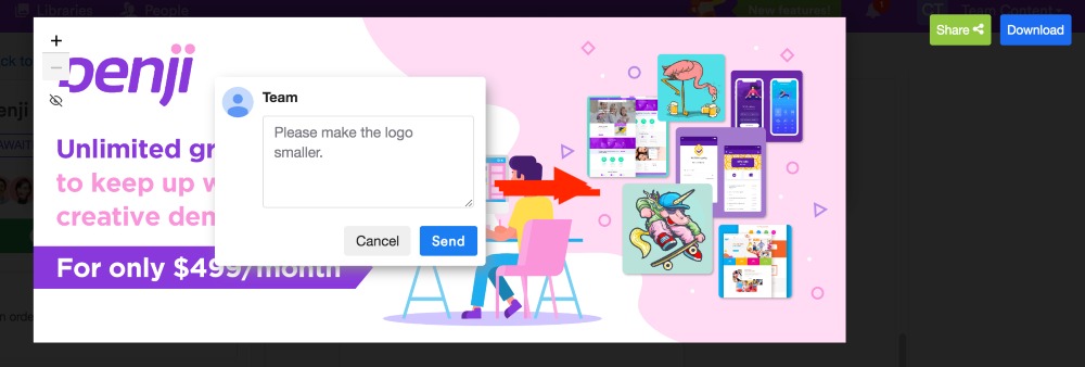
Once you receive the first draft, review, and revise it if necessary. Penji offers unlimited revisions for all plans — at no cost.
Plus, asking for revisions is easy. You can just click on the design and write your feedback there.
Step 3: Download
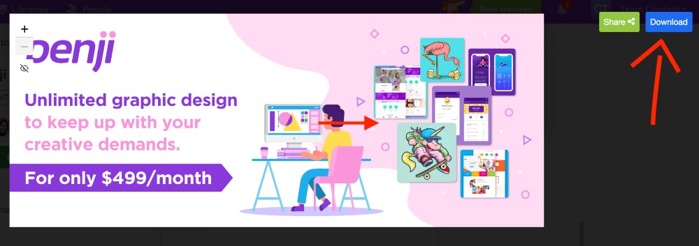
Once you’re 100 percent happy with the design, download it from the same design card. It will then automatically save to your computer. Plus, you can write negative or positive feedback on the same platform as well.
Conclusion
If you want hassle-free graphic designs for marketing with full rights and licenses, subscribe to Penji. They cover every design type you need at affordable pricing plans. Sign up and try the service for 30 days!
[convertkit form=3285107]
About the author
Table of Contents
- Billboard Ads: Overview
- 1. Cossette and Spencer & Jordan Collab
- 2. Anando Milk
- 3. Seat Belt Billboard Ad
- 4. Spotify
- 5. LEGO
- 6. Berger
- 7. Law & Order
- 8. The Economist
- 9. Science World
- 10. BiC
- 11. Smirnoff
- 12. Netflix
- 13. Nationwide
- 14. Allstate
- 15. Formula
- 16. Tylenol
- 17. Maker’s Mark
- 18. Nike
- 19. KFC
- 20. McDonald’s
- 21. Sky, Now You Know, Discovery Channel
- 22. BBC
- 23. Miele
- 24. Tailgating Awareness
- 25. Panasonic
- 26. Levi’s
- 27. Coca Cola
- 28. Audi and BMW
- 29. Apple
- 30. Tiger Beer
- 31. Subway
- 32. Racers, Dallasburg Baptist Church
- 33. Air Asia
- 34. Oldtimer
- 35. 2006 World Cup
- 36. Cadbury
- 37. Donatos
- 38. Colorado Crisis Services
- 39. Kit-Kat
- 40. IBM
- 41. A/C & Appliance Service
- 42. Craftsman
- 43. Donatos, Chaz
- 44. Royal
- 45. Korean Police
- 46. Heineken
- 47. Martor Solingen
- 48. Siemens
- 49. Silberman’s Fitness Center
- 50. YMCA
- Request Billboard Designs from Penji


