

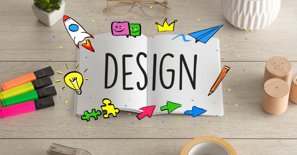
TL;DR: Your visitors size you up 50 milliseconds before they read a word. That gut feeling is based on your design: layout, colors, fonts, and photos. Here I’ll examine why that is, what design decisions support or impede trust, what the research says, and where brand design services (including the subscription kind) fit in.
Picture someone landing on your homepage. Before they’ve read your headline, their brain has already decided: stick around, or bounce.
That’s not me being dramatic. A study by Gitte Lindgaard at Carleton University, published in Behavior & Information Technology, found people form a visual impression of a site in roughly 50 milliseconds, quicker than a blink. And the unnerving part: that snap judgment held up even when people were given much longer to look. First impressions don’t soften. They stick.
This feeling is the thing a lot of business owners sense but can’t name. The traffic’s there, people just leave, and sales stay flat. So the instinct is to rewrite the copy. But usually the copy isn’t what’s hurting you; it’s the design. It’s already done its job before anyone reads a word. So let’s get into what’s actually going on.
Why does design decide trust before words do?

In that first moment, your visitor’s brain makes a quick judgment based on looks alone. Three things are key, and none of them is guesswork:
- The aesthetic-usability effect. The Nielsen Norman Group coined this. People assume that attractive things are easier to use and more trustworthy, even when they are identical inside. Nice design earns you patience.
- Processing fluency. When something’s easy on the eyes, your brain quietly reads that ease as “this is legit.” Smooth to look at becomes safe to trust.
- The halo effect. One strong impression, say, a polished look bleeds into everything else. Looks sharp, must be honest; looks sharp, must be good at the work.
The short version: people trust you with their eyes before their head. Your copy, reviews, and credentials only get a fair read after the design clears the gate. So which choices matter most?
Which design signals build the most trust?
Not everything carries equal weight. Here’s roughly how it shakes out, with the heaviest hitters listed first.
| Signal | Why it builds (or breaks) trust | Quick fix |
| Visual hierarchy | Shows the eye where to go first. Skip it, and people feel lost. | One clear focal point per screen |
| Typography | Clean type reads as professional. Clashing fonts read as careless. | Two fonts, generous spacing |
| Whitespace | Space feels confident. Clutter feels frantic. | Add breathing room around key things |
| Color | Hits instantly (blue = trust, green = growth, red = urgency). | Pick one palette and stick to it |
| Image quality | Real photos build trust. Obvious stock kills it. | Swap generic stock for the real thing |
| Mobile polish | Most first impressions now happen on a phone. | Check every page at phone width |
| Loading speed | A slow page reads as a cheap brand before anything appears. | Compress images, drop heavy scripts |
Color is the fastest of the bunch; it lands before your brain even processes shapes or text. If you’re choosing or fixing yours, Penji’s guide to the meaning of brand colors and how to choose yours is a good place to start. Now, the data.
What trust factors do most guides skip?
These quietly separate a brand people trust from one they forget. Does consistency across channels really matter?
More than almost anything. Trust builds when your site, emails, social, and ads all clearly belong to the same brand, and it cracks the second they don’t. The gap is real: 95% of companies have brand guidelines, but only a quarter follow them. Think about how you spot a brand’s email before you read who sent it that’s consistency working for them, for free.
Want the full checklist of what to keep aligned? Penji has a complete guide to the elements of a brand identity.
How does mobile change the first impression?
Most people meet your brand on a phone before they ever see a desktop. A site that shines on a big monitor but falls apart on a small screen is failing where it counts. Cramped tap targets, pinch-to-read text, and a page that crawls on mobile data all chip away at trust. Design the phone first.
Can a design actually look too polished?
It can. More polish isn’t automatically more trust. A no-name vendor with a flawless site and zero contact info reads as too-good-to-be-true. Slick layouts built on dark patterns feel manipulative, and people pick up on it. And a wall of generic stock-photo smiles quietly says you’ve got nothing real to show.
How do you look real in the AI era?
People are suspicious now of AI images, fake reviews, and content that feels manufactured. So looking genuinely human has become its own trust signal. Real product shots, real faces from your team, specific details that prove there’s something behind the curtain. That beats glossy-but-faceless every time.
Is accessibility a trust signal too?
Yes. Low contrast, tiny buttons, and clutter don’t just shut out some users—they tell everyone you don’t sweat the details, and in many places they’re a legal liability. Accessible design and trustworthy design are the same thing. Which brings us to the obvious question: how do you fix any of this?
How do you fix a design that isn’t building trust?
Start with a quick check of your own site. No designer required.
Your 5-point first-impression audit
- Consistency: Pull up your homepage, last email, and top social profile side by side. Do they look like one brand?
- Hierarchy: On each page, can you find one obvious focal point in two seconds?
- Images: Anything generic or stock? Swap it out.
- Contrast: Can you read every line without straining? Run it through a free contrast checker.
- Mobile: View your key pages at phone width. Anything breaking or crowding?
Flag two or more, and your design is probably working against you. The audit tells you what’s broken. The harder part is figuring out who fixes it.
What are brand design services, and how do they help?
Brand design services are the umbrella term for professional help with your visual identity, logos, color systems, web pages, social graphics, and ads, so everything a customer sees feels consistent and cohesive.
Knowing what good looks like is the easy part. Producing it, over and over, across dozens of assets, is where most teams stall. You’ve basically got three routes.
In-house vs. freelance vs. a design subscription service
| Factor | In-house designer | Freelancer | Design subscription service |
| Cost | High fixed salary | Varies per project | Flat monthly rate |
| Consistency | High | Spotty (people rotate) | High (dedicated designers) |
| Turnaround | Fast but capped | All over the map | Often 24–48 hrs first draft |
| Scaling | Hard (hire more) | Hard (find more) | Built in (unlimited requests) |
| Best for | Big, design-heavy teams | One-off jobs | SMBs and agencies with steady needs |
These reflect typical industry models; check current pricing and terms before you commit.
A full-time hire is pricey and can only juggle so much at once. Freelancers can be unreliable and are often busy when you need them. DIY tools tend to, well, look like DIY projects. That’s exactly why the next option has become so popular.
Conclusion
Design isn’t the thing you bolt on at the end. It’s the first thing your business says in milliseconds before anyone reads a word. The research keeps landing in the same place: looks drive trust, trust comes before the sale, and consistency is where most brands quietly bleed out. Tighten up the design layer, and everything downstream, engagement, sales, and loyalty, gets room to grow.
Your first impression is happening right now, whether you planned it or not. If keeping your look consistent at scale is the thing tripping you up, a graphic design service is the most direct fix.
Explore Penji’s brand design services and plans, and put a real system behind everything your customers see.
Get a design package with unlimited graphic design
Try Penji risk-free for 30 days & get unlimited custom designs


FAQs
Around 50 milliseconds, per Lindgaard et al. at Carleton University, faster than you can read a word.
Yes. The Stanford Web Credibility Project found 75% of users judge credibility by website design, the single biggest factor.
Clear hierarchy, clean fonts, whitespace, a consistent palette, real images, fast loading, and a phone-friendly layout.
Brand design services” is the broad category. A design subscription service is one model inside it: a flat monthly fee for ongoing, unlimited design.
If you’ve got steady, ongoing needs, yes. The design-as-a-service model gets you consistent, on-brand work for a predictable price.
It can. Over-polish, dark patterns, and obvious stock photos all read as fake and push people away.
About the author

Je Ann Bacalso
Je Ann is a creative content writer who crafts engaging, SEO-friendly articles and web copy. With a passion for storytelling and a sharp eye for detail, she delivers clear, compelling content that connects with readers.


