

TLDR: 10 Design Terms You Need to Know for Better Results from Graphic Design Service. Learn visual hierarchy and the difference between vector and raster. Use proper color profiles. You’ll get accurate assets faster, cut down on revisions, and launch campaigns without delay.
Marketers and designers often speak completely different languages. You ask for entirely pop or “modernize the look.” The designer delivers an asset that doesn’t meet the brief.
This mismatch creates a huge bottleneck. Revisions mount. Campaign launches delayed. Workflows die fast.
This problem is solved immediately by learning industry-standard terminology. It gives a standardized vocabulary to communicate layout needs, file specs, and brand constraints to creative pros. You give me honest, straightforward feedback. Designers execute it immediately.
We break down the 10 essential terms you need to master. You will learn how they impact campaign performance and how to use them to streamline your creative production today.
Let us start with a quick overview of the core concepts.
What Are the 10 Essential Terms for Graphic Design Service?

Understanding the vocabulary below guarantees you get exactly what you ask for from your creative team.
Mastering these specific terms transforms how you manage your creative production. It moves your feedback from subjective opinions to clear directives.
1. Raster Graphics vs. Vector Graphics
How do you deal with your core brand assets? Understanding Vector and Raster Graphics.
Vectors use math formulas to draw shapes. They are scalable without any loss of quality. Logos, icons, and typography should be provided as vector files (EPS, SVG, and AI). You can scale a vector logo to fit a billboard without any pixelation.
Rasters consist of fixed grids of pixels. You use raster files (JPG, PNG, GIF) for complex photography. Rasters lose quality when scaled up. If you try to blow up a raster image larger than it is native to, it gets all blurry and messy.
2. CMYK vs. RGB and Hex Codes
Color profiles determine how colors render across different mediums. Pick the wrong profile, and your brand colors look washed out.
CMYK (Cyan, Magenta, Yellow, Key/Black) is the standard color model for print marketing. These four ink colors are used in the production of your physical design.
RGB (Red, Green, Blue) is the color model for digital displays. In web design, you use hex codes (a six-digit alphanumeric code) to define exact RGB colors. For brochures always provide CMYK files. For website updates always provide RGB files with exact hex codes
3. Visual Hierarchy
Visual hierarchy: An intentional arrangement of design elements to establish a hierarchy of importance.
According to Nielsen Norman Group (2006), users scan web pages in particular patterns, such as the F-pattern or Z-pattern. A strong visual hierarchy exploits these same patterns. The eye goes directly from the headline to the supporting copy and on to the Call to Action (CTA). Bad hierarchy leads to visual confusion and tanks your conversion rates.
4. White Space (Negative Space)
White space is the space between design elements, between paragraphs and images. It does not have to be literally white.
Providing “breathing room” for elements reduces cognitive overload. High-converting landing pages utilize generous white space to direct attention to the primary value proposition. Filling all pixels with text makes the asset look cheap.
5. Typography, Kerning, and Leading
Typography is the art of arranging text to make written language legible and appealing. You must understand two specific spacing concepts.
Kerning is the adjustment of space between individual characters. Bad kerning makes words completely unreadable. Leading is the vertical space between lines of text. For mobile-first assets (i.e., Meta ads), a small increase in leading helps readability on small screens.
6. Resolution (DPI / PPI)
Resolution dictates the sharpness of a raster image. You use different metrics for screens versus print.
PPI (Pixels Per Inch) applies to digital displays. The industry-standard indicative range for web images is 72 PPI to 144 PPI for retina displays. DPI (Dots Per Inch) applies to print. Print materials require a minimum of 300 DPI. Sending a designer a low-resolution image for a print campaign stalls production immediately.
7. Bleed and Crop Marks
If you execute physical marketing, you must understand bleed. Bleed is the area of a design that extends past the intended cut line of the printed document.
This ensures the ink goes all the way to the edge of the paper after trimming. Crop marks indicate exactly where the printer should cut the page. Standard industry bleed requires 0.125 inches (1/8 inch) on all sides.
8. Brand Guidelines / Brand Book
Brand guidelines are the fundamental rules for how your company visually represents itself.
They set the rules for logo usage, hex codes, typography hierarchy, and tone of voice. Without a brand book, it gets messy trying to scale assets across different designers. Properly document these rules to keep your aesthetic intact.
9. Mockup vs. Wireframe
Marketers often confuse these terms during website builds. This leads to mismatched expectations and wasted time.
A wireframe is a low-fidelity, structural blueprint. It shows layout and element placement without colors, images, or final styling. You use it to test functionality. A mockup is a high-fidelity visual representation. It shows exactly what the final product will look like, including typography and actual images.
10. Aspect Ratio
Aspect ratio is the ratio of the width to the height of an image. It is written as x:y.
The aspect ratio required differs from platform to platform. Ideal dimensions for a LinkedIn feed post are 4:5 or 1:1. Instagram Story needs to be a 9:16 aspect ratio. Designers don’t have to crop and rebuild assets later if they ask for the right aspect ratio up front.
Now that you know the vocabulary, you can use these terms in your daily requests.
How Do You Translate These Terms into a Creative Brief?

Clear vocabulary only works if you structure it properly. Use this step-by-step process to build briefs that eliminate guesswork and speed up your graphic design service.
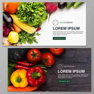
Define the aspect ratio and the deliverable. Say exactly what output you want. One 9:16 graphic for Instagram Story and one 1:1 version for the Meta feed.
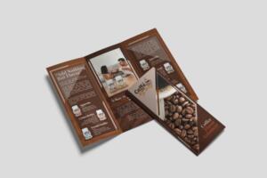
Includes file format and resolution. Tell us if you need a vector or raster file. Final delivery must be a high-resolution PNG at 144 PPI and the AI source file.
Control white space and visual hierarchy. Please list the exact copy and rank it up. For example, “Headline number one: “Give the ‘Download Now’ CTA lots of white space.
Attach Brand Guidelines. Always link your brand book. The designer gets immediate access to approved typography and hex codes. Simple.
Once the designer delivers the file, you need a system to check it.
Ready to Scale Your Creative Output Fast?
Mastering these 10 graphic design terms transforms how you collaborate with creative professionals. You shift your feedback from subjective opinions to objective directives and reduce revision cycles. You launch campaigns faster.
But even with clear communication, hiring an in-house designer comes with massive overhead costs. Freelancers struggle with availability.
It’s like hiring a full team, but without the overhead. Penji offers a streamlined alternative. We provide unlimited, on-demand graphic design for a flat monthly rate.
Get a design package with unlimited graphic design
Try Penji risk-free for 30 days & get unlimited custom designs

You submit a brief using precise terminology, and our vetted designers deliver high-quality assets fast. No contracts. Cancel anytime. Get the smartest way to manage your graphic design service today with Penji.
FAQs
A wireframe is the skeleton of a page, showing its structure but with no styling. It is used to plan functionality. A mockup is a visual representation of the design, with exact colors, typography, and imagery, at high fidelity.
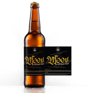
Always ask for a vector format like EPS, SVG or AI Vectors are infinitely scalable without losing quality so your logo will look sharp on a business card or a billboard.
Digital images use the RGB color profile. This uses light to create bright colors on a screen. Printers use CMYK ink. Converting RGB to CMYK often mutes vibrant colors. Always design in CMYK for print materials.
There is no strict mathematical rule. The industry standard is to provide enough empty space around primary elements like headlines and CTAs so they immediately draw the eye without competing against secondary graphics.
Visual hierarchy is the arrangement of design elements to communicate the order of importance. It guides the user’s attention from the most critical message to the desired action.
About the author

Je Ann Bacalso
Je Ann is a creative content writer who crafts engaging, SEO-friendly articles and web copy. With a passion for storytelling and a sharp eye for detail, she delivers clear, compelling content that connects with readers.


