
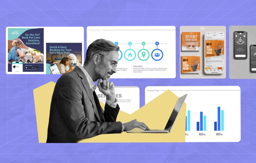
TL;DR – Design service for marketing allows brands to establish trust and credibility, boosting revenue and helping the brand stand out in a competitive market. Professional creatives know how to apply design hacks to increase the effectiveness of every visual asset.
Want to know a secret about audiences across industries? People don’t read word-for-word.
Instead, they scan the visuals and decide whether it’s worth their next few seconds or not. This process only goes to show how crucial marketing visuals are.
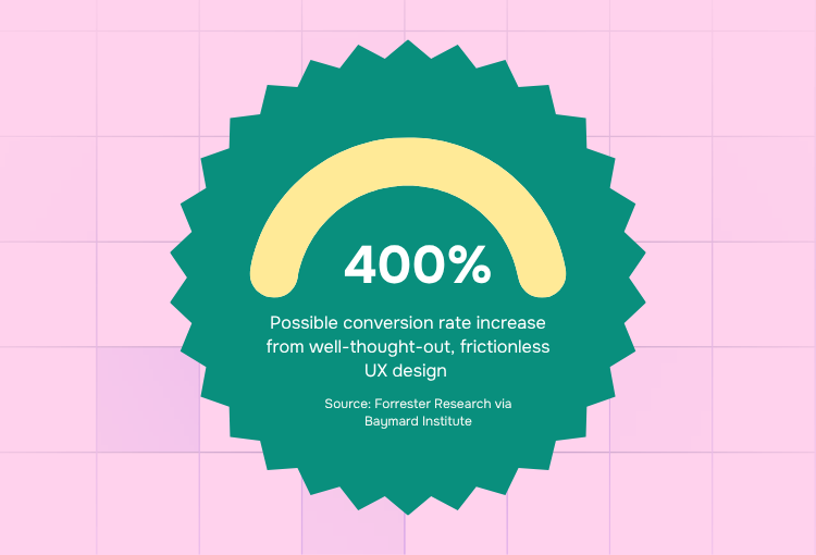
It’s so important that well-executed user experience (UX) design can bring up to 400% increase in revenue.
Whether you’re doing your marketing visuals yourself, using a design-as-a-service platform, or getting design support for marketing teams, you need to know what good graphic design for marketing looks like.
Knowing these data-backed design hacks can spell the difference between a well-performing campaign and one that simply drains your budget. But before we discuss the hacks, let’s answer a common question:
Why Does Design Matter in Marketing Performance?
Design service for marketing shapes your audience’s first impression of your brand before they even read a single word in your copy. This initial impression can either encourage them to keep an open mind about your pitch or completely shut it out.
An effective design service for marketing by a professional graphic design service helps brands:
- Communicate information
- Establish authority and trust
- Increases click-through rates by encouraging interest
- Improves conversion rates
- Creates a smooth experience, boosting customer retention
Remember: marketing visuals should not only look good; they should be strategically designed so that every element works to make it easier for your customer to say “yes.”
Graphic design for marketing by the world's top 2% designers
Unlimited graphic design at a flat monthly rate

What Are the Most Effective Design Hacks to Boost Marketing ROI?
Here are a few data-backed hacks implemented by reputable design services for marketing platforms that you can apply to maximize your return on investment:
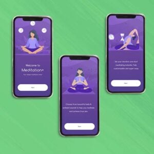
1. Use Visual Hierarchy to Guide Attention
Visual hierarchy guides your audience where to look first and how to process the information that you’re giving them.
Data reveals that people spend 80% of their time on a website looking at the left half of the screen and spends 20% on the other side.
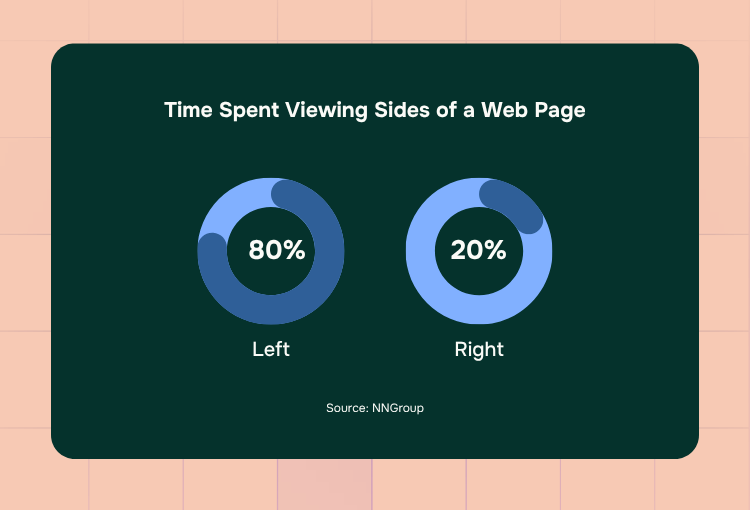
Applied to marketing collateral design, these numbers tell us that the audience doesn’t view visuals at random. Professional creatives usually design collaterals using this pattern:
- F-pattern – for text-heavy pages
- Z-pattern – for simpler layouts like landing pages
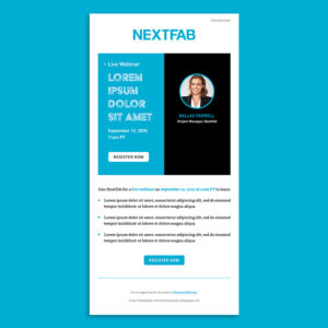
For instance, this brochure, designed by Penji, applies the F-pattern on some sections and uses color blocking to help make each part easily digestible for the reader.
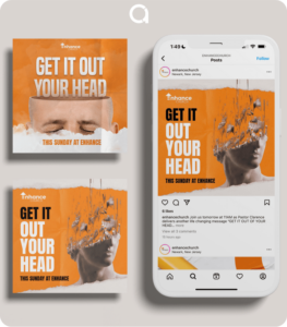
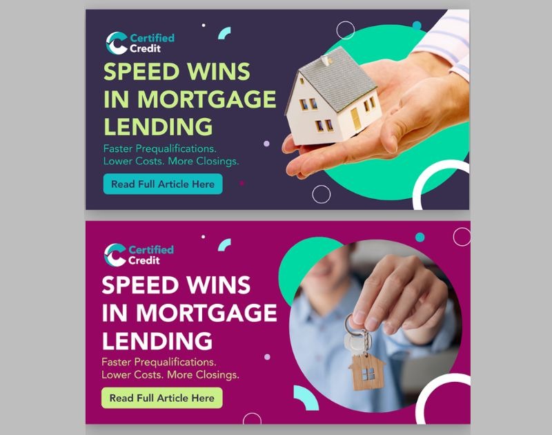
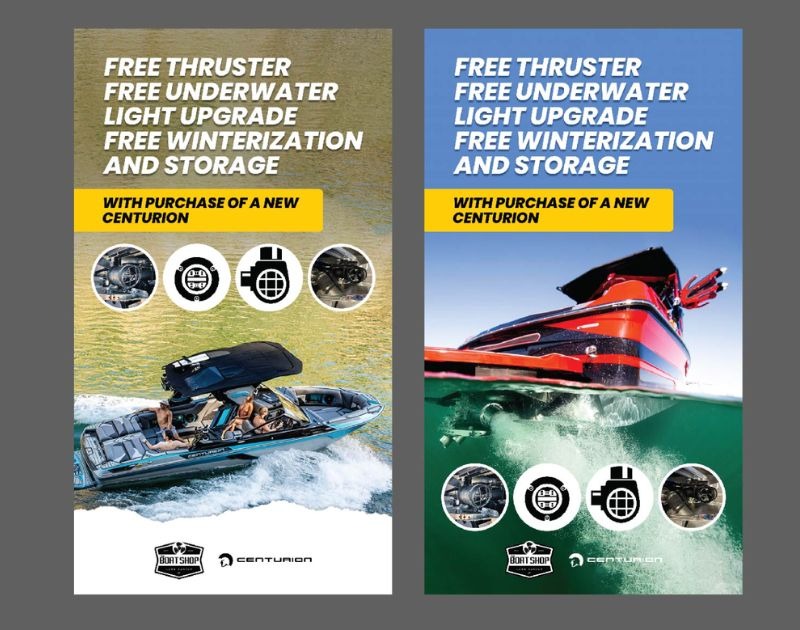
2. Make Your CTA Impossible to Miss
A call-to-action (CTA) is one of the most crucial parts of marketing materials design.
Data showing that changing a single word in the CTA can change conversion rates by 10-30% highlights how important every aspect of this button is.
Alongside copy, visual elements should also be strategic. For instance, reputable graphic design services would know that CTA buttons should visually pop against the background, just like in the examples below:
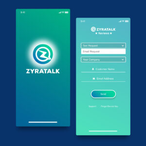
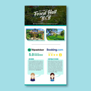
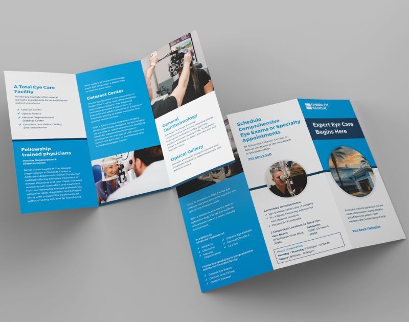
3. Simplify Your Layout
It’s hard to understand your pitch when your layout and background are competing with your message. In fact, data says 85% of people prefer minimal background elements, even the color white, when visiting websites.
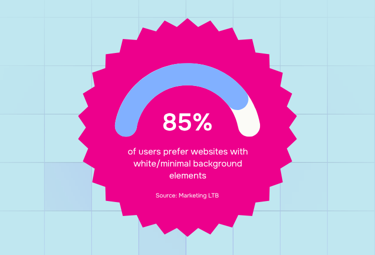
People are not likely to convert when they’re confused about your message. That said, it’s best to keep your layout and background uncomplicated to reduce cognitive load and speed up the decision-making process.
Here’s a good example of a clean layout:
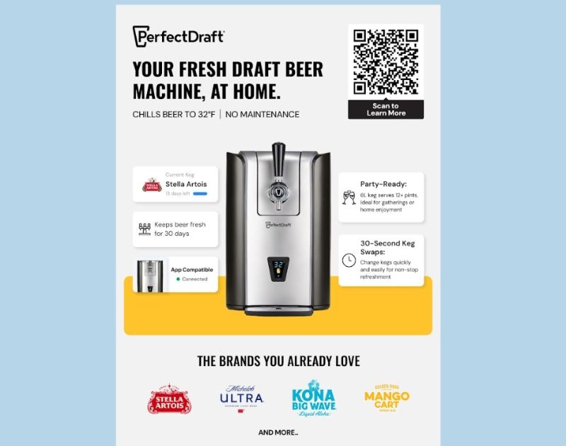
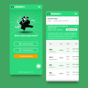
4. Use High-Quality, Contextual Images
Would you ever click an ad that uses a plain, generic image? Most probably not. In fact, a survey found that 6 out of 10 consumers are likely to engage with content if it has an attractive design, which includes clear context.
Here’s an example of a marketing visual that uses a contextual image:
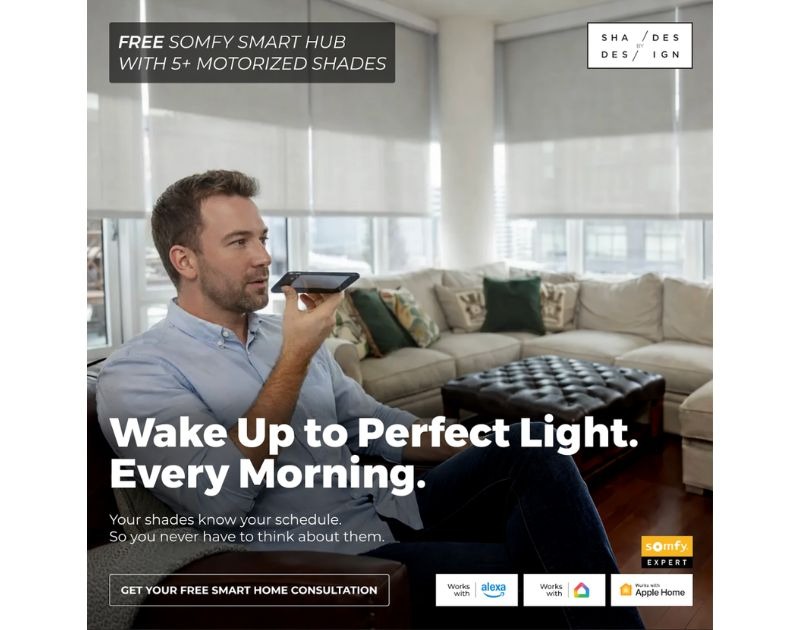
As seen in the image above, the contextual photo helps:
- Communicate value at a glance
- Visualize how the product fits into customers’ lives
- Build an instant connection between the brand and the audience
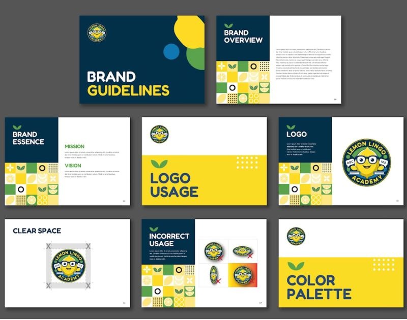
5. Apply Consistent Branding Across All Touchpoints
In marketing, every touchpoint counts. Data reveals that 80% of online purchases are a result of a customer journey involving multiple touchpoints. Another survey, meanwhile, shows consistent branding across platforms can increase revenue by up to 23%.
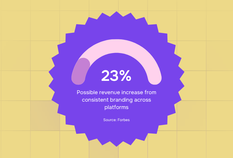
But how do you ensure visual consistency across platforms? The answer lies in an essential material: your branding guidelines.
Whether you’re using an on-demand graphic design platform or hiring a freelance designer, having a well-designed branding kit will help you maintain a consistent brand look through every email, social media post, or digital ad.
6. Optimize for Mobile-First Design
If you’re only optimizing your marketing materials for desktop, then you’re already missing more than half of the pie. Data from February 2026 shows that 51.62% of online traffic comes from mobile, while 46.74% comes from desktop.
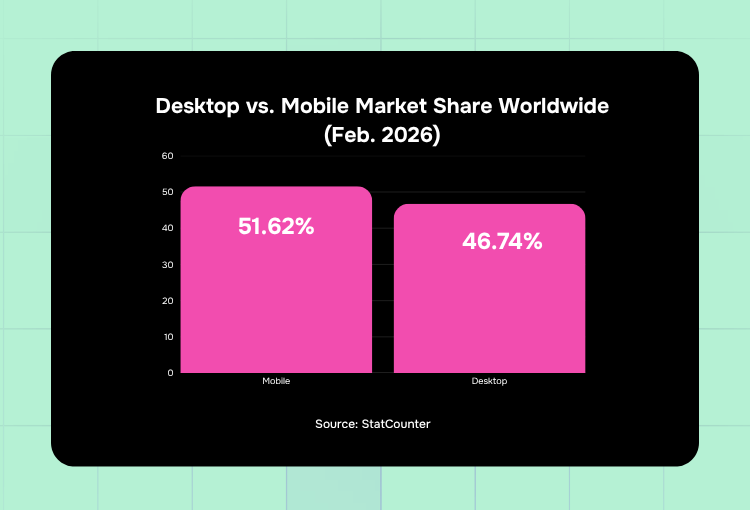
These numbers remind us that we should always optimize for mobile by ensuring that:
- Text, especially headlines, is readable even on small screens
- Information is organized in a way that’s easily scannable even for mobile users on the go
- Visuals don’t overwhelm the viewer, but they stay bold and clear
- Designs are on a vertical format when they need to be, allowing for easy scrolling
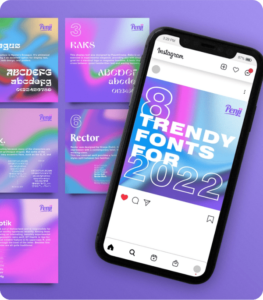
7. Use Color Psychology to Influence Behavior
Colors aren’t just for aesthetics, but they can also trigger decisions. A study from the University of Loyola revealed that color can increase brand recognition by up to 80%. That said, choosing the right color for your brand can shape how your audience perceives you.
To see the power of colors at work, let’s take a look at these sample designs:
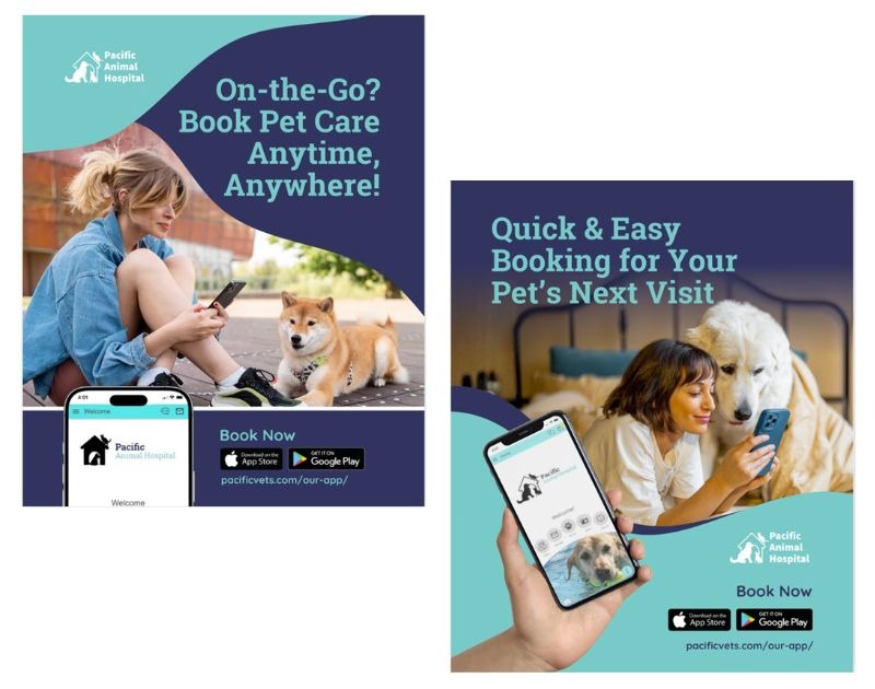
The designs above show:
- A blue palette that invokes calmness and trustworthiness, suitable for healthcare brands like veterinary services
- Color contrast emphasizes the headline
- The palette is consistent, making the brand easily recognizable
Even at first glance and without reading the text, the designs above already represent what the brand is all about.
The Lowdown
The right design service for marketing that applies these data-backed visual hacks can be one of the biggest drivers of revenue for your business.
It’s not all about making your visuals look better; it’s about making them easier to understand, and reducing the friction for your audience, making their brand experience smoother.
If you’re looking for unlimited graphic design services from designers who have mastered these hacks, along with more expert tricks up their sleeve, reach out to Penji. Hiring only the world’s top 2% designers, Penji’s monthly graphic design packages are a smart investment for your brand.
Check out Penji’s portfolio to see how marketing teams around the world improve their creative output with Penji as a partner.
Frequently Asked Questions (FAQs)
Superb marketing design services build and consistently communicate brand identity, allowing the business to establish itself as a credible entity that consumers can trust.
As people process visuals faster than text, effective design from reputable creative design-as-a-service platforms allows a brand to express its identity, values, and messages to its community quickly and more efficiently.
Yes. Poor mobile design can push visitors to leave immediately, increasing bounce rates and negatively affecting conversions.
About the author

Carla Deña
Carla is a journalist and content writer who produces stories for both digital and legacy media. She is passionate about creativity, innovation, and helping small businesses explore solutions that drive growth and social impact.


